Here are nominal returns for various investments during key periods of history. Note the 1940s' big returns for small caps and value. Bonds were repressed back then, with a cash-like return for a cash-like volatility. Could this be part of the Fed’s playbook in years ahead?
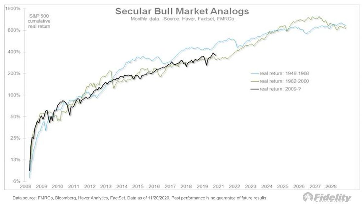
For clarification, I picked the 5 regimes for specific reasons to highlight possible analogs to today’s markets. 2009-2021 is the current post-GFC “monetary inflation” regime, which, in my opinion, is also a secular bull market that may have a ways further to go. (1/4)
1982-2000 was the previous secular bull market, driven in part by disinflation. 1949-1968 was the secular bull market before that, driven by post-depression/WWII productivity and demographics. (2/4)
1942-1951 was the “financial repression” regime, driven by fiscal/monetary policy coordination during WWII (including rate caps), and ending with the Fed’s new-found independence in 1951. (3/4)
Finally 1962-1985 was the “rising/high inflation” regime. Inflation was low-for-long during the 1950s and early 1960s, started a gradual climb during the late 1960s, and then rose rapidly during the 1970s. (4/4)
• • •
Missing some Tweet in this thread? You can try to
force a refresh
Let’s compare two important historical market regimes to the post-GFC era. Here, I isolate the era of financial repression from 1942-51, and the secular rise in inflation from the early 1960s to the early 1980s. (THREAD /1)
I am showing these charts as a scatter plot of nominal returns (x) and real returns (y). It’s an unusual format (without the time scale) but it shows the trends clearly. /2
The financial repression era started in 1942 w/ the buildup to WWII & ended when the Fed gained independence in 1951. The federal debt tripled & the Fed monetized it all while pushing real rates firmly negative via rate caps. That same conversation appears to be happening now. /3
Bitcoin is in the spotlight these days but let’s not rule out #gold. Let’s assume that in coming years the current fiscal/monetary regime were to produce the same kind of 10% growth rate (CAGR) in the money supply that the 1930s/1940s & the 1970s produced (THREAD/1)
Looking back, both periods produced a 10% CAGR for M2 that lasted at least 10 years and that took M2 from below its long-term exponential trendline to above it. Both these previous periods produced a strong advance in the above-ground market value of #gold relative to M2. /2
What if we see this pattern again? What do I think that would that mean for the price of gold and how might this dynamic change now that #bitcoin has entered the scene and seems to be cannibalizing gold? /3
Earnings & the #Fed. I assumed the 1930s weren’t a good analog for 2020 b/c the fiscal/monetary policy response this year was greater & faster than ever, except perhaps the ‘40s. Policy response matters & in 2020 it blew away steps taken in ’08. How it started… (THREAD/1)
During volatile March, the 1987 crash was a better analog in the speed of the decline in stock prices & in the spike in the #VIX—VXO then. Also: the 1987 episode produced a full retest & pretty slow recovery. The analog worked in helping identify the market’s exhaustion point. /3
Let’s revisit secular trends, looking at the secular bull markets of 1949-1968 & 1982-2000. We’re at the point where the long-term momentum of #stocks vs #commodities has peaked in the past. This chart shows a lot of cyclicality when it comes to financial vs real assets. 1/THREAD
During the 1949-1968 cycle, growth peaked against value right about now (in terms of the 10-year CAGR), while during the 1982-2000 cycle the 10-year CAGR flattened for a few years before spiking into what became the dot-com bubble in 1999-2000. 2/
So is this the 1960s or the 1990s? Given that we have already experienced a parabolic out-performance phase for large-cap growth, I like the 1949-1968 analog here, in which case we are somewhere in the early 1960’s. 3/
A secular fork in the road: Here, the secular bear mkts & secular bull mkts interspersed. It’s my thesis that we’re in a secular bull mkt which, at 11 years old (since the #SP500 index started making new highs in spring 2013), I believe is only in its 5th or 6th inning. 1/THREAD
The double-digit CAGR, the short & swift bear markets followed by robust recoveries to new highs, and the steady expansion in valuation multiples all spell “secular bull” in my view. 2/
The post-global financial crisis (GFC) #bullmarket continues to closely track the secular bull markets of 1949-1968 and 1982-2000. It’s a sample size of only two but the analog suggests we may have a ways to go still. 3/
(1/THREAD) Sentiment: One might think, with the #market erasing all its losses, that sentiment would have gotten somewhat lopsided, but it hasn’t. Here, flows into equity funds & ETFs & money market funds. #equities#SPX
2/ The rush into #cash has barely been undone, while #investors aren’t exactly rushing into #equities. While cash sitting in money market funds has dropped slightly from nearly $5 trillion to about $4.55 trillion, it has fallen from 17% to 13% as a percent of equity market cap.
3/ Looking at the percent of equity market capitalization is probably a better way to slice the data as a proxy for sentiment and it has matched almost perfectly the spread on high-yield corporate #bonds. The rest of the sentiment picture is mixed too.