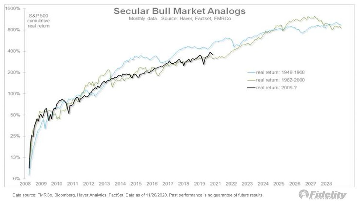
Earnings & the #Fed. I assumed the 1930s weren’t a good analog for 2020 b/c the fiscal/monetary policy response this year was greater & faster than ever, except perhaps the ‘40s. Policy response matters & in 2020 it blew away steps taken in ’08. How it started… (THREAD/1)
During volatile March, the 1987 crash was a better analog in the speed of the decline in stock prices & in the spike in the #VIX—VXO then. Also: the 1987 episode produced a full retest & pretty slow recovery. The analog worked in helping identify the market’s exhaustion point. /3
1987 & 2020: How it started… /4
A look at the VXO volatility index… /5
How it’s going… /6
And the VXO… /END
• • •
Missing some Tweet in this thread? You can try to
force a refresh
Let’s revisit secular trends, looking at the secular bull markets of 1949-1968 & 1982-2000. We’re at the point where the long-term momentum of #stocks vs #commodities has peaked in the past. This chart shows a lot of cyclicality when it comes to financial vs real assets. 1/THREAD
During the 1949-1968 cycle, growth peaked against value right about now (in terms of the 10-year CAGR), while during the 1982-2000 cycle the 10-year CAGR flattened for a few years before spiking into what became the dot-com bubble in 1999-2000. 2/
So is this the 1960s or the 1990s? Given that we have already experienced a parabolic out-performance phase for large-cap growth, I like the 1949-1968 analog here, in which case we are somewhere in the early 1960’s. 3/
A secular fork in the road: Here, the secular bear mkts & secular bull mkts interspersed. It’s my thesis that we’re in a secular bull mkt which, at 11 years old (since the #SP500 index started making new highs in spring 2013), I believe is only in its 5th or 6th inning. 1/THREAD
The double-digit CAGR, the short & swift bear markets followed by robust recoveries to new highs, and the steady expansion in valuation multiples all spell “secular bull” in my view. 2/
The post-global financial crisis (GFC) #bullmarket continues to closely track the secular bull markets of 1949-1968 and 1982-2000. It’s a sample size of only two but the analog suggests we may have a ways to go still. 3/
(1/THREAD) Sentiment: One might think, with the #market erasing all its losses, that sentiment would have gotten somewhat lopsided, but it hasn’t. Here, flows into equity funds & ETFs & money market funds. #equities#SPX
2/ The rush into #cash has barely been undone, while #investors aren’t exactly rushing into #equities. While cash sitting in money market funds has dropped slightly from nearly $5 trillion to about $4.55 trillion, it has fallen from 17% to 13% as a percent of equity market cap.
3/ Looking at the percent of equity market capitalization is probably a better way to slice the data as a proxy for sentiment and it has matched almost perfectly the spread on high-yield corporate #bonds. The rest of the sentiment picture is mixed too.
Valuation: It’s a contested issue in the market. Are stocks as divorced from fundamentals as many say? This chart shows that’s a fair point. While the #SPX is up 50% from the low, the NTM P/E multiple has almost doubled.
But, in my view, the bearish P/E argument misses something important: At bottoms, price usually leads #earnings. So there are going to be periods where price goes up while earnings still go down which, mathematically, leads to a rising P/E ratio.
The same thing happened in 2009 after the GFC bottom. Look: an analog of the inflation-adjusted #SP500 index now & back then. Bottom panel: Earnings as measured from the price low—not the earnings low. Back in ’09, EPS fell another 5% after the #SPX bottomed on March 9.
One noteworthy aspect of the #COVID19 market has been the success with which the #Fed & other #centralbanks have been able to stem the “Covid Crash” and then help control the recovery. The current backdrop reminds me a bit of the 1942-1946 #QE cycle. Let’s take a look. (THREAD)
1/ After the Great Depression, the government went into high gear during WWII and, in the process, ran up huge government debt. Federal debt as a percent of #GDP jumped to 116% from 39% during the 1st half of the 1940s.
2/ Not only did the Fed monetize the debt by increasing its balance sheet 10-fold, it repressed the entire #yieldcurve by capping short rates at 3/8% & long rates at about 2.5%. #Inflation ran up but, with the #Fed repressing rates at low levels, real rates went negative.
Another #tech bubble? There’s a lot of talk about the FANG mega-cap #growth companies leading the market, just like 2000. The #tech companies’ narrow leadership of the #SPX is a big reason perma-bears are hating on the #market. Right or wrong? Let’s take a closer look. (THREAD)
1/ In 1999 I did a deep dive on the top darling stocks to compare the lopsided leadership of the late 1990s to the early to mid-1970s. Earlier, during the 1960s, the cyclical #bullmarket from Oct. 1966 to Nov. 1968 produced a huge bubble in retail speculation.
2/ #Tech & space companies were big favorites. Then came the #recession of 1970 & a painful bear market that wiped out speculators. During that decline & recovery, institutional investors dominated the #stockmarket & were buying tried-and-true stocks with bulletproof #earnings.