It was four months ago that I first wrote about bitcoin, and a lot has happened (and a lot has been learned) since then. So here is a refresh of my take on the topic. (THREAD)
In my view, there are at least two dimensions to what makes bitcoin unique: an asymptotic supply curve and an exponential demand curve. At the intersection of the two lies a parabolic price discovery curve for this unique asset class. /2
The supply curve is best described by the stock-to-flow (S2F) model, originated by @100trillionUSD. The higher the S2F, the higher the valuation. From what I understand, the S2F model is basically a power regression between bitcoin’s price and it’s inflation rate. /3
Supply scarcity is not enough though. Fortunately, the demand curve is equally compelling—and equally exponential. The chart below shows the price of bitcoin against the number of bitcoin addresses with a balance of at least $1. /4
Both scales are logarithmic, which shows that both price & demand have been growing exponentially. While we know the supply curve in advance (based on the pre-determined halvings), we don’t know what the demand curve will look like going forward. /5
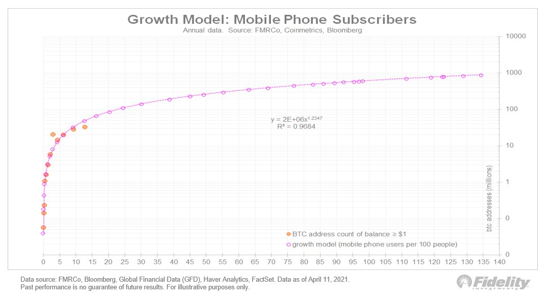
Fortunately, we have many examples of historical S-curves to guide us. We can use these analogs to help give us a possible clue to how bitcoin’s demand curve might evolve in the years to come. /6
Below is one example, using mobile phone subscriptions per 100 people in the US. The scatter plot regresses mobile phone subscriptions vs bitcoin addresses. I then added a power regression trendline to project potential future values for bitcoin demand. /7
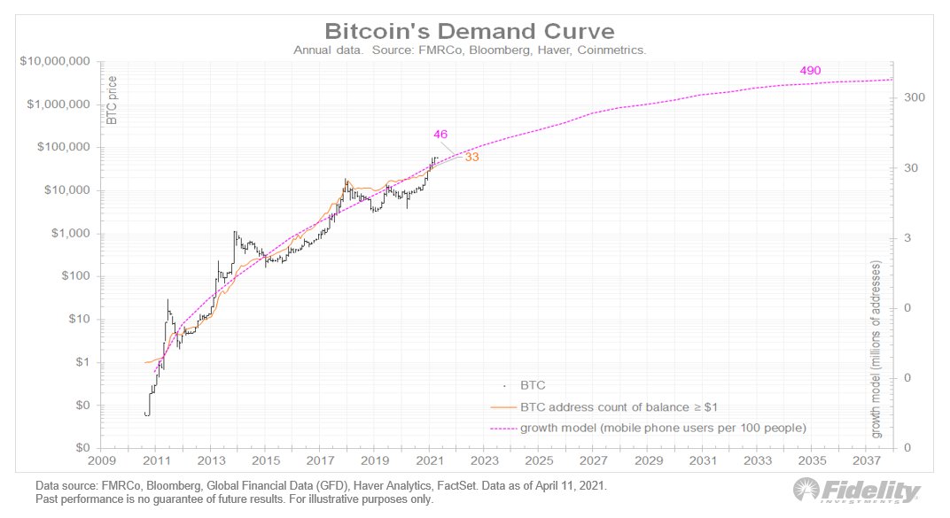
This chart shows the existing and projected demand curve against price. /8
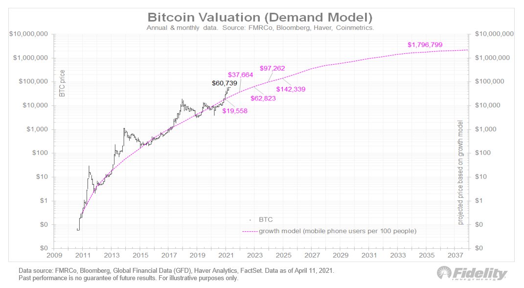
From there we can convert this demand curve into a price projection, by applying a power regression to the series. /9
Now let’s compare this to the stock-to-flow model. Below I added in the S2F model, which is the aforementioned inflation rate regressed against price. /10
I find it interesting that both the demand and supply models line up as well as they do, each appearing to predict ongoing impressive price gains. But the demand model turns more conservative than the S2F the further out we go. /11
Such is the nature of S-curves, as demand growth turns increasingly asymptotic while the supply curve continues on its pre-existing exponential trend. /12
I don’t know which model (if any) will do the best job in suggesting bitcoin’s historic journey, but for me the main takeaway is that it is helpful to look at both supply and demand curves. /13
While the S2F model seems too optimistic in the out years given its persistent exponential slope, the demand curve seems more plausible to me. (END/14)

• • •

Missing some Tweet in this thread? You can try to force a refresh
 

Keep Current with Jurrien Timmer

Jurrien Timmer Profile picture

Stay in touch and get notified when new unrolls are available from this author!

Read all threads

This Thread may be Removed Anytime!

PDF

Twitter may remove this content at anytime! Save it as PDF for later use!

Try unrolling a thread yourself!

how to unroll video
  1. Follow @ThreadReaderApp to mention us!

  2. From a Twitter thread mention us with a keyword "unroll"
@threadreaderapp unroll

Practice here first or read more on our help page!

More from @TimmerFidelity

14 Apr
Bitcoin vs Gold: Let’s take my hypothetical exercise () one step further by bringing gold into the mix. (THREAD)
Let’s take the above models and convert them into projected market values. The gray line shows the market cap of above-ground gold. We only have data through 2020, but I took the liberty of extrapolating this series using two simple assumptions. /2
The first is that gold production continues at the same rate of 100 million oz, as it has done in recent years. The second is that the price of gold will advance by the same 8% CAGR that it has since it started to trade freely in the early 1970s. /3
Read 9 tweets
2 Apr
Here are nominal returns for various investments during key periods of history. Note the 1940s' big returns for small caps and value. Bonds were repressed back then, with a cash-like return for a cash-like volatility. Could this be part of the Fed’s playbook in years ahead? Image
For clarification, I picked the 5 regimes for specific reasons to highlight possible analogs to today’s markets. 2009-2021 is the current post-GFC “monetary inflation” regime, which, in my opinion, is also a secular bull market that may have a ways further to go. (1/4)
1982-2000 was the previous secular bull market, driven in part by disinflation. 1949-1968 was the secular bull market before that, driven by post-depression/WWII productivity and demographics. (2/4)
Read 5 tweets
31 Mar
Let’s compare two important historical market regimes to the post-GFC era. Here, I isolate the era of financial repression from 1942-51, and the secular rise in inflation from the early 1960s to the early 1980s. (THREAD /1)
I am showing these charts as a scatter plot of nominal returns (x) and real returns (y). It’s an unusual format (without the time scale) but it shows the trends clearly. /2
The financial repression era started in 1942 w/ the buildup to WWII & ended when the Fed gained independence in 1951. The federal debt tripled & the Fed monetized it all while pushing real rates firmly negative via rate caps. That same conversation appears to be happening now. /3
Read 15 tweets
8 Mar
Bitcoin is in the spotlight these days but let’s not rule out #gold. Let’s assume that in coming years the current fiscal/monetary regime were to produce the same kind of 10% growth rate (CAGR) in the money supply that the 1930s/1940s & the 1970s produced (THREAD/1)
Looking back, both periods produced a 10% CAGR for M2 that lasted at least 10 years and that took M2 from below its long-term exponential trendline to above it. Both these previous periods produced a strong advance in the above-ground market value of #gold relative to M2. /2
What if we see this pattern again? What do I think that would that mean for the price of gold and how might this dynamic change now that #bitcoin has entered the scene and seems to be cannibalizing gold? /3
Read 7 tweets
15 Dec 20
Earnings & the #Fed. I assumed the 1930s weren’t a good analog for 2020 b/c the fiscal/monetary policy response this year was greater & faster than ever, except perhaps the ‘40s. Policy response matters & in 2020 it blew away steps taken in ’08. How it started… (THREAD/1) Image
#Earnings & the #Fed. How it’s going… /2 Image
During volatile March, the 1987 crash was a better analog in the speed of the decline in stock prices & in the spike in the #VIX—VXO then. Also: the 1987 episode produced a full retest & pretty slow recovery. The analog worked in helping identify the market’s exhaustion point. /3
Read 7 tweets
27 Nov 20
Let’s revisit secular trends, looking at the secular bull markets of 1949-1968 & 1982-2000. We’re at the point where the long-term momentum of #stocks vs #commodities has peaked in the past. This chart shows a lot of cyclicality when it comes to financial vs real assets. 1/THREAD Image
During the 1949-1968 cycle, growth peaked against value right about now (in terms of the 10-year CAGR), while during the 1982-2000 cycle the 10-year CAGR flattened for a few years before spiking into what became the dot-com bubble in 1999-2000. 2/ Image
So is this the 1960s or the 1990s? Given that we have already experienced a parabolic out-performance phase for large-cap growth, I like the 1949-1968 analog here, in which case we are somewhere in the early 1960’s. 3/
Read 7 tweets

Did Thread Reader help you today?

Support us! We are indie developers!


This site is made by just two indie developers on a laptop doing marketing, support and development! Read more about the story.

Become a Premium Member ($3/month or $30/year) and get exclusive features!

Become Premium

Too expensive? Make a small donation by buying us coffee ($5) or help with server cost ($10)

Donate via Paypal Become our Patreon

Thank you for your support!

Follow Us on Twitter!