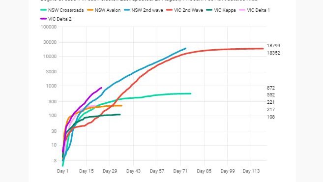
Comparisons between current outbreaks in NSW and VIC - by request
1. Outbreak sum
2. Daily cases
3. Unlinked cases
4. Wilds
Note - VIC's July / Aug outbreaks separated into Delta 1 (pink) and Delta 2 (purple)
1. Outbreak sum -
#covidvic #covid19vic #covid19aus
1/7
1. Outbreak sum
2. Daily cases
3. Unlinked cases
4. Wilds
Note - VIC's July / Aug outbreaks separated into Delta 1 (pink) and Delta 2 (purple)
1. Outbreak sum -
#covidvic #covid19vic #covid19aus
1/7

Note re starting points -
Above = index case
All charts below = 10 local cases in one day
2. Daily cases -
2/7
Above = index case
All charts below = 10 local cases in one day
2. Daily cases -
2/7

Something to keep in mind when you look at these -
To compare outbreaks, we have to start them at the same 'point in time'.
What starting point do we choose?
Our options include ...
5/7
To compare outbreaks, we have to start them at the same 'point in time'.
What starting point do we choose?
Our options include ...
5/7
1. Date of index case (useful in localised outbreaks)
2. Formula to remove volatility at outbreak start. eg. Day 1 = 100 cases total, 10 cases in one day
The charts above use both of these
But keep in mind the *real* scenarios these curves represent
6/7
2. Formula to remove volatility at outbreak start. eg. Day 1 = 100 cases total, 10 cases in one day
The charts above use both of these
But keep in mind the *real* scenarios these curves represent
6/7
NSW -
Day 1 (June 17)
Day 7: 17 daily cases (i.e. > 10 for first time)
Day 19: took off in the south-west (37 daily cases)
So - days 1-19 focus was eastern suburbs
VIC Delta 2 -
Day 1 (Aug 4)
Day 3: 29 daily cases (i.e. >10 for first time)
So - took off more quickly
7/7
Day 1 (June 17)
Day 7: 17 daily cases (i.e. > 10 for first time)
Day 19: took off in the south-west (37 daily cases)
So - days 1-19 focus was eastern suburbs
VIC Delta 2 -
Day 1 (Aug 4)
Day 3: 29 daily cases (i.e. >10 for first time)
So - took off more quickly
7/7
Given the above, I'm wondering if it might be better to use 20 local cases in one day as the starting point
But I think this is fraught and arbitrarily chosen starting points means we're just looking at two lines next to each other
I prefer consistency of index / 10 cases
But I think this is fraught and arbitrarily chosen starting points means we're just looking at two lines next to each other
I prefer consistency of index / 10 cases
Live charts here: covid19data.com.au/compare-outbre…
Hey @Matt_Hopcraft - are you comparing these outbreaks as well? And if so, what starting point are you using? :)
• • •
Missing some Tweet in this thread? You can try to
force a refresh


