Is this the 1st time a company itself says its product is not good anymore but FDA says it is?
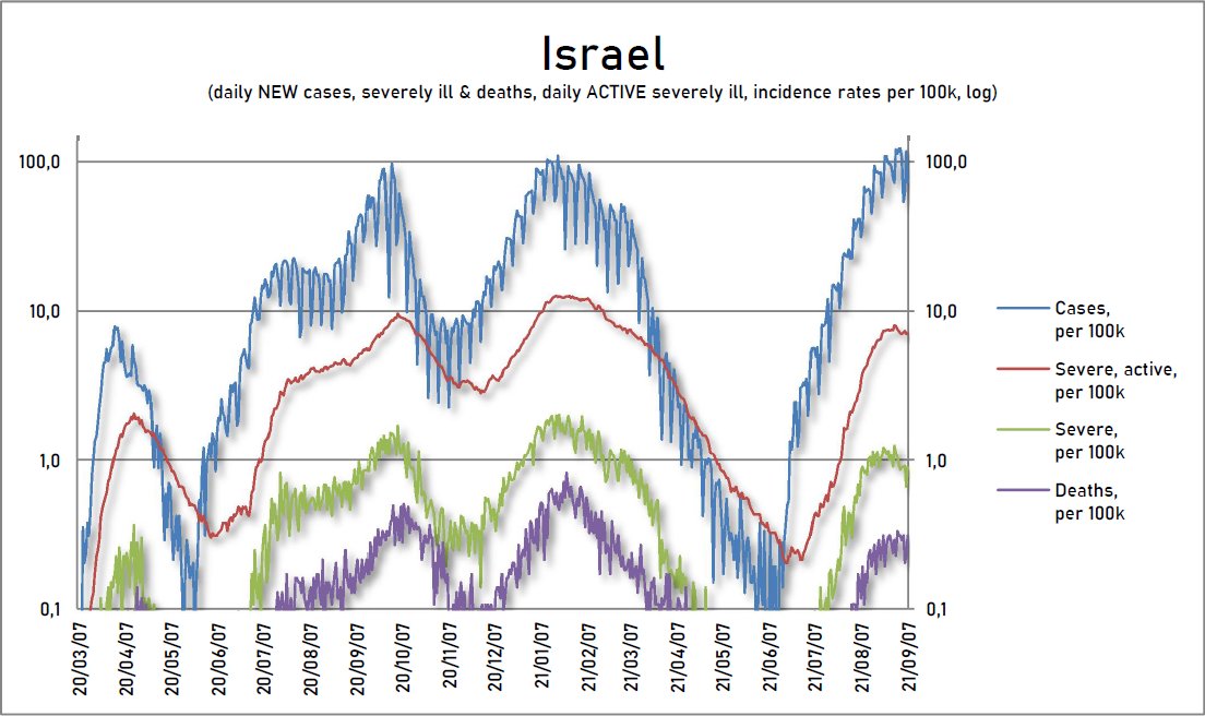
"Data from Israel suggest reduced effectiveness against SEVERE disease could eventually FOLLOW observed reductions in effectiveness against #SARSCoV2 INFECTIONS.
fda.gov/media/152161/d…
Moreover, reductions in effectiveness against infections could lead to increased transmission, especially in the face of the highly transmissible B.1.617.2 (#Delta) variant. Policymakers will need to continue to monitor VE over time and may need to consider recommendations for... Image
booster doses to restore initial high levels of protection observed early in the vaccination program, and to help control heightened transmission of B.1.617.2 (Delta) as we enter the upcoming fall/winter viral respiratory season."
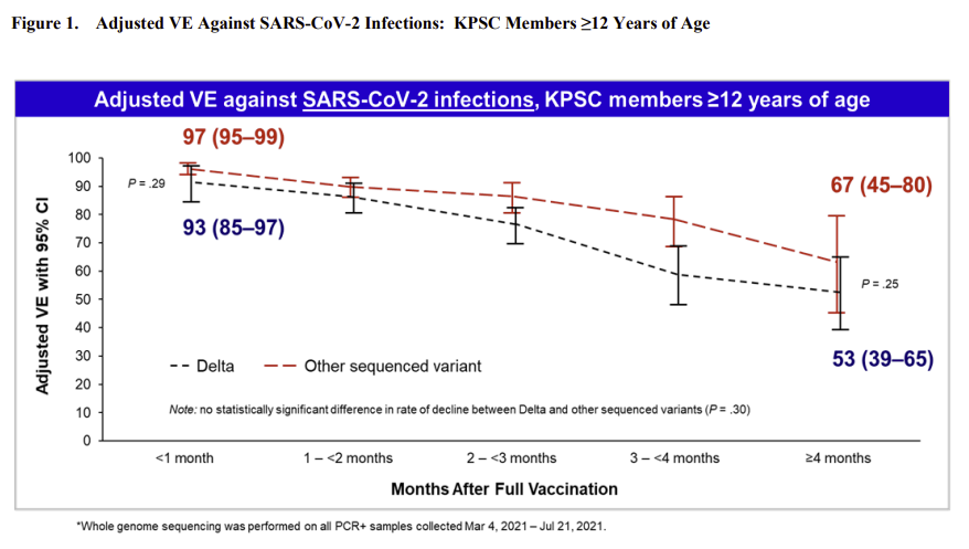
FDA unimpressed, though:
fda.gov/media/152176/d…
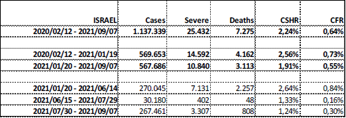
The @IsraelMOH will also present tomorrow at the FDA. Here's their presentation. I've already wrote about most of this data many, many times but it's a nice summary.
"Booster protection against confirmed infections and severe disease - data from Israel"
fda.gov/media/152205/d…

• • •

Missing some Tweet in this thread? You can try to force a refresh
 

Keep Current with Double Individual Speculator

Double Individual Speculator Profile picture

Stay in touch and get notified when new unrolls are available from this author!

Read all threads

This Thread may be Removed Anytime!

PDF

Twitter may remove this content at anytime! Save it as PDF for later use!

Try unrolling a thread yourself!

how to unroll video
  1. Follow @ThreadReaderApp to mention us!

  2. From a Twitter thread mention us with a keyword "unroll"
@threadreaderapp unroll

Practice here first or read more on our help page!

More from @x2IndSpeculator

18 Sep
I've been tweet-erratic the last few days because I thought my #SARS2 safety protocol has been breached. Like many other parents have experienced, it took us only seven days of this new living-with-#COVID school for my younger son to develop respiratory illness symptoms.
My guess, potential exposure was physical education (gym) class held INDOORS (& maskless) due to bad weather. Then, 36h later, a sore throat, fever, congested nose & cough. My wife & I are both x2 Pfizer post-3 months, and sons Pfizer 3 weeks after 1st dose (scheduled for 2nd).
After a couple of days of anxiety, surprisingly, I just got our #SARS2 negative test results. It seems my kid caught some other bug.
Since we managed to avoid close calls with #SARS2 for 20 months & stayed unusually healthy, this was my 1st firsthand experience with PCR testing.
Read 5 tweets
16 Sep
A great interview with @florian_krammer with several useful explanations about testing the levels of nAbs. My nightmare virus is #SARSCoV2, though. For 50% killers, the global reaction would be swift.
"Some antibody tests give you a yes-or-no response...
medscape.com/viewarticle/95…
That is okay to figure out if you had an infection or not, or if you made an immune response to the vaccine. But that's all it can tell you. Then there are antibody tests that are semi-quantitative or quantitative, that tell you what level of antibody you have now...
...these antibody tests are NOT MEASURING NEUTRALIZING ANTIBODIES; they're measuring BINDING antibodies. But...there's a relatively good correlation between neutralizing and binding antibodies... There isn't a single number above which...protected... it's usually a PROBABILITY."
Read 7 tweets
15 Sep
I'm sorry but I can't stand anymore these simplified charts with selected time frames & selected subgroups & equalized y-axis for cases, severe & deaths to minimize damage from #SARS2 & wrong assertion naturally infected are only among unvaccinated... like just published in FT.
My philosophy is:
Find .csv or .xls data from an official trusted source.
Plot a chart from DAY 1 of the provided dataset.
Show ALL available subgroups; comparison is vital, especially if using incidences.
If combining deaths & cases use LOG charts because linear diminish deaths!
After I import & consolidate data, creating a new chart is a truly exciting exploration moment for me. I go where it leads me.
The mainstream media's half-charts are not exploratory. They serve to confirm predestined presumptions of its authors/editors & justify someone's policy.
Read 4 tweets
14 Sep
A continuation of NIH studies on macaques; this one trying to solve a riddle of differences in #COVID severity & immune response between the young & the old.
@fitterhappierAJ
"Aging results in numerous changes to cells & mediators of the immune system... biorxiv.org/content/10.110…
which alter susceptibility to infection, disease progression & clinical outcomes...
immunosenescence include cytokine dysregulation, an accumulation of senescent cells leading to chronic inflammation, a loss of naïve T- & B-cells & defective responses by innate immune subsets."
"Declining adaptive immunity is another hallmark of immunosenescence. A reduction in thymic & bone marrow function contributes to a loss of naïve T- and B-cells & the accumulation of terminally differentiated effector cells...
older rhesus macaques exhibited lower frequencies...
Read 6 tweets
12 Sep
This thread caused quite a stir. Though I can't confirm these numbers (the US doesn't have accessible national data), it's an important idea. If we are indeed all supposed to "get" infected by #SARS2 sooner or later, it would be very useful to know what outcomes we are facing.
1/
Once again, I turn to the country that had multiple significant outbreaks, since the beginning collects & now releases in real-time raw data separated by the vaccination status: #Israel.
So, let's compare case fatality rates & case severe hospitalization rates.
2/
These are #Israel's totals of cases, new severe patients & deaths. I have to stress that Israel tests a lot & includes antigen tests. Their level of healthcare is among the best in the world. And importantly, they reacted swiftly & blunted the impact of both #Alpha & #Delta.
3/ Image
Read 11 tweets
10 Sep
A change in definitions of vaccinated status & new raw data from @IsraelMOH demanded a refreshed approach to my #Israel's #SARS2 charts. I start with general population totals of the four available daily datasets: NEW cases, severely ill & deaths, and ACTIVE severely ill.
1/
Due to the different sizes of these categories, I had to use log charts. Daily NEW cases, severe & deaths jump around wildly depending on the day of the week, so I'll (mostly) use the standard 7-day rolling averages of both the absolute numbers & the incidence rates.
2/
It's fascinating to see how much the beginnings of this & last year's waves resemble each other. After a prolonged period of new cases below active severely ill, a sudden outbreak above that range signals the start of a huge new wave. A policy reaction is a must at THAT point.
3/
Read 11 tweets

Did Thread Reader help you today?

Support us! We are indie developers!


This site is made by just two indie developers on a laptop doing marketing, support and development! Read more about the story.

Become a Premium Member ($3/month or $30/year) and get exclusive features!

Become Premium

Too expensive? Make a small donation by buying us coffee ($5) or help with server cost ($10)

Donate via Paypal Become our Patreon

Thank you for your support!

Follow Us on Twitter!

:(