What’s a yield curve? Why is it important? Why the inverted relationship btw bond yields and prices? And why do investors keep obsessing about it?
Everything you wanted to know about bond yields and the yield curve but were too afraid to ask – explained 😊 (27-point thread)👇🧵
Everything you wanted to know about bond yields and the yield curve but were too afraid to ask – explained 😊 (27-point thread)👇🧵

1/ You’re probably aware that the 10-Y T-bill yield shot up from 0.5% in July ‘20 to 1.1% in Jan ’21, and then to its 1.7% March peak.
It fell back to 1.2% in Jul, shot up to 1.6% in mid-Oct, and is jumping around from one inflation report to the next.
Why does this matter?
It fell back to 1.2% in Jul, shot up to 1.6% in mid-Oct, and is jumping around from one inflation report to the next.
Why does this matter?

2/ What does it even mean when bond yields rise?
Usually, it is a sign that demand is moving away from T-bills and into other higher-return assets, which is what typically happens during recoveries.
But this time, however, this is also due to higher #inflation expectations.
Usually, it is a sign that demand is moving away from T-bills and into other higher-return assets, which is what typically happens during recoveries.
But this time, however, this is also due to higher #inflation expectations.
3/ Before moving on, a quick recap of the relationship btw bond prices and yields – a primer, so to speak.
Think of it in terms of supply and demand. Bond prices and bond yields move inversely: the higher the demand for a bond, the higher its price, and the lower its yield.
Think of it in terms of supply and demand. Bond prices and bond yields move inversely: the higher the demand for a bond, the higher its price, and the lower its yield.
4/ Why? Each bond carries a coupon (payment the bond issuer pays to the buyer/holder of the bond) which remains fixed until maturity
It’s like a loan. You give money to Uncle Sam, they pay you interest, and at the end of the period (say 10 years), they pay you back the principal
It’s like a loan. You give money to Uncle Sam, they pay you interest, and at the end of the period (say 10 years), they pay you back the principal
5/ The yield of a bond is its current yield: value of a fixed coupon payment divided by the current price of a bond
E.g., bond is sold for $1000 face value, has a 2% annual coupon rate, meaning it pays $20 annually to the bearer until maturity. Its initial yield is 20/1000 = 2%
E.g., bond is sold for $1000 face value, has a 2% annual coupon rate, meaning it pays $20 annually to the bearer until maturity. Its initial yield is 20/1000 = 2%
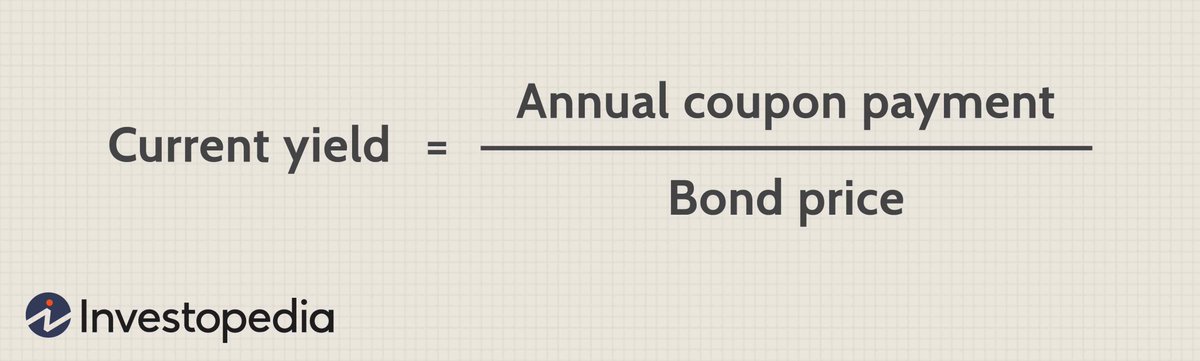
6/ If there is greater demand for a bond, and its price goes🔼to, say, $1050, the current yield is 20/1050 = 1.9%
If the price of a bond goes🔻due to less demand, say to $920, the current yield jumps to 20/920 = 2.17%
Hence the inverted relationship btw bond yields & prices.
If the price of a bond goes🔻due to less demand, say to $920, the current yield jumps to 20/920 = 2.17%
Hence the inverted relationship btw bond yields & prices.
7/ So when someone says yields are going🔺this means that bond prices are going🔽due to lower demand for bonds (e.g., money going from bonds to stocks).
When yields go🔻this means bond prices are going🔼 due to higher demand for bonds (e.g., foreigners buying more US bonds)
When yields go🔻this means bond prices are going🔼 due to higher demand for bonds (e.g., foreigners buying more US bonds)
8/ Which brings us back to the recent yield hikes. Are they really hikes?
Actually, yields are quite low compared to their historical trend (see chart). The current rise in yields is hence primarily a signal about short-run expectations. A cyclical rather than a structural trend
Actually, yields are quite low compared to their historical trend (see chart). The current rise in yields is hence primarily a signal about short-run expectations. A cyclical rather than a structural trend

9/ Expectations on what exactly?
#inflation
Bond yields typically go up as a result of several factors.
Demand moving away from Treasuries into higher-return assets, like stocks. This typically happens during times of economic recoveries and/or expansions.
#inflation
Bond yields typically go up as a result of several factors.
Demand moving away from Treasuries into higher-return assets, like stocks. This typically happens during times of economic recoveries and/or expansions.
10/ Also, as the US government issued more debt during the pandemic to finance its fiscal packages, it is increasing the *supply* of its bonds.
Coupled with a slightly weaker demand for Treasuries, it is no surprise that bond prices went down and yields up.
Coupled with a slightly weaker demand for Treasuries, it is no surprise that bond prices went down and yields up.
11/ However, in this context, the main reason behind rising bond yields and a steep yield curve are higher inflation expectations.
Basically, the market factored in higher inflation expectations already in February and March, and we saw it manifest later in the year.
Basically, the market factored in higher inflation expectations already in February and March, and we saw it manifest later in the year.
12/ How exactly do inflation expectations impact yields?
When inflation is expected to be high, you sell bonds, as its low returns are not enough to offset inflation.
Lower demand for bonds lowers their price, which increases the yield.
When inflation is expected to be high, you sell bonds, as its low returns are not enough to offset inflation.
Lower demand for bonds lowers their price, which increases the yield.
13/ Ok, now that this is clear, where does the #YieldCurve come in?
The yield curve shows yields for bonds of the same rating but across different maturities. When someone says yield curve, they typically mean the Treasury yield curve, the benchmark for assessing market debt.
The yield curve shows yields for bonds of the same rating but across different maturities. When someone says yield curve, they typically mean the Treasury yield curve, the benchmark for assessing market debt.
14/ A yield curve can be:
- upward sloping (normal)
- downward sloping (inverted)
- flat
- upward sloping (normal)
- downward sloping (inverted)
- flat

15/ A normal (steep) yield curve signals an economic expansion and/or higher inflationary expectations.
The steeper the curve, the greater the expected expansion (driven by very low short-term interest rates during recovery periods)
The steeper the curve, the greater the expected expansion (driven by very low short-term interest rates during recovery periods)
16/ A flat curve indicates uncertainty (investors expect similar yields across all maturities during episodes of high uncertainty).
It typically occurs at the end of a high growth period (or driven by high inflation expectations), leading to fears of a slowdown.
It typically occurs at the end of a high growth period (or driven by high inflation expectations), leading to fears of a slowdown.
17/ An inverted yield curve signals an upcoming recession. It is the most important leading indicator of recessions.
Why (and when) does the yield curve invert?
Why (and when) does the yield curve invert?
18/ Usually, a yield curve is upward sloping, meaning that investors demand greater yields for investing in longer maturity assets, which makes sense: there is greater risk in holding long-term assets.
When you borrow someone money for 30 years, you expect bigger annual payments
When you borrow someone money for 30 years, you expect bigger annual payments
19/ As the economy starts to overheat (🔼 growth & inflation expectations), the Fed needs to react by raising short-term interest rates (via the federal funds rate), thus affecting short term Treasury yields.
Yields on short-term rates go up and stay up (yellow curve 👇)
Yields on short-term rates go up and stay up (yellow curve 👇)

20/ As short-term rates keep going up, investors become worried about an upcoming recession. They expect short-term rates to fall in the future (the Fed will cut rates in a recession), so they start buying long-term bonds.
🔼demand for long-term bonds: 🔼price and🔻 yield
🔼demand for long-term bonds: 🔼price and🔻 yield
21/ Coupled with the Fed's increase in short-term rates the yield curve begins to flatten and invert.
And so we get an *inverted* yield curve - a self-perpetuating and reinforcing mechanism that sends signals to investors and at the same time drives reactions of market actors.
And so we get an *inverted* yield curve - a self-perpetuating and reinforcing mechanism that sends signals to investors and at the same time drives reactions of market actors.
22/ When this happens, when the yield curve inverts, which is typically observed by comparing the yield on the 2 year T-bill to the 10 year T-bill (or even better the 3-month yield to the 10-year yield), a crisis happens in the next 6 to 9 months - a self-fulfilling prophecy


23/ What’s happening now?
For one thing, it’s not pointing to a recession.
But something is changing.
Notice the comparison btw 3 different Treasury yield curves: May, August, and November 2021. Notice first that all three are still upward slopping. That’s good.
For one thing, it’s not pointing to a recession.
But something is changing.
Notice the comparison btw 3 different Treasury yield curves: May, August, and November 2021. Notice first that all three are still upward slopping. That’s good.

24/ However, the November curve (yellow) is starting to flatten a bit – longer maturity yields have clearly gone down since May, while shorter maturity yields are up. Not by much, and not enough to be worried as we’re still a long way from an inverted curve. That’s the good news.
25/ The bad news is that the #Fed is holding the majority of T-bills, even those of longer maturity.
This means that it could be sending false signals about the true market value of the yield curve (not allowing demand from market participants to fully determine the price).
This means that it could be sending false signals about the true market value of the yield curve (not allowing demand from market participants to fully determine the price).
26/ However, even if this is the case, the yield curve still would not be inverted. It might just be flatter than what it is now.
This is why it will be interesting to watch the yield curve after the Fed starts raising its short-term rates (expected by the end of 2022).
This is why it will be interesting to watch the yield curve after the Fed starts raising its short-term rates (expected by the end of 2022).
27/ Meaning? We’re gonna keep inflating this stock market #bubble for most of next year as well. Happy stock picking!
Full txt here: oraclum.substack.com/p/eyes-on-the-…
Don’t forget to subscribe to the newsletter.
Thanks for reading, all feedback is welcomed! 🙂
Full txt here: oraclum.substack.com/p/eyes-on-the-…
Don’t forget to subscribe to the newsletter.
Thanks for reading, all feedback is welcomed! 🙂
• • •
Missing some Tweet in this thread? You can try to
force a refresh