,
21 tweets,
8 min read
Read on Twitter
Welcome to another @PICUQI #tweetorial! Let’s talk about simple run charts – the classic way to visualize QI change and variation over time. #PICUQI
A run chart is a powerful tool in #PICUQI bc it is both a reflective and forward-thinking visualization of data. You can identify antecedent causes for trends in behavior, as well as actually evaluate the effect your intervention has on behavior as you collect data in real time.
Let’s use an example again from parenting life. We are teaching our kids (ages 9 and 11) how to do their own laundry. It has been…mildly successful.
I want to track their successful completion of loads of laundry per month. Not only because stepping back and looking at data over time is often the best way to get a clear picture of reality, but also to see if my various interventions are actually improving outcomes.
Any run chart will start with your data measurement (for me, number of successful loads of laundry per month) on the Y axis, and time on the X axis. 

This can obviously be any type of collective data you want to follow, and can deal with process or outcome. For example, I run our hospital’s CLABSI prevention team. We have run charts both for our process (% of CLABSI bundle compliance) and outcome (# of CLABSIs).
Once you plot your data points, you draw a line to connect them.
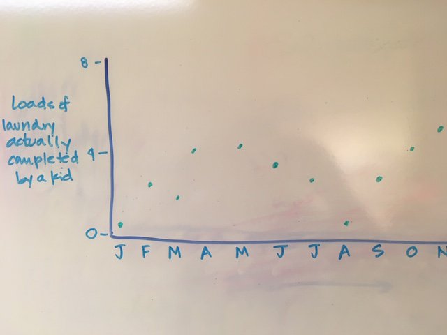

Then calculate the median of your data points. The median number of completed loads of laundry per month in our house is 3. Draw a line through the data points representing the median. This is called the center line.

It is super helpful to then look back and see if you can identify any collections of data points (called “runs” -> run charts! Boom!) that look like perhaps more than just random variation.
A SHIFT in the data is defined as 6 or more data points above or below the center line. If you have a shift, go back and look at the circumstances surrounding the shift. Was the data collected differently? Were the conditions or the system different?

A TREND is defined at 5 or more data points that consistently go up or go down (not including plateaus). What was happening at the time of a trend? Did you have an intervention around that time?

And an ASTRONOMICAL OUTLIER is just that – a data point that when you eyeball your chart, looks way out of whack. What happened at that time point?

Annotate your current run chart with the information you have gleaned from reviewing the data and its variations.

Now you are ready to trial an intervention – your first PDSA cycle! For us, it was setting a specific day of the week to do laundry. SUNDAY IS LAUNDRY DAY, FELLAS.

Remember that any PDSA cycle is a trial! You Plan and DO the intervention, collect your data, and then Study the data to see if you made a difference. Meaning, did you see a TREND or a SHIFT in the data in the direction of improvement?
Importantly, you need to give it time! Since I am looking at my data over months, I need to consistently deploy my intervention for likely 6-12 months before I could reliably say change has or has not occurred.
Sigh. This is a good parenting lesson as well. Thanks, run charts
Once you have identified that change has occurred (we will be super optimistic here), you can calculate a new center line. Set a goal for what you want your center line to be! Keep tracking the data to ensure you don’t creep back down towards the previous baseline.

Run charts can do and show you far more than what I have drawn out here, and are a very powerful tool to examine your data and visualize change. Enjoy playing around with what you can track and find!
The Institute for Healthcare Improvement Open School has excellent videos on both run charts and control charts – find the first video on run charts here:
ihi.org/education/IHIO…
ihi.org/education/IHIO…