
,
11 tweets,
6 min read
Read on Twitter
Happy Tuesday, #epitwitter! There’s been a lot of discussion #onhere about #causalinference lately, but that’s not all that epi is about.
For this week’s #epichat with @epiellie, let’s talk about descriptive epi!
#epiellie
For this week’s #epichat with @epiellie, let’s talk about descriptive epi!
#epiellie

To kick things off, an #epiquiz:
How often do you do descriptive epidemiology in your work or research?
(click to see poll options)
How often do you do descriptive epidemiology in your work or research?
(click to see poll options)
Next question — this one’s for discussion so share your thoughts!
What differentiates descriptive epi from causal inference epi?
My take: descriptive epi is about who, what, where, & when; causal inference epi is about why, how, and what would happen if we changed something.
What differentiates descriptive epi from causal inference epi?
My take: descriptive epi is about who, what, where, & when; causal inference epi is about why, how, and what would happen if we changed something.

One of the big challenges with descriptive epi is how to actually convey the description:
Tables are boring but do the job for “who” and “what”;
Graphs can be a good tool for “when”
Maps are the easiest way to describe “where”
But these all get tricky if you want covariates!
Tables are boring but do the job for “who” and “what”;
Graphs can be a good tool for “when”
Maps are the easiest way to describe “where”
But these all get tricky if you want covariates!
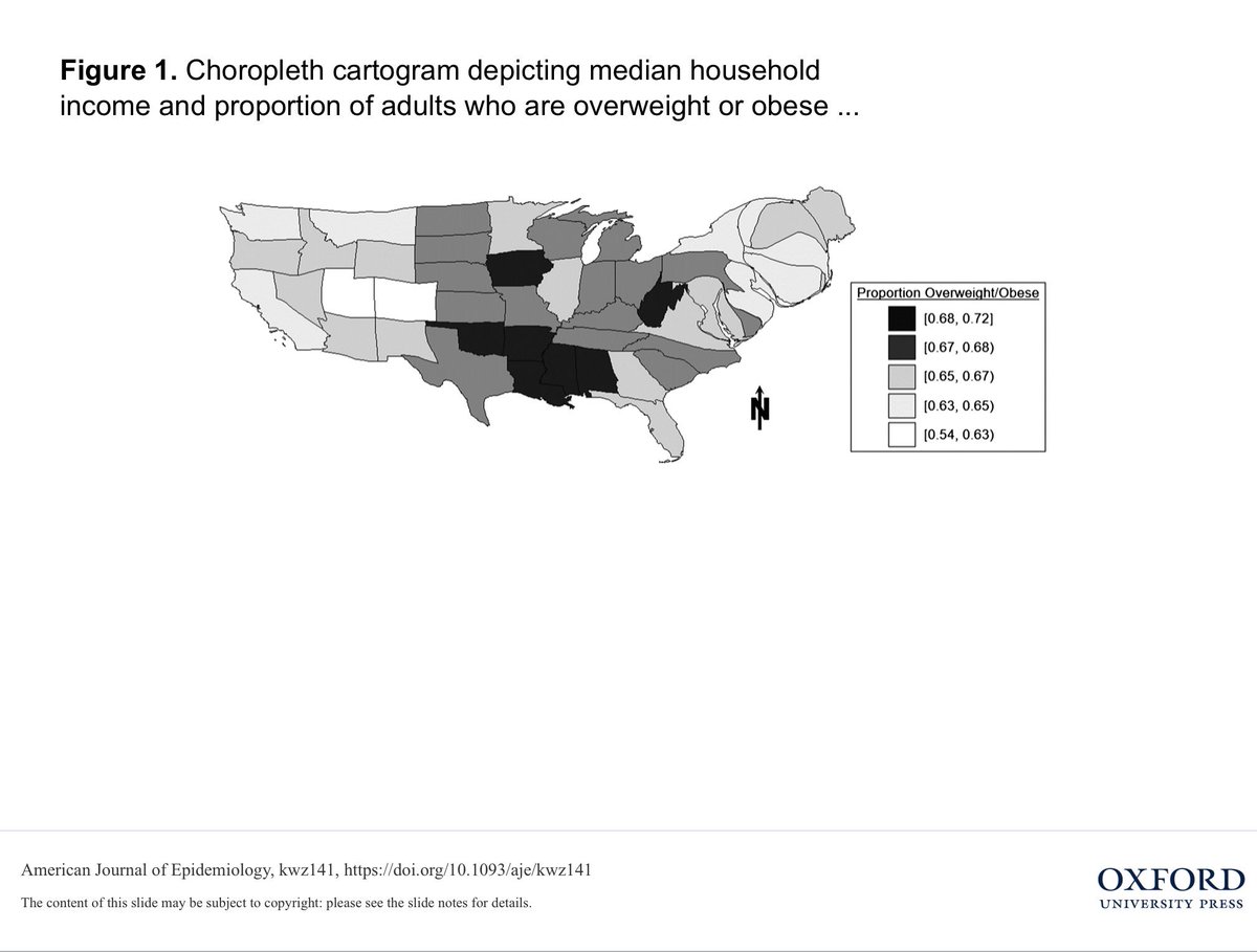
A short paper coming out soon in @AmJEpi proposes a solution for when we want to map the relationship between two variables: cloropleth cartograms
academic.oup.com/aje/advance-ar…
academic.oup.com/aje/advance-ar…
How does it work? Well, instead of drawing two separate cloropleth (ie color coded) maps — one each for exposure and outcome — which could be hard to compare...

... we draw one single map which is color-coded by outcome (the chloropleth part) and then distorted in size & shape to represent exposure information (the cartogram part).
The authors (who I don’t think are on twitter — someone tell them to sign up already!) discuss a couple potential limitations.
A big one: maps by definition display what we in epi call “ecological data” — that is, group-level info which may not be relevant to individual-level.
A big one: maps by definition display what we in epi call “ecological data” — that is, group-level info which may not be relevant to individual-level.
Another potential problem: using distortion to display information relies on the distribution of the variable you’re using to distort the map (and it also relies on the viewer knowing the “correct” undistorted shape)
What about tables & graphs for the who, what, and when of it all?
What innovative tools have you used to display multi-variable information on distributions?
How have you combined them to display multiple aspects of the distribution — where & who, when & what, etc?
#govepi
What innovative tools have you used to display multi-variable information on distributions?
How have you combined them to display multiple aspects of the distribution — where & who, when & what, etc?
#govepi


