, 11 tweets, 3 min read
My Authors
Read all threads
Software interfaces undervalue peripheral vision! (a thread)

My physical space is full of subtle cues. Books I read or bought most recently are lying out. Papers are lying in stacks on my desk, roughly arranged by their relationships.
Peripheral vision spontaneously prompts action.

If I need to fix a door, I’ll be reminded each time I see it. Digital task lists live in a dedicated app. I have no natural cause to look at that app regularly, so I need to establish a new habit to explicitly review my task list.
Peripheral vision emphasizes the concrete.

Unread digital books and papers live in some folder or app, invisible until I decide that “it’s reading time.” But that confuses cause and effect.
If I leave books lying on my coffee table, I’ll naturally notice them at receptive moments. I'll read a book if I feel an actual, concrete interest in it. By contrast, the motivation to read a digital book comes from abstract interest in the habit of reading.
Peripheral vision offers context.

If I mark up a physical book then later flip through to see my margin notes, I’ll always see them in the context of the surrounding text. By contrast, digital annotation listings usually display only the text I highlighted, removed from context.
The primary “unit” in such systems is a single highlight or note, but that’s not how I think. Marginalia have fuzzy boundaries, and I often think of a page’s markings as a single unit.

LiquidText is a lovely counterexample: it works hard to display annotations in context.
In digital note systems, the UI centers on the experience of writing one note. The core operations and representations fixate on “the note you have open,” not on larger structures. I often can’t simultaneously see another note I’ve just finished writing—let alone the last four.
Most systems barely support multiple windows, but even if I can open multiple windows, it’s awkward to arrange them into the spatial relationships I might naturally use for physical index cards. Rather than peripheral vision, it’s like I’m wearing horse blinders and mittens.
Backlinks are a weak peripheral vision, and they help, but they’re generally about switching the one note you have open, not an effective means of sense-making across many notes. Contextual backlinks help, but if you navigate, you lose object permanence.
If I read an old digital note, I get the unnerving sense that it’s part of some “whole” that I can’t see at all—no matter how much hypertext is involved. Working with physical notes, I’d shuffle notes around to make sense of the structure. There isn’t a digital equivalent.
What are the best examples and design patterns of peripheral vision in software interfaces?
Missing some Tweet in this thread? You can try to force a refresh.

Enjoying this thread?

Keep Current with Andy Matuschak

Profile picture

Stay in touch and get notified when new unrolls are available from this author!

Read all threads

This Thread may be Removed Anytime!

Twitter may remove this content at anytime, convert it as a PDF, save and print for later use!

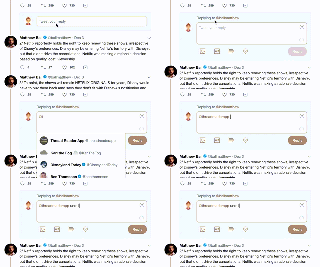
Try unrolling a thread yourself!

how to unroll video

1) Follow Thread Reader App on Twitter so you can easily mention us!

2) Go to a Twitter thread (series of Tweets by the same owner) and mention us with a keyword "unroll" @threadreaderapp unroll

You can practice here first or read more on our help page!

Follow Us on Twitter!

Did Thread Reader help you today?

Support us! We are indie developers!


This site is made by just three indie developers on a laptop doing marketing, support and development! Read more about the story.

Become a Premium Member ($3.00/month or $30.00/year) and get exclusive features!

Become Premium

Too expensive? Make a small donation by buying us coffee ($5) or help with server cost ($10)

Donate via Paypal Become our Patreon

Thank you for your support!