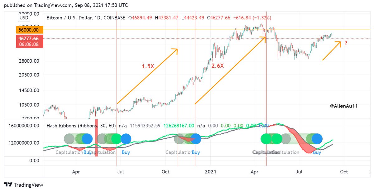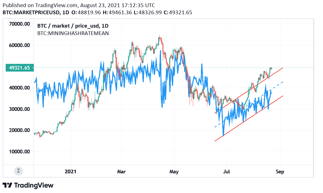
I've developed 4 #BTC indicators using @glassnode's workbench for detecting:
1. Buy & sell signals
2. Bear phase bottom
3. Top before final lift off + Timing of blow-off top
4. Best BTC accumulation periods
Also, I've rebuilt Willy Woo's Top Cap model for finding BTC's peak.
1. Buy & sell signals
2. Bear phase bottom
3. Top before final lift off + Timing of blow-off top
4. Best BTC accumulation periods
Also, I've rebuilt Willy Woo's Top Cap model for finding BTC's peak.

1a. Buy & Sell Signals
This indicator is developed from #BTC's moving average price. It gives accurate buy & sell signals of BTC.
It's simple to use: Whenever BTC's price is above the orange trend line, buy. Otherwise, sell.
It's now a good time to buy #Bitcoin!
This indicator is developed from #BTC's moving average price. It gives accurate buy & sell signals of BTC.
It's simple to use: Whenever BTC's price is above the orange trend line, buy. Otherwise, sell.
It's now a good time to buy #Bitcoin!

1b. To simplify things further, I have made an oscillator for this Buy & Sell Signals indicator.
Note that when this oscillator > 2, #BTC is near an interim top or cycle top.
Oscillator >= 1 ➡️ Buy
Oscillator < 1➡️ Sell
Oscillator >2 ➡️ Near interim or cycle top
Note that when this oscillator > 2, #BTC is near an interim top or cycle top.
Oscillator >= 1 ➡️ Buy
Oscillator < 1➡️ Sell
Oscillator >2 ➡️ Near interim or cycle top

2a. Bear Market Bottom
This indicator is developed using #BTC's moving average price. It catches all the bear phase bottoms of past cycles.
The bottom occurs when #BTC's price crosses the red trend line & rebounds.
This indicator also catches the COVID bottom in March 2020.
This indicator is developed using #BTC's moving average price. It catches all the bear phase bottoms of past cycles.
The bottom occurs when #BTC's price crosses the red trend line & rebounds.
This indicator also catches the COVID bottom in March 2020.

2b. Note that in the last cycle's bear market, #BTC's price temporary pierced through the red trend line & rebounded. It did that again to reach its final bear phase bottom. If we count the first cross & rebound as the detected bear market bottom, this indicator is off by 5%. 

3a. Interim top before final lift off + Timing of blow-off top
This indicator is developed using #BTC's 2-year moving average price. It detects the interim top before the final lift off (blow-off phase) & when the blow-off top phase begins.
How to use?
This indicator is developed using #BTC's 2-year moving average price. It detects the interim top before the final lift off (blow-off phase) & when the blow-off top phase begins.
How to use?

3b. When #BTC's price touches the turquoise trend line, that price is the interim top before the final lift off.
When BTC's price finally crosses above the turquoise trend line, the blow-off top phase begins.
This indicator detected the above in the past 2 cycles.
When BTC's price finally crosses above the turquoise trend line, the blow-off top phase begins.
This indicator detected the above in the past 2 cycles.
4a. Best #BTC accumulation periods
This indicator is developed using BTC's 2-year moving average price.
If one's a HODLer, every day is a good day to DCA into BTC. This indicator points to the periods when BTC is undervalued, upon which one can accumulate relatively more sats.
This indicator is developed using BTC's 2-year moving average price.
If one's a HODLer, every day is a good day to DCA into BTC. This indicator points to the periods when BTC is undervalued, upon which one can accumulate relatively more sats.

4b. Whenever #BTC is below the green trend line, it's a good time to accumulate more BTC, but start doing so after BTC has hit its bear phase bottom.
The chart marks the accumulation periods in yellow boxes in the past 2 cycles.
The chart marks the accumulation periods in yellow boxes in the past 2 cycles.
5a. I have rebuilt Willy Woo's Top Cap Model, which is based on the Average Cap of #BTC x 35. I've made a slight adjustment to this rebuild based on past cycle peak data.
#BTC will reach its cycle peak when its price touches the purple trend line.
h/t @woonomic
#BTC will reach its cycle peak when its price touches the purple trend line.
h/t @woonomic

5b. Per Willy's model & other on-chain indicators I have shown before, #BTC hasn't reached its cycle peak.
Using this model, we can estimate the top price of BTC which currently stands at $172K.
Given the trajectory of the purple trend line, we'd project the BTC's peak price.
Using this model, we can estimate the top price of BTC which currently stands at $172K.
Given the trajectory of the purple trend line, we'd project the BTC's peak price.
All the #BTC indicators above will be posted as needed on the weekly #CTM on-chain metric dashboards.
Note these indicators are additional tools at your disposal to guide your investment decisions, but DYOR.
Note these indicators are additional tools at your disposal to guide your investment decisions, but DYOR.
• • •
Missing some Tweet in this thread? You can try to
force a refresh


