Using Fed Tapering Signals & #BTC Coin Maturation Waves to Time BTC's Cycle Peak
TLDR: The 2021 BTC bull phase is similar to that of 2013 as they're under similar Fed QE policies. On-chain data show similar patterns.
Cycle peak likely in Dec. 2021. BTC isn't in a bear phase.
TLDR: The 2021 BTC bull phase is similar to that of 2013 as they're under similar Fed QE policies. On-chain data show similar patterns.
Cycle peak likely in Dec. 2021. BTC isn't in a bear phase.
1a/ I have tweeted a number of times using TA & on-chain data to show that the 2021 #BTC bull phase has more similar traits to that of 2013 rather than that of 2017. The driving force behind these similar price action could be US Fed monetary policy. Why?
1b/ In 2013, the Fed initiated QE3. Since March 2020, the Fed has launched QE Infinity. In both cases, the markets are awash with lots of liquidity, albeit on a different scale. In 2017, there was no QE & the Fed launched a B/S normalization program- quantitative tightening. 

1c/ Looking at the table above, one can see that #BTC's price has front run the Fed's policy announcements. In 2013, the BTC interim peak happened before the Fed signaled tightening under QE3. In 2021, the BTC ATH occurred before the Fed signaled tapering for the first time.
1d/ The #BTC 2013 cycle peak occurred before the Fed started tapering on 12/28/2013. The Fed just signaled that it may start tapering soon. Per Bloomberg*, >50% of the surveyed economists expect the Fed to begin tapering in Dec. 2021, perhaps after the FOMC meeting on 12/15/2021.
1e/ If history rhymes, #BTC's 2021 cycle peak could occur in December 2021. This is what my BTC cycle peak models suggest (see pinned tweet under 1a, b & c).
If so, there will be no lengthening cycle.
On-chain data reflect these macro policy swifts & I'll illustrate how.
If so, there will be no lengthening cycle.
On-chain data reflect these macro policy swifts & I'll illustrate how.
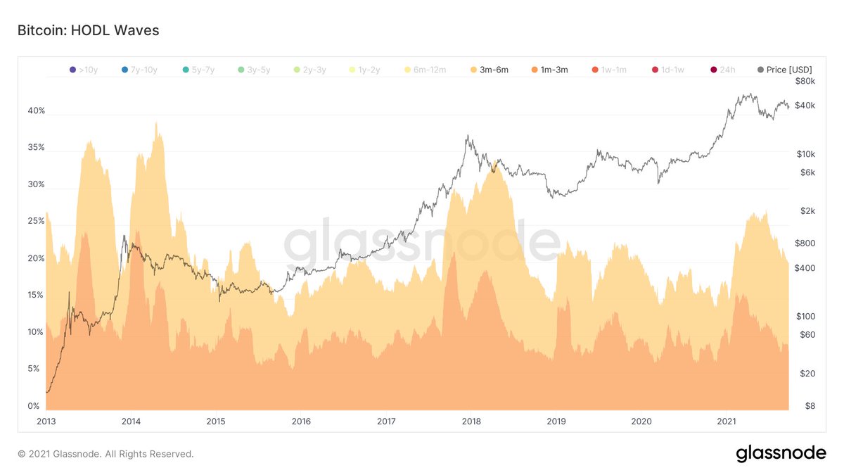
2a/This time I will use #BTC's HODL Waves & Coin Maturation Waves to show the similarities between the 2013 & 2021 bull phases.
First, we look at the topping patterns of the HODL Waves in terms of the proportion of active BTC supply held by HODLers of different age bands.
First, we look at the topping patterns of the HODL Waves in terms of the proportion of active BTC supply held by HODLers of different age bands.
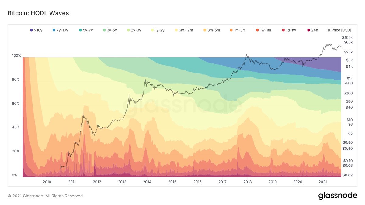
2b/ Of all the age bands, the ones that show consistency across interim & cycle tops are those who have held #BTC from 1-3 mo. & 3-6 mo.

2c/ These 2 groups form ~30% of the supply of #BTC & can be used as a proxy to ST HODLers that FOMO in to buy BTC as LT HODLers sell their coins to them as the price of BTC runs up during interim/cycle tops.
They are more sensitive to changes in the markets & macro trends.
They are more sensitive to changes in the markets & macro trends.
2d/ The narratives in each cycle are different, but one can think of the LT HODLers push up #BTC's price prior to the Fed tightening. As BTC's price increases, ST HODLers FOMO in, causing the price to surge leading to a blow-off top right before the actual Fed tightening occurs.
2e/ This supply dynamics change as #BTC's price changes is reflected on-chain so we can look at the BTC 60-Day Coin Maturation Waves for the 1-3 mo. & 3-6 mo. age bands for clues.
2f/ It's clear from the chart below that the 2021 #BTC bull phase shows similar coin maturation waves as that of the 2013 bull phase. Note patterns 1, 2, 2a, 3 & 4 are in both bull phases.
But only patterns 1, 2 & 3 are in the 2017 bull phase. Pattern 2a is visibly missing.
But only patterns 1, 2 & 3 are in the 2017 bull phase. Pattern 2a is visibly missing.

2g/ Note in bear phases of the past 2 cycles, patterns 5, 6 & 7 showed up on the #BTC 60D SMA Coin Maturation Waves. These are visibly absent in the current cycle. This shows that BTC isn't in a bear phase.
Not that a bear phase will come, but BTC is now in a bull run!
Not that a bear phase will come, but BTC is now in a bull run!
3a/ Is it possible to use #BTC Coin Maturation Waves to identify the timing of the cycle peak? The 30D SMA Coin Maturation Waves for the 1-3 mo. age band is used.
The 1-3 mo. Coin Maturation Waves follow an a, b, c & d pattern from mid-cycle correction to cycle peak (chart👇).
The 1-3 mo. Coin Maturation Waves follow an a, b, c & d pattern from mid-cycle correction to cycle peak (chart👇).

3b/ In the past, #BTC's cycle peak occurred when pattern d crossed the x-axis on its way up.
How accurate is this metric? When did pattern d cross the x-axis in bull phase of past cycles?
2013: 11/25/2013
2017: 12/21/2017
Accuracy is within 1 week. Not ideal, but not bad.
How accurate is this metric? When did pattern d cross the x-axis in bull phase of past cycles?
2013: 11/25/2013
2017: 12/21/2017
Accuracy is within 1 week. Not ideal, but not bad.
3c/ It is noted that after pattern d crosses below the x-axis, it'll take 48 days (2013) to 50 days (2017) to reach cycle peak.
The #BTC 30D SMA Coin Maturation Waves for 1-3 mo. age band is forming pattern c. Once pattern d begins, we can estimate the timing of the cycle peak.
The #BTC 30D SMA Coin Maturation Waves for 1-3 mo. age band is forming pattern c. Once pattern d begins, we can estimate the timing of the cycle peak.
Conclusion:
1. Fed tapering signals could be used to determine #BTC's cycle peak. Likely in Dec. 2021.
2. Fed policy swifts cause changes in BTC supply dynamics that're reflected on chain.
3. 2 on-chain metrics can determine a) BTC isn't in a bear phase & b) cycle peak timing.
1. Fed tapering signals could be used to determine #BTC's cycle peak. Likely in Dec. 2021.
2. Fed policy swifts cause changes in BTC supply dynamics that're reflected on chain.
3. 2 on-chain metrics can determine a) BTC isn't in a bear phase & b) cycle peak timing.
• • •
Missing some Tweet in this thread? You can try to
force a refresh