How to Create Small Multiple Charts in Python, with Plotly
🧵[1/23]
sharpsightlabs.com/blog/plotly-sm…
#python #datascience #pythoncode #datavisualization
🧵[1/23]
sharpsightlabs.com/blog/plotly-sm…
#python #datascience #pythoncode #datavisualization

[2/]
Before I get into the mechanics of how to create a small multiple charts in Python, let me quickly explain why they are so important.
Before I get into the mechanics of how to create a small multiple charts in Python, let me quickly explain why they are so important.
[3/]
Small multiple charts are one of my favorite chart types.
They are very powerful, and also highly under-used.
#datascience #dataanalytics #datavisualization
Small multiple charts are one of my favorite chart types.
They are very powerful, and also highly under-used.
#datascience #dataanalytics #datavisualization
[4/]
The reason I love them so much, is that data analysis is a huge part of data science.
And data analysis is largely about making *comparisons*
#datascience #dataanalytics #datavisualization
The reason I love them so much, is that data analysis is a huge part of data science.
And data analysis is largely about making *comparisons*
#datascience #dataanalytics #datavisualization
[5/]
When we analyze data, we often need to make comparisons between different categories.
Examples:
– Team A vs team B
– Country X vs country Y
– Experiment group α vs experiment group β
#datascience #dataanalytics #data
When we analyze data, we often need to make comparisons between different categories.
Examples:
– Team A vs team B
– Country X vs country Y
– Experiment group α vs experiment group β
#datascience #dataanalytics #data
[6/]
If you need to compare across categories, one great technique is take a data visualization (histogram, scatterplot, bar chart, etc) and make one small version of the chart for every level of a categorical variable.
#datascience #dataanalytics #datavisualization
If you need to compare across categories, one great technique is take a data visualization (histogram, scatterplot, bar chart, etc) and make one small version of the chart for every level of a categorical variable.
#datascience #dataanalytics #datavisualization
[7/]
If you create these small plots and organize them into a grid, it usually makes it easy to compare metrics across categories.
#datascience #dataanalytics #datavisualization
If you create these small plots and organize them into a grid, it usually makes it easy to compare metrics across categories.
#datascience #dataanalytics #datavisualization
[8/]
We have a name for this chart type: the small multiple chart
(AKA: trellis plot, grid plot)
#datascience #dataanalytics #datavisualization
We have a name for this chart type: the small multiple chart
(AKA: trellis plot, grid plot)
#datascience #dataanalytics #datavisualization

[9/]
Creating small multiples is sometimes complicated ...
Because if you don’t have the right software, then you need to create them manually, which requires you to subset your data down to particular categories, and then create one plot per category.
#datavisualization
Creating small multiples is sometimes complicated ...
Because if you don’t have the right software, then you need to create them manually, which requires you to subset your data down to particular categories, and then create one plot per category.
#datavisualization
[10/]
But with Plotly Express, creating small multiple charts is easy.
#datascience #Python #datavisualization
But with Plotly Express, creating small multiple charts is easy.
#datascience #Python #datavisualization
[11/]
To create small multiple charts with Plotly, you need to use some special parameters for the Plotly Express functions:
– facet_row
– facet_col
– facet_col_wrap
#datascience #dataanalytics #datavisualization #Python #pythoncode
To create small multiple charts with Plotly, you need to use some special parameters for the Plotly Express functions:
– facet_row
– facet_col
– facet_col_wrap
#datascience #dataanalytics #datavisualization #Python #pythoncode
[12/]
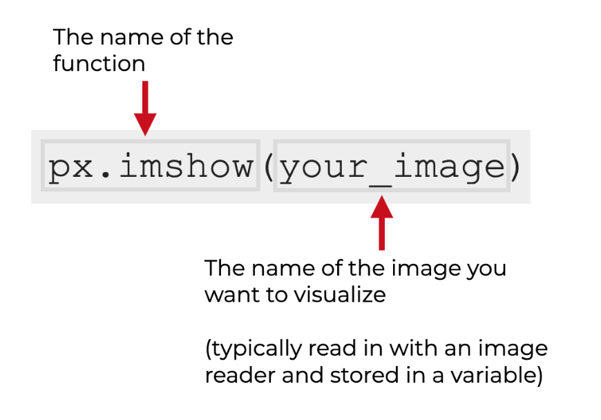
These small-multiple parameters are available for several important Plotly Express functions, like:
– px.histogram
– px.scatter
– px.line
– px.imshow
… just to name a few
#datascience #Python #pythoncode
These small-multiple parameters are available for several important Plotly Express functions, like:
– px.histogram
– px.scatter
– px.line
– px.imshow
… just to name a few
#datascience #Python #pythoncode
[13/]
So to create a small multiple in Plotly, you call the Plotly Express function
... then use one of the small multiple parameters inside the function call.
#datascience #dataanalytics #datavisualization #Python #pythoncode
So to create a small multiple in Plotly, you call the Plotly Express function
... then use one of the small multiple parameters inside the function call.
#datascience #dataanalytics #datavisualization #Python #pythoncode

[14/]
Let’s take a look at some examples.
Let’s take a look at some examples.
[15/]
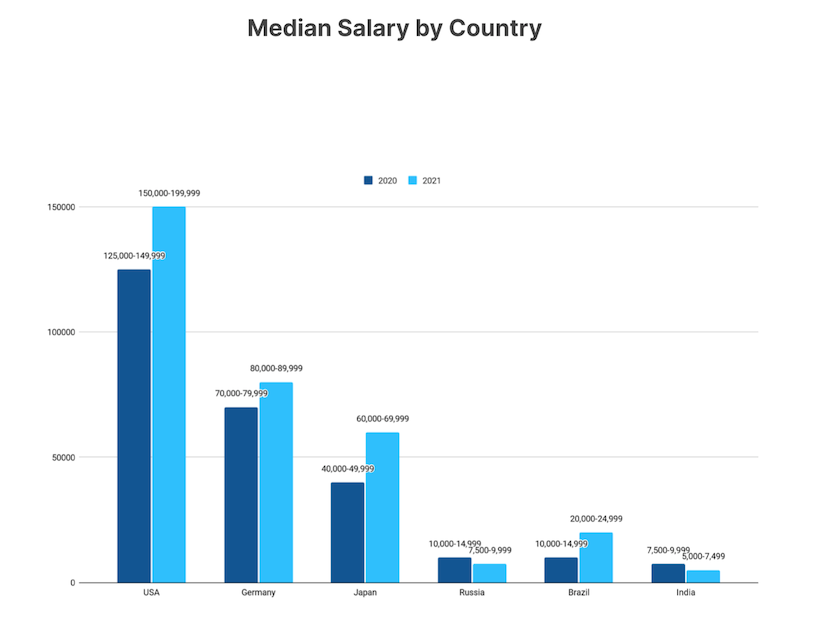
Let’s say that you have a Plotly histogram:
#datascience #datavisualization #Python #pythoncode
Let’s say that you have a Plotly histogram:
#datascience #datavisualization #Python #pythoncode


[16/]
You can create a small multiple faceted by column, by using the facet_col= parameter.
#datascience #dataanalytics #datavisualization #Python #pythoncode
You can create a small multiple faceted by column, by using the facet_col= parameter.
#datascience #dataanalytics #datavisualization #Python #pythoncode


[17/]
If you facet by column, and you have too many categories ...
... you can “wrap” the columns with the facet_col_wrap= parameter:
#datascience #dataanalytics #datavisualization #Python #pythoncode
If you facet by column, and you have too many categories ...
... you can “wrap” the columns with the facet_col_wrap= parameter:
#datascience #dataanalytics #datavisualization #Python #pythoncode


[18/]
To create a small multiple that’s faceted by row, you can use the facet_row= parameter.
#datascience #dataanalytics #datavisualization #Python #pythoncode
To create a small multiple that’s faceted by row, you can use the facet_row= parameter.
#datascience #dataanalytics #datavisualization #Python #pythoncode


[19/]
And if you want to facet by *two* categorical variables – one by column and one by row – you can use facet_row= and facet_col= together:
#datascience #dataanalytics #datavisualization #Python #pythoncode
And if you want to facet by *two* categorical variables – one by column and one by row – you can use facet_row= and facet_col= together:
#datascience #dataanalytics #datavisualization #Python #pythoncode


[20/]
As I said previously, small multiple charts are an extremely powerful technique.
And they are easy to make in Python, if you use Plotly express.
#datascience #dataanalytics #datavisualization #Python
As I said previously, small multiple charts are an extremely powerful technique.
And they are easy to make in Python, if you use Plotly express.
#datascience #dataanalytics #datavisualization #Python
[21/]
If you want to read my full tutorial about small multiples with Plotly, along with the code, you can get it here:
sharpsightlabs.com/blog/plotly-sm…
#datascience #dataanalytics #datavisualization #Python #pythoncode
If you want to read my full tutorial about small multiples with Plotly, along with the code, you can get it here:
sharpsightlabs.com/blog/plotly-sm…
#datascience #dataanalytics #datavisualization #Python #pythoncode
[22/]
Do you have questions about small multiple charts, Plotly, or data visualization in Python?
Leave a comment and I’ll reply.
#datascience #dataanalytics #datavisualization #Python #pythoncode
Do you have questions about small multiple charts, Plotly, or data visualization in Python?
Leave a comment and I’ll reply.
#datascience #dataanalytics #datavisualization #Python #pythoncode
[23/]
And if you want to master data science and data visualization, follow me here: @Josh_Ebner
Every day, I post tutorials and threads about data science, data visualization, and machine learning in Python and R.
#datascience #dataanalytics #datavisualization #Python #rstats
And if you want to master data science and data visualization, follow me here: @Josh_Ebner
Every day, I post tutorials and threads about data science, data visualization, and machine learning in Python and R.
#datascience #dataanalytics #datavisualization #Python #rstats
• • •
Missing some Tweet in this thread? You can try to
force a refresh