, 34 tweets, 12 min read Read on Twitter
Add online branding to the list of things @AOC is just *better* at

Everyone talks about the big stuff, but she and her team are just better at the small details too

Whether you support her or not, worth understanding. Because the delta shows

And her Facebook ads tell the story
Comparing her facebook ads to the current Dem candidates is a microcosm that shows how far everyone else has to catch up

Here’s AOC’s facebook ad. We’ll get back to why it’s great. But for now take a look before we go into the ads of all the current 2020 presidential candidates
Okay, all set?

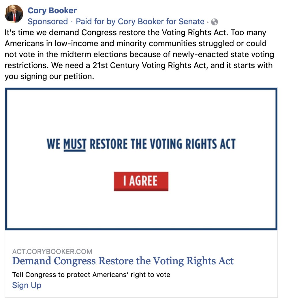
Great, then let’s look at others’ ads, starting with Warren and Booker

The first thing you notice is they have very similar looking ads. That’s odd, right?

It isn’t. Both use a fundraising tool called ActBlue. And I’d take any odds this is a default template.
I’m not a huge fan of stock templates. This is a presidential campaign!

But if you’re going to use one, at least use one that's meant to have photos. Photos are more eye-catching and have higher conversion than text only
There’s nothing that ties the content of these ads to the candidates behind them

Which of these ads was Warren and which was Booker?

From the content it’s hard to tell. Someone could sign up without realizing which candidate it was even for.
Now let’s talk about their Calls to Action (CTA).

They’re weak.

“I agree” and “Add my name” are not particularly compelling. They’re very passive
And Warren’s fundraising ads are roughly the same

Again, all text.

And this ad is really in the weeds
- Why am I being told about the details of ActBlue Express?
- Why are there separate buttons in the ad for different donation amounts?
Next up is Amy Klobuchar

She’s gotten the memo about having photos ✅

But random stock photos? Again there’s nothing that ties it to Klobuchar

Photos are a good step, but let’s be more precise. A photo of the candidate would be ideal. One that makes clear who the ads for.
Hopefully something that’s personalized for the candidate. And what better than a photo of the candidate themselves. Has anyone done that?

Tulsi Gabbard and Kamala Harris have!
Here’s Tulsi’s

This is better--it’s a photo of the candidate. But again, it’s lacking.

You can barely see her. If you can’t distinguish the candidate from the background, it’s not a great photo.

Ideally you’d want to touch up the photos and add text to the photo
And what’s the call to action?

I guess at the bottom it has “Join Me: Add your name”

But ideally you’d want the CTA in large text on the photos. And still nothing other than the fact that it’s posted by her account to make clear this is for Tulsi Gabbard.
Kamala Harris’ is better

Okay, now we’re getting a little bit closer.

✅ It’s a photo of the candidate
✅ You can see her face
✅ There’s a Call to Action on the photo

That’s progress.

But still a lot missing.
Kamala is pretty small compared to the size of the photo. It’s hard to see her clearly, and it doesn’t help that there’s a lot going on in the photo. It’s not crisp.

Take the teleprompters for example, they distract from the photo and should be removed in post-processing
And let’s talk about the Call to Action

“Chip in to Kamala’s Campaign” is direct, but weak

Why does she need the money now? Apparently we’re donating before their end of month deadline. But why is there an end of month deadline? This seems a totally arbitrary deadline
Will anyone learn the right lessons?

Well since he published that first ad, Cory Booker has been iterating. That’s good. Progress!

Here’s his next at bat from beginning of February

He got the memo about photos of the candidate--great! ✅

But this could be better. Here's why
Who photoshopped this headshot of him.

You can see the artifacts where they cropped his headshot.

That’s amateur work, and shouldn’t be in a presidential ad.

What’s the Call to Action? There’s none on the photo, so it’s off to a bad start. But maybe the text has some?
Okay, so seems like it’s about gathering people to solve seemingly impossible problems.

But what are those problems? The ad doesn’t mention any.

This ad might as well be saying the seemingly impossible problem to gather together to solve is getting Booker elected
Booker has a more recent fb ad from just a few days ago.

This has a call to action and no artifacting. That’s better. But the good news stops there.

What is this? This seems a candid snapchat story, masquerading as an ad. Ads should have polish, and that means post-processing
And what’s the call to action here?

“I’ve got something to tell you”

“Be a part of this beginning”

Again the call to action seems to be about people getting to be part of his movement to get elected? But that’s not a compelling call to action.
I get where Cory Booker’s campaign is coming from.

He’s modeling his run off of Obama’s run--Yes We Can.

But by the time Obama did that he was *already* a movement. Cory Booker isn’t yet, so it’s weird to act like he already is and that’s enough to carry his campaign
So who’s doing it right? And again we return to Alexandria Ocasio-Cortez

Who in Facebook ads, like many other areas, is showing the Democratic party how it’s done in the modern age

What’s so good about this ad? Everything! Let’s go through it
1. Clear, polished photo

Great photo of candidate that’s been post-processed. Overlaid on top of distinctive background without any artifacting

Clear choice of color palette that is used consistently--you’ll notice that shade of yellow in her other ads too
2. Logo

She has a crisp logo in all her photos

It makes clear who ad is for, even if her face isn’t in it

Uses the inverted exclamation point “¡” which makes tells us her hispanic roots and constituency

And incorporates a speech bubble representing advocacy, speaking up, etc.
3. Strong Call to Action

“This is the first time we’ve been threatened with a serious primary”

“Fight with us”

Kamala’s ad had unclear urgency

AOC is being attacked! And needs help right now!

“Fight with us” is much stronger active copy where “chip in” was passive
4. General copy

The general copy is also much better

Let’s go through each sentence line by line and why they are good
Did you see the headline from The Hill today? → Something JUST happened

Alexandria’s House colleagues are talking about trying to “make her a one-term congressperson.” → Incumbent politicians already want to get rid of AOC
They’re mad because we’re shaking things up → They’re mad because AOC is *too* effective already

We’re fighting for a bold agenda: a Green New Deal, Medicare for All, and an end to corporate control of our politics. → Here’s some policies AOC has already been moving needle on
We always knew the political establishment would stand in our way. → We’re not surprised the establishment wouldn’t be happy with us. We want change and we expected resistance.
We just didn’t expect them to come after us so fast. → But they’re pushing back unexpectedly fast because we’ve been unexpectedly effective.
Make a donation to our campaign right now to help us fight back against any primary challenge the establishment throws our way. → That’s why we need your help to continue to do our work
It’s surprising how bad most of these candidates’ political ads are

The good thing for them all is that it’s still very early. There’s lots of room for all these candidates to improve

But they have a lot to learn, and one good place to start is by looking at what AOC is doing
Finally, all these campaign ads come from @ProPublica which has a great resource collecting all political ads

Check it out and support it here

projects.propublica.org/facebook-ads/
UPDATE

New ads from Amy Klobuchar since she announced candidacy yesterday

These are improvement. No more stock photos. Now photos of Klobuchar--Progress!
I love all critiques of my points here. I'm no expert on paid acquisition or branding. And surrounded by many smarter people on both topics here:)

So super love all the pushes. I just want political ads to be as good as tech ads. And for me to get new learnings on paid acq too;)
Missing some Tweet in this thread?
You can try to force a refresh.

Like this thread? Get email updates or save it to PDF!

Subscribe to Kevin Kwok
Profile picture

Get real-time email alerts when new unrolls are available from this author!

This content may be removed anytime!

Twitter may remove this content at anytime, convert it as a PDF, save and print for later use!

Try unrolling a thread yourself!

how to unroll video

1) Follow Thread Reader App on Twitter so you can easily mention us!

2) Go to a Twitter thread (series of Tweets by the same owner) and mention us with a keyword "unroll" @threadreaderapp unroll

You can practice here first or read more on our help page!

Follow Us on Twitter!

Did Thread Reader help you today?

Support us! We are indie developers!


This site is made by just three indie developers on a laptop doing marketing, support and development! Read more about the story.

Become a Premium Member ($3.00/month or $30.00/year) and get exclusive features!

Become Premium

Too expensive? Make a small donation by buying us coffee ($5) or help with server cost ($10)

Donate via Paypal Become our Patreon

Thank you for your support!