,
3 tweets,
1 min read
Read on Twitter
Many apps have surprisingly poor UX on 1st use.
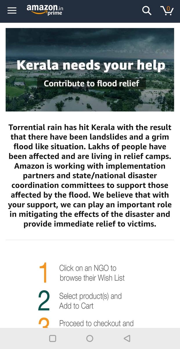
"Would you like to donate?" -> Not before trying the app!
"Would you prefer layout X or Y?" -> How should I know before seeing the app?
"Please fill out this form + connect 3 data sources" -> How do I even know if this is useful?
"Would you like to donate?" -> Not before trying the app!
"Would you prefer layout X or Y?" -> How should I know before seeing the app?
"Please fill out this form + connect 3 data sources" -> How do I even know if this is useful?
A user's first experience should be delightful, otherwise they're likely to churn forever. Instead, a lot of first experiences are confusing or downright frustrating. 🙄
Another ex:
- I visit a news site for the first time.
- I'm shown a pop-up that covers the content I hoped to read and tells me I must disable my ad blocker to see anything.
- Simulatenously, I get a Chrome pop-up asking if I want to opt-in for notifications from the site. LOL.
- I visit a news site for the first time.
- I'm shown a pop-up that covers the content I hoped to read and tells me I must disable my ad blocker to see anything.
- Simulatenously, I get a Chrome pop-up asking if I want to opt-in for notifications from the site. LOL.