, 16 tweets, 6 min read
every time i go look at mastodon it somehow manages to have made its interface even worse
mastodon's development seems to be almost entirely "what if we threw out things we had that were good and copied the bad parts of twitter"
took a look at the flagshit instance and hoo lordy it really is just fuckin twitter all over again
it's literally twitter except that the menu is on the right and the compose is on the left. fabulous. love 2 copy failed designs of megacorps for our "totally not twitter we promise" garbage platform
"If you want to make use of your entire screen width"

heres a protip you dunces, if i didnt i wouldnt maximize the fucking window. why are web developers like this.
also lmao @ autoplay gifs being "recommended".

MASTO DEV: captain! users across the internet are rebelling against auto-playing content
MASTO DEV 2: good. we can recommend and default this to on to ensure that users can expect consistent annoyances across the entire web.
as best i can tell this is not retroactive (unlike twitter) and only affects the /default/ option that's chosen when you post. good that it doesn't mention this anywhere. love to crib twitter's ui and then pull the rug out from people
i love that this, which i pointed out literally years ago, is still there. three of the upper buttons change the right column (with no indication if it's already *ON* that, like now). the other two opens an entirely new page for settings and logs you out, respectively.
you might think the dropdown arrow next to the user might be for multi-user support or something.

wrong!!!!!!!!!!!!

it's DIFFERENT options that aren't part of the upper menu. wonderful. also two of the menu items are in both places. fabulous.
but ok. mastodon is indie and lots of people are advocates for accessibility. they even had a way to add descriptions to images right in the interface as a text box!
just kidding that got removed. now it's like twitter where you have to edit every single image individually in its own modal popup.

at least twitter says "add description" instead of "edit". lol.
also im gonna go out on a limb here but IF YOU HAVE TO HAVE HOVER TEXT EXPLAINING IF A CHECKBOX IS CHECKED OR NOT THEN MAYBE YOU SHOULDNT FUCKING USE THIS GARBAGE DESIGN YOU IMBECILES
extremely light gray on white is my favorite color to use for indicators in my user interface. it helps keep the important parts in focus while ensuring everything else is invisible.

actual correct usage of these controls included as an example.
.
con
   sis
ten
   cy?
one final note. mastodon lets you mark images as "sensitive". that's good!

rather than give you the obvious ability to optionally read an image's description before unveiling it... you can't. surprise. it's just a "sensitive content" overlay.

thanks, mastodon. thastodon.
mastodon could have been good. it could have had an interface that wasn't abject, outright garbage. instead we got eugen and twitter except worse.
Missing some Tweet in this thread? You can try to force a refresh.

Enjoying this thread?

Keep Current with Ex

Profile picture

Stay in touch and get notified when new unrolls are available from this author!

Read all threads

This Thread may be Removed Anytime!

Twitter may remove this content at anytime, convert it as a PDF, save and print for later use!
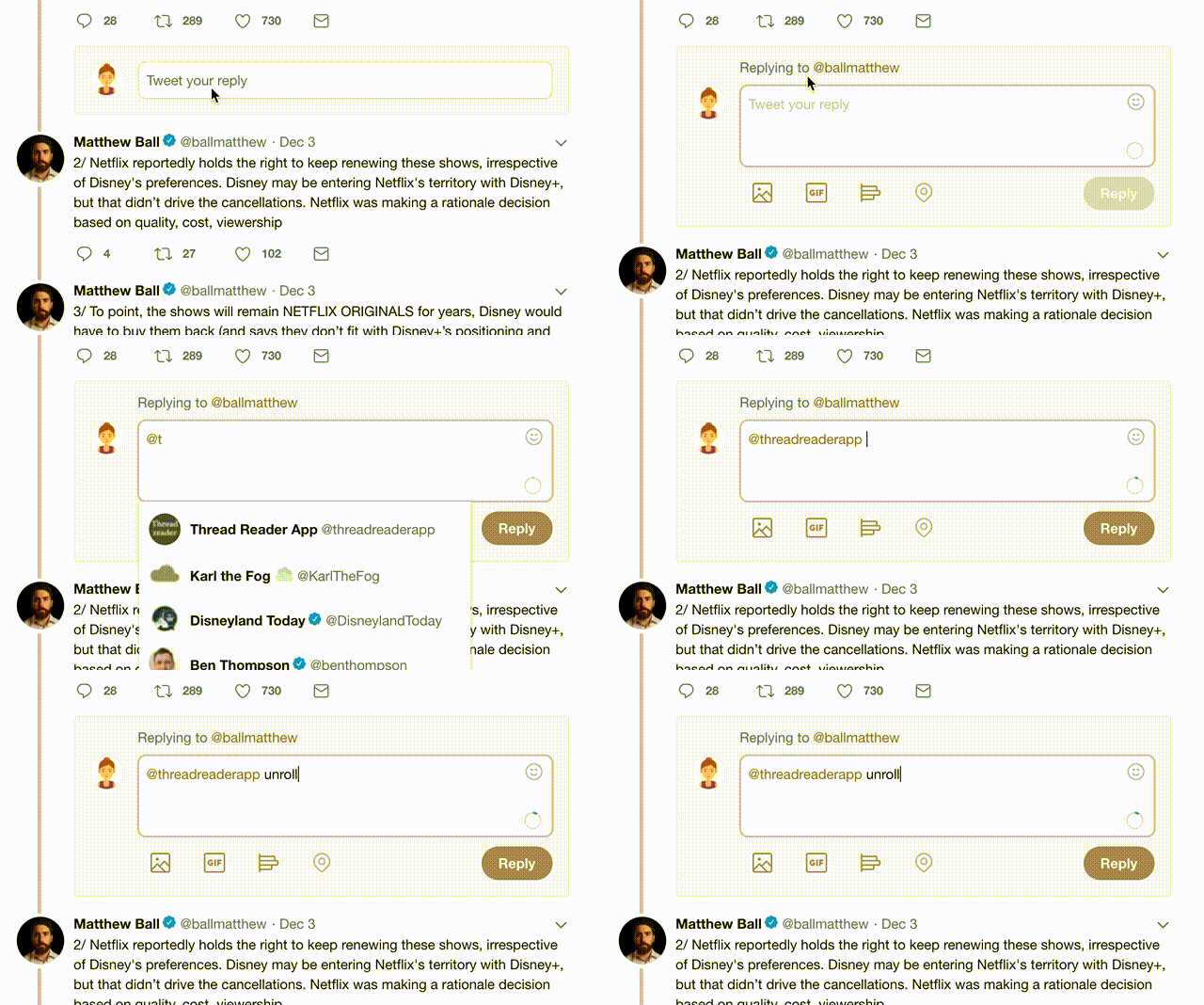
Try unrolling a thread yourself!

how to unroll video

1) Follow Thread Reader App on Twitter so you can easily mention us!

2) Go to a Twitter thread (series of Tweets by the same owner) and mention us with a keyword "unroll" @threadreaderapp unroll

You can practice here first or read more on our help page!

Follow Us on Twitter!

Did Thread Reader help you today?

Support us! We are indie developers!


This site is made by just three indie developers on a laptop doing marketing, support and development! Read more about the story.

Become a Premium Member ($3.00/month or $30.00/year) and get exclusive features!

Become Premium

Too expensive? Make a small donation by buying us coffee ($5) or help with server cost ($10)

Donate via Paypal Become our Patreon

Thank you for your support!