Teaching students how regression analysis works?
I plan to do so visually (using an approach inspired by @paulvanderlaken)
How did I do it?
[THREAD]
I plan to do so visually (using an approach inspired by @paulvanderlaken)
How did I do it?
[THREAD]
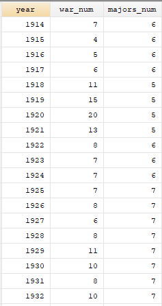
Since I'm teaching a class on quantifying war, I'll start with annual data on number of wars (of all types: inter; intra; & extra) and the number of major powers. The data come from the Correlates of War project (correlatesofwar.org) 
I'll then plot the data

Eyeballing it, seems clear that there is a negative relationship between number of major powers in the system and the propensity of war
Adding a trend line confirms it
Adding a trend line confirms it
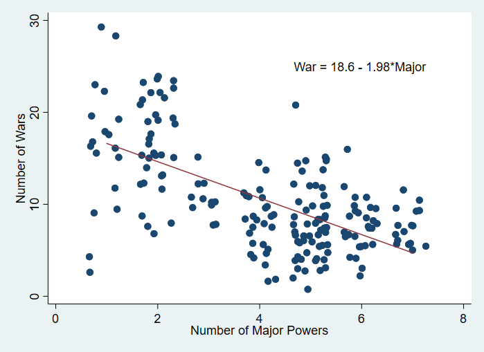
So we should score one for Morton Kaplan, right (i.e. multipolarity is more peaceful than bipolarity)?
Not quite...
Not quite...

Could it be that the era of bipolarity (and then unipolarity) -- after 1945 -- overlapped with a BIG omitted variable? 🤔


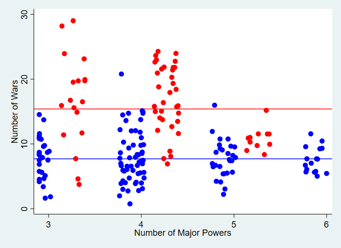
That seems to be the case!
The red dots below are observations from the nuclear era, the blue dots are from before the nuclear era
The red dots below are observations from the nuclear era, the blue dots are from before the nuclear era

So I should probably "control" for "nuclear era"
How?
How?
I begin by computing the average number of major powers during the nuclear era (1.9) and the average number of major powers during the non-nuclear era (5.3)

I then compute the average number of major powers for the whole sample (4.6) and then recenter both groups on the overall sample mean (by subtracting (1.9-4.6) from each observation in the "nuclear era" and subtracting (5.3-4.6) from each observation in the "non-nuclear era")

Next, I compute the average number of major wars during the nuclear era (15.4) and the average number of wars during the non-nuclear era (7.7)
I then compute the average number of wars for the overall sample (10.3) and then recenter both groups on the overall sample mean (by subtracting (15.4-10.3) from each observation in the "nuclear era" and subtracting (7.7-10.3) from each observation in the "non-nuclear era")

After all that, let's take another look at the trend line!
As you might expect, this "flatted" the line, meaning, once we control for the nuclear era, the relationship b/w # of wars and # of major powers is quite weak.

As a sanity check, I ran the regression models

Sure enough, the model without controls produced...

...while the model with the control produced 👇

Overall, this seems like a nice way of illustrating what control variables do: they show the average association between X and Y after you remove the average variation explained by C
[END]
[END]