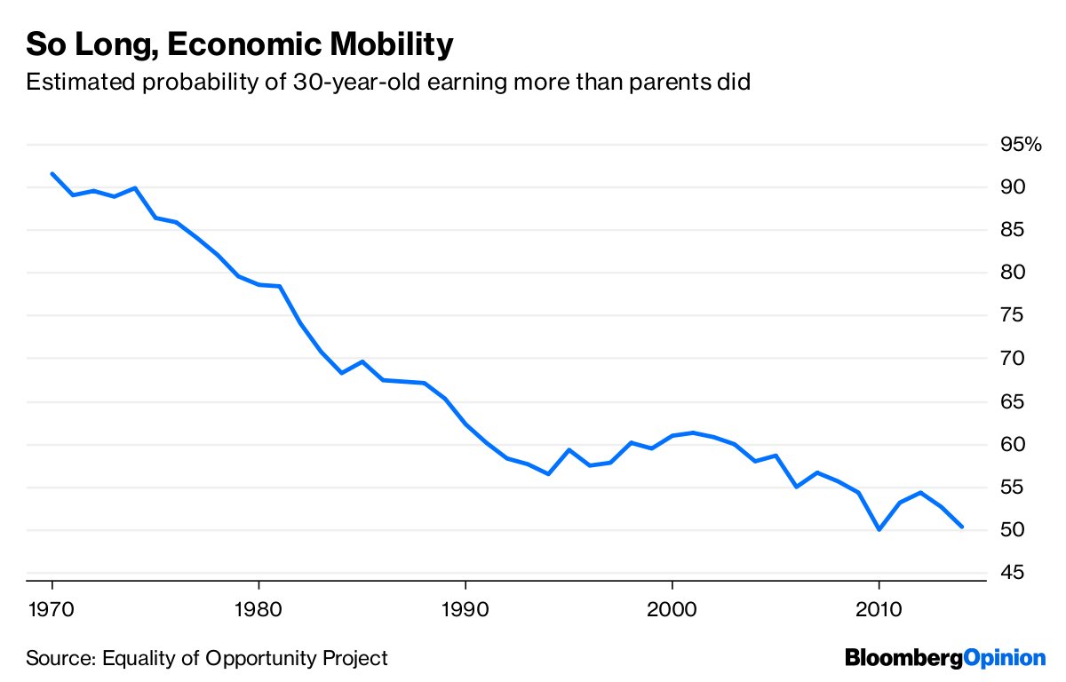
The answer is: It's complicated.
bloomberg.com/opinion/articl…
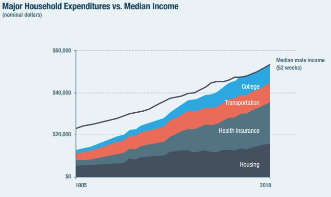
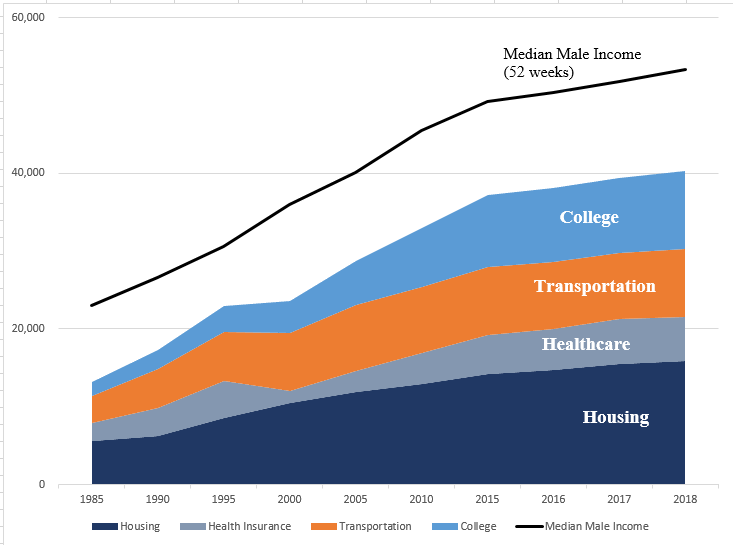
The chart counts health insurance premiums in "costs", but doesn't count employer premium contributions in "income". Thus, it makes it seem as if many workers are paying for something they're not actually paying for.
Here's that modified chart, by @CaptainTako:
vox.com/2020/2/25/2115…
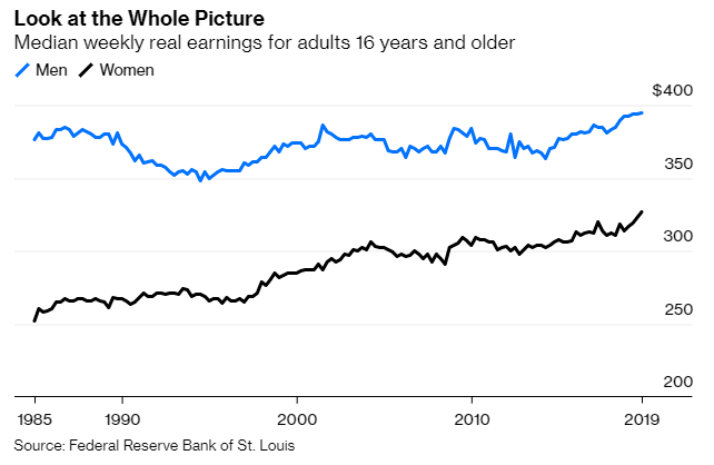
A) much more independence for women who choose not to be economically dependent on a man
B) more income and higher standards of living for dual-earner couples
The chart just ignores that entirely!
Here's my colleague @MichaelRStrain, who leans more to the right:
bloomberg.com/opinion/articl…
nber.org/papers/w22910
But their commutes have gotten longer:
washingtonpost.com/transportation…
Zoning regulations and poor public transit are probably forcing many Americans to live in big houses in exurbs, where they'd rather not be.
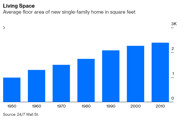
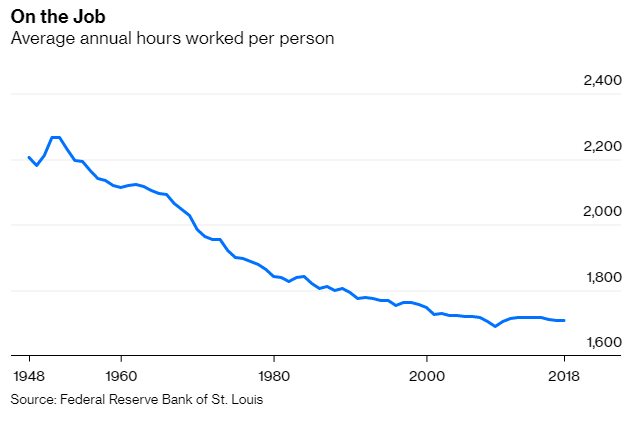
But for some, it's just a case of underemployment: bloomberg.com/opinion/articl…
investopedia.com/terms/p/positi…
The median worker has a bigger house, more cars, etc.
But what if the standard of what it means to be a middle-class person has risen even faster?
Going from making $40k to making $50k is great, unless "success" is now defined by the lifestyles of people making $150k.
Under these circumstances, pointing to rising median incomes is like saying "Let them eat cake".
(end)
bloomberg.com/opinion/articl…

