1/ Brief thread… (I promise)
…focusing in on the correlations between (i) Toronto neighbourhood workforce/demographic concentrations & (ii) #SARSCov2 prevalence (cases/100k) identified in yesterday's thread.
Only a few sips of coffee/tea needed
(but this is no less striking)
…focusing in on the correlations between (i) Toronto neighbourhood workforce/demographic concentrations & (ii) #SARSCov2 prevalence (cases/100k) identified in yesterday's thread.
Only a few sips of coffee/tea needed
(but this is no less striking)

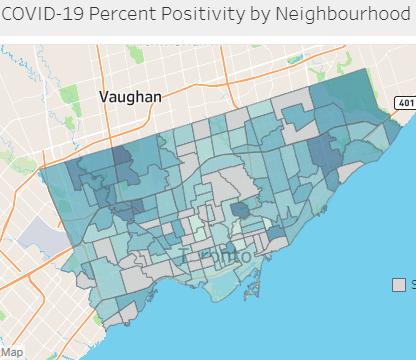
3/ In my thread from yesterday, we examined % test positivity and cases/100k by neighbourhood in Toronto (for its 140 hoods) and then compared them to neighb'hood socioeconomic/demographic concentrations from census data to find (or not find) correlations.
https://twitter.com/rubiconcapital_/status/1329223985289105411?s=20
4a/ We found strong positive correlations between (i) neighborhoods with *high* %positivity/cases and (ii) neighbourhoods with high workforce concentration in the Services industry sectors….

4b/ …we found strong *negative* correlations between (i) neighborhoods with *high* positivity/cases and (ii) neighbourhoods with high workforce concentration in the “Knowledge”/”White-collar”/”Work-from-home” industry sectors…

4c/ …and we showed the same neighbourhood employment characteristics and their related positivity trends in this current “wave”.
https://twitter.com/rubiconcapital_/status/1329228396786823168?s=20
5/ Let’s drill into this briefly, with just a couple of charts, to really bring to light the differences in neighbourhood employment/demographics and #SARSCOv2 prevalence.
6a/ A simple chart (and in table format), comparing the correlation co-efficient for neighbourhood characteristic/employment makeup vs. #SARSCov2 prevalence (cases/100k).
(see chart notes for interpretation if your statistics knowledge is not as sharp today as it usually is 😉)
(see chart notes for interpretation if your statistics knowledge is not as sharp today as it usually is 😉)


6b/ Same chart again.
Many things could be said about and observed from this chart, but the plain truth is there are differences between who is bearing the brunt of the #COVID19 pandemic, and who is not.
Many things could be said about and observed from this chart, but the plain truth is there are differences between who is bearing the brunt of the #COVID19 pandemic, and who is not.

7a/ This is the same chart illustration (and table), but on the horizontal axis, I show only industry workforce categories/groups.
Same observation as above: workers in certain sectors are bearing the brunt of the #COVID19 pandemic, while workers in other sectors much less so.
Same observation as above: workers in certain sectors are bearing the brunt of the #COVID19 pandemic, while workers in other sectors much less so.


7b/ Same industry specific chart
Note the *relatively weak* +correlation between neighb’hoods w/ Foodservices employees as a % of the workforce and neighb'hood cases/100k (& relative to other Service sectors!)
(cc: @RestaurantsCA, hang in there, you’re doing great)
Note the *relatively weak* +correlation between neighb’hoods w/ Foodservices employees as a % of the workforce and neighb'hood cases/100k (& relative to other Service sectors!)
(cc: @RestaurantsCA, hang in there, you’re doing great)

8/ Again, these statistics and observations lay bare *precisely* what the brave and courageous folks behind the @gbdeclaration (@MartinKulldorff, @SunetraGupta, Jay Bhattacharya) are and have been desperately trying to convey.

9/ End thread.
Thank you again for reading, considering, and to all those that shared my previous thread.
Thank you again for reading, considering, and to all those that shared my previous thread.

Sources and Industry Classifications/
Case data: toronto.ca/home/covid-19/…
Census data: open.toronto.ca/dataset/neighb…
Case data: toronto.ca/home/covid-19/…
Census data: open.toronto.ca/dataset/neighb…

/last thought...
...my intention here is not to fuel upset or division between society's groups obviously (this is no one's fault) but rather to maybe increase awareness around what we're actually doing so we can try to function together more optimally during this time. Thanks.
...my intention here is not to fuel upset or division between society's groups obviously (this is no one's fault) but rather to maybe increase awareness around what we're actually doing so we can try to function together more optimally during this time. Thanks.
• • •
Missing some Tweet in this thread? You can try to
force a refresh