1/ Toronto is entering full lockdown.
In this thread, I’ll show the absurdity of a citywide shutdown, simply using by-neighbourhood case/positivity data, w/ census data integration.
Unmeasurable, unnecessary collateral harm is coming; please read/share.
(get a cup of coffee)
In this thread, I’ll show the absurdity of a citywide shutdown, simply using by-neighbourhood case/positivity data, w/ census data integration.
Unmeasurable, unnecessary collateral harm is coming; please read/share.
(get a cup of coffee)
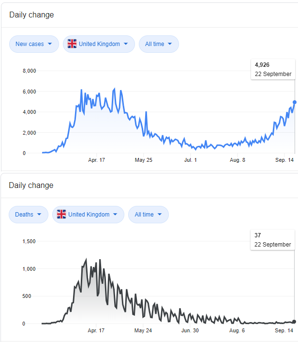
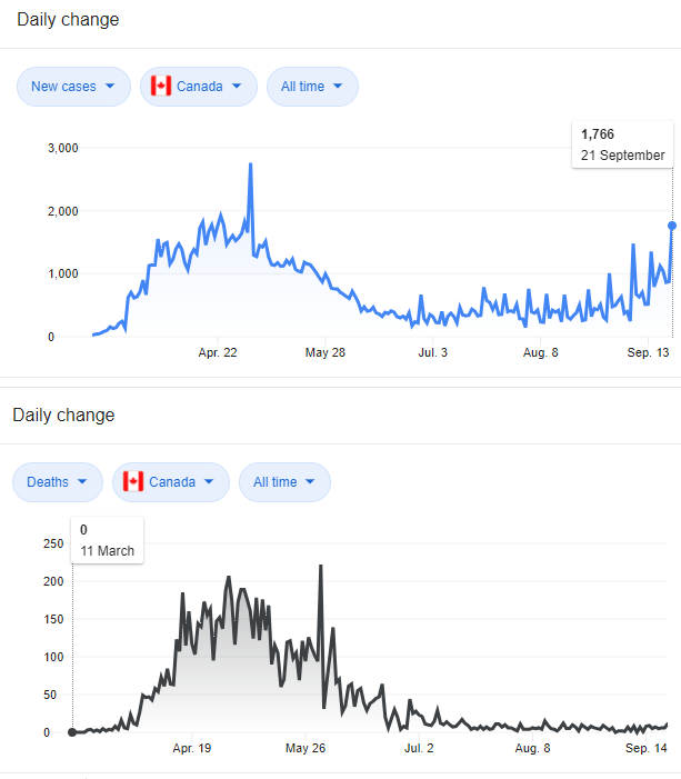
2/ Note: if you are not in Toronto/Canada, you will still find this #SARSCoV2 prevalence analysis and its conclusions compelling, as these same dynamics likely exist in many of the world’s major cities.
3/ Quick note: this analysis follows and adds substantially to a previous related thread, found here (tweets 4a/b sites the data sources/limitations, which are the same as used in this current thread). All %pos/cases data is cumulative since Aug 30.
https://twitter.com/rubiconcapital_/status/1329223985289105411?s=20
4/ Let’s go.
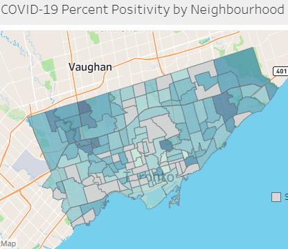
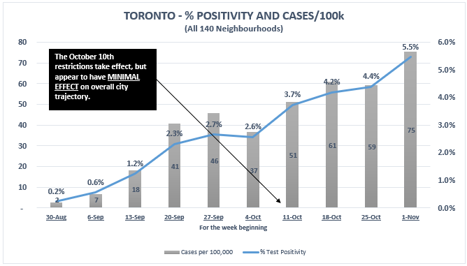
5/ Here is the current *overall* citywide situation. (2.7m people, 140 neighbourhoods).
% positivity and cases/100k rising (but not exponentially).
*NOTE* the previous October 10th restrictions appear to have had little effect on overall trajectory.
% positivity and cases/100k rising (but not exponentially).
*NOTE* the previous October 10th restrictions appear to have had little effect on overall trajectory.
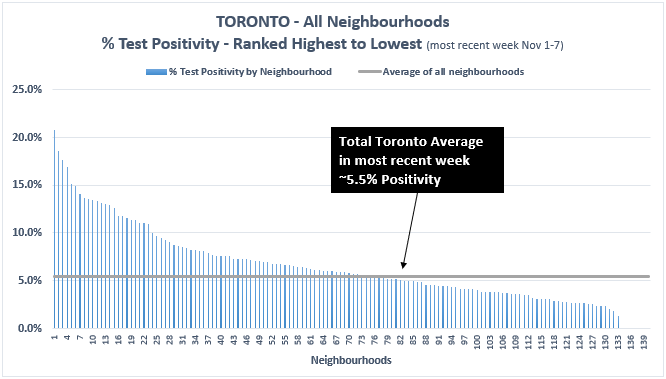
6/ Citywide % positive in most recent reported week (Nov 1-7) was ~5.5%. But with huge variance…
Highest: 20.8%, in a neighbourhood in Northwest Toronto (a current ‘hotspot’).
Lowest: 0%, * in 38 neighbourhoods! * representing 499k people, or ~18% of the population.
Highest: 20.8%, in a neighbourhood in Northwest Toronto (a current ‘hotspot’).
Lowest: 0%, * in 38 neighbourhoods! * representing 499k people, or ~18% of the population.
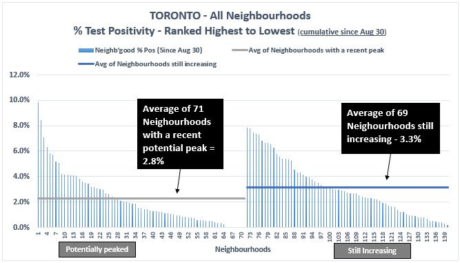
7/ But get this
71 of Toronto’s neighb'hoods, with 1.28m people, or 47% of the pop, may have peaked in positivity *3 weeks ago or more*, and represent just 32% of recent cases.
Similar variance graph as #6, separating neighb’hoods past a recent peak and those still increasing:
71 of Toronto’s neighb'hoods, with 1.28m people, or 47% of the pop, may have peaked in positivity *3 weeks ago or more*, and represent just 32% of recent cases.
Similar variance graph as #6, separating neighb’hoods past a recent peak and those still increasing:

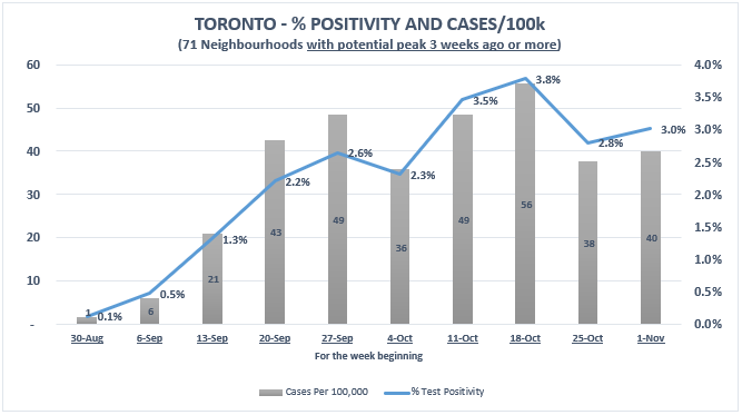
8/ …and here is the 10-week trend of the collective % positivity and cases/100k for those 71 neighbourhoods that perhaps appear past their current “wave”/seasonal(?) peak?:

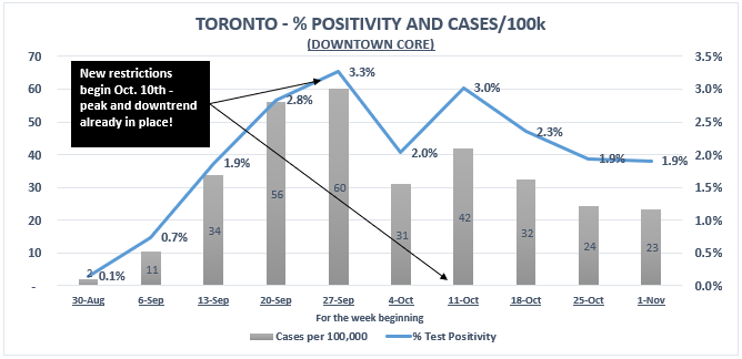
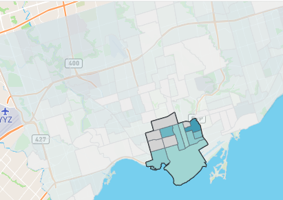
9/ Here is the stunner.
The Downtown Core—the vibrant beating heart of the city, home to >300,000 residents, and swaths of those pesky bars & restaurants peaked in LATE SEPTEMBER, a week b4 the Oct 10th restrictions.
Currently just 2.1% cumulative %pos, with a peak of 3.3% pos.
The Downtown Core—the vibrant beating heart of the city, home to >300,000 residents, and swaths of those pesky bars & restaurants peaked in LATE SEPTEMBER, a week b4 the Oct 10th restrictions.
Currently just 2.1% cumulative %pos, with a peak of 3.3% pos.
10/ Let that sink in for a moment.
All we get from the media and our public health officials is fear; runaway, unrelenting cases and positivity, everywhere, now and always.
Yet the dense downtown core of Toronto has relatively low, and now perhaps decreasing PCR positivity.
All we get from the media and our public health officials is fear; runaway, unrelenting cases and positivity, everywhere, now and always.
Yet the dense downtown core of Toronto has relatively low, and now perhaps decreasing PCR positivity.
11/
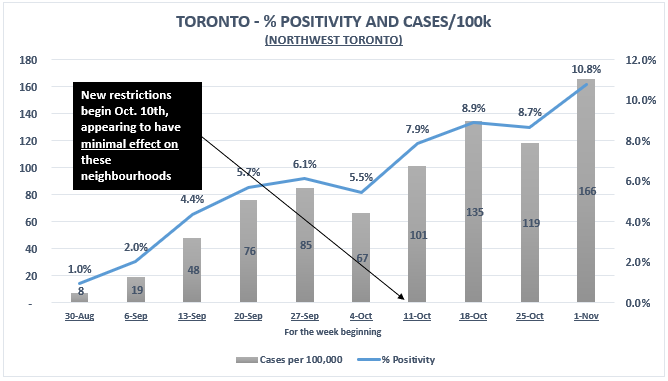
12/ But there are real problems in other areas.
18 neighbourhoods in Northwest Toronto are having a difficult time. Their collective % positivity is ~11%, and still rising. NWTO is 13% of the pop., but 27% of recent cases.
*NOTE* despite the Oct 10th restrictions.
18 neighbourhoods in Northwest Toronto are having a difficult time. Their collective % positivity is ~11%, and still rising. NWTO is 13% of the pop., but 27% of recent cases.
*NOTE* despite the Oct 10th restrictions.
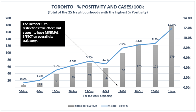
13/ The 25 neighbourhoods in Toronto with the highest % positivity have a collective % positivity of 11.9% (and rising), have 593,000 people, or 22% of the population, and represent 47% of all the city’s recent cases.
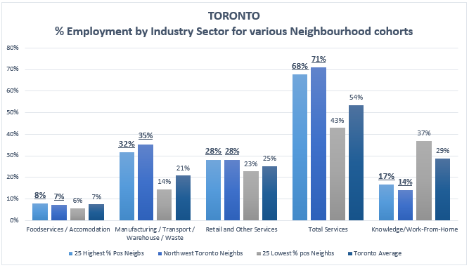
14/ These neighbourhoods have the city’s highest %’s of employment in community, facing essential services industries like retail, as well as in transport, warehousing, manufacturing, and construction.
i.e. those people/neighbourhoods keeping the city going and food on plates.
i.e. those people/neighbourhoods keeping the city going and food on plates.
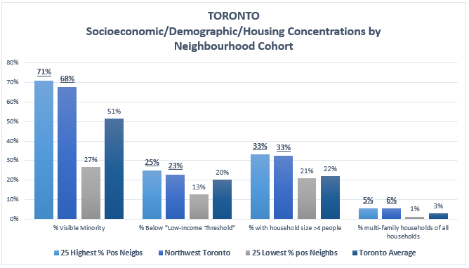
15/ They also have some of the city’s highest concentrations of visible minorities, % below low-income thresholds, and highest household densities.
These are the folks that *must* go into the community to earn a living and who are building up our herd immunity for us.
These are the folks that *must* go into the community to earn a living and who are building up our herd immunity for us.
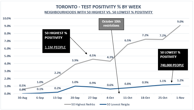
16/ To sum so far, and further illustrate these differences, that make Toronto “a tale of two cities”, here are the simple trends in total % positivity for the 50 neighbourhoods with the highest % positivity vs. those with lowest % positivity.
17a/ Question:
If massive #SARSCov2 prevalence differences exist, and restrictions appearing to have nil effect in the Northwest, and w/ restrictions arriving *after* low immunity %positive peaks in other areas, why is the blunt instrument of citywide lockdown being used?....
If massive #SARSCov2 prevalence differences exist, and restrictions appearing to have nil effect in the Northwest, and w/ restrictions arriving *after* low immunity %positive peaks in other areas, why is the blunt instrument of citywide lockdown being used?....
17b/ Answer:
Well, in my view, there is no answer. But I do know:
“To the man with a hammer, every problem looks like a nail” -Charlie Munger
Blanket lockdown/restriction is being used everywhere and at will, w/out any account for the nuances that I am identifying…
Well, in my view, there is no answer. But I do know:
“To the man with a hammer, every problem looks like a nail” -Charlie Munger
Blanket lockdown/restriction is being used everywhere and at will, w/out any account for the nuances that I am identifying…

17c/ …why should individuals, families, businesses, communities, in wide swaths of the city, in 71 neighbourhoods appearing past their peak positivity and heading down, be forced stop daily life and lose livelihoods?
17d/ If there is good reason for this, let’s debate it—what is the counterargument? Members of the Ontario #COVID19 Science Table advising the Premier are quite vocal on Twitter. What do they think of my questions and common-sense observations?
18/ Moving on, and shifting gears just slightly…
19/ Back to those variances in peak positivity…
Those 71 neighb’hoods appearing to have reached a % pos peak (or levelling off of growth), have a collective 2.3%pos since Aug 30, w/a peak of 3.8% (wk of Oct 18). The rest of the city is averaging 3.3% (7.5% in most recent wk).
Those 71 neighb’hoods appearing to have reached a % pos peak (or levelling off of growth), have a collective 2.3%pos since Aug 30, w/a peak of 3.8% (wk of Oct 18). The rest of the city is averaging 3.3% (7.5% in most recent wk).
20/ In this 2nd seasonal resurgence (data since Aug 30) of #SARSCoV2, could Toronto be nearing community immunity thresholds (and already reached in certain areas?)? If some areas levelled off at 2.3% positivity, could the rest of the city be not far behind now at 3.3%?
21/ We of course do not know the population immunity that existed heading into fall, as we don’t know true positivity/prevalence from the spring first wave, and Toronto has not published % positivity data by neighbourhood for the first wave…
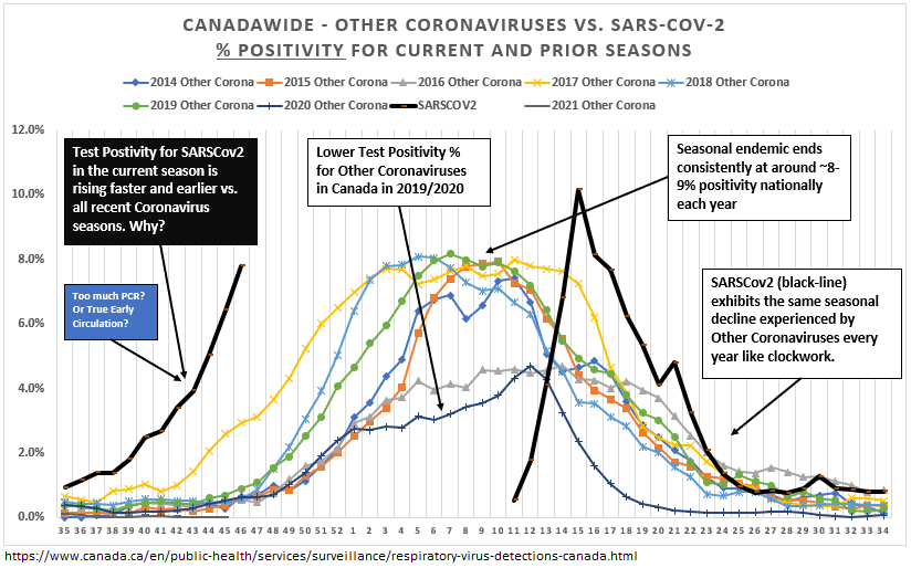
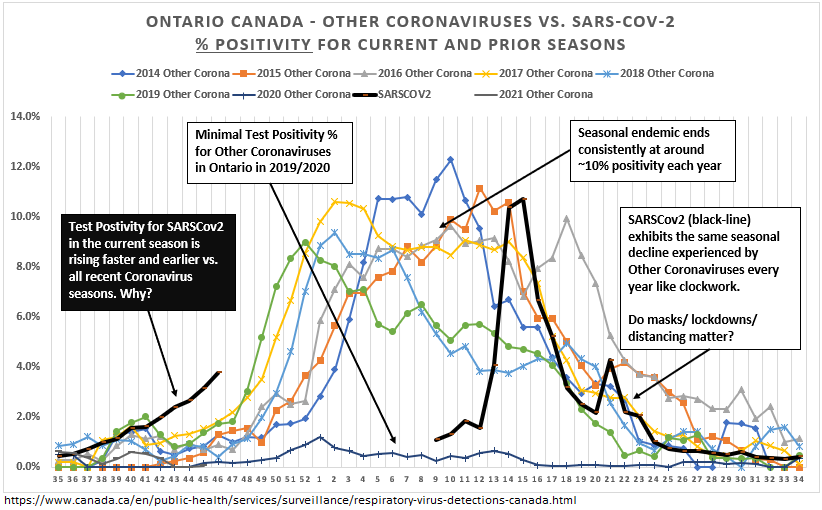
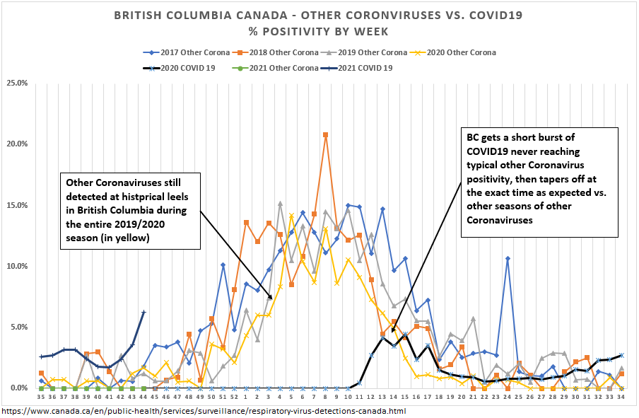
22/ …but as I explored in a previous thread (link here), using publicly available data, seasonal coronaviruses circulate like clockwork in Canada, and peak *consistently* at population level positivity rates of 6-8%. Sometimes very early in the season…
https://twitter.com/rubiconcapital_/status/1328088250372788226?s=20
23/ …and it stands to reason that it is *possible* that certain neighbourhoods with more contact and immune susceptibility (perhaps the Northwest of Toronto) may just be currently “overshooting” natural community immunity thresholds (cruise ships, New York City subway anyone?)?
24/ It is a controversial subject, on which (to be clear) I am only hypothesizing, but perhaps there is hope that (regardless of lockdown / test & trace), that Toronto (and other areas) are close to community immunity levels…
25/ …I and others have observed that many prominent immunologists / virologists / epidemiologists are reminding us that its likely that many have cross-immunity to other coronaviruses from T/B-cells that are long-lasting:
https://twitter.com/jeffreyatucker/status/1330181063050735622?s=20
26/ Back to Toronto… where perhaps we have some interesting statistical evidence to further support the idea of existing immunity...
27/ Toronto has a prominent Asian community, at ~30% of the population and 57% of the city’s visible minorities. From my previous thread on Toronto, we know that neighbourhoods with high concentrations of visible minorities correlate strongly with neighbourhood % positives.
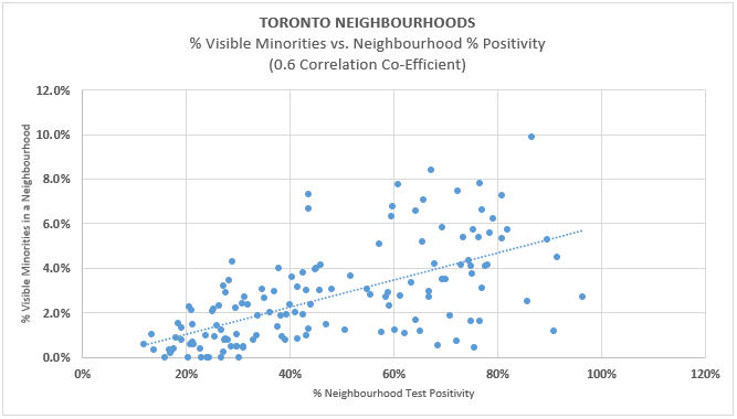
28/ But wow… separating all visible minorities into Asian and ‘other visible minorities’, and running the same regression vs. neighbourhood positivity, we see a MUCH WEAKER correlation to positivity in Asian communities (and conversely, higher for ‘other visible minorities’)
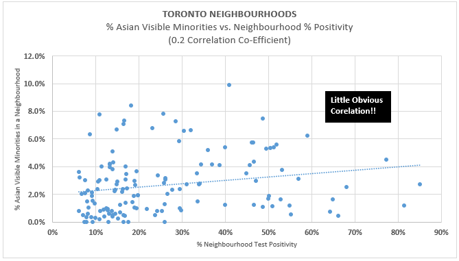

29/ This is perhaps suggestive, as many in the scientific community have hypothesized, that because of prior exposure to SARS coronaviruses, the Asian community may have relatively more pre-existing immunity (…again, I am only hypothesizing based on data and reason).

30/ Time to wrap up...
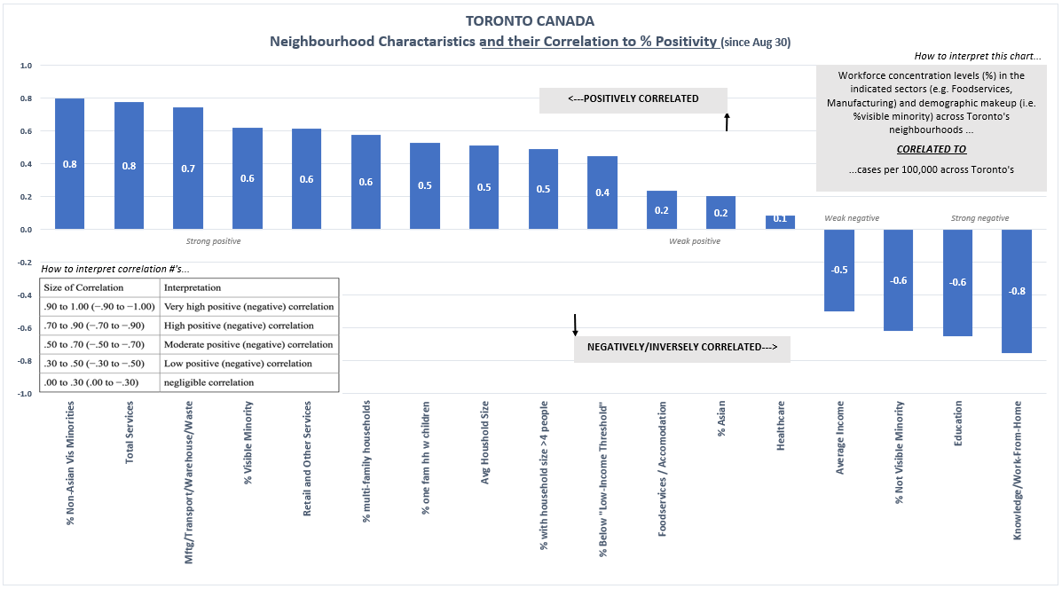
31a/ I will finish by quickly revisiting the Toronto data showing how neighbourhoods with a large % of their workforce in community facing services industries, as well as certain socioeconomic/demographic factors, strongly correlate with neighbourhood % positivity…
31b/ A collection of various socioeconomic/demographic factors, visually ranked by degree of correlation (left = more correlated, right = negatively correlated). The conclusions in the graph are self-evident. And note the much weaker correlation for foodservice/accommodation!

32/ Fascinating stuff all around. Its clear that:
1. There are vast differences in prevalence levels and growth across the city, with much of the city perhaps(?) already past its peak.
2. The burden of lockdown falls heaviest on those least able to bear it in our city.
1. There are vast differences in prevalence levels and growth across the city, with much of the city perhaps(?) already past its peak.
2. The burden of lockdown falls heaviest on those least able to bear it in our city.
33/ A personal note to our journalists:
Why are you not running this data? It is all publicly available. Why am I, a private citizen *with nothing to gain*, and my time to lose, having to do this analysis? (Although I am happy to do so).
The public deserves better from you.
Why are you not running this data? It is all publicly available. Why am I, a private citizen *with nothing to gain*, and my time to lose, having to do this analysis? (Although I am happy to do so).
The public deserves better from you.
34/ Let’s get back to normal soon Toronto.
Thank you for reading, and if you enjoyed this thread and found it important and informative, please share widely.
End thread.
Thank you for reading, and if you enjoyed this thread and found it important and informative, please share widely.
End thread.
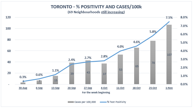
6b-correction/
Wrong chart pasted in #6, but the data/captions are all correct. Here is the correct chart to go with tweet #6.
Wrong chart pasted in #6, but the data/captions are all correct. Here is the correct chart to go with tweet #6.

• • •
Missing some Tweet in this thread? You can try to
force a refresh