I was discussing #healthcare cost variation (& #EHP #RBP models) across geography with a colleague earlier today. I have followed the work of @zackcooperYale and thought it would be interesting to, in very simple terms, visualize some of the cost variation. A short thread. 1/n
2/n I started looking for a datasource. While our #benefitconsulting and #insurance clients engage networks of private insurers, that data is subject to different rules... I wondered what variation "looks like" for Medicare claims. I landed here: dartmouthatlas.org
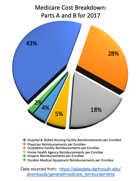
3/n First, there is a ton of #Medicare data. It can be downloaded by state (see below) as well as to a county level (which I pulled into Python.) To consider the amount of cost attributable to different segments, I looked at the largest categories with observations by county. 


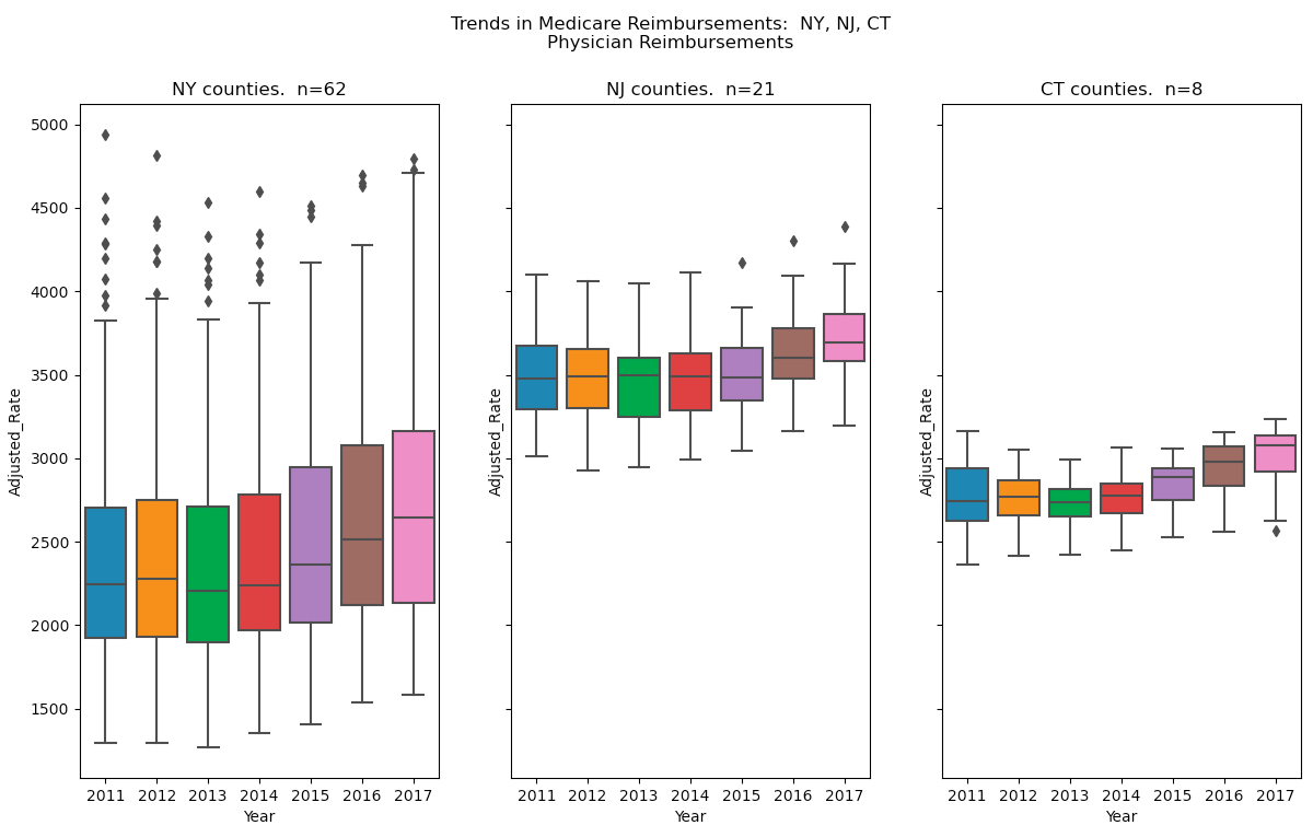
4/n #Hospital & #SNF: I found it interesting to note the changes of median costs across these states, as well as the higher rates of variation in WV compared with PA and MD. Furthermore, amongst NY, NJ, CT, is it possible there is even greater variation in NY? Hmmm... 


5/n #Physician: So, I wondered how this would compare with physician reimbursements. Hmmm... The variation in cost seems quite different, in fact. 


6/n #DME: What about the smallest "sliver" of the cost "pie"? It appears the story has similarities and differences in term of the absolute levels of variation, trends over time, and differences in variation... 


7/n In our #benefitsconsulting practice we regularly advise clients based on observed variation in costs arising from plan design, utilization, and unit costs. Our industry has generated increasing interest in reference prices (i.e. Medicare) as an alt. to PPO constructs. #RBP
8/n I am hopeful that employers are getting clear (and accurate) counsel about both advantages AND challenges in #ReferenceBasedPricing strategies. We have surveyed results across clients who have adopted RBP, and validated financial impact. But, they are not for everyone!
@threadreaderapp unroll
• • •
Missing some Tweet in this thread? You can try to
force a refresh


