1/ Ever wondered how your local area has changed over half a century? Today, @ONS is releasing an interactive article covering some of the most interesting changes between 1961 and 2011 England & Wales censuses right down to a local/district level ons.gov.uk/peoplepopulati…
2/ This piece—developed by my colleagues @Annaekhoo (#DataJournalism) and @SamCtrl (#DataViz) from analysis by Amy Boyson (@ONS historical)—has been an opportunity to test some of the techniques we’re hoping to use to explore 100 years of change up to the most recent @Census2021
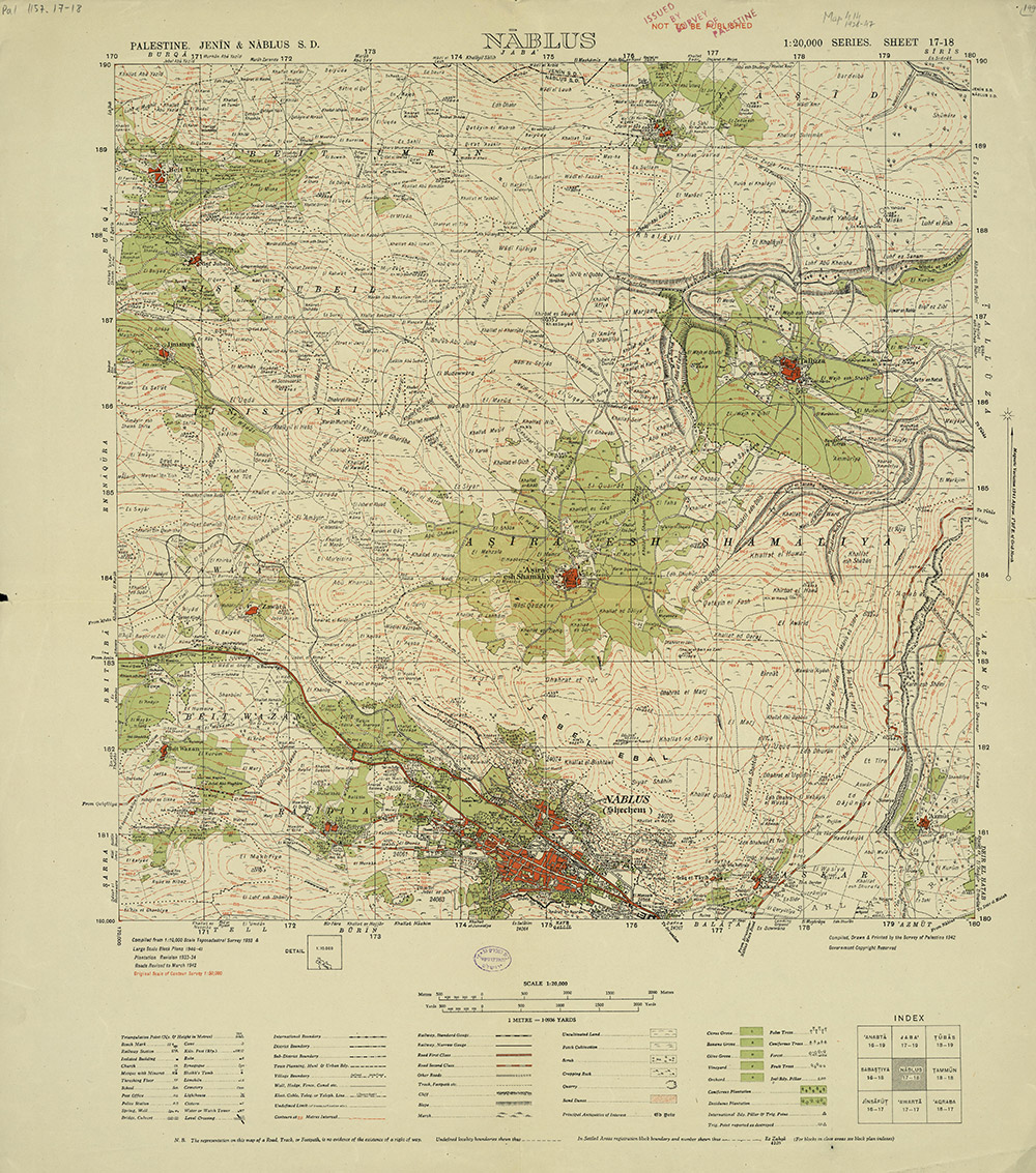
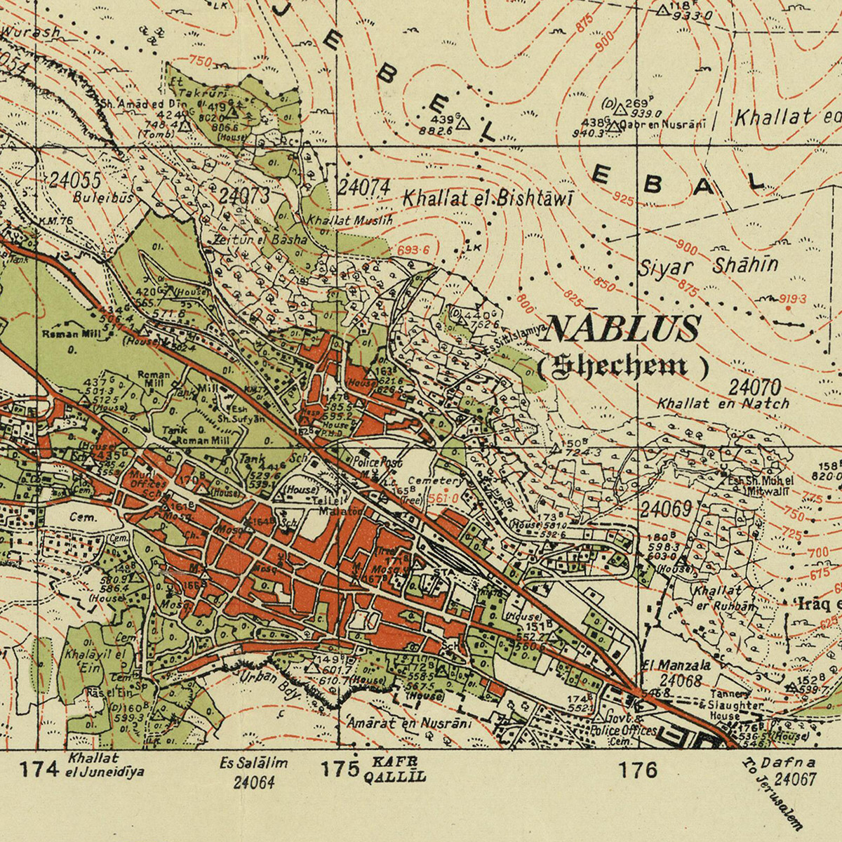
3/ In particular we've been exploring ways to use historical @OrdnanceSurvey maps painstakingly digitised by @natlibscotmaps as a background for the historical datasets. We hope this #steampunk-esque retro-innovation helps to bring the past to life...
4/ Some of the most interesting topics covered in the analysis include changes in demographics, home ownership and marrital status, but the one that had us all talking was the surprisingly low prevalence of indoor toilets in rural Wales and East Anglia back in 1961!
5/ The analysis in this article is based on newly digitised data from the 1961 Census, which is all available to explore and download from Nomis nomisweb.co.uk/query/select/g…
6/ If you want to work with the data — and especially if you want to visualise it — you’ll likely need to download the 1961 district boundaries from the @ONSgeography portal geoportal.statistics.gov.uk/datasets/local…
7/ And if you want to make comparisons with 2011 data, you can map 2011 Census small area data to 1961 districts with the help of this lookup file (unfortunately 1961 districts don’t neatly map the opposite way onto today’s local authority boundaries ☹️) geoportal.statistics.gov.uk/datasets/outpu…
8/ Oh... And if you're interested in those historical basemaps, you can find a ton of them on the @natlibscotmaps website, and you can also explore/search a few of the most detailed ones in this little map comparison tool

• • •

Missing some Tweet in this thread? You can try to force a refresh
 

Keep Current with Ahmad Barclay

Ahmad Barclay Profile picture

Stay in touch and get notified when new unrolls are available from this author!

Read all threads

This Thread may be Removed Anytime!

PDF

Twitter may remove this content at anytime! Save it as PDF for later use!

Try unrolling a thread yourself!

how to unroll video
  1. Follow @ThreadReaderApp to mention us!

  2. From a Twitter thread mention us with a keyword "unroll"
@threadreaderapp unroll

Practice here first or read more on our help page!

More from @bothness

17 May
1/ Today we published this first of two interactive #scrollytelling pieces focused on economic inequality in the UK, based on measures of income and productivity for each local area. Check it out here... ons.gov.uk/visualisations…
2/ As you'd expect, the analysis found notable economic disparities between southern England and the rest of the UK (the blue map shows relative income, the pink shows relative productivity)... But there were also other notable findings
3/ Importantly, the analysis found some interesting patterns once the two economic measures were overlaid as a #bivariate map, including disparities between cities and their surrounding rural areas (the scatter plot top-right explains the colours)
Read 8 tweets
14 May
1/ A year ago, @visualizingpal launched #PalestineToday, telling the story of 1,200 historical towns, villages and cities, and highlighting how the #Nakba and the foundation of #Israel in 1948 created the fractured #Palestinian geography that we see today today.visualizingpalestine.org
2/ Looking at the history of the region in this way helps us to put today's events in context. Eg. in "mixed cities" like #Jaffa, #Haifa or #Lydd, where many #Palestinians were forcibly displaced in 1948, and those that remained became an isolated minority today.visualizingpalestine.org/lydda/
3/ In the #GazaStrip, where nearly 70% of the population are refugees originating from towns and villages in what became #Israel, the population of towns and cities like #Gaza, #Rafah and #KhanYounis have increased massively today.visualizingpalestine.org/rafah/
Read 8 tweets
21 Sep 20
1/ Nerdy thread... I recently put together this tool for exploring @ONS statistical geographies & administrative regions for England & Wales. It's one of various prototypes that we're working on in the #DataVis team in thinking how to visualise @Census2021 bothness.github.io/geo-explorer/
2/ Since joining @ONS a few months ago, I've been trying to make sense of the MANY geographies are used to report data across the UK, from neighbourhood level all the way up to national level, and to be honest it's been a challenge. Here's a list from the 2011 Census...
3/ The smallest "statistical building block" for census data in England & Wales is an Output Area, covering around 100 households. These areas are so small that there are over 180,000 of them, and they don't even have names, only 9-digit codes like E00080085
Read 11 tweets
23 Apr 20
1/ Hello world! We just made 338 #HistoricMaps of #Palestine available to download in high resolution on Palestine Open Maps #PalOpenMaps. Please do share! palopenmaps.org (a project supported by @visualizingpal @basselkhartabil @creativecommons @mozilla @fabricatorz)
2/ All of the maps are in the public domain (expired copyright), sourced from archives including the David Rumsey map collection, the Israeli and Australian national libraries. The maps are all scanned at resolutions of at least 300dpi. Here's an example of the detail level...
3/ We also just added a new split-screen mode to #PalOpenMaps, so that you can instantly compare the various historic map layers to present day satellite maps and #OpenStreetMap road overlays palopenmaps.org
Read 6 tweets
22 Dec 19
1/ THREAD. I had been planning for a while to visualise the volume of mainstream media coverage on @UKLabour's "antisemitism crisis". Since the @guardian have been central to promoting this narrative (and have a good API) I started scraping their articles to see what I could find
2/ I shelved the idea (for a while) when I realised that just showing the volume of articles mentioning "Labour" + "antisemitism" might simply reinforce existing prejudices. Corbyn supporters would see a media conspiracy. Opponents would see evidence of an actual crisis
3/ I came back to the data after seeing this tweet by @davidgraeber. What I found interesting was the factor of virtually zero coverage of antisemitism in political parties before 2015, and the relative absence of articles covering Tory antisemitism
Read 8 tweets
10 Dec 19
1/ Thread... I've decided to spend the day today making charts to remind people of the @Conservatives awful record in government since 2010. Here's the first, on jobs. A decline in wages and a huge increase in zero hours contracts #GE2019 #ToriesOut
@Conservatives 2/ Here's how the @Conservatives have been doing on crime since 2010. Police numbers falling, recorded violent crime incidents rising #GE2019 #ToriesOut

(Nb. the Crime Survey - an alternative measure - shows a pretty flat trend under Tories after sharp decline from 1995-2010)
@Conservatives 3/ Although the @Conservatives have thrown record amounts of cash at the #NHS, the health service has a staffing shortfall of over 100,000 (including over 30,000 nurses), while A&E waiting times have seen a sharp rise #GE2019 #ToriesOut
Read 6 tweets

Did Thread Reader help you today?

Support us! We are indie developers!


This site is made by just two indie developers on a laptop doing marketing, support and development! Read more about the story.

Become a Premium Member ($3/month or $30/year) and get exclusive features!

Become Premium

Too expensive? Make a small donation by buying us coffee ($5) or help with server cost ($10)

Donate via Paypal Become our Patreon

Thank you for your support!

Follow Us on Twitter!

:(