2/ Looking at the history of the region in this way helps us to put today's events in context. Eg. in "mixed cities" like #Jaffa, #Haifa or #Lydd, where many #Palestinians were forcibly displaced in 1948, and those that remained became an isolated minority today.visualizingpalestine.org/lydda/
6/ In its totality, #PalestineToday is intended as a tool to help us to tell the story of how a land and its people that have been divided and subjugated by more than a century of #colonisation, #occupation and #apartheid
7/ Tomorrow is #NakbaDay, when the world marks the forced displacement of 750,000+ #Palestinians in 1948. You can use #PalestineToday to share the stories of the places that are meaningful to you. Just select a place and then click "Share the story..." today.visualizingpalestine.org
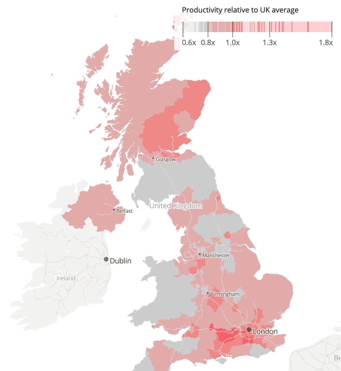
1/ Today we published this first of two interactive #scrollytelling pieces focused on economic inequality in the UK, based on measures of income and productivity for each local area. Check it out here... ons.gov.uk/visualisations…
2/ As you'd expect, the analysis found notable economic disparities between southern England and the rest of the UK (the blue map shows relative income, the pink shows relative productivity)... But there were also other notable findings
3/ Importantly, the analysis found some interesting patterns once the two economic measures were overlaid as a #bivariate map, including disparities between cities and their surrounding rural areas (the scatter plot top-right explains the colours)
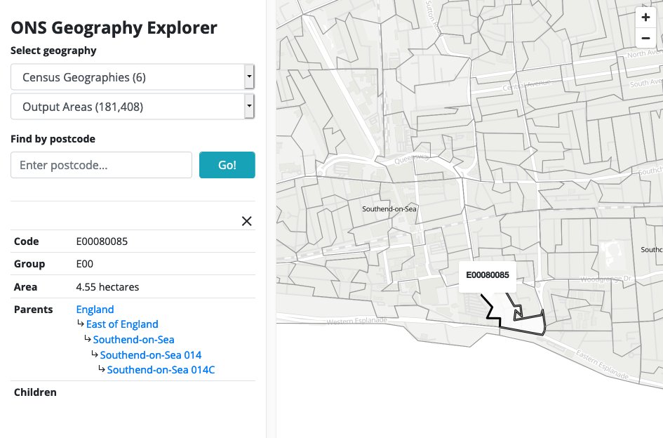
1/ Nerdy thread... I recently put together this tool for exploring @ONS statistical geographies & administrative regions for England & Wales. It's one of various prototypes that we're working on in the #DataVis team in thinking how to visualise @Census2021bothness.github.io/geo-explorer/
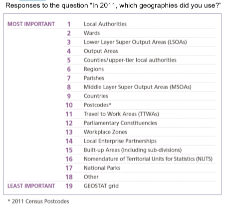
2/ Since joining @ONS a few months ago, I've been trying to make sense of the MANY geographies are used to report data across the UK, from neighbourhood level all the way up to national level, and to be honest it's been a challenge. Here's a list from the 2011 Census...
3/ The smallest "statistical building block" for census data in England & Wales is an Output Area, covering around 100 households. These areas are so small that there are over 180,000 of them, and they don't even have names, only 9-digit codes like E00080085
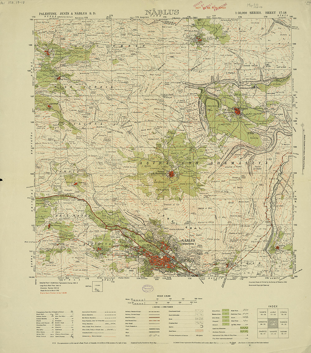
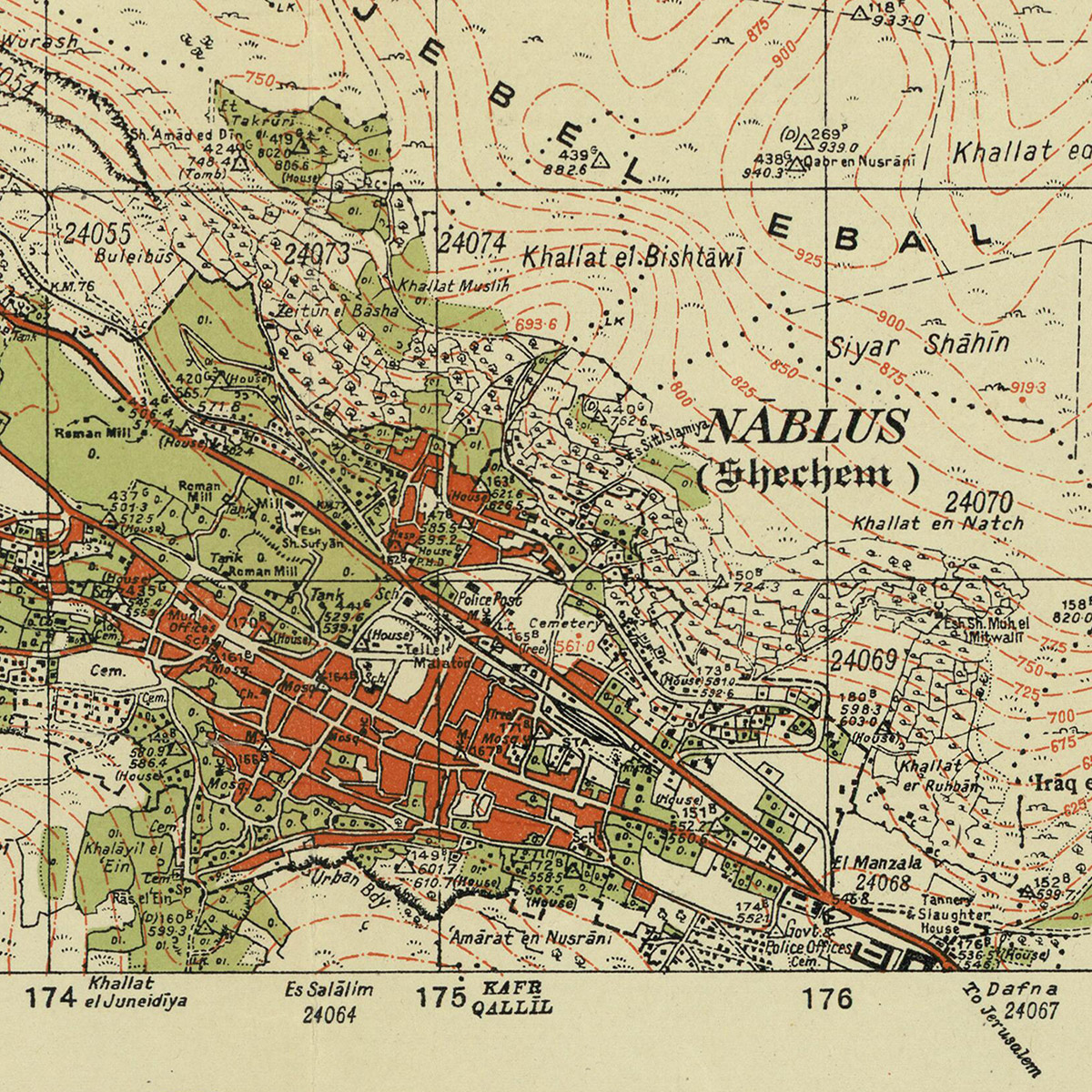
2/ All of the maps are in the public domain (expired copyright), sourced from archives including the David Rumsey map collection, the Israeli and Australian national libraries. The maps are all scanned at resolutions of at least 300dpi. Here's an example of the detail level...
3/ We also just added a new split-screen mode to #PalOpenMaps, so that you can instantly compare the various historic map layers to present day satellite maps and #OpenStreetMap road overlays palopenmaps.org
1/ THREAD. I had been planning for a while to visualise the volume of mainstream media coverage on @UKLabour's "antisemitism crisis". Since the @guardian have been central to promoting this narrative (and have a good API) I started scraping their articles to see what I could find
2/ I shelved the idea (for a while) when I realised that just showing the volume of articles mentioning "Labour" + "antisemitism" might simply reinforce existing prejudices. Corbyn supporters would see a media conspiracy. Opponents would see evidence of an actual crisis
3/ I came back to the data after seeing this tweet by @davidgraeber. What I found interesting was the factor of virtually zero coverage of antisemitism in political parties before 2015, and the relative absence of articles covering Tory antisemitism
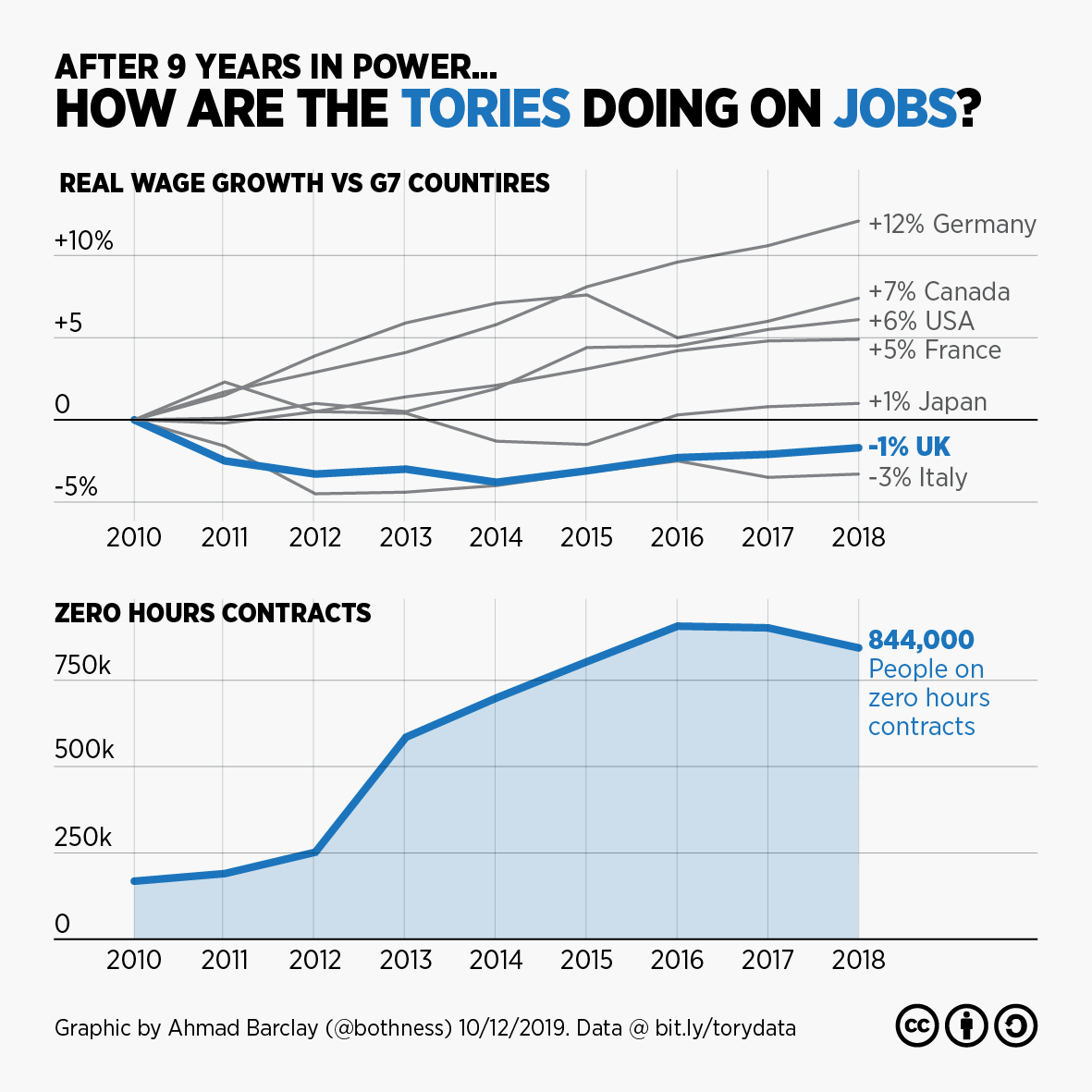
1/ Thread... I've decided to spend the day today making charts to remind people of the @Conservatives awful record in government since 2010. Here's the first, on jobs. A decline in wages and a huge increase in zero hours contracts #GE2019#ToriesOut
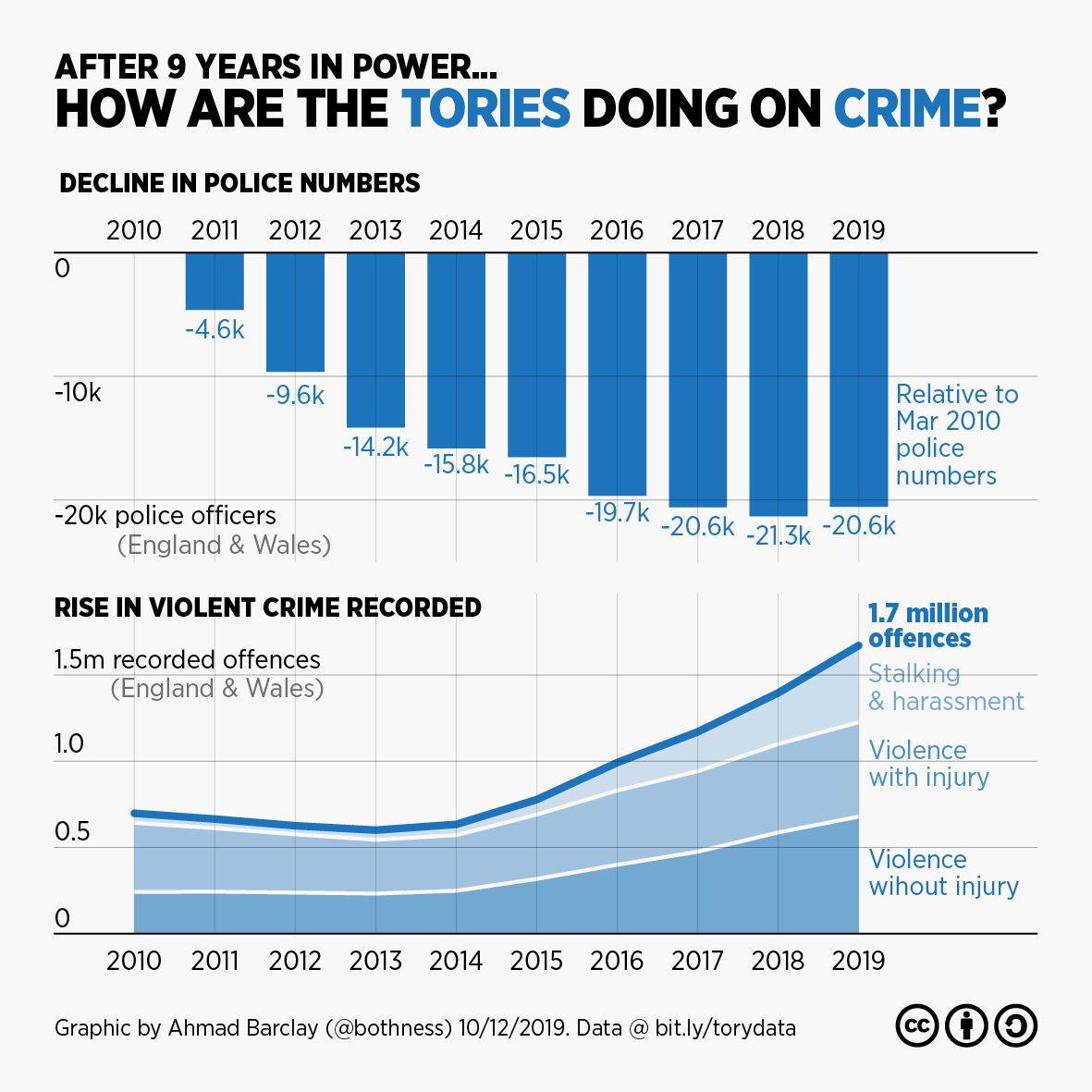
(Nb. the Crime Survey - an alternative measure - shows a pretty flat trend under Tories after sharp decline from 1995-2010)
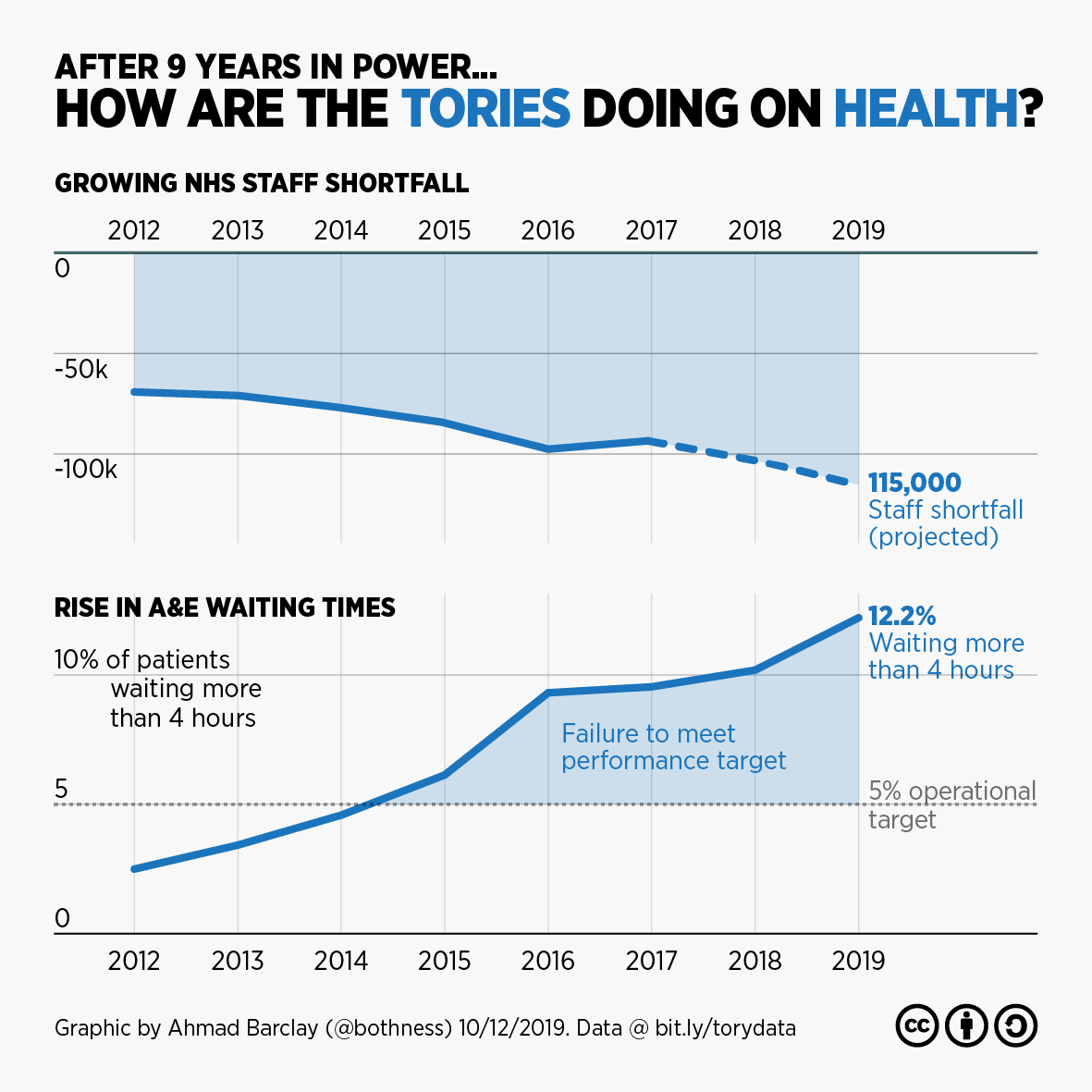
@Conservatives 3/ Although the @Conservatives have thrown record amounts of cash at the #NHS, the health service has a staffing shortfall of over 100,000 (including over 30,000 nurses), while A&E waiting times have seen a sharp rise #GE2019#ToriesOut
2/ So... I decided to get the constituency-by-constituency data from this site and a couple of others (tactical.vote & tacticalvote.co.uk) to see how they compare, and whether they pass a basic "plausibility" test based on % voting swing needed from 2017 results
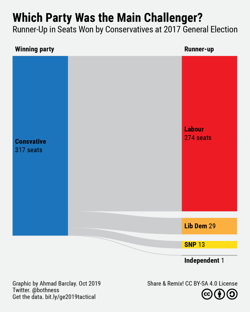
3/ I narrowed down my analysis to the 317 seats won by @Conservatives at the 2017 General election, since these are the core focus for tactical voting, whether to get the #ToriesOut or #StopBrexit. This chart shows which party came second in each of these constituencies in 2017