1/ Today we published this first of two interactive #scrollytelling pieces focused on economic inequality in the UK, based on measures of income and productivity for each local area. Check it out here... ons.gov.uk/visualisations…
2/ As you'd expect, the analysis found notable economic disparities between southern England and the rest of the UK (the blue map shows relative income, the pink shows relative productivity)... But there were also other notable findings
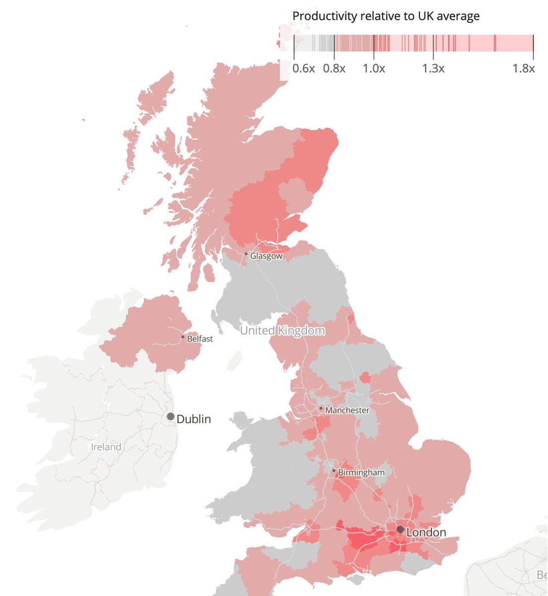
3/ Importantly, the analysis found some interesting patterns once the two economic measures were overlaid as a #bivariate map, including disparities between cities and their surrounding rural areas (the scatter plot top-right explains the colours)
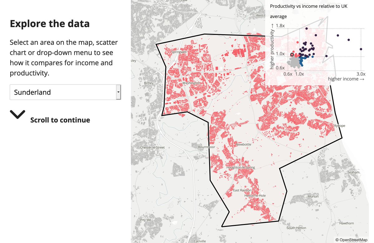
4/ At the end of the article you can select your own area to see how it compares to the country as a whole
5/ And a quick ask... The #scrollytelling format is something that we're developing to present the analysis of @Census2021 data once it's released. So, please do your feedback and ideas so we can make it as effective as possible!!
6/ The analysis was the work of Richard Prothero, Martin Joyce and Joseph Collias. Data journalism by @Annaekhoo. #dataviz + coding by me. Special thanks also to @fryford, @henrylau_ONS, @jamestrimble1, Theo Jolliffe, Carlie Edge, @rachel_pricetag, @mathew_weeks
7/ The next piece in this series -- planned to be release soon -- aims to go a step further, looking at income inequality in England at a neighbourhood level, and whether patterns of income deprivation might correlate with other forms of deprivation
8/ The piece was coded using the #Svelte Javascript framework, #MapboxGLJS and the #LayerCake charting library. You can check out the code for the scrollytelling template we've built here (still a work in progress!) github.com/ONSvisual/svel…

• • •

Missing some Tweet in this thread? You can try to force a refresh
 

Keep Current with Ahmad Barclay

Ahmad Barclay Profile picture

Stay in touch and get notified when new unrolls are available from this author!

Read all threads

This Thread may be Removed Anytime!

PDF

Twitter may remove this content at anytime! Save it as PDF for later use!

Try unrolling a thread yourself!

how to unroll video
  1. Follow @ThreadReaderApp to mention us!

  2. From a Twitter thread mention us with a keyword "unroll"
@threadreaderapp unroll

Practice here first or read more on our help page!

More from @bothness

14 May
1/ A year ago, @visualizingpal launched #PalestineToday, telling the story of 1,200 historical towns, villages and cities, and highlighting how the #Nakba and the foundation of #Israel in 1948 created the fractured #Palestinian geography that we see today today.visualizingpalestine.org
2/ Looking at the history of the region in this way helps us to put today's events in context. Eg. in "mixed cities" like #Jaffa, #Haifa or #Lydd, where many #Palestinians were forcibly displaced in 1948, and those that remained became an isolated minority today.visualizingpalestine.org/lydda/
3/ In the #GazaStrip, where nearly 70% of the population are refugees originating from towns and villages in what became #Israel, the population of towns and cities like #Gaza, #Rafah and #KhanYounis have increased massively today.visualizingpalestine.org/rafah/
Read 8 tweets
21 Sep 20
1/ Nerdy thread... I recently put together this tool for exploring @ONS statistical geographies & administrative regions for England & Wales. It's one of various prototypes that we're working on in the #DataVis team in thinking how to visualise @Census2021 bothness.github.io/geo-explorer/
2/ Since joining @ONS a few months ago, I've been trying to make sense of the MANY geographies are used to report data across the UK, from neighbourhood level all the way up to national level, and to be honest it's been a challenge. Here's a list from the 2011 Census...
3/ The smallest "statistical building block" for census data in England & Wales is an Output Area, covering around 100 households. These areas are so small that there are over 180,000 of them, and they don't even have names, only 9-digit codes like E00080085
Read 11 tweets
23 Apr 20
1/ Hello world! We just made 338 #HistoricMaps of #Palestine available to download in high resolution on Palestine Open Maps #PalOpenMaps. Please do share! palopenmaps.org (a project supported by @visualizingpal @basselkhartabil @creativecommons @mozilla @fabricatorz)
2/ All of the maps are in the public domain (expired copyright), sourced from archives including the David Rumsey map collection, the Israeli and Australian national libraries. The maps are all scanned at resolutions of at least 300dpi. Here's an example of the detail level...
3/ We also just added a new split-screen mode to #PalOpenMaps, so that you can instantly compare the various historic map layers to present day satellite maps and #OpenStreetMap road overlays palopenmaps.org
Read 6 tweets
22 Dec 19
1/ THREAD. I had been planning for a while to visualise the volume of mainstream media coverage on @UKLabour's "antisemitism crisis". Since the @guardian have been central to promoting this narrative (and have a good API) I started scraping their articles to see what I could find
2/ I shelved the idea (for a while) when I realised that just showing the volume of articles mentioning "Labour" + "antisemitism" might simply reinforce existing prejudices. Corbyn supporters would see a media conspiracy. Opponents would see evidence of an actual crisis
3/ I came back to the data after seeing this tweet by @davidgraeber. What I found interesting was the factor of virtually zero coverage of antisemitism in political parties before 2015, and the relative absence of articles covering Tory antisemitism
Read 8 tweets
10 Dec 19
1/ Thread... I've decided to spend the day today making charts to remind people of the @Conservatives awful record in government since 2010. Here's the first, on jobs. A decline in wages and a huge increase in zero hours contracts #GE2019 #ToriesOut
@Conservatives 2/ Here's how the @Conservatives have been doing on crime since 2010. Police numbers falling, recorded violent crime incidents rising #GE2019 #ToriesOut

(Nb. the Crime Survey - an alternative measure - shows a pretty flat trend under Tories after sharp decline from 1995-2010)
@Conservatives 3/ Although the @Conservatives have thrown record amounts of cash at the #NHS, the health service has a staffing shortfall of over 100,000 (including over 30,000 nurses), while A&E waiting times have seen a sharp rise #GE2019 #ToriesOut
Read 6 tweets
4 Nov 19
1/ I've been following the debate about #TacticalVoting in UK #GeneralElection2019, and particularly the controversy about @BestForBritain's site getvoting.org, which is accused of giving "bogus" advice based on a fairly opaque methodology theguardian.com/politics/2019/…
2/ So... I decided to get the constituency-by-constituency data from this site and a couple of others (tactical.vote & tacticalvote.co.uk) to see how they compare, and whether they pass a basic "plausibility" test based on % voting swing needed from 2017 results
3/ I narrowed down my analysis to the 317 seats won by @Conservatives at the 2017 General election, since these are the core focus for tactical voting, whether to get the #ToriesOut or #StopBrexit. This chart shows which party came second in each of these constituencies in 2017
Read 12 tweets

Did Thread Reader help you today?

Support us! We are indie developers!


This site is made by just two indie developers on a laptop doing marketing, support and development! Read more about the story.

Become a Premium Member ($3/month or $30/year) and get exclusive features!

Become Premium

Too expensive? Make a small donation by buying us coffee ($5) or help with server cost ($10)

Donate via Paypal Become our Patreon

Thank you for your support!

Follow Us on Twitter!

:(