
The Heat is On🔥🌍
A world of climate promises not yet delivered
Today we’ve publish the @UNEP #EmissionsGap report
Good news:
we are doing increasingly better closing in on 2°C
Bad news:
it is still far from meeting the goals of the #ParisAgreement
A short thread (1/n)
A world of climate promises not yet delivered
Today we’ve publish the @UNEP #EmissionsGap report
Good news:
we are doing increasingly better closing in on 2°C
Bad news:
it is still far from meeting the goals of the #ParisAgreement
A short thread (1/n)

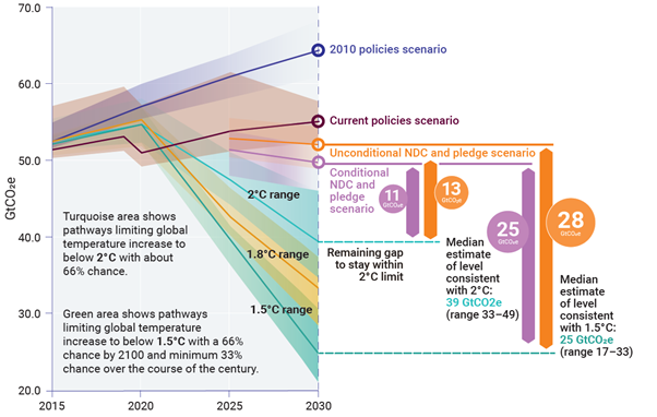
The @UNEP #emissionsgap report takes stock of current pledges of countries and compares them to where emissions emissions should be going to limit warming to 1.5°C or 2°C.
The difference is called the emissions gap.
(2/n)
The difference is called the emissions gap.
(2/n)
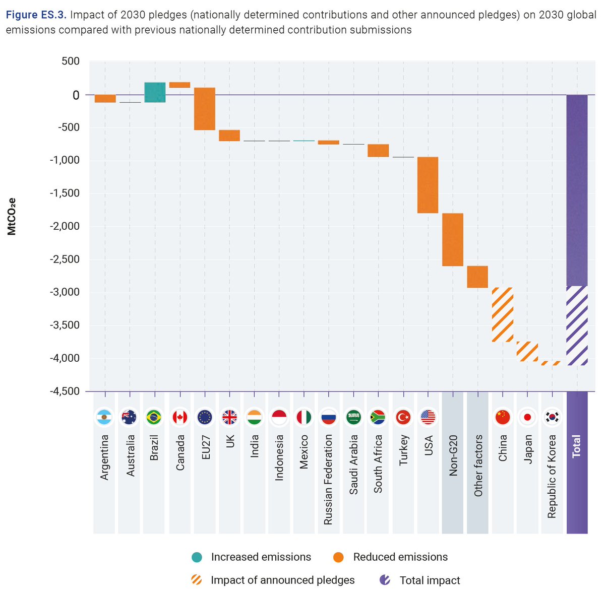
The latest @UNEP #EmissionsGap Report finds new and updated Nationally Determined Contributions only take 7.5% off predicted 2030 emissions compared to previous commitments. Reductions of 30% are needed to stay on the least-cost pathway for 2°C and 55% for 1.5°C. (3/n)
Various countries contribute differently to this reduction in the #EmissionsGap, with Brazil actually counteracting the decrease. (4/n)
For the first time ever, the @UNEP gap report also looks into #NetZero targets.
It finds that a total of 49 countries plus the EU have pledged a net-zero target, covering over half of global greenhouse gas emissions, over half of GDP and a third of the global population. (5/n)
It finds that a total of 49 countries plus the EU have pledged a net-zero target, covering over half of global greenhouse gas emissions, over half of GDP and a third of the global population. (5/n)

#NetZero targets should not be considered in isolation. Clear near-term plans a targets should accompany them to put countries and the globe on a clear path towards achieving the net zero target. (6/n)
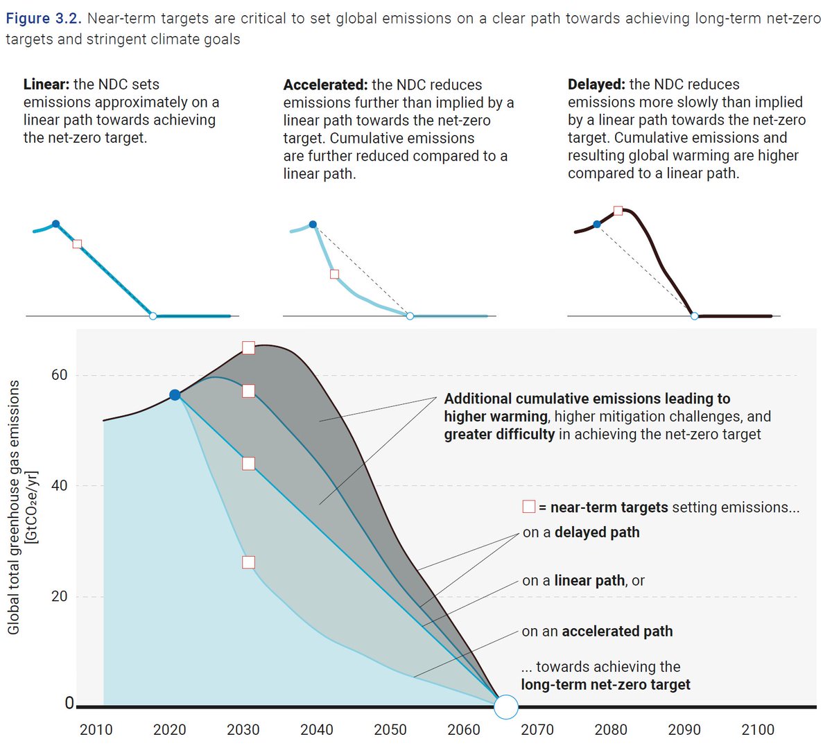
The reports dives deeper into the various aspects by which #NetZero targets are being distinguished, and looks into whether the near-term NDCs of countries already put them on a clear path towards achieving their net zero targets. (7/n)
(Figure 3.3)
(Figure 3.3)

What does all this mean for global warming?
If current NDCs and pledges are achieved by 2030, and climate action continues at the same level of ambition thereafter, warming over the course of this century will only with a 2-in-3 chance be kept to 2.7°C (range: 2.2-3.2°C). (8/n)
If current NDCs and pledges are achieved by 2030, and climate action continues at the same level of ambition thereafter, warming over the course of this century will only with a 2-in-3 chance be kept to 2.7°C (range: 2.2-3.2°C). (8/n)

Achieving, in addition, the announced #NetZero targets are achieved, would reduce this these projections by about half a degree. (9/n)
In the most optimistic case:
If all conditions that are included in NDCs (such as access to finance, technology transfer, capacity building) are met and also #NetZero targets are met, we are projected to en up with a 2-in-3 chance below 2.1°C (range: 1.9-2.4°C).
(10/n)
If all conditions that are included in NDCs (such as access to finance, technology transfer, capacity building) are met and also #NetZero targets are met, we are projected to en up with a 2-in-3 chance below 2.1°C (range: 1.9-2.4°C).
(10/n)
That is closer, but still not in line with the #ParisAgreement.
Finally, these single number hide some of the variation and risk in the global warming projections. Therefore, the report also shows the full distribution. (11/n)
Finally, these single number hide some of the variation and risk in the global warming projections. Therefore, the report also shows the full distribution. (11/n)

Under current pledges there is about a 1-in-5 chance that warming still exceeds 3°C, whereas when considering the #NetZero targets in addition, this risk is strongly reduced but still a bit more than a 1-in-8 chance remains that warming would exceed 2.5°C until 2100. (12/n)

Finally, as every year, the @UNEP report also highlights way of reducing the #EmissionsGap and this year it highlights:
- The importance of a green #COVID19 recovery
- The potential additional contributions of #methane cuts
- The role of market mechanisms.
(13/n)
- The importance of a green #COVID19 recovery
- The potential additional contributions of #methane cuts
- The role of market mechanisms.
(13/n)
The @UNEP #EmissionsGap report has been launched today, and can be accessed online at the link below. (14/n)
unep.org/resources/emis…
unep.org/resources/emis…
Honoured to have been once again part of an incredible and world-leading author team, including @AOlhoff, @tarynfransen, @niklashoehne, @micheldenelzen, @joanna_portugal, and so many talented others (end)
• • •
Missing some Tweet in this thread? You can try to
force a refresh


