
,
49 tweets,
19 min read
Read on Twitter
What. The. Fuck.
Someone, please explain this to us ASAP cuz we're very very very lost.
Someone, please explain this to us ASAP cuz we're very very very lost.
C'mon
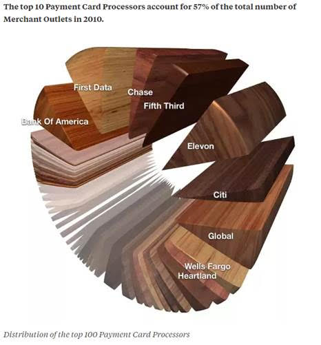
A pie chart of wood swatches
A pie chart of wood swatches
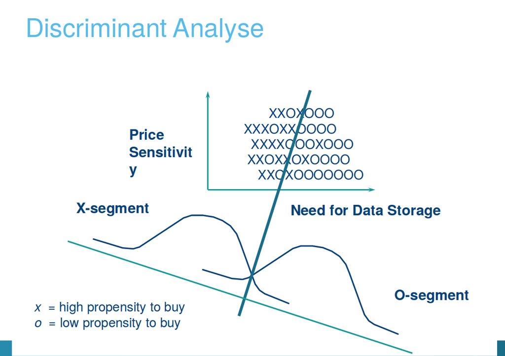
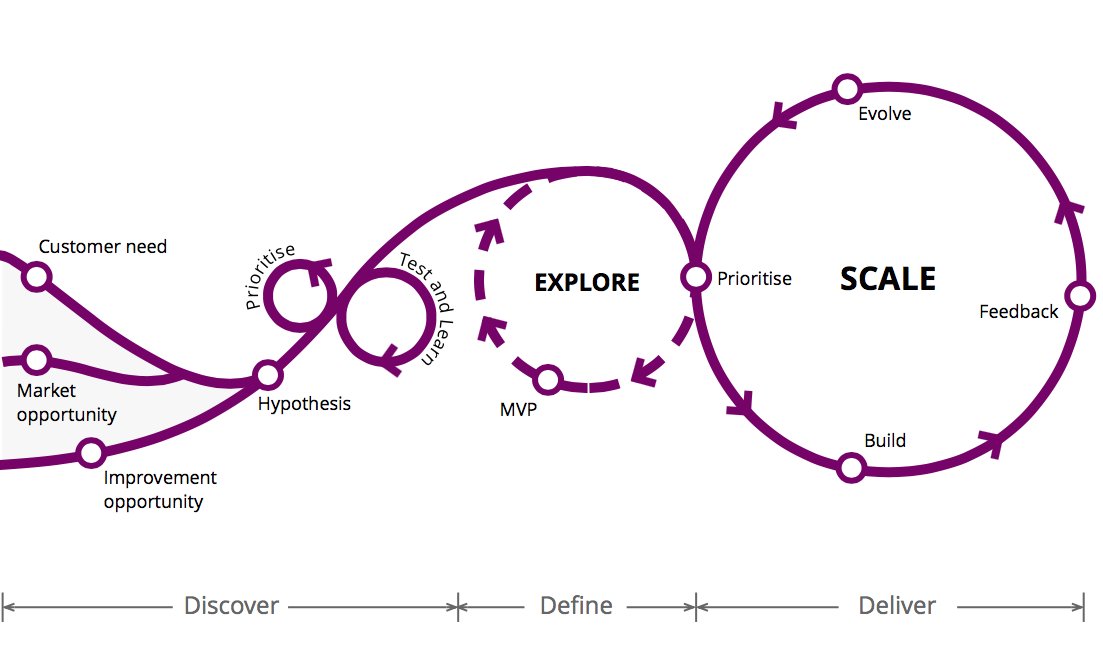
Can someone explain this framework?
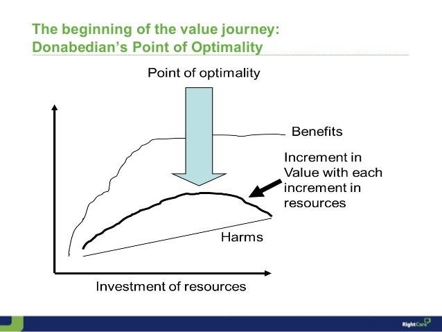
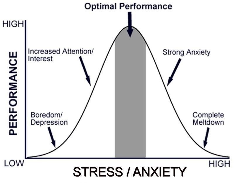
In your best robot voice, say "The Point of Optimality"
Now try to make sense of this graph. You can't.
ht/ @trstndh
Now try to make sense of this graph. You can't.
ht/ @trstndh
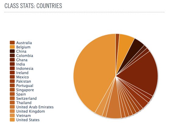
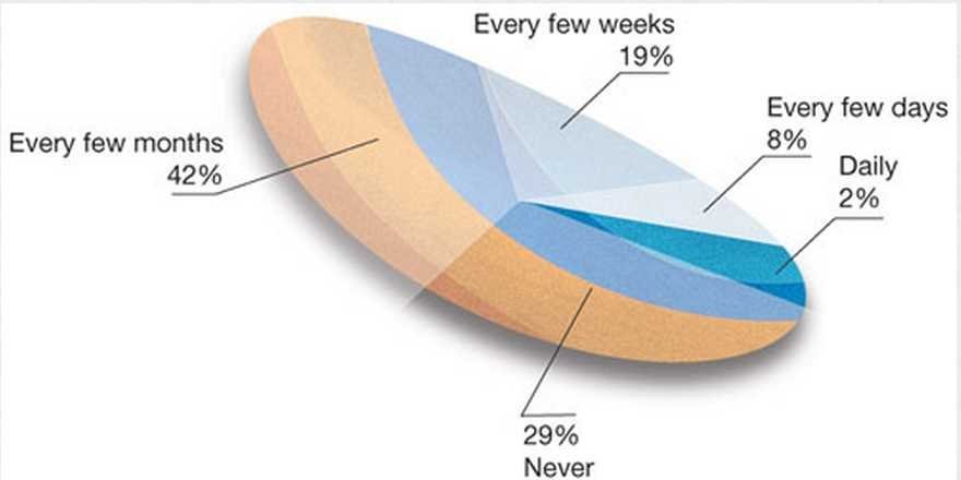
What countries are U Chicago's summer business scholars from? This pie chart will not tell you.


If there is anything good about this graph, could it be that it is colorblind friendly?
i.redd.it/tm3rshoefxbz.p…
i.redd.it/tm3rshoefxbz.p…


When you suck at pie charts, this is what you get
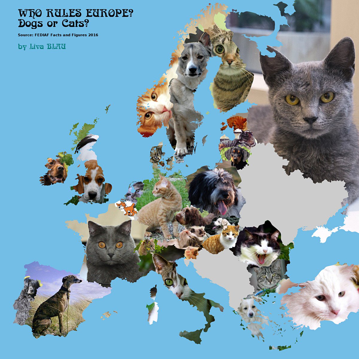
Not everything with dogs and cats is cute reddit.com/r/dataisugly/c…
A layered pie chart. Why?

Not a bad graph, but still
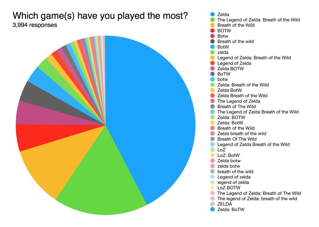
Legend of Zelda wins for most slices reddit.com/r/dataisugly/c…
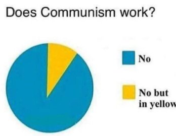
Does Communism work?
Both a good and bad pie chart at the same time
h/t our many newsletter subscribers who sent this one
Both a good and bad pie chart at the same time
h/t our many newsletter subscribers who sent this one

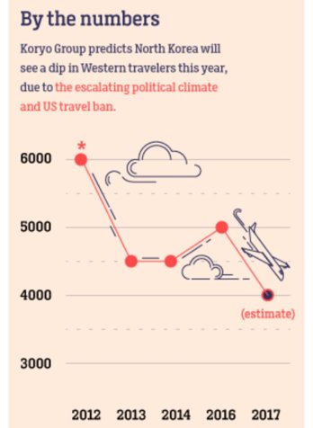
This is not the best way to visualize a decline in travelers imgur.com/vHMkVHk
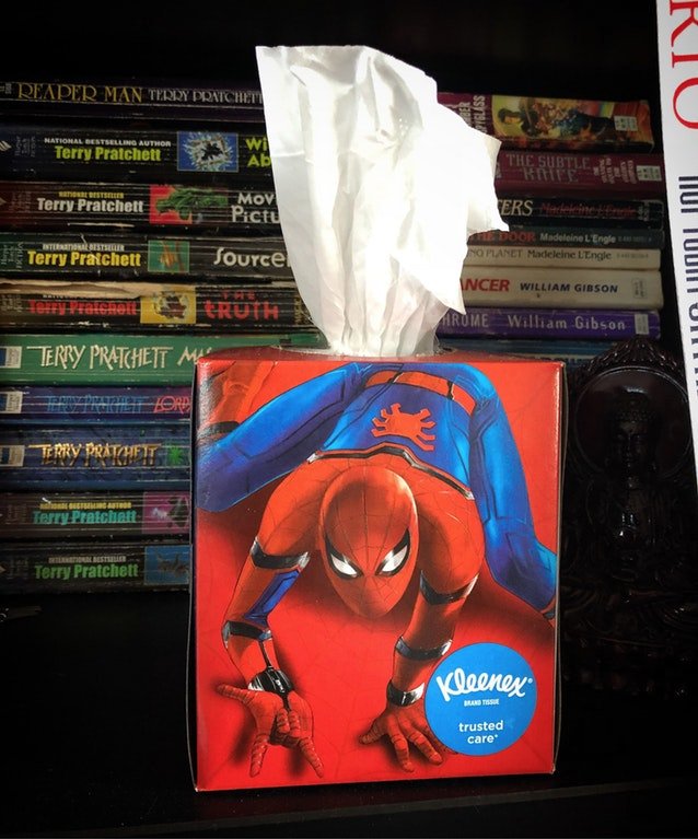
The most uncomfortable Kleenex box ever i.redd.it/pc7ftlrwa7mz.j… (not a graph but deserved a shoutout for bad design)
When there just aren't enough colors
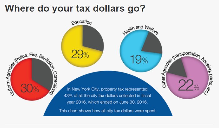
4 pie charts. All nonsense from nyc.gov
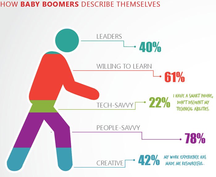
Boom! 243% of boomers describe themselves as follows designyourway.net/blog/inspirati…
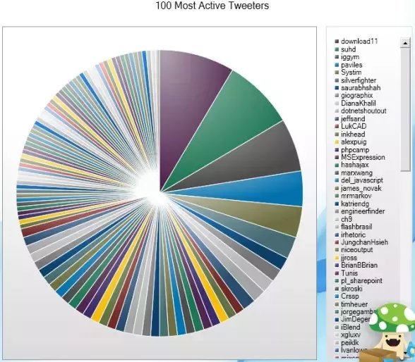
The 100 most active tweeters quora.com/What-are-examp…
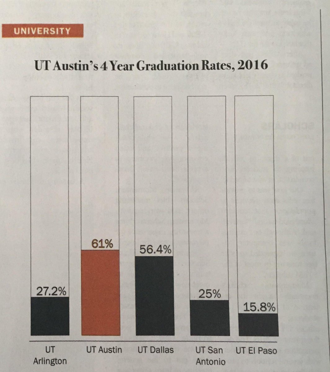
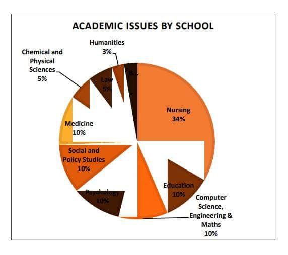
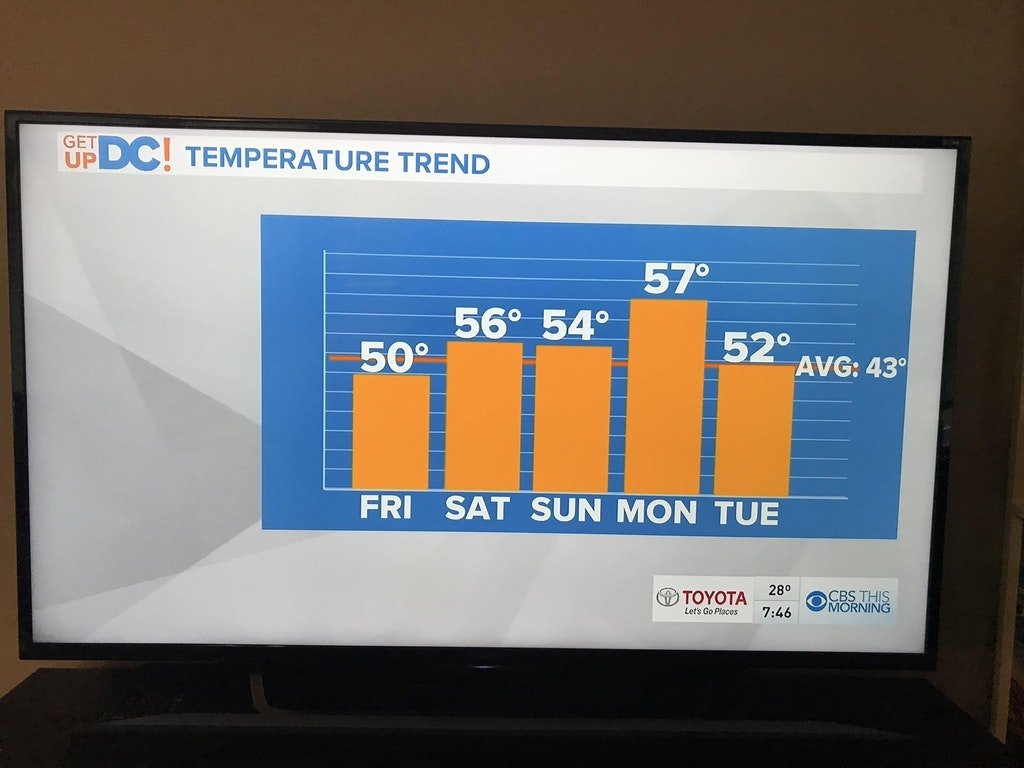
Not sure we can believe University of Texas graduation rates given this graph h/t @phillipoung
A 381% pie chart reddit.com/r/dataisugly/c…
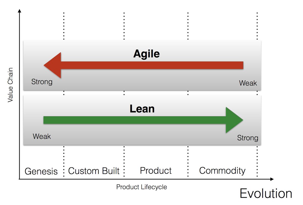
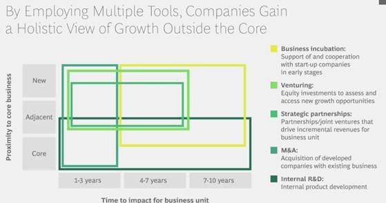
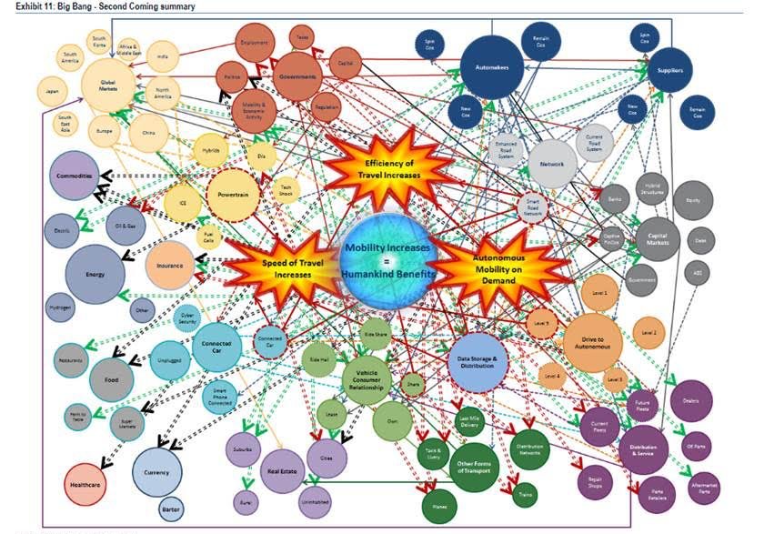
We have no idea where to begin on this rollercoaster of a consultant framework
Another sweet innovation framework
Square venn diagram + Similar colors + Jargon = Winning
Square venn diagram + Similar colors + Jargon = Winning
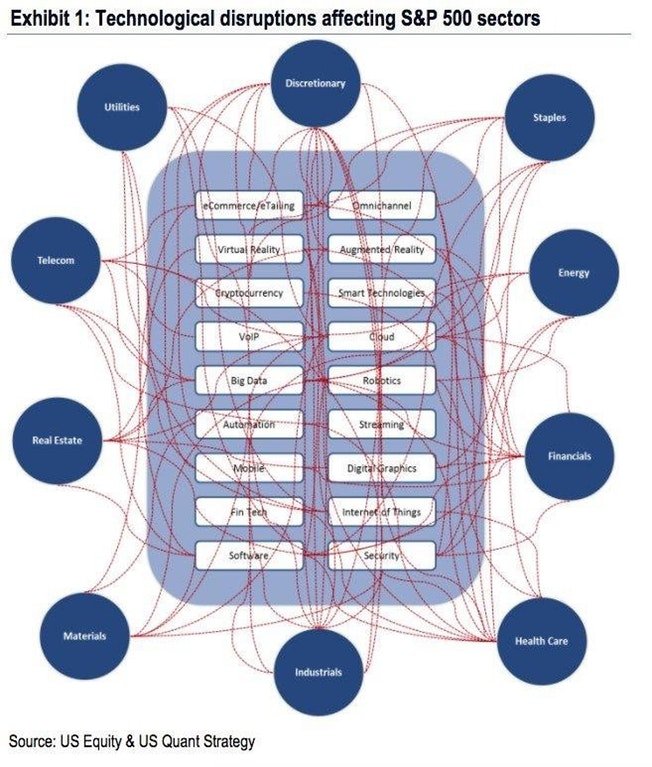
This is a very disruptive visualization reddit.com/r/dataisugly/c…
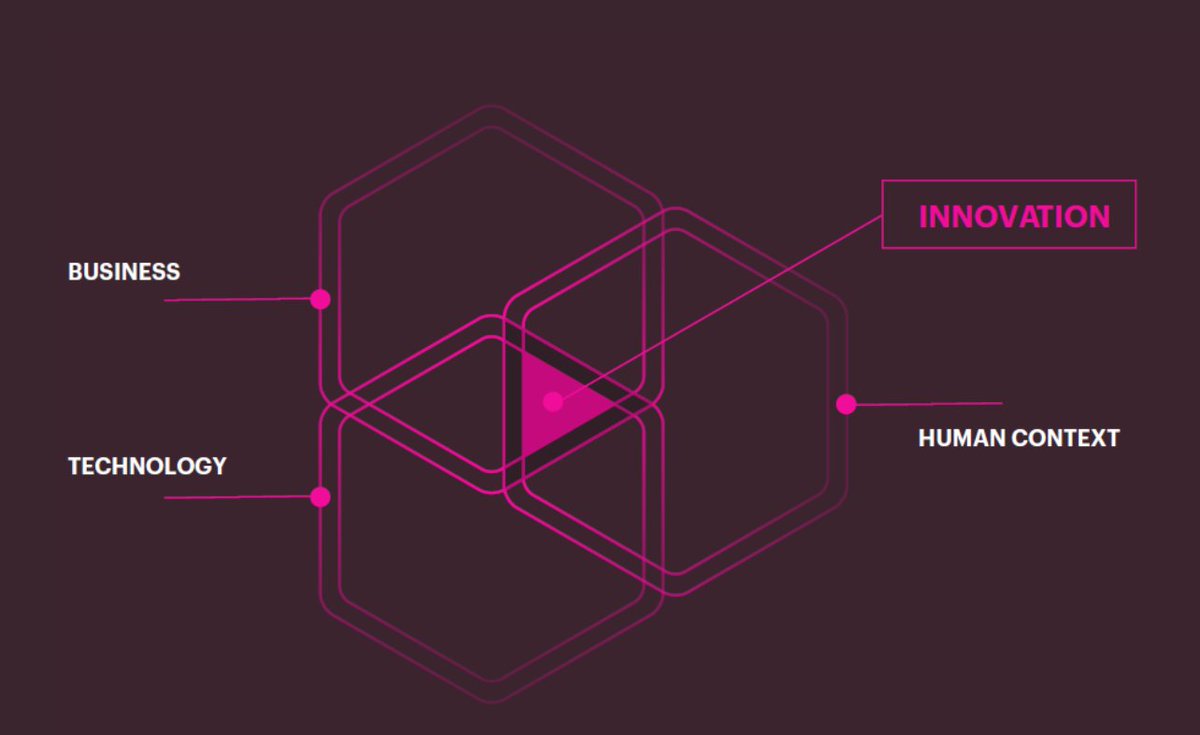
Business + technology + human context = Innovation
profoundly meaningless gibberish
congrats consultants!
profoundly meaningless gibberish
congrats consultants!

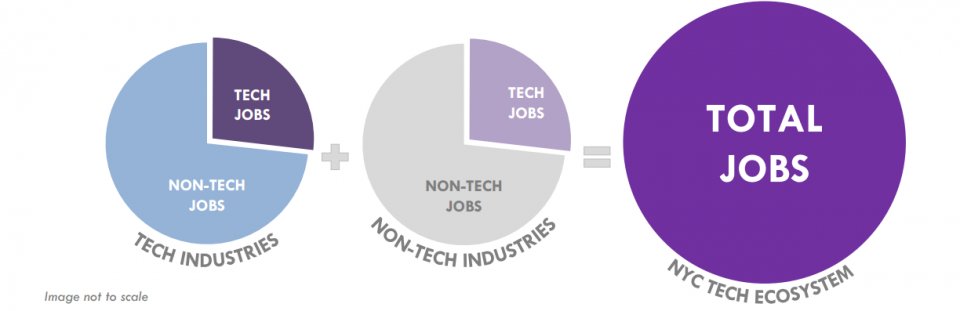
The "image not to scale" was a helpful footnote on what are otherwise, 3 very meaningless pie charts

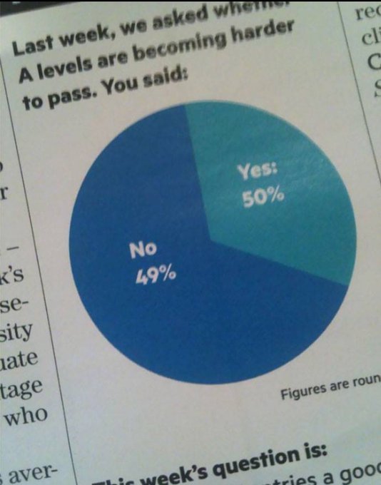
Yes. Definitely yes.
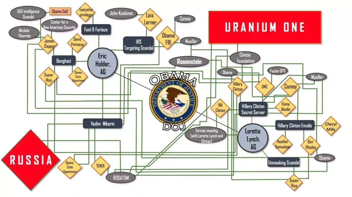
This simple flowchart explains the whole Russia - Uranium One issue
Just simply follow along and voila
washingtonpost.com/news/politics/…
#dataviz
Just simply follow along and voila
washingtonpost.com/news/politics/…
#dataviz
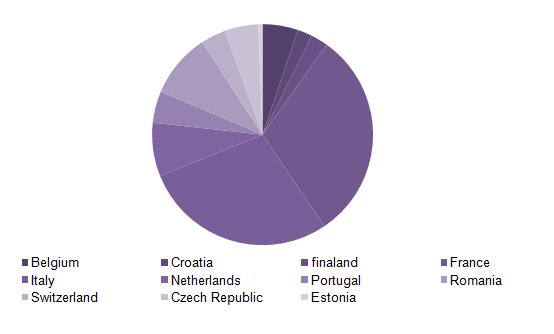
This pie chart needs a bit more purple
We take a break from bad pie charts to share this good one
We have no idea what this is trying to illustrate but it seems important i.redd.it/ujsdi40n6c601.…

Bad dataviz transcends languages
It transcends borders
It brings people together
Here is a beauty sent to us by one of our awesome newsletter subscribers from Sweden
It transcends borders
It brings people together
Here is a beauty sent to us by one of our awesome newsletter subscribers from Sweden
Dear Mr Consultant,
Until you made this, we had no idea what our strategy should be.
After seeing this, we still don't.
Thank you so much. We hope the fees we paid you got you a nice vacation
Sincerely,
Your poorer client
h/t newsletter subscriber Dean Wormell
Until you made this, we had no idea what our strategy should be.
After seeing this, we still don't.
Thank you so much. We hope the fees we paid you got you a nice vacation
Sincerely,
Your poorer client
h/t newsletter subscriber Dean Wormell
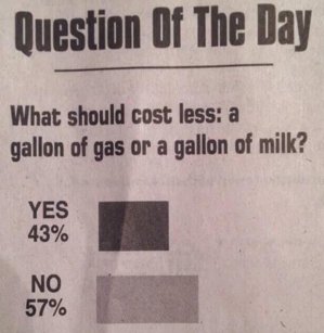
Yup - not how bar charts work i.redd.it/5frdduusg1b01.…
Q: Is this even a pie chart?
This non-sensical graph is from the World Economic Forum and somehow illustrates that "perfectionism has become a hidden epidemic among young people"
weforum.org/agenda/2018/01…
h/t @hanskunisch
weforum.org/agenda/2018/01…
h/t @hanskunisch

Good lord
This data viz is explosive
This data viz is explosive


