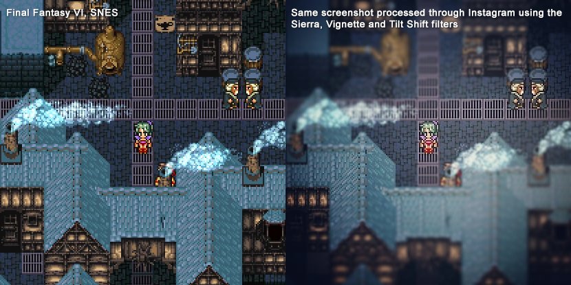
Octopath is a beautiful game in many regards. It has GREAT sprite art and designs and overall art direction. The team behind it are some of the best artists in the world. However, the color grading filters really flatten everything out. 

Look at the roof tiles in Octopath. They're just different shades of blue. Look at the roof tiles in Narshe in FF6. They're warmer under the glow of the moon and cooler in the shadows. A human being selected every single color. It's conveying much more information with much less.

Here's a quick and dirty photoshop analysis of the colors used in the Octopath Roof tiles (left) vs Final Fantasy 6 (right). Octopath is just blue moving towards white or black. FF6 has blue, green, red and yellow, of varying levels of saturation and value.


^Don't take that last tweet too seriously as Photoshop is picking up on a lot of colors that got added from compression (The actual SNES tile probably has less than 16 colors). But If you just use your eyes you can see the huge difference.
Look at this screenshot of Xenogears compared to Octopath. Which image looks more dimensional and naturalistic to you? How does the image on the right benefit from filtering?

Every inch of Xenogears is rich with good color choices. Even something that's easily taken for granted like the dirt has both warm and cool tones working together to convey the sense of mud without looking murky and muddy.

I have no doubt that the raw pixel art in Octopath also has these rich color choices. A little tiny bit of the hue variation can still be seen. But it's all hidden under the filters that really limit the color range of the final image on screen.
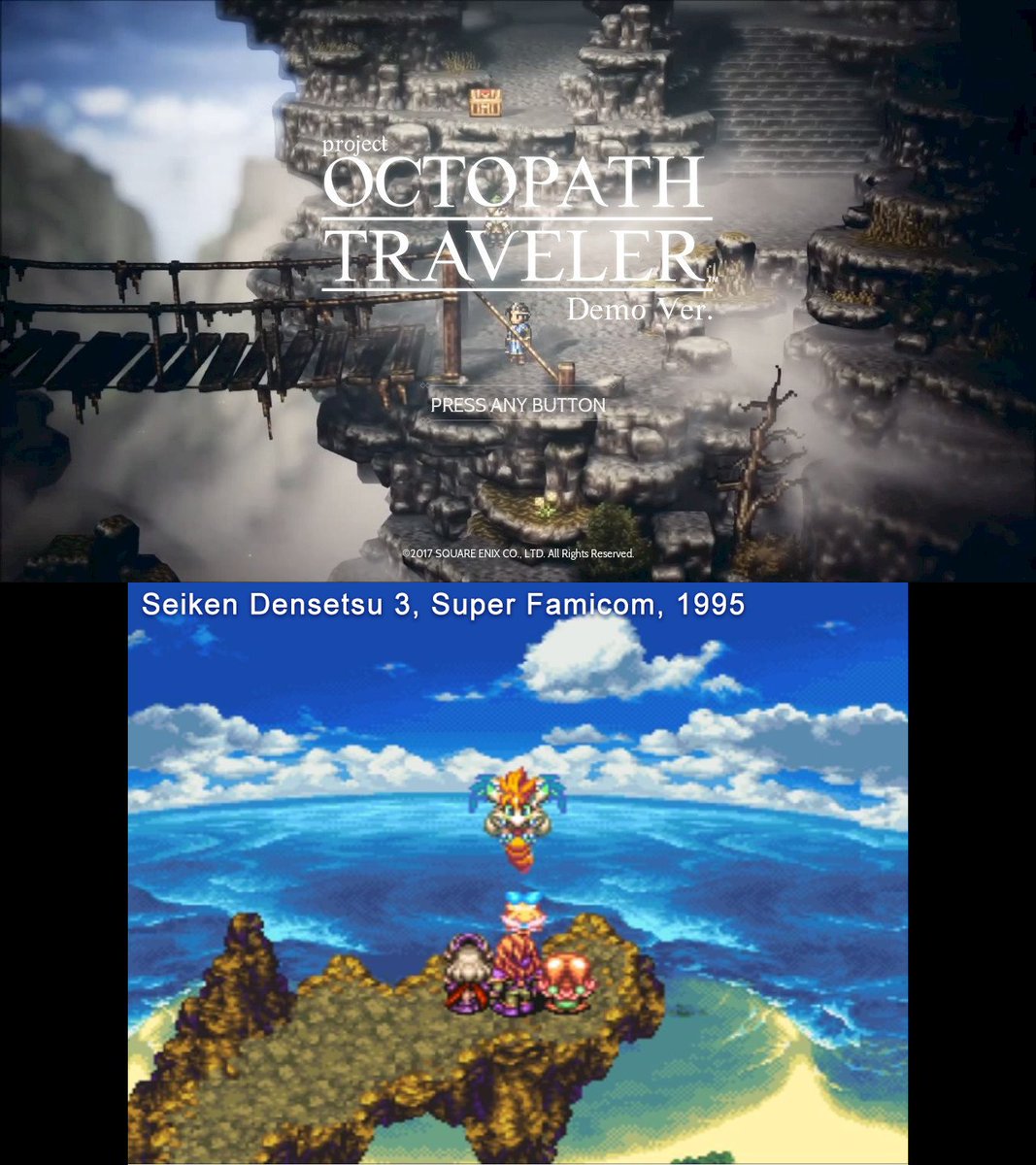
Compare Octopath Traveller to Seiken Densetsu 3 and the differences are very stark. Seiken Densetsu 3 ran on the SNES, which had a limit of 256 colors on screen. Octopath has millions to choose from. But Sieken Densetsu 3 looks much richer and fuller.

Due to the limits of the SNES hardware, artists had to carefully select every single color on screen. This results in very lush, robust imagery because everything has been optimized by hand. The resolution and number of colors may be lower, but the sophistication is VERY high.
Now take a look at Legend of Mana, one of the most beautiful games ever made! Even though the PSOne was capable of displaying hundreds of thousands of colors on screen (not millions actually) they retained the lessons they learned from the 16bit days and kept it efficient.
Bravely Default, made by the same team as Octopath, also retains all these lessons from the early days. It's colors are ON POINT. It's like a living classical painting. So it's not a lack of ability that drove them to rely on color grading in post so much for Octopath.
It's fun to see SquareEnix explore and try new things. I just hope they don't stay on this (Octo)path of overuse of color grading, which is something that I personally don't like about a lot of games and films of the last 20 years. I want to see SquareEnix lead instead of follow.


Like, what is the benefit of the color grading here? That's supposed to be a hot desert, bleached by the sun right? Why the cool green filter and fog/heightened atmospheric perspective? That just makes it feel more damp and overcast. Like you're in london not the dry clear desert


No disrespect to the art team behind Octopath. They are some of the best artists out there. No doubt the decision to rely on color grading was a conscious exploration of contemporary trends. And there are parts of the game where the local colors seep through and it's gorgeous.

Anyway, it's still a great game. I hope I haven't dampened anyone's enthusiasm for it. I just wanted to explain why I personally dislike heavy reliance on color grading. All that said, SquareEnix is still using these techniques far better than most, and in very unique ways too.
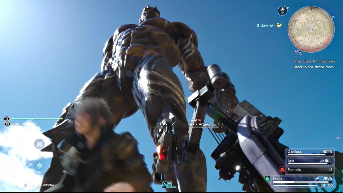
I want to reiterate: I'm not saying older/retro=better. Bravely Default provides a classic RPG experience with modern execution. It's a BEAUTIFUL game. And FFXV has some of the best, most tasteful, realistic, artful lighting out there! (And neither is reliant on color grading!)