Hey, y'all! I redesigned and relaunched my website! I'm particularly fond of the new bibliography. And... is that a blog? Check it out here: aidanmoher.com
🏗️ Thread: Since this is what I do for a living (building and designing websites), I wanted to talk about author websites and how I thought about mine as I created it and filled with with content.
First, I reached out to my followers to see what they wanted from an author website. I used the feedback here (plus research via visiting websites by several prominent SFF authors, like @MaryRobinette and @KameronHurley) to guide my design.
I'll get into the specifics of that feedback in a moment, but the overwhelmingly obvious consensus was that information should be easy to find. However, each type of visitor is looking for something different.
New/potential readers want to know about your work. Fans want to know what you're up to (blog/news). Editors and agents want to know how they can contact you.

It's all got to be right there and obvious regardless of the visitor's goals.
So, I went with a fairly traditional architecture for the site:

- Homepage/About
- News & Blog (We'll get to that later)
- Bibliography
- Elsewhere
- Contact / Press Kit
Let's go in order, starting with the homepage. @hannahnpbowman provided strong feedback for having a homepage that gives an overview of who the author is and what they've done.

While @the1germ suggested a hybrid approach that provides that same information, but also brings the blog/news section right to the forefront. I liked this marriage of the two styles.
So, the homepage of my site starts with a short bio, and continues with excerpts from my recent blog posts/news items. Thanks to the site-wide sidebar, it also has up-to-date information about my latest stories, how to support me, and other fiction I've written.
I spent a lot of time developing the bibliography. This page separates my books from my short fiction/non-fiction. It's clean, provides multiple ways to read/purchase the work, and also provides pertinent publishing info like word count, first publisher, and publication date.
I write in several different venues, which can make it difficult to follow my work if you don't catch me linking to it in the moment on Twitter. "Elsewhere" is a simple collection of hand-picked essays/reviews/etc. that I've published around the web.
Contact / Press Kit serves 2 purposes:

- Allow people to easily get in touch with me.
- Provide editors with easily accessible bios and other press material.

I shamelessly stole the idea for the 20/50/100 word bios from @MaryRobinette, and think every author should do the same.
So, as you can see, everything's been designed to provide visitors with the information/content they're looking for as easily as possible.
At this stage of my writing career, some of this might be jumping the gun—however, it's very important to future-proof this sort of thing, and it never hurts to be over-prepared when it comes to professionalism.
As for the design, my major focus was cleanliness and easy readability. I began by choosing a font/combo that I liked:

- Sans-serif: fonts.google.com/specimen/Lato
- Serif: fonts.google.com/specimen/Lusit…
I took inspiration for the typography from several places—Medium, newyorker.com, Slate.com, newyorktimes.com, etc. To begin with, I tried to emulate the look and feel of a newspaper. Clean. Limited color. However, this proved to be a bit sterile.
So, I brought in the background image. You don't sit on a @juliedillon original—it's gorgeous, and I wanted to evoke A Dribble of Ink (which I'm best known for) without *being* A Dribble of Ink. The image worked perfect to remove the sterility and add character.
All of this is built on a Wordpress backend. I used a custom post type and custom fields for the bibliography—so each book is its own entity in the database and can be displayed around the site where needed.
I also baked in responsive design from the ground floor, so the site will look great on all devices—phone, tablet, desktop, etc. A text-heavy approach to content also makes the site friendly for screenreaders. Accessibility is important.
I skipped over the News/Opinion section earlier, but now I want to return to it. I expect most of y'all know me because I started A Dribble of Ink, which ended up winning a Hugo and published a *ton* of great content from various writers over the years. aidanmoher.com/blog
I closed A Dribble of Ink about 3 years ago for various reason—I have a growing family, I wanted to work on writing fiction, and I'd accomplished everything and more that I'd set out to do.
But, there was another reason, too: online conversation and fandom were in flux and moving away from isolated platforms toward social media. Well, as we all know, that experiment has been... struggling, and I feel like there will be a shift back to creator-owned platforms.
I've blogged sporadically on Medium, have written a lot for @tordotcom and @BNSciFi, which I'll continue to do, and earlier this year, started blogging and reviewing again on Patreon. (Which, if you're into my stuff, is a good way to support my writing.) patreon.com/adribbleofink
However, I've found it immensely difficult to create any pickup of my content at Patreon, and, as @scalzi (I think) has always said, it's important for a writer to own their platform. This all led to a decision I've been mulling for several months: starting up a new blog.
Now, this ain't A Dribble of Ink. It won't be a large platform. I won't be inviting guest writers over. I won't have contributors. It won't have the magazine-style focus on feature articles. Instead, it'll be a continuation of what I've been doing on Patreon: news and opinions.
It'll be a place where I can chat about the books I'm reading, the games I'm playing, the projects I'm working on. The internet home I've been looking for for the past three years. It feels good.
It's obvious that an author needs a place to spread news—in my case: WIP updates, short story sales, new publications, etc. But a blog serves another purpose that, with today's struggling social media, remains important: giving the author a voice.
This was something that @BardGroupie brought up when I was soliciting advice for a website:
Social Media is great at a lot of things. However, it's next to impossible to carve a niche and have your voice consistently heard. Even when you have 5k+ followers like I do. Having a singular home, where you can clear out space around your content is wonderful.
So, now I want to talk about the blog's design, because a lot of thought went into it. First, a few people have noted that the design for the blog differs slightly from the main site. There's a few reasons for this.
First off, I *want* the blog to feel a little different—like its own thing, rather than a dull extension of the main site. It won't be focused solely on *my* work and news, and I want visitors to understand that right off the bat.
The sidebar is a lot more minimalistic than the main site. This was intentional, too. It's got links for people to support me and categories. That's it. I want something clean, that encourages readers to interact with the blog content, rather than wander off.
I also wanted a content area that was narrower and centred. Being narrower and using a larger font improves readability and mimics a lot of the nicely designed magazine-style websites I mentioned earlier.
The words are always the most important part of a blog, and I wanted those front and centre. I doubled-down on this by giving each blog post its own "card," which further individualizes them.
Since I'm moving away from blogging directly on Patreon (which desperately needs an update for its writing/sharing tools), it was important that I encourage readers and fans to support the work I am doing on the blog. So, each post features encouragement to share and support.
(A lot of inspiration for the direction of the blog came from a helpful conversation with @KameronHurley and @MikeRUnderwood.)
All of this will, I hope, lead to a great experience for readers, and a solid, predictable platform for my writing. I'll still be writing longer, more intricate stuff for other websites, but now I have a casual platform for writing, too.
The new blog is already loaded with content, including reviews of books, essays about things I love, a long love letter to my favourite RPGs, and an in-depth look at my WIP novel, THE THOUSAND SHATTERED GODS: aidanmoher.com/2018/08/13/wor…
I'm fortunate to have the experience and skillset from my day job to do all of this work myself—however, for those of you looking to hire a web designer to re/build your website, I hope there's information here that you can use to help share and articulate your vision.
If you found this thread useful, there are a few ways you can kick back the favour:

Support me:

☕️ Ko-fi: ko-fi.com/aidanmoher
🍀 Patreon: patreon.com/adribbleofink

Or read and share some of my stories: aidanmoher.com/bibliography/
I'm also happy to chat about this sort of thing, so if you've got questions I didn't answer in the thread, give me a shout.

Thanks for listening.
Missing some Tweet in this thread?
You can try to force a refresh.

Like this thread? Get email updates or save it to PDF!

Subscribe to Aidan Moher 🦖 READ YOUNGBLOOD RAWR
Profile picture

Get real-time email alerts when new unrolls are available from this author!

This content may be removed anytime!

Twitter may remove this content at anytime, convert it as a PDF, save and print for later use!

Try unrolling a thread yourself!

how to unroll video

1) Follow Thread Reader App on Twitter so you can easily mention us!

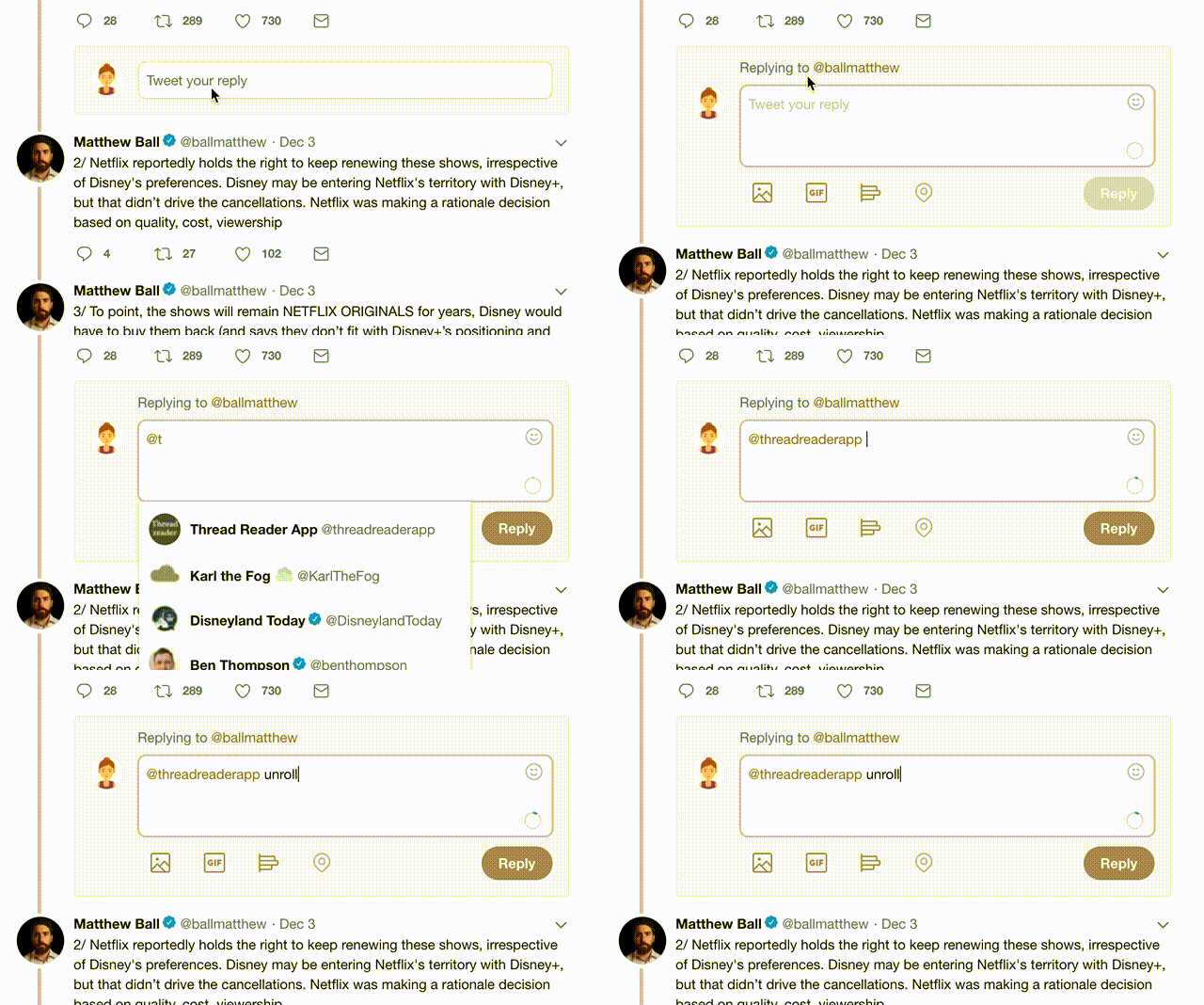
2) Go to a Twitter thread (series of Tweets by the same owner) and mention us with a keyword "unroll" @threadreaderapp unroll

You can practice here first or read more on our help page!

Did Thread Reader help you today?

Support us! We are indie developers!


This site is made by just three indie developers on a laptop doing marketing, support and development! Read more about the story.

Become a Premium Member and get exclusive features!

Premium member ($30.00/year)

Too expensive? Make a small donation by buying us coffee ($5) or help with server cost ($10)

Donate via Paypal Become our Patreon

Thank you for your support!