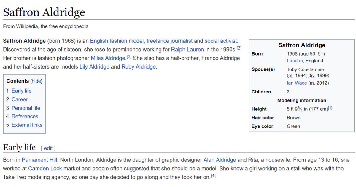
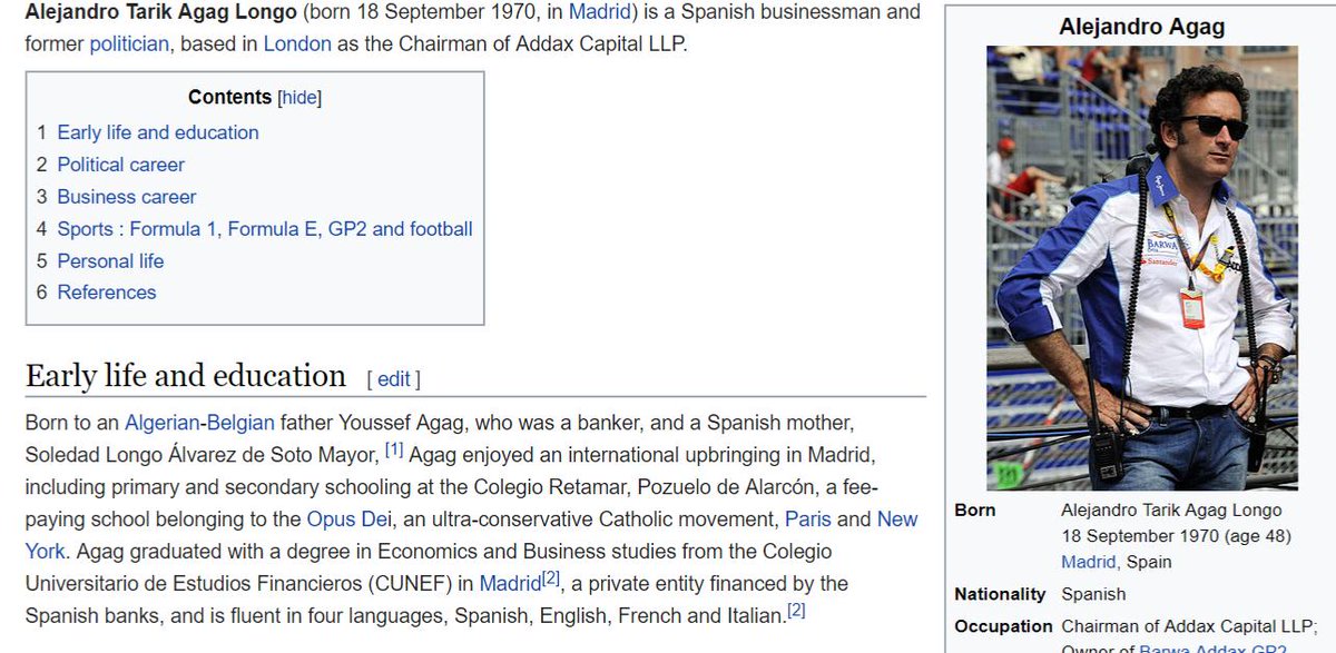
The principal form of website identity is like google.com
Also show extra information through Extended Validation certs, like show cert is associated with a legal entity
Like in cars, check engine light comes on when there's a problem.
Result: it has effectively no effect [🔥🔥🔥]
Result: it doesn't matter. Showing the wrong code, showing no country code. Users didn't notice.
Result: they looked in the same places but didn't see the issue.
Best quote: "I never noticed the MX on a PayPal page, but it seems legit"
Used eyetracking studies to see where people looked for Safari UI. Basically the same.
... few noticed anything strange
* EV UIs fall short, doesn't provide good defense, users don't act differently
* Recent POC attacks would likely to be effective in the wild
* Simple tweaks don't seem to be enough
For example: Chrome experimenting with "lookalike" warning. If a user goes to a site and going to something that looks really similar, shows interstitial warning page.
We should use user research to know if we're helping users understand the sites they visit.
A: Yes, this is why we're approaching these things carefully, analyzing false positives, monitoring in the wild, etc.
A: simplest heuristics are things like being off by 1 character, but I didn't implement all of this so chat offline
A: there are things on the policy and implementation level for identity verification
[ tl;dr it's not strong indication of anything but that was said politely ]


