, 13 tweets, 3 min read
My Authors
Read all threads
Seems like a lot of #graph visualization stuff cues off of humans' tendency to want to reason about things in terms of either time, or space.
In a force-directed layout, effectively you have an x/y axis and you're reasoning about the graph in space, where "distance" is used as a proxy for path length.
there are also a lot of Google Earth representations, that try to render the spatial view as more tangible

"Crap on a map" has worked really well for a long time because brains are good at reasoning about known physical spaces
We're also good at thinking about time & durations, so surprisingly graph visualizations that are laid out on timelines are very popular, assuming you have a temporal ordering
I'm sure Edward Tufte could say this better than me: but all 2D spatial layouts are "translating" some salient semantic aspect of the graph into 2 variables: your X and Y coordinate in the plane
This is why it's hard, and goes off the rails so quickly, and why there are so many BAD graph visualizations; because the semantic "translation" from salient feature of interest to X,Y is either unintuitive, doesn't make sense, or both.
Step further: what is a "salient feature"? What are we trying to show?

You have to know what you want in order to identify a thing which would help you with that task.
Force-directed layouts tend to be open-ended "exploratory". They work with every graph, but as a consequence they're not deeply powerful or "the right way to look at it" for any graph.

The good 'ol power/generality tradeoff at work.
Maps go the other way: they ASSUME the salient aspect of the graph is physical space, and lay it out that way. If that's true, maps are great. If you need to see some other salient aspect (but happen to have geospatial data) then you've got "crap on a map".
The moral of the story is that there's no one clear simple answer. Most common mistake I see is people starting with the visualization design before they know exactly who will use it, and what they need to get out of it.

They get stuck pretty fast.
A better thought process goes:

1. Who uses this viz?
2. What do they need from it?
3. What does that then mean is the salient feature?
4. Should users even see a graph? (Likely no!)
5. Which viz format best lays bare the salient feature?
Finally: if you do this, you might discover that in many cases "graph visualization" is a red herring. Most people, most scenarios, don't want graph visualization. They need a system which answers a small handful of key questions, *on the basis of graph data*.

Biiig difference
Remember to tip your servers, 2 drink minimum, and stay tuned for other future tweet storms like the power/generality tradeoff, the top dog data modeling problem, and why the rent is too damn high
Missing some Tweet in this thread? You can try to force a refresh.

Enjoying this thread?

Keep Current with M. David Allen

Profile picture

Stay in touch and get notified when new unrolls are available from this author!

Read all threads

This Thread may be Removed Anytime!

Twitter may remove this content at anytime, convert it as a PDF, save and print for later use!

Try unrolling a thread yourself!

how to unroll video

1) Follow Thread Reader App on Twitter so you can easily mention us!

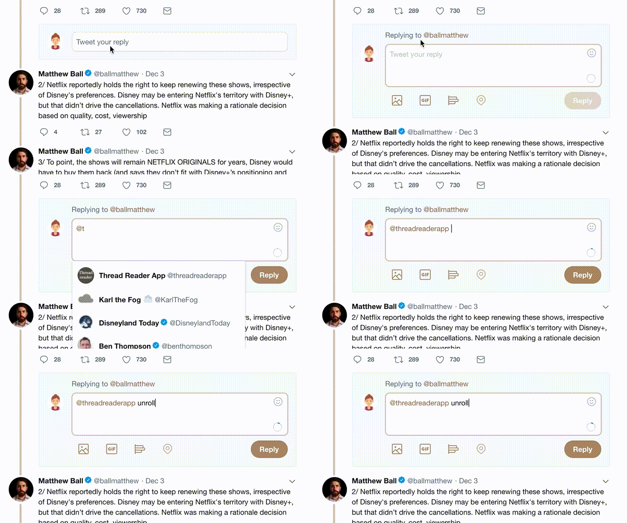
2) Go to a Twitter thread (series of Tweets by the same owner) and mention us with a keyword "unroll" @threadreaderapp unroll

You can practice here first or read more on our help page!

Follow Us on Twitter!

Did Thread Reader help you today?

Support us! We are indie developers!


This site is made by just three indie developers on a laptop doing marketing, support and development! Read more about the story.

Become a Premium Member ($3.00/month or $30.00/year) and get exclusive features!

Become Premium

Too expensive? Make a small donation by buying us coffee ($5) or help with server cost ($10)

Donate via Paypal Become our Patreon

Thank you for your support!