1/ The Log Growth Model also known as power-law corridor has gained a lot of fame recently. Based on it, the bottom is in and we can reach a Bitcoin price as high as 90k this year? The perfect channel fit is too good to be true I thought.
I was very surprised by what I found.
I was very surprised by what I found.
2/ Besides many Bitcoin logarithmic regression models that appeared in recent years (e.g. logarithmic regression by Trololo or Awe & Wonder), the first more scientific approach through defining a power-law channel for price and time was taken by @hcburger1 through the following
3/ Medium article (hcburger.com/blog/powerlaw/…) in September 2019. While many were amazed by this discovery and seemingly perfect relationship of price and time on a log scale, in November 2019, @BurgerCryptoAM published an article officially debunking the model from a statistician´s
4/ perspective (medium.com/burgercrypto-c…).
Beginning of this year, @ColeGarner published a great model walk-through and a Tradingview script for the Log Growth Curves became available. As more and more people became aware of it, @phraudsta took a similar approach as
Beginning of this year, @ColeGarner published a great model walk-through and a Tradingview script for the Log Growth Curves became available. As more and more people became aware of it, @phraudsta took a similar approach as
5/ @BurgerCryptoAM to proof the model false. Even though it was very clear by now that the relationship between Bitcoin´s price and time has no statistically meaningful relationship, I and probably many others were still left wondering how this could be such a perfect and
6/ seemingly highly rare coincidence? I decided to recreate the model myself to better understand potential subjectivity and to figure out how much of a coincidence this relationship really is.
First of all, I am not a mathematician nor statistician. I studied finance and took
First of all, I am not a mathematician nor statistician. I studied finance and took
7/ basic math and statistics courses. Therefore, this thread is not meant to confirm the falsification by @CryptoBurgerAM or @phraudsta but rather to understand the falsification from a practical point of view based on my personal experience recreating it and eventually shedding
8/ some light on how rare this coincidence might really be. There are million ways to approach it, this is my personal intuitive, non-statistician / mathematician take on it.
Alright, let´s get to it!
Let´s start from scratch and plot the Bitcoin price first.
Alright, let´s get to it!
Let´s start from scratch and plot the Bitcoin price first.
9/ The X-axis shows the days passed since inception of Bitcoin and the Y-axis shows Bitcoin´s price at each of these days. Both axes are non-log, meaning on linear scale, e.g. just as you look at any other stock chart.

10 / In order to better see Bitcoin´s price development, using a log scale for price has become very common as Bitcoin´s price has gone parabolic over and over again. Let´s have a look at it putting the Y-axis on log scale.

11/ In order to arrive at the power-law corridor used by the Log Growth Model, I also have to put the X-axis on log scale. This leads me to the following chart.

12/ One can already notice that price data for the first 561 days is missing. As Bitcoin was mostly traded peer to peer back then, there is barely a price history available, but rather a few data points one could use. For ease of use, I will stick to the price data from
13/ @coinmetrics which starts on 7/18/2010. Let´s keep this missing price data in mind as it becomes relevant later on. For ease of visualization, I will let the chart start on day 500 for now and let´s see if we can draw a bottom and top line next.
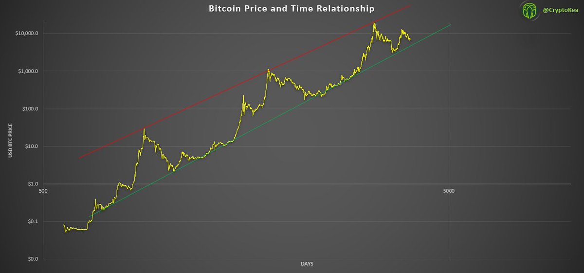
14/ The top line looks very good now as it touches all major three peaks. From my point of view, fitting the bottom line, however, is very subjective and could be fitted in many different ways. When trying to find the most touch points, I would personally arrive at the bottom
15/ line above.
As an alternative to manually fitting the bottom line, one could also use a regression line as a trend line (orange) and mirror the bottom line to it as follows.
As an alternative to manually fitting the bottom line, one could also use a regression line as a trend line (orange) and mirror the bottom line to it as follows.

16/ Now that we have a trend line derived from the regression (orange) and mirrored the bottom line to it (green), it can be seen that the difference between manual fitting and the regression approach is extremely close. However, in both cases the bottom line does not touch the
17/ last bear market low in December 2018. Why do other models have such a perfect bottom line? Since this chart is on log scale, a minor change can already cause huge deviations. Therefore, I assume it highly depends on chosen price history, data source or starting day of

18/ the model but more to that later. Let´s move on and change the X-axis from log to linear again. Let´s start the axis from 0 days and split it in 365 days to better infer the years and extend the price range to 1 Mio. USD to be able to project the price development based on

19/ the new trend lines. Here is my Log Growth Model derived from a power-law corridor based on my personal subjective starting points and fittings. Now let´s add the year-end values (bottom-, trend-, and peak line) to better see where BTC prices could be at in the next years.
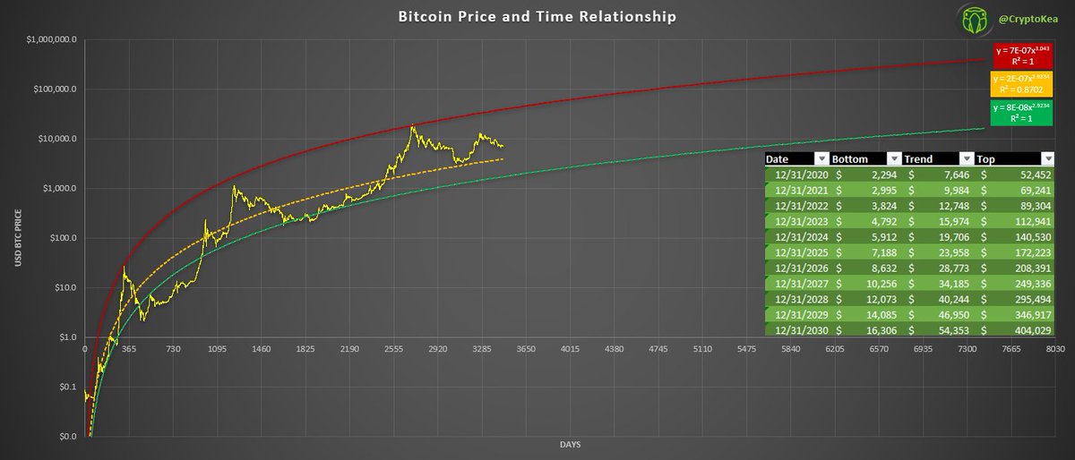
20/ There we go, peak prices of 90k in 2020, 133k in 2021 and 193k in 2022 are on the table. If I wanted that model to look perfect, I would adjust price data, source and starting point until it also touches Dec 2018 bottom. Nevertheless, this relationship looks still amazing.
21/ That can´t be a coincidence, right?
A few takeaways of mine so far:
- Bottom line involves a lot of subjective fitting, using regression doesn't make it fit much better
- While bottom line could be derived from regression line, top line is "just" a best fit based on peaks
A few takeaways of mine so far:
- Bottom line involves a lot of subjective fitting, using regression doesn't make it fit much better
- While bottom line could be derived from regression line, top line is "just" a best fit based on peaks
22/
- Chart starts at inception date despite missing price data for first 561 days
Let´s see how sensitive this model is to subjective changes. Let´s create the same chart
- Chart starts at inception date despite missing price data for first 561 days
Let´s see how sensitive this model is to subjective changes. Let´s create the same chart
23/ but instead of starting from Bitcoin´s inception day (as done by many who created Bitcoin Log Growth Models), let´s set day 0 to the starting date of the price history (7/18/2010) which is 561 days later.

24/ When I try to find the best fitting top line and the best fitting bottom line now, I already notice how difficult it has become and how off the chart looks like. Suddenly, there is neither a good fitting top nor bottom line, whether using manual fit or basing it off of the

25/ regression line.
Let´s use the bottom line derived from the regression line as it touches bottom prices over a longer price history. I know, a very subjective choice again.
Let´s use the bottom line derived from the regression line as it touches bottom prices over a longer price history. I know, a very subjective choice again.

26/ Curious what the new bottom and top targets are? Despite the bad fit, let´s put the x-axis back into linear scale and paste the new targets in to see how much the price targets have changed.

27/ By changing the starting day to where price history starts, the lowest year-end target dropped from $7.9k to $2.3k while the highest year-end target dropped from $89.4k to $52.4k. One could argue whether setting day 1 to Bitcoin´s inception day despite missing price data or
28/ to the day the price history starts is correct. It should rather show how subjective model parameters are and how quickly changing a parameter such as a starting date can change the entire course of the log curves.
Takeaway:
As time and price are on log scale, a simple
Takeaway:
As time and price are on log scale, a simple
29/ change as changing the starting day can drastically change the power-law corridor and by that substantially change price targets.
Going back to the power-law corridor starting from Bitcoin´s inception, I was also wondering how rare this coincidence of log time and log price
Going back to the power-law corridor starting from Bitcoin´s inception, I was also wondering how rare this coincidence of log time and log price
30/ running in such a perfect channel could be? Shortly after looking at some other data, I stumbled upon many other good-looking power-law corridors.
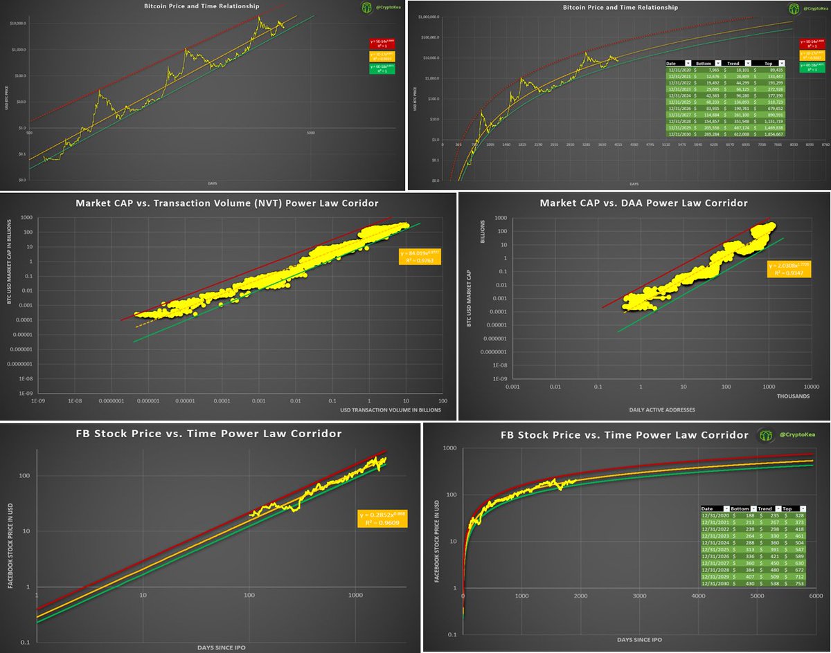
31/ The X-axis is Daily Active Bitcoin Addresses, the Y-axis is the BTC USD market capitalization at that time. Both axes are on log scale. The coefficient of determination is very high, the channel almost perfect. This might just be a lucky find? On to the next one.

32/ The X-axis is the adjusted daily USD transaction volume of Bitcoin, the y-axis is the BTC USD market capitalization at that time. Both axes are on log scale. The coefficient of determination is very high, the channel almost perfect. This is all Bitcoin data, no wonder that

33/ it produces such a perfect fit corridor? Alright, let´s look outside of Bitcoin. On to the next one.
The X-axis are the days since Facebook launched on a stock exchange, the Y-axis is the stock price at the respective day. Both axes are on log scale again. The coefficient
The X-axis are the days since Facebook launched on a stock exchange, the Y-axis is the stock price at the respective day. Both axes are on log scale again. The coefficient

34/ of determination is decently high, the channel almost perfect.
Hmm, to be honest, it doesn´t look very satisfying yet and the coefficient of determination is not very high. How about we adjust this chart as it was done with the power-law corridor of Bitcoin? Not having a
Hmm, to be honest, it doesn´t look very satisfying yet and the coefficient of determination is not very high. How about we adjust this chart as it was done with the power-law corridor of Bitcoin? Not having a
35/ price for 561 days but still starting the model from day 1? Just that we cut only the first 100 days of price data here.
36/ There you go. This is a wonderful power-law corridor now. It is even so perfect, that we can derive the top and bottom line from the regression line and the coefficient of determination is very high, too.

37/ Let´s move on and put the X-axis on linear scale again and add the year-end values (bottom-, trend-, and peak line) to see where, based on this model, Facebook´s stock price could be in the next few years.

38/ Would you bet the farm on this projection? Probably not. With these examples I just wanted to show that if you keep looking, you will find enough good-looking power-law corridors and by that Log Growth Curves, meaning Bitcoin´s price/time power-law corridor is not as rare as
39/ it first might have seemed.
My overall, personal findings of recreating the Log Growth Curves:
- Bottom line for Bitcoin´s power-law corridor involves a lot of subjective fitting
- While bottom line could be derived from regression line, top line is still "just" a best fit
My overall, personal findings of recreating the Log Growth Curves:
- Bottom line for Bitcoin´s power-law corridor involves a lot of subjective fitting
- While bottom line could be derived from regression line, top line is still "just" a best fit
40/
based on peaks
- As time and price are on log scale, a simple change as changing the starting day can drastically change the power-law corridor and by that the outcome
- Bitcoin´s power-law corridor is by far not rare
based on peaks
- As time and price are on log scale, a simple change as changing the starting day can drastically change the power-law corridor and by that the outcome
- Bitcoin´s power-law corridor is by far not rare
41/ For me, going through this journey was important to better understand not only why there is no relationship between time and price but also how much subjectivity is involved in creating the power-law corridor / Log Growth Curves and how non-rare Bitcoin´s power-law corridor
42/ really is. Therefore, this model is fun to play with but I do not use it to base any personal investment decision on it.
What I found to be interesting though is, that most good-looking power-law corridors outside of Bitcoin were price/time relationships of companies in a
What I found to be interesting though is, that most good-looking power-law corridors outside of Bitcoin were price/time relationships of companies in a
43/ high growth phase. Therefore, my best guess is, that Bitcoin´s power-law corridor is not driven by price to time but rather by price to an adoption metric (e.g. see DAA, NVT charts). However, research needs to be done in this area to proof or falsify my gut feeling.
44/ Maybe @BurgerCryptoAM or @phraudsta would be interested in looking into it 😉?
As I do these walk-throughs often just for myself to better understand new models/approaches, I am happy to share more of my personal journeys through the Bitcoin universe
As I do these walk-throughs often just for myself to better understand new models/approaches, I am happy to share more of my personal journeys through the Bitcoin universe
45/ if enough interest is there 😊! Therefore, I would highly appreciate a like and retweet😉!
Have a wonderful weekend everyone!
Have a wonderful weekend everyone!
UPDATE: I uploaded the wrong chart under 19/, please note that this one is correct.

UPDATE: Please note that I uploaded the wrong chart under 19/. The correct one is the following.