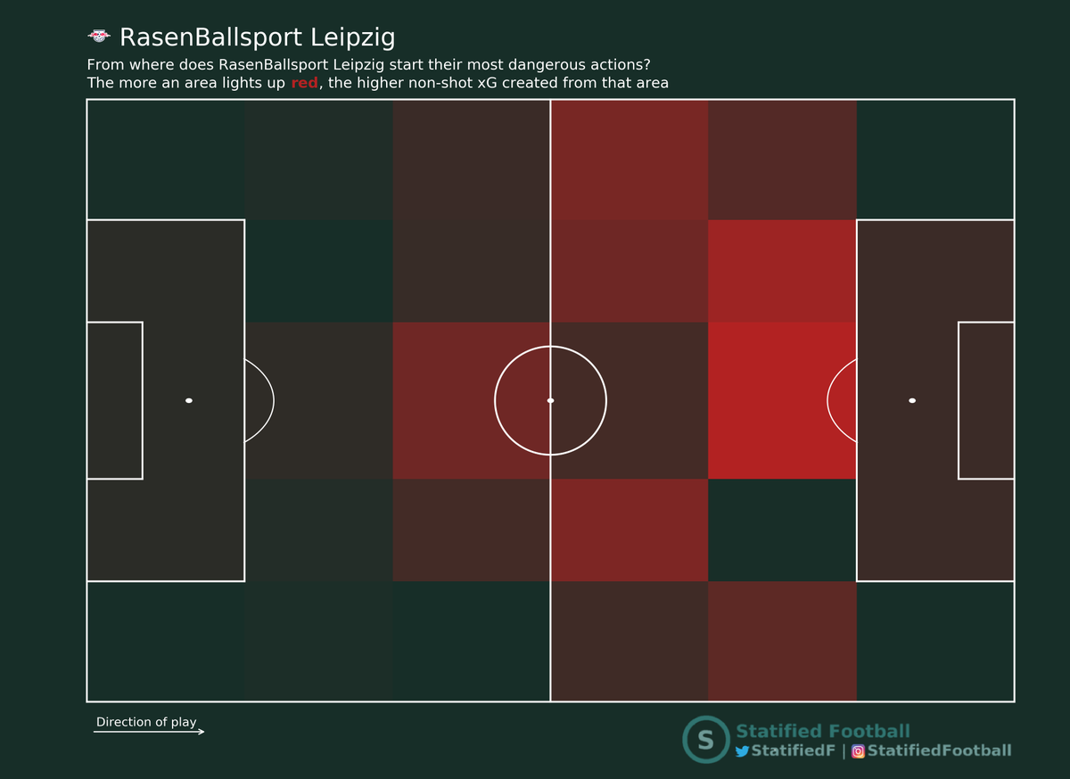
Time to introduce something I've been working on lately. It's called non-shot (NS) xG maps and they look like 👇
In this thread I'll try to explain what they are, why they're useful and how they can be used!
#xG #NSxG #football #data #analytics

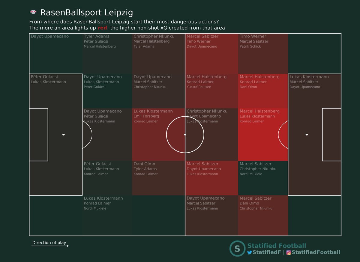
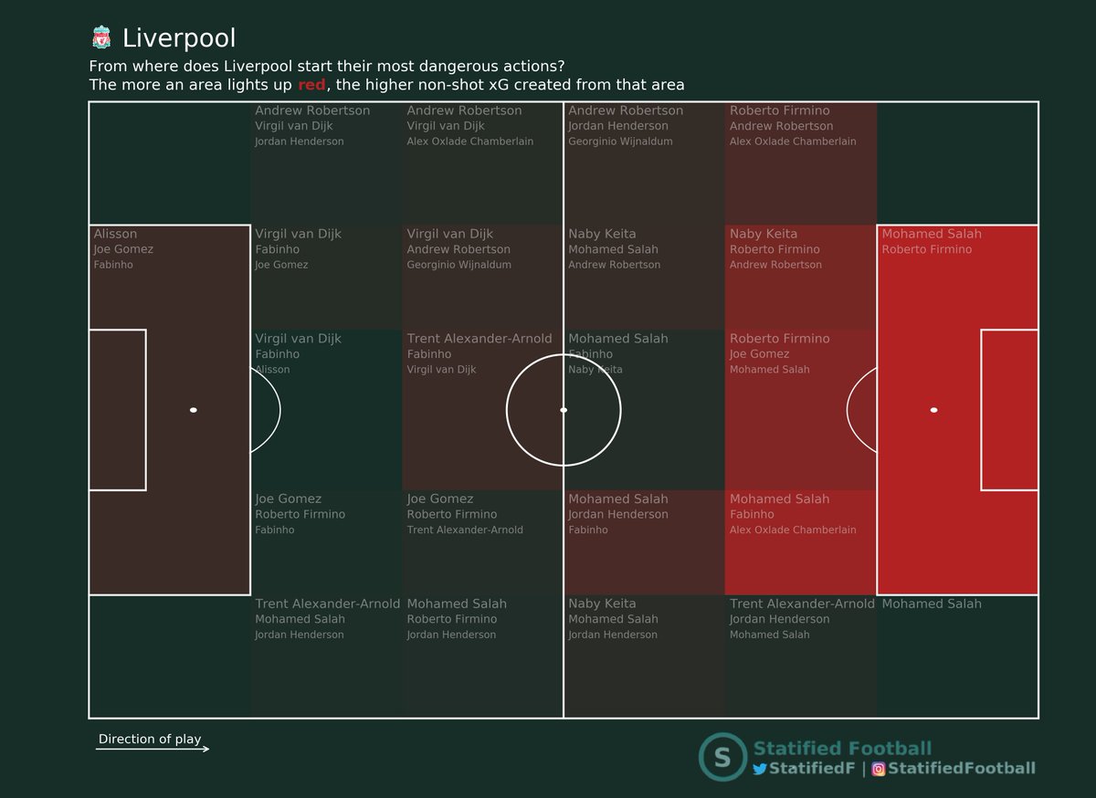
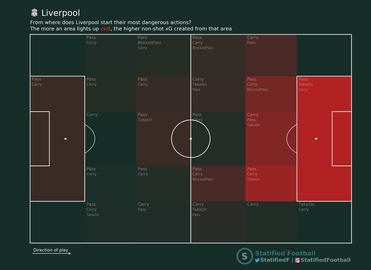
Usually analysts watch hours of video footage, in order to understand how a certain team plays: how do they create dangerous attacks? Which players are most dangerous?
▶️ Enter NSxG (or similar metrics like xT or PV)
By plotting in which area of the pitch a team makes their most valuable actions (mind you, we are not talking frequencies here!), we know where they get most dangerous from
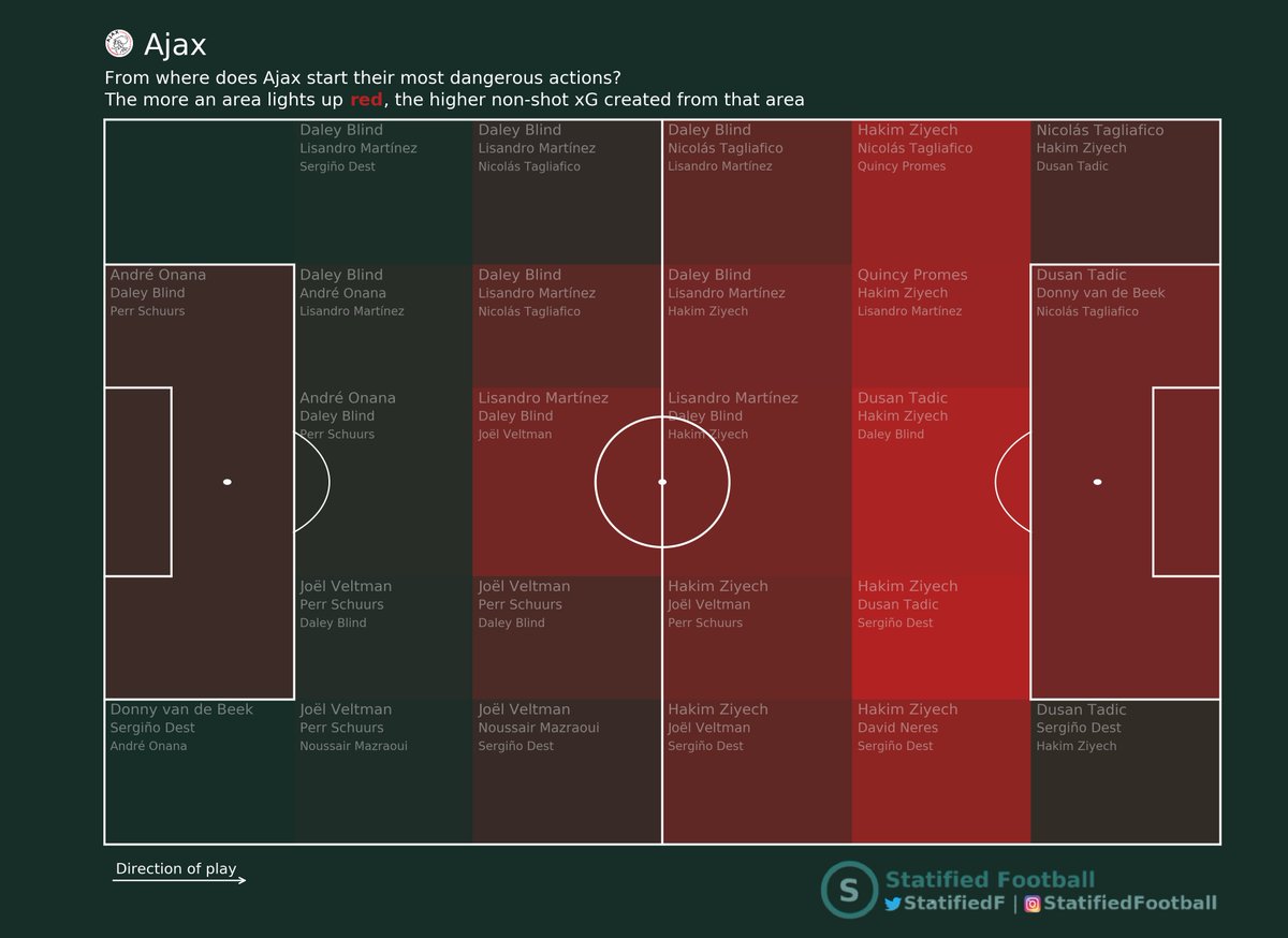
Here we see that #Ajax so far this season generates most threat from the right half space and the so-called "zone 14" (central area outside the box).

Well let's see, what does the data tell us if we add the 3 most influential players in every zone? Indeed, there's Ziyech! Together with #Tadic the most dangerous players in these zones!
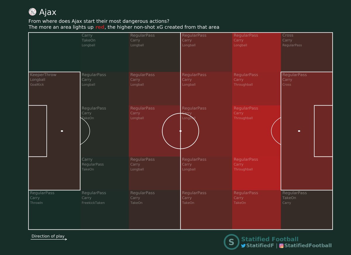
Below we see *how* #Ajax generates NSxG from every area of pitch. Mostly with regular passes (unsurprisingly).
We know which match events have the highest NSxG and for every event we know in which game at which time it took place.
But NSxG maps can also be generated per match. Or for the last X matches a team had played. It depends on what the coaching staff wants to see.
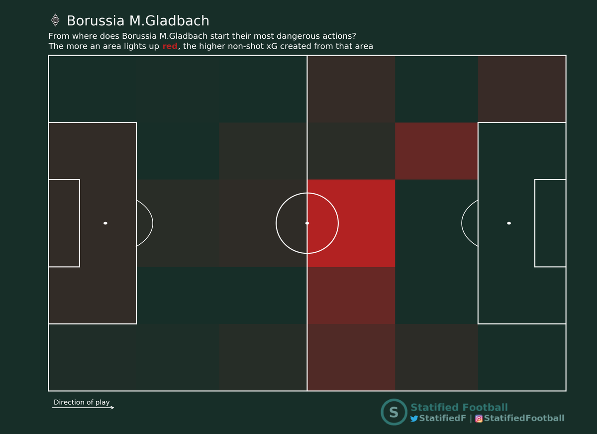
It shows pretty quickly that #RBL created a lot of danger from zone 14, while #BMG struggled to create chances form near the opponents box.
