
A recent analysis from Oxford presented a range of model scenarios consistent with observed COVID death counts. I’m going to reproduce their analysis here and then present some slight modifications to provide a conservative (if technical) perspective. (gonna be 15ish tweets)
They showed you can estimate the same number of deaths with either a high % of the population at risk of severe disease and a recent epidemic start, or a low % and an earlier start. Some media outlets have reported this as suggesting “majority of the UK has already been infected”
But that’s *not* what the authors were trying to say. The aim was: given what we do know about the virus, let’s test different assumptions for the stuff we don’t know and see which tests are consistent with observed death counts.
They took a Bayesian approach, so told the model what they reckoned the parameters should be before plugging in the data. This plot shows the pre-data assumptions in blue, and the post-data estimates in orange for the low-%-at-risk scenario. 
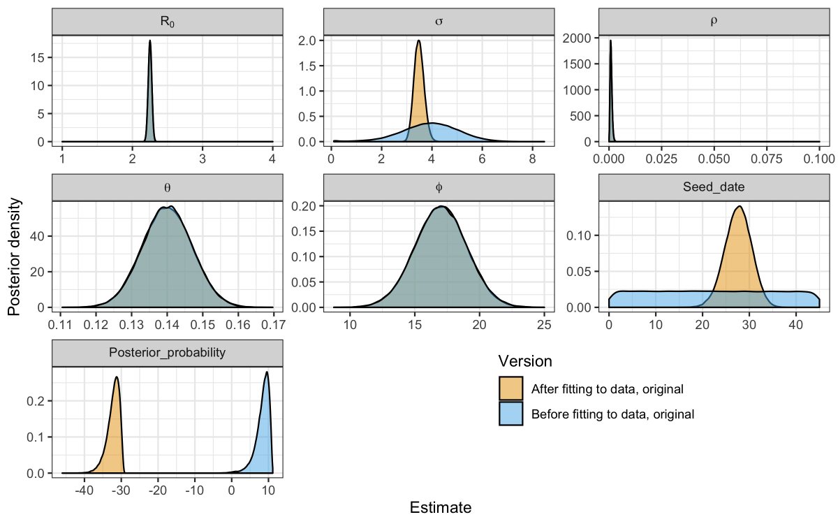
The x-axis shows the parameter value, and the height shows how much weight we put on that value being real.
The blue regions are narrow, meaning that they placed high confidence in the assumptions. Note very narrow for R0 and ρ (% at risk). As there wasn’t much data, the model is like 🤷♀️ for some of the parameters, and the orange ends up copying the blue (θ, ϕ, ρ).
Here’s the same plot, but for another scenario (higher % at risk). Key differences in R0, ρ, σ and seed_date.
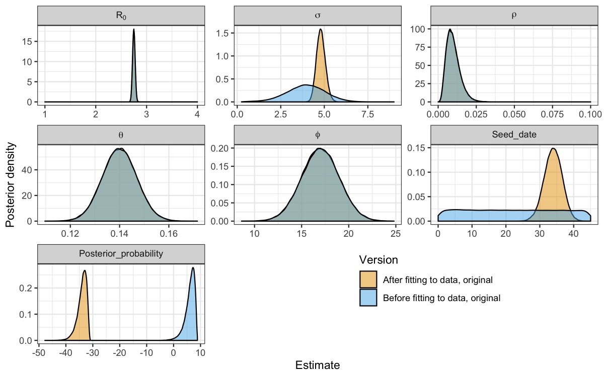
Both scenarios fit the data well, but represent different, strong prior assumptions for R0 and ρ. Can we fit the model whilst making less confident (more ignorant) assumptions regarding the % of the population at risk of severe disease?
I ran the same analysis but used much less confident priors for the key parameters – R0 and ρ. Particularly for ρ, I said “I have literally no idea what ρ is other than it’s somewhere between 0 and 0.1”. My blue regions are much wider, but the model stills fits just as well
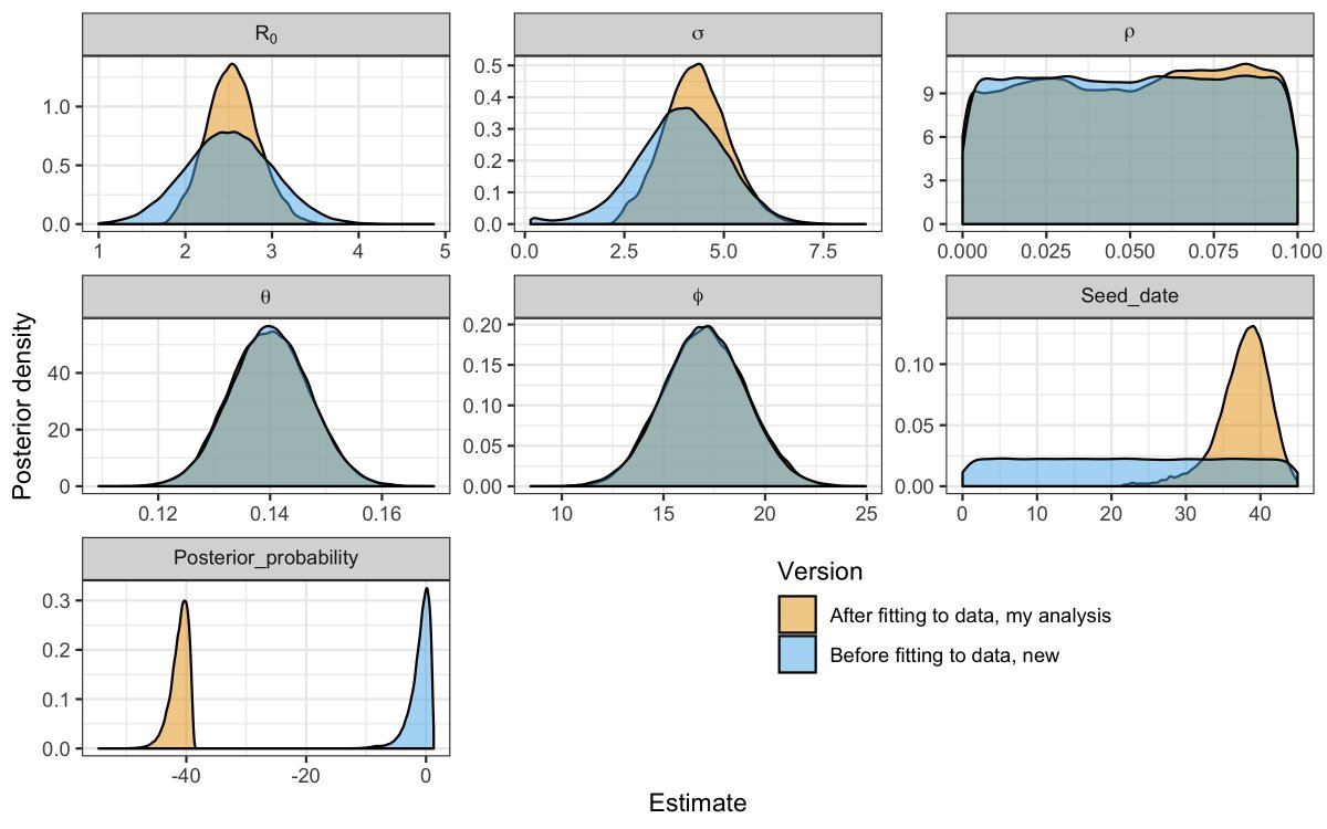
In my analysis, the model is able to use any value for ρ between 0 and 0.1 and still get the same value for “posterior_probability” once you subtract the prior probability (the blue). Very roughly (sorry statisticians), this shows how closely the model fits the data.
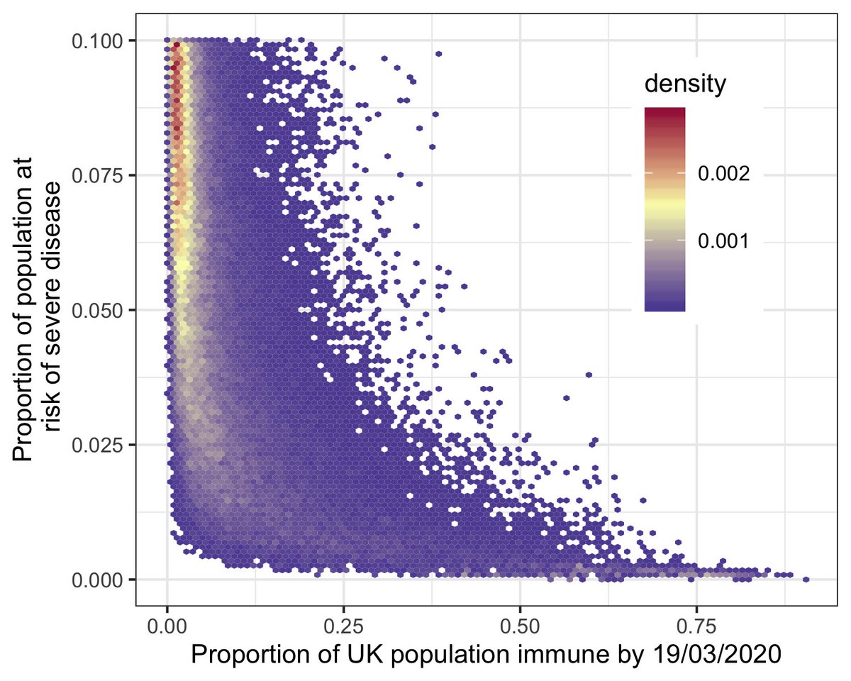
This plot is where the money’s at. The model fits the data based on *combinations* of parameter values - they have to synergize (one for the business bods). The axes show combinations of parameter values, and colored area gives estimates consistent with the data.
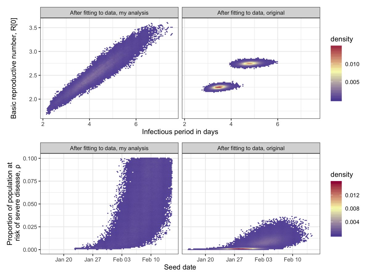
The analysis is basically the same as the original one, but I’ve iterated over *all* possible scenarios rather than a dichotomy (or trichotomy). This shows that, if we minimize the prior information we feed in, we can generate the same data under a huge range of scenarios.
From my mega-ignorant approach, I estimated that the proportion of the UK population that has already been infected could be anywhere between 0.71% and 56% (95% credible intervals, if you’re in that business). This plot shows how rho and the proportion immune estimate synergize.
I won’t get into how ignorant or confident we should be in our prior beliefs for the pre-data assumptions, @AdamJKucharski has already written a fantastic summary of that here: .
The final thing to point out is that the epidemic seed date is key to these fits (is the start of Feb too late? Is mid Jan too early?), but that’s a whole other discussion.
Thanks to @PamelaPMartinez, @maryebushman, @BillHanage, @nish_epi, @ruoranepi and Heather (me wife) for checking this and ensuring that I wasn't making some dreadfully wrong assertions. All code here: github.com/jameshay218/gu…
Oh, here's a link to the Oxford study. All really amazing scientists on the list, and I followed much of their work closely for my PhD.
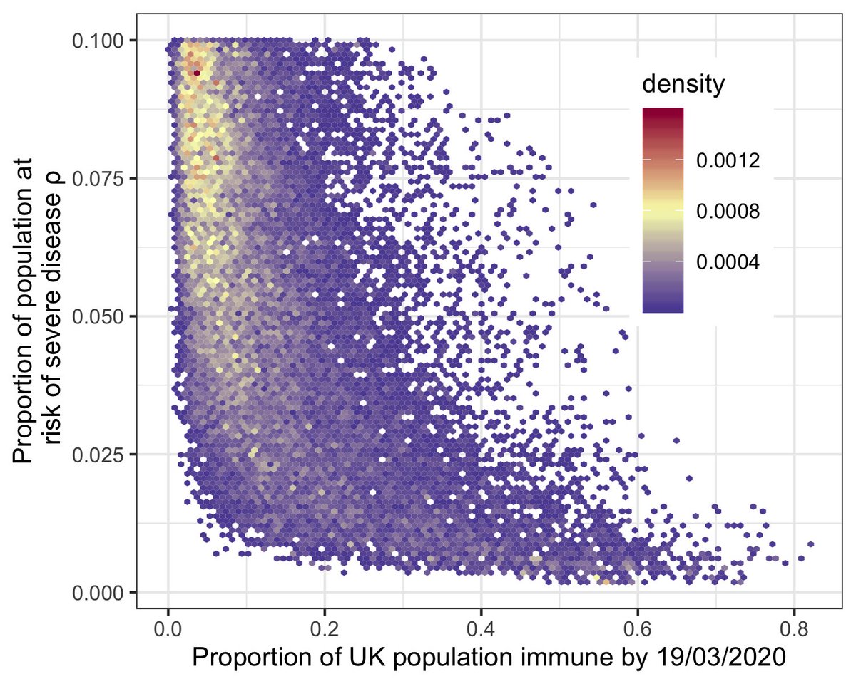
UPDATE: my anxiety politely asked me to recheck the code and I found a bug. The key message and plots are unchanged, but the updated estimate for “proportion of UK population immune by 19/03/2020” is between 1.9% and 53% (95% credible intervals). Previously 0.71-56%
I wouldn’t conclude that 2% is a real lower bound for the % infected. These estimates are based on the priors, data and model structure used, none of which include all available information. I can imagine a similar analysis with additional data that gives a much lower minimum
The code is updated and still available here, so you're all complicit: github.com/jameshay218/gu…


