
,
11 tweets,
3 min read
Read on Twitter
1. So I want to talk about men and women in the Malaysian economy, on some trends that I think more people should know about. Some of them might surprise you.
2. Malaysia is one of the more gender unequal countries in the world, often ending at the bottom of global rankings on gender equality. For eg, the latest WEF gender gap report put us at 101 out of 149 countries (reports.weforum.org/global-gender-…).
3. Specific to the workforce, a common way to look at this is the labour force participation rate, i.e., the proportion of working age adult who decided to actually work rather staying out of the workforce.
In 2017, it was 78% for men and 54% for women. Longer term trend below.
In 2017, it was 78% for men and 54% for women. Longer term trend below.

4. We could look at this rate across different age groups. The common reason cited for low women participation is because they tend to drop off the workforce after starting a family.
So if you see below, the rate starts to decline more sharply for women after 30.
So if you see below, the rate starts to decline more sharply for women after 30.

5. BUT THIS IS WRONG.
The graph aggregates women who entered the workforce in different years. It sums up the participation rates of different cohorts and does not necessarily tell the story of women dropping off after marriage.
The graph aggregates women who entered the workforce in different years. It sums up the participation rates of different cohorts and does not necessarily tell the story of women dropping off after marriage.
6. It could simply be the case that less women entered the workforce in earlier decades, and more in more recent decades. I.e., older cohorts have lower participation rates than younger cohorts. If you sum them up, you will get this downward slopping curve.
7. Fortunately, we can correct for this (approximately), as per this graph.
Malaysian women - on average (and if you are reading this, you are most probably not the average) - do not stop working after certain young'ish age! At least not since the 60s.
Malaysian women - on average (and if you are reading this, you are most probably not the average) - do not stop working after certain young'ish age! At least not since the 60s.
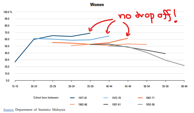
8. Malaysian women, it seems, either joined the workforce or did not. And more of them have been in recent years.
In this narrow perspective at least, it shows that we have been making slow progress. BUT...
(Note: All charts so far from @KRInstitute State of Households 2018)
In this narrow perspective at least, it shows that we have been making slow progress. BUT...
(Note: All charts so far from @KRInstitute State of Households 2018)
9. ... there is a very worrying trend... for men.
Our tertiary education enrollment rate, i.e., students enrolled in tertiary education as a proportion of population of the tertiary education age, has been steadily increasingly. It was ~5% in 1980. In 2017, it's above 40%.
Our tertiary education enrollment rate, i.e., students enrolled in tertiary education as a proportion of population of the tertiary education age, has been steadily increasingly. It was ~5% in 1980. In 2017, it's above 40%.
10. But there's a growing gap between men and women. In 1980, the rate is higher for men (~2% gap), but at around 2000 this reversed and the gap is very worryingly large in recent decades (~10%!).
More and more boys are being left behind girls in education!
More and more boys are being left behind girls in education!

11, end. Malaysia is a rather gender unequal economy. And a rather extreme one. We need to urgently fight for a fairer future for our girls, but at the same time, make sure that our boys are not left behind.
The latter, especially, needs more attention.
The latter, especially, needs more attention.


