Profile picture
, 4 tweets, 1 min read Read on Twitter
The reason bad UI is so destructive is that it's actually WORSE than the poor human interaction it's (generally) trying to replace.

You can at least ask the human questions, ie "OK what's the next step here?"

This is why product is so hard - bad UI is like a maze with no map.
This is also why great customer service is so valuable at an early stage startup btw.
The whole process of building a product is generally about finding new efficiencies - but it actually produces new INefficiencies instead.

This is the core of the Peter Thiel secret cliche. A great founder has found a tiny gap, a little crack that can be opened slightly wider.
At worst, this creates a little helpful program that aids a few people. At best it cracks a whole industry wide open.
Missing some Tweet in this thread?
You can try to force a refresh.

Like this thread? Get email updates or save it to PDF!

Subscribe to Julien 🌲
Profile picture

Get real-time email alerts when new unrolls are available from this author!

This content may be removed anytime!

Twitter may remove this content at anytime, convert it as a PDF, save and print for later use!

Try unrolling a thread yourself!

how to unroll video

1) Follow Thread Reader App on Twitter so you can easily mention us!

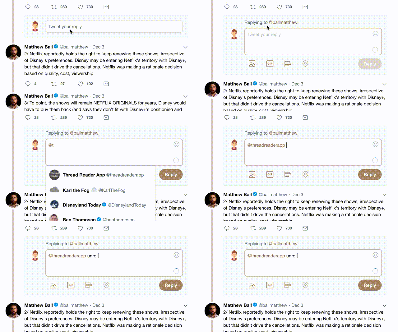
2) Go to a Twitter thread (series of Tweets by the same owner) and mention us with a keyword "unroll" @threadreaderapp unroll

You can practice here first or read more on our help page!

Follow Us on Twitter!

Did Thread Reader help you today?

Support us! We are indie developers!


This site is made by just three indie developers on a laptop doing marketing, support and development! Read more about the story.

Become a Premium Member ($3.00/month or $30.00/year) and get exclusive features!

Become Premium

Too expensive? Make a small donation by buying us coffee ($5) or help with server cost ($10)

Donate via Paypal Become our Patreon

Thank you for your support!