Let's go through each of these and discuss various facets that one might want to consider when designing a medical viz
Know your audience, particularly if your audience is one that *doesn't* have access to the article that inspired your viz. If they don't, then recognize that your viz may be the 1st and only exposure to the science that the reader will have.
Stick with 8.5"x11" size (standard paper size). While you can make the viz wider and/or longer, such viz become harder to read and require multiple zoom-in/zoom-out finger gestures. Most mobile devices can fully display an 8.5"x11" image.
In the above viz I used 3 colors to define each trial (red, blue, green). I defined randomized and statistically significant at the bottom. I used black color to define connections/sections of the viz. I used a black or white stomach to define gastric acidity.
So what do you want to include in your medical viz? I approach this question the same way as I would a manuscript: is there a background/context section, methods, results, and conclusions section of the viz? A good medical viz touches on each of these to give....
Often we want to pack as much info into a viz as possible. While this has advantages, there is a limit beyond which the lack of "white/blank space" can deter the reader or make it harder to convey your message. One needs to..
The B/W ratio converts all colored text/icons/emojis/images into black pixels. Blank areas of your viz are converted to white pixels. Divide the two to get a ratio that indicates the amount of *information density* in your viz.
Too low an information density score and you haven't conveyed enough info to the reader to allow for a clinical decision to be made. Too high and you have overwhelmed the reader.
To calculate B/W, download ImageJ: a free software from the @NIH imagej.nih.gov/ij/

Launch ImageJ and open your proposed medical viz file (must be in JPG or PNG format). Once you see your image, you'll need to convert it to a binary format (either black or white). See the video to learn how to do that.
Now you have your proposed medical viz in black and white pixels. Black is the content and white is the blank space. To calculate the ratio, you need the number of pixels of each color. See the video to learn how to do that.
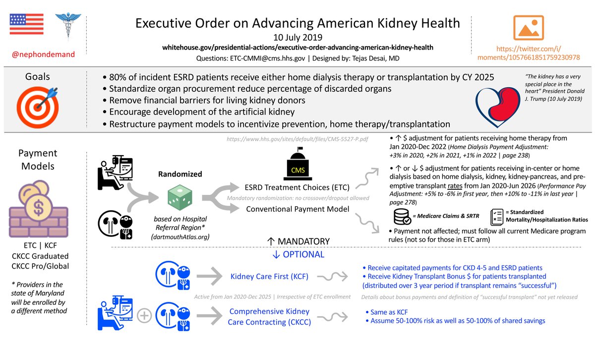
The density for my viz is 0.107. Is that too low/high or just right? There isn't a threshold level as yet, but a group of researchers led by @virenkaul are creating a model that incorporates the info density score to predict engagement on #SoMe. For now...

A few points to address in the tweet/facebook post:
• link to the article
• tag the journal & any authors who are on #SoMe
• briefly describe the article & viz
• use one of the 3 hashtags: #infographic, #visualAbstract, #graphicalAbstract


