,
58 tweets,
11 min read
Read on Twitter
Thank you to @rallamee for loaning me the use of her garden and boating lake to do a few demonstrations in this weekend's tweetorial.
Thank you also to a colleague, for sending me this just now. It is enlightening and I am genuinely sorry. 
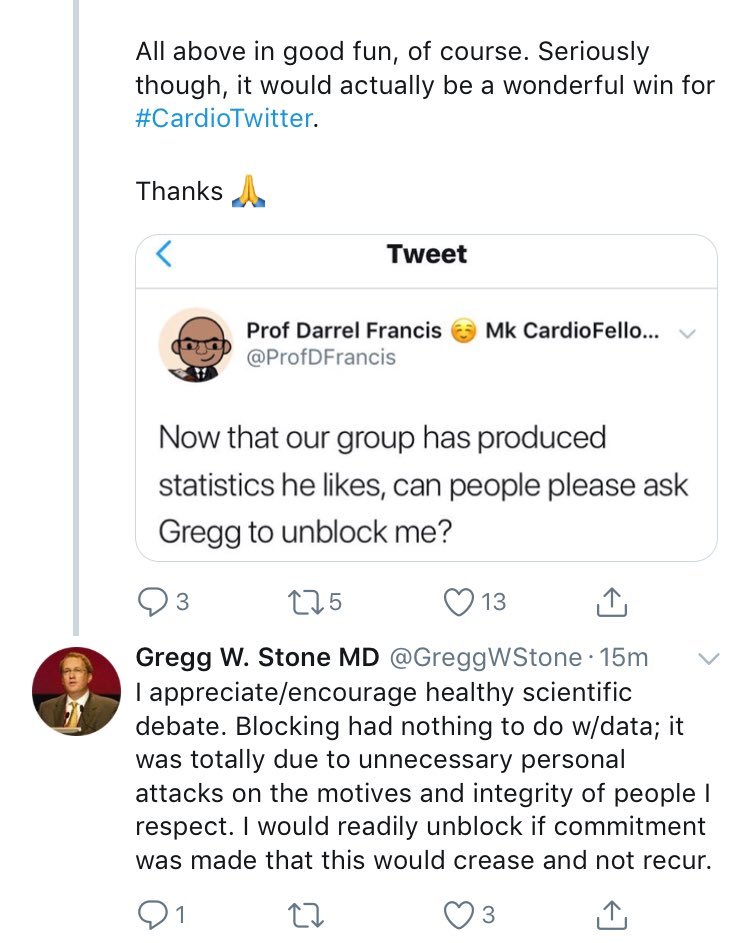
I frequently make fun of my friends and I considered Gregg my friend through Twitter interactions, and used to the rough-and-tumble of to-and-fro that makes science.
I thought his blocking was all about the occasional intermittent mention of him in a mildly unfavourable light.
I thought his blocking was all about the occasional intermittent mention of him in a mildly unfavourable light.
I can see now that the blocking was about my adverse comments about Jeffrey Moses to whom he is very loyal. Loyalty is a wonderful attribute, and if I had realised that, I would myself have joined the blockade of myself, to send me the message extra-clearly.
However, message received, and I promise not to mock Jeffrey Moses (and any other person Gregg lists as a distinguished elder scientist etc).
Please @greggwstone can you please unblock me?
Please @greggwstone can you please unblock me?
What was plotted on the X axis, across the screen?
What was plotted on the Y axis, up the screen?
Where can I get someone with small weight and low math score?
Where can I most reliably get someone with a higher weight and a higher math score, than the former group?
...
Within the children, what is the correlation of weight with math test score?
Within the math grad school cafeteria cream-cake special-interest-group, what is the correlation between weight and math score?
Of course, the journal may catch you. Why?
So when you get caught lumping just 2 groups together, what should you do to get past the reviewers and also be significant?
(A) Recruit from 2 kindergartens and 2 university cafeterias? So 4 in total, not 2?
(B) Get rid of the kindergarten?
(C) Get some in-between patients
(A) Recruit from 2 kindergartens and 2 university cafeterias? So 4 in total, not 2?
(B) Get rid of the kindergarten?
(C) Get some in-between patients
Excellent!
So you have seen the two variants of "Gymnasts and Grannies".
Now let's "take it to the next level", as they say on the Apprentice.
So you have seen the two variants of "Gymnasts and Grannies".
Now let's "take it to the next level", as they say on the Apprentice.
Which one is clinically unrepresentative and should be removed?
Choose:
Actually there is no list of options at this stage.
I am giving time for people to
(a) use their intuition, or
(b) run a few simulations in Matlab or R, or
(c) do it manually in Excel, or
(c) ask anyone who is currently completing a PhD, who may being doing this for real.
I am giving time for people to
(a) use their intuition, or
(b) run a few simulations in Matlab or R, or
(c) do it manually in Excel, or
(c) ask anyone who is currently completing a PhD, who may being doing this for real.
Feel free to answer below your mental or simulation-based estimates. Back in ~3hrs.
When you remove the half of patients (50%) that are most inconvenient to your hypothesis, on average what correlation coefficient do you achieve ?
Wry tin 0.5?
Or, as hinted by Nils Johnson
Pubmed 27282899
2/3 (0.67)
Pubmed 27282899
2/3 (0.67)

Or beloved-of-NEJM-1996,
Pubmed 8637515
3/4 (0.75)
Pubmed 8637515
3/4 (0.75)

Or as clearly prespecified by Top People in guidelines,
4/5 (0.80)
4/5 (0.80)

Starting at a correlation of 0.00, removing half the patients, the most annoying, disrespectful, unamenable and generally unprofessional ones, gives you on average what correlation coefficient?
Pick the closest harmonious celestial fraction to the true answer.
Pick the closest harmonious celestial fraction to the true answer.
Hint.

The above graph was created by the Francis Fraudogram. An automated algorithm that generates false correlations without faking any data.
On average removing the 50% of most unprofessional patients achieves a correlation of ... 0.78!
On average removing the 50% of most unprofessional patients achieves a correlation of ... 0.78!
That is the power of "remove" when applied in 2 dimensions.
Cut the disrespectful 50% of data points and you get correlation coefficient to jump from 0.00 to 0.78.
Cut the disrespectful 50% of data points and you get correlation coefficient to jump from 0.00 to 0.78.
A short train ride later I had made some progress. But also hit upon a slight hitch.
So we have 3 broad methods of optimising correlation coefficients so far.
1. Grannies and gymnasts
2. Continuous G & G, to fill in the embarrassing gap in the middle
3. Remove/block disrespectful people
1. Grannies and gymnasts
2. Continuous G & G, to fill in the embarrassing gap in the middle
3. Remove/block disrespectful people
I am amazed at how resistant New York people are to fraud.
I mean, the home of Bernie Madoff, I expected more flexibility.
So I've decided to go to New York to find out for myself. It will take a few hours but here are some revision questions to keep you occupied.
I mean, the home of Bernie Madoff, I expected more flexibility.
So I've decided to go to New York to find out for myself. It will take a few hours but here are some revision questions to keep you occupied.
Quiz question 1.
You have invented a supercomputer programme to predict weather. You've taken in 1 billion of funding and you have your machine at last.
Unfortunately it doesn't work. Hopeless.
However Francis Industries has a suggestion, free of charge (for the usual fee).
You have invented a supercomputer programme to predict weather. You've taken in 1 billion of funding and you have your machine at last.
Unfortunately it doesn't work. Hopeless.
However Francis Industries has a suggestion, free of charge (for the usual fee).
"Why don't you get it to Google the last seven days of weather, and predict tomorrow will be the average of those last seven days?"
You react with horror.
'You mean, not actually calculate it but just WRITE IN a made up value?'
"Yes, it's quite a standard approach when you have no idea what you are doing. We recommended it to Bernie and Nic and they loved it."
'You mean, not actually calculate it but just WRITE IN a made up value?'
"Yes, it's quite a standard approach when you have no idea what you are doing. We recommended it to Bernie and Nic and they loved it."
'But how could I persuade people it worked? All the predictions would be fairly samey.'
The CFO (Chief Fraud Officer) smiled back.
"Do some in summer and some in winter!"
The CFO (Chief Fraud Officer) smiled back.
"Do some in summer and some in winter!"
What would that be an example of?
Which is the most likely appearance of the scatter plot?

It is easy to narrow down to two possible options. To pick the right one of two most plausible options, think about this.
In summer, which will vary more, the predictions (average of last 7 days) or the actuals?
In summer, which will vary more, the predictions (average of last 7 days) or the actuals?
Have I died and gone to dims-ville? How can this be difficult?
In the winter, on most days
* the last 7 days will have LOW temperatures, e.g. 8 degrees Celsius
* the actual next day's temperature will be LOW, e.g. 8 degrees.
This will give a clump of dots, where?
Hint: low, low
In the winter, on most days
* the last 7 days will have LOW temperatures, e.g. 8 degrees Celsius
* the actual next day's temperature will be LOW, e.g. 8 degrees.
This will give a clump of dots, where?
Hint: low, low
In the summer, on most days:
* the last 7 days will have an average temperature that is quite high, e.g. 20 Celsius
* the actual next day's temperature will also be quite high, e.g. 20 Celsius
This will give a clump of dots, where?
* the last 7 days will have an average temperature that is quite high, e.g. 20 Celsius
* the actual next day's temperature will also be quite high, e.g. 20 Celsius
This will give a clump of dots, where?
Which TWO of the graphs below have two clumps, in the positions you have chosen?
i.e. which TWO graphs are plausible outcomes of your study?
i.e. which TWO graphs are plausible outcomes of your study?

Which combination of two?
Alright, you've narrowed it down to 2 possible graphs.
Which will be MORE VARIABLE:
* single-day temperatures (e.g. tomorrow's temperature)
* AVERAGES of 7 days of temperature (e.g. average of last 7 days)
Which will be MORE VARIABLE:
* single-day temperatures (e.g. tomorrow's temperature)
* AVERAGES of 7 days of temperature (e.g. average of last 7 days)
Therefore WITHIN each clump of dots, which co-ordinate will show more variablity?
Y-axis (tomorrow's 1-day temperature) more variable
X-axis (7-day average temperature) more variable
Equal variability
Y-axis (tomorrow's 1-day temperature) more variable
X-axis (7-day average temperature) more variable
Equal variability
Of the two graphs you picked as being ROUGHLY right, which ONE graph shows the behaviour described in the question above this one?
Within-clump Y showing more variability than X,
Within-clump X showing more variability than Y,
Within clump variability identical for X and Y
Within-clump Y showing more variability than X,
Within-clump X showing more variability than Y,
Within clump variability identical for X and Y
And that is the correct answer. At 8 votes, 75% correct.
But the Francis Industries CFO suddenly has the smile wiped off his face.
'The validation research study has to be done in the next 4 weeks. No hanging around for a year.'
But the Francis Industries CFO suddenly has the smile wiped off his face.
'The validation research study has to be done in the next 4 weeks. No hanging around for a year.'
Luckily there is a perfect solution.
Francis Industries has a wholly owned but completely independent charitable subsidiary known as the Krooked Research Foundation, KRF.
We have branches all over the world from Antarctica to Zimbabwe.
Will this work?
Francis Industries has a wholly owned but completely independent charitable subsidiary known as the Krooked Research Foundation, KRF.
We have branches all over the world from Antarctica to Zimbabwe.
Will this work?
Yes!
The Antarctica data will be bottom left.
And Zimbabwe top right.
Gymnast and granny plan, using geographical space rather than time.
The Antarctica data will be bottom left.
And Zimbabwe top right.
Gymnast and granny plan, using geographical space rather than time.
Both the summer-winter and the Antarctica-Zimbabwe can be extended with intermediate times or places so there is a nice band rather than 2 blobs.
That would make the continuous granny and gymnast ploy.
That would make the continuous granny and gymnast ploy.