This thread is Part 2 of my #EconTwitter tweetorial on how to create effective figures 📈📉📊 in @Stata. Today: designing effective Legends and Labels.
Part 1 on choosing & customizing Defaults started here.
<begin thread>
Part 1 on choosing & customizing Defaults started here.
<begin thread>
Custom legends are an enormous opportunity to make your figures more effective:
- Readers can't interpret your figure without understanding the legend
- The default legend is rarely the easiest to understand
You can improve a legend by adjusting the location🎯 and colors🎨 2/11
- Readers can't interpret your figure without understanding the legend
- The default legend is rarely the easiest to understand
You can improve a legend by adjusting the location🎯 and colors🎨 2/11
Remember the main goal for a figure: get your message across with a minimum amount of effort from the reader.
With a default legend—at the bottom or the side—readers glance at the plot, realize they don't understand, then seek out the legend.
Which requires less effort? 👇🏼 3/11
With a default legend—at the bottom or the side—readers glance at the plot, realize they don't understand, then seek out the legend.
Which requires less effort? 👇🏼 3/11

Whenever possible, replace legends with labels that:
1. Minimize the distance between the data & the labels explaining it.
2. Use color to tie the labels with the data at a glance.
The 💻 can't do this by default b/c the graph area is a chaotic place it dares not touch. 4/11
1. Minimize the distance between the data & the labels explaining it.
2. Use color to tie the labels with the data at a glance.
The 💻 can't do this by default b/c the graph area is a chaotic place it dares not touch. 4/11
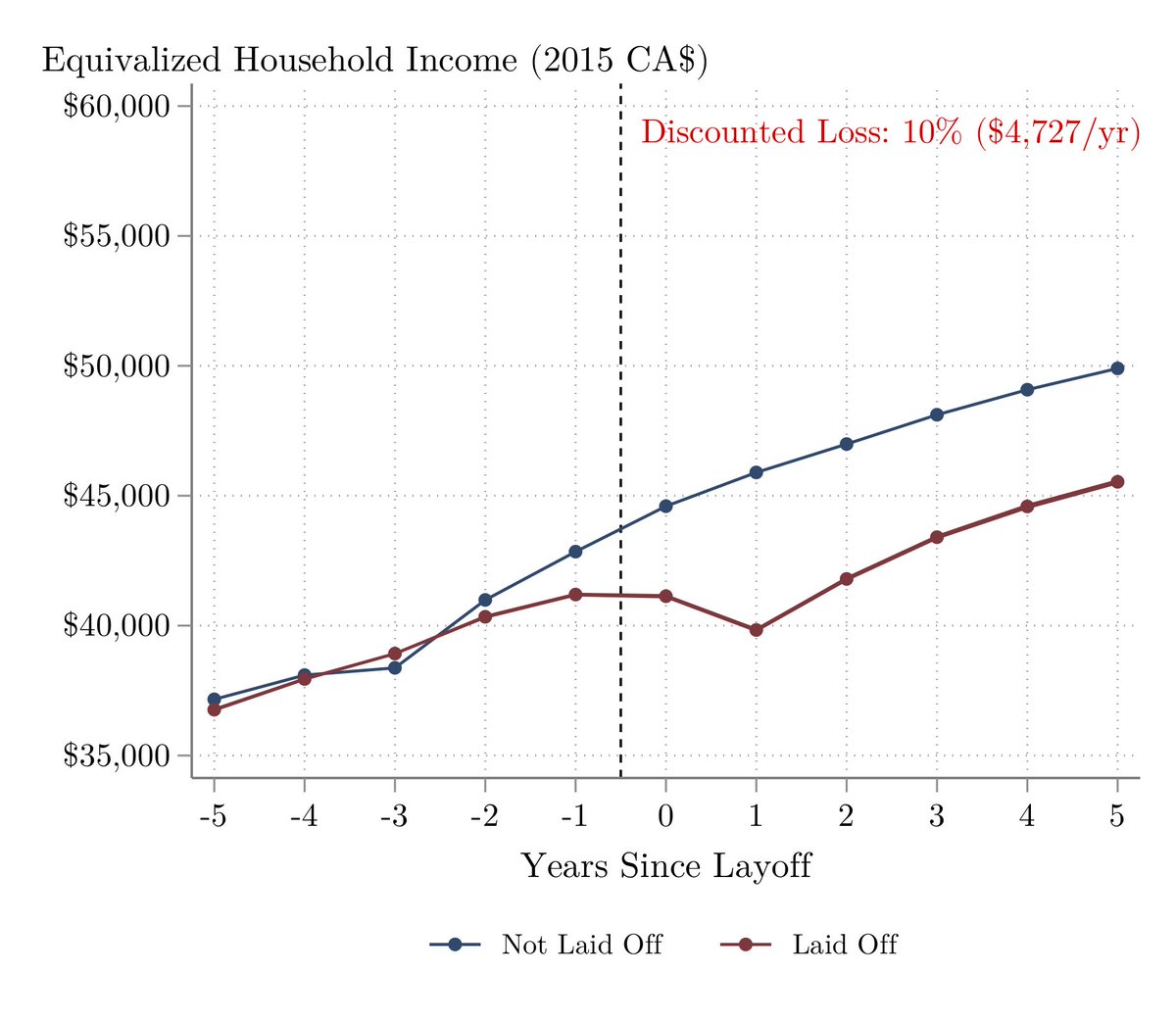
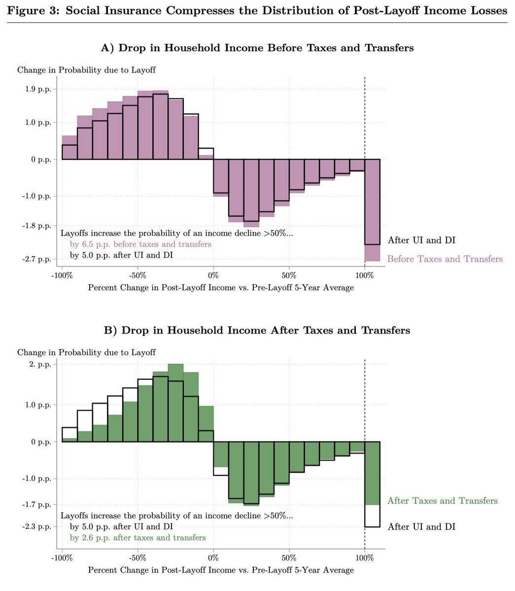
Placing labels is trickier than placing a legend. Ex: `text(43000 2.5 "Laid Off", place(c) color(maroon))`
For a handful of figures that appear up in your paper or on your slides, it's worth investing your time to save your readers' time & effort. They appreciate it. 5/11
For a handful of figures that appear up in your paper or on your slides, it's worth investing your time to save your readers' time & effort. They appreciate it. 5/11
Brief aside: why bother with all this work? #EconTwitter, y'all are familiar with constrained optimization problems.
You want to communicate as much as possible to your audience given the time budget they've allotted to your paper. 6/11
You want to communicate as much as possible to your audience given the time budget they've allotted to your paper. 6/11
It's worth investing in effective communication even if the audience's time budget is exogenous (ex: 60 min talk).
But with papers, the reader's time allocation is likely endogenous. They're more likely to keep reading if they feel they're getting a lot out of their effort. 7/11
But with papers, the reader's time allocation is likely endogenous. They're more likely to keep reading if they feel they're getting a lot out of their effort. 7/11
Back to legends...sometimes labels aren't your best choice! The shape of your plot might not accommodate labels for each element. That doesn't mean you can't improve on the default legend.
Try to minimize the distance between the legend and your data! 8/11
Try to minimize the distance between the legend and your data! 8/11
Usually it's easiest to bring a legend close to the data by putting it on the right side, then adjusting its location and spacing.
Making space on the side without squeezing your plot is another reason to maximize the width using xsize(). See yesterday's thread for details. 9/11
Making space on the side without squeezing your plot is another reason to maximize the width using xsize(). See yesterday's thread for details. 9/11
Customizing the placement of a legend isn't easy. I had to use a mess of options to get one figure looking 👌🏼
legend(rowgap(*7.2) size(*1.4) symysize(*1.4) pos(3) ring(4) bmargin(0 0 0 17))
I don't have those memorized. @Stata has excellent documentation in `help twoway`. 10/11
legend(rowgap(*7.2) size(*1.4) symysize(*1.4) pos(3) ring(4) bmargin(0 0 0 17))
I don't have those memorized. @Stata has excellent documentation in `help twoway`. 10/11
That's a wrap for my thread on effective Legends and Labels. If you missed it yesterday, check out my thread on choosing & customizing Defaults.
Stay tuned for parts 3 to 5 on creating effective figures! Next up: (3) Axes. (4) Color. (5) Titles. <end>
Stay tuned for parts 3 to 5 on creating effective figures! Next up: (3) Axes. (4) Color. (5) Titles. <end>