, 36 tweets, 10 min read
My Authors
Read all threads
Working on the SDK over the last few days I've spent a lot of time in Quake's E1M1, both testing its functionality in Dusk and comparing things in Mark V, and I've come to a conclusion:

I think it might be better than Doom E1M1

A rambling thread:
So Doom E1M1 is simplistic by modern mapping standards, but examined in context it's basically immaculate. A perfect introduction to the game it prefaces and the tech it introduces.
It's a short, simple, relatively linear path that I'm sure most of us blaze through on muscle memory alone at this point, but every room is showing something new and important about what made Doom a jaw-dropping followup to Wolfenstein 3d.
You've got varying wall sizes, heights, angles. You have interiors and exteriors. You have enemies you and below you. You have complex interconnecting secrets. You have lighting. You have slime. You have insane organic pathways and stairwells cut into the walls and floor.
The first job of an introductory level is onboarding, of course, and E1M1 accomplishes that. But it's also a quick, succinct tl;dr of the new freedom and sense of spatial spectacle offered by its tech compared with anything else at the time.
I'd always looked at Quake's E1M1 as sort of... more of the same. Basically Doom but slightly more advanced. A retread of old ground with a bit more polish.

Now that I've been forced to really LOOK at that level in detail, I realize that's not true at all.
It's doing for Quake exactly what Doom E1M1 did for Doom. It's just that the advances are necessarily more subtle.
First you've got this room. Right off the bat we're seeing a lot of ceiling detail (something that continues throughout). We see heavy shadows. We see flickering lights that propagate realistically without the hard edges of Doom's sectors.
There are platforms with visible "underneath" bits at the far end--something not possible in vanilla Doom. There are several areas that encourage you to use the new jump ability. One thing I'd forgotten until now is that on easier difficulties there are jump tutorial messages.
The first doors we come across are these guys, which wonder of wonders OPEN SIDEWAYS.

Not just that, but they also have these odd not-rectangle shapes that--once again--would not have been possible in vanilla Doom.
And inside we have this: one of the most on-the-nose environmental tutorials this side of Valve's "put a spotlight on it." This room has two and only two purposes: teach you what buttons are (the obnoxious blinky things) and how to use them (run into them. No use key here!).
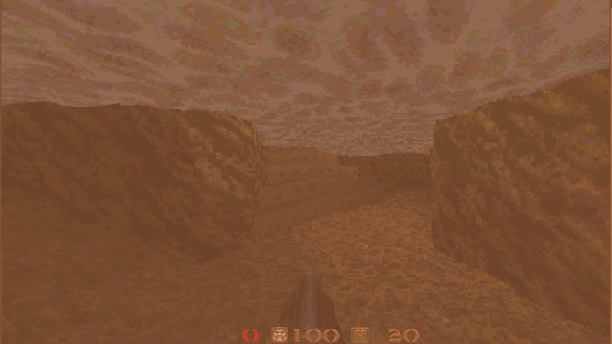
A short elevator ride takes us outside. On easier difficulties this is where you get your first taste of combat. It's also showing us a few more new features. Like animated skies!
And water you can swim in!
And of course if you swim in that water you'll find your first loop back to a previous area. Doom E1M1 had one main secret loop that turned the map into a big circle. Quake E1M1 has several that almost make it feel like a big puzzle box of sorts.
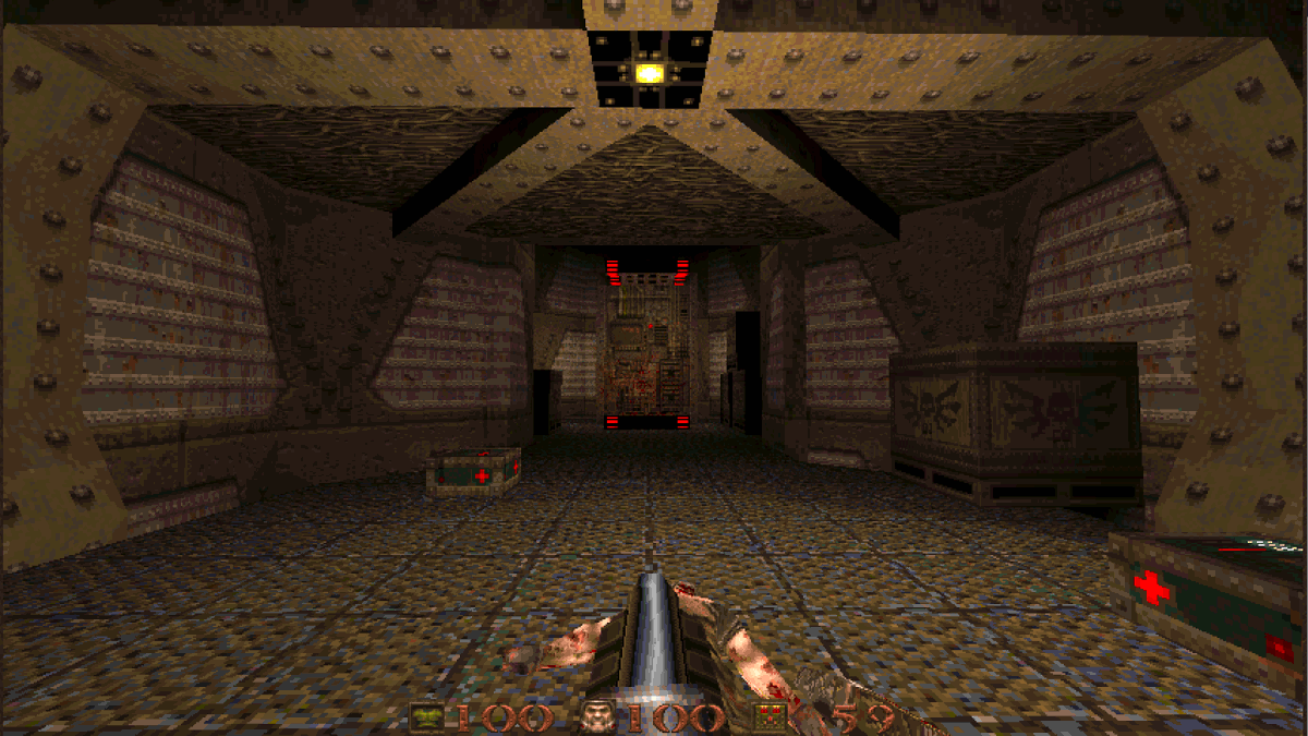
Entering the next building we continue with lots of abstract ceiling detail. Again, this is not something Doom couldn't do (yet) but it was certainly a much bigger ordeal.
And then in the next room, we get THIS.

This bridge.

It doesn't look like much now, but it's the first really big gut-puch of "we are a 3d game now. We can have stuff over other stuff."
This whole area in general is a big showpiece of sorts. Just layering on cool stuff. We got ceiling details. We got room over room. We got bridges that can move sideways. We got awesome shadows. We got moving clouds. Etc etc.
I can't tell you how many times I've run through this room and never really LOOKED at everything going on here. It's really quite cool. Little details like how abstract and organic these stairs are. This is Romero layering on how cool abstract level design is now in 3d.
This is also a bit of a more open area compared to what we've had so far. There are a few things you can do. A few secrets to find. Then eventually you're funneled into...
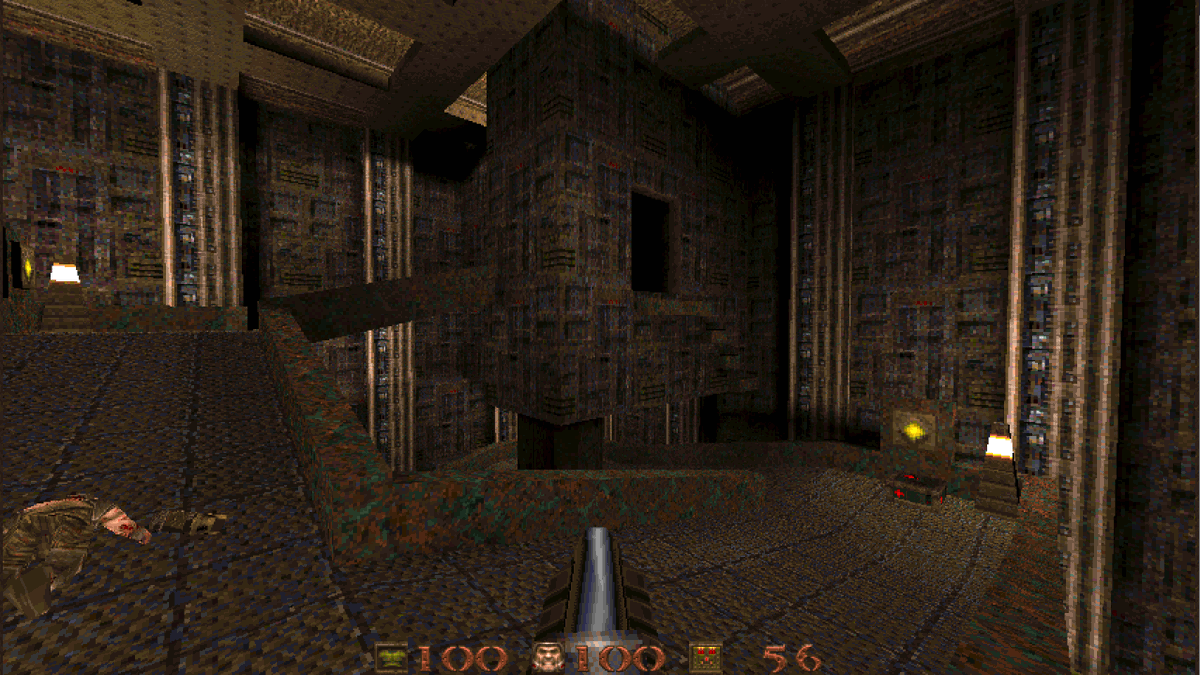
THIS place.

What's new here?

SLOPED FLOORS!

Technically there was a bit if this back in the first room but this is where we're really seeing them on display for the first time.
The lights clunking on to light up the pitch darkness is a fantastic touch too, driving home the feeling that you're seeing real tangible light doing realistic illumination things. And of course we still have lots of things happening on the ceiling.
You'll also notice throughout this the added benefit of ceiling/wall detail is that it provides plenty of opportunities to cast interesting shadows. Once again, the lighting feels distinctly natural and real compared to anything before.
This room is just a really cool shape in general, and having the pitch black doorway there that you pass under is again making use of the whole "we're actually 3d!" thing.
And getting down to the bottom we're passing underneath where we started, on shapes that we never would have seen in Doom.
And if we grab a biosuit, we get even more of this. Swimming underneath the final walkway to a secret.
That final walkway is itself doing interesting things with vertical angles in its wall details. Also, it begins the great Quake tradition of having no qualms about using literal big red arrows to point you to your goal.
Finally at the end, we can walk through the teleporter...

OR... if we've been paying attention to the spacial relationship of the areas we've been though, we could...
And here we are, with an easy shortcut back to the beginning, free to secret hunt or stock back up on ammo as we see fit.
(slight thread pause while I put my daughter to bed, brb with some conclusions asap)
Ok so...

Like I said, I've always thought Doom E1M1 was the gold standard of throwing down the "look what we can do now asshole" gauntlet, and Quake E1M1 was sorta going through the same motions with an extra layer of polish.

I've realized over the last few days that's not fair
Doom is flashier, for sure, but it also had more material to work with. It's comparatively quite easy to see the difference between Wolf3d's blocky mazes and Doom's organic abstract complexity.
It's a lot harder to immediately cognate the difference between Doom's sector-based levels and Quake's 3d brushes. Doom did a lot to hide its limitations. 3d spatial relations are difficult to intuitively grasp. Much of what Quake's doing parses as details.
But once you start looking there's a wealth of those details packed into a short, rather elegant level, that flows and interconnects even more confidently than its predecessor and presents a variety of ways to engage with it on replays.
It's not as showy a showcase level, but it's still a damn good one. Much better than the introductory level in say... Quake II, which presents its new colored lighting by... basically lighting everything in similar shades of gloomy orange.
So in conclusion, while Doom E1M1 is always gonna be the sexier one, I've gained new respect for Quake E1M1's comparatively subtle confidence. It's a great level, and a great introduction to a great game.
Missing some Tweet in this thread? You can try to force a refresh.

Enjoying this thread?

Keep Current with David Szymanski

Profile picture

Stay in touch and get notified when new unrolls are available from this author!

Read all threads

This Thread may be Removed Anytime!

Twitter may remove this content at anytime, convert it as a PDF, save and print for later use!

Try unrolling a thread yourself!

how to unroll video

1) Follow Thread Reader App on Twitter so you can easily mention us!

2) Go to a Twitter thread (series of Tweets by the same owner) and mention us with a keyword "unroll" @threadreaderapp unroll

You can practice here first or read more on our help page!

Follow Us on Twitter!

Did Thread Reader help you today?

Support us! We are indie developers!


This site is made by just three indie developers on a laptop doing marketing, support and development! Read more about the story.

Become a Premium Member ($3.00/month or $30.00/year) and get exclusive features!

Become Premium

Too expensive? Make a small donation by buying us coffee ($5) or help with server cost ($10)

Donate via Paypal Become our Patreon

Thank you for your support!