1/ In 1999 I did a deep dive on the top darling stocks to compare the lopsided leadership of the late 1990s to the early to mid-1970s. Earlier, during the 1960s, the cyclical #bullmarket from Oct. 1966 to Nov. 1968 produced a huge bubble in retail speculation.
2/ #Tech & space companies were big favorites. Then came the #recession of 1970 & a painful bear market that wiped out speculators. During that decline & recovery, institutional investors dominated the #stockmarket & were buying tried-and-true stocks with bulletproof #earnings.
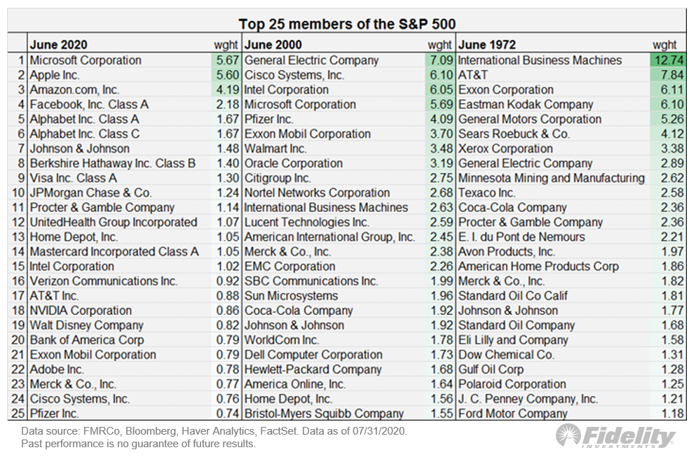
3/ This handful of mega-cap stocks were call the “Nifty Fifty” and they indeed withstood the vicious 1973-1974 bear market & even held on to their performance during the ’75 recovery. #Earnings never wavered but came at a price: high P/E multiples.
4/ But the Nifty Fifty buckled from collapsing valuation multiples when #inflation became the #market enemy in the 2nd half of the ‘70s. Decades later, during the late 1990s, the market became dominated by a handful of mega-cap growth companies.
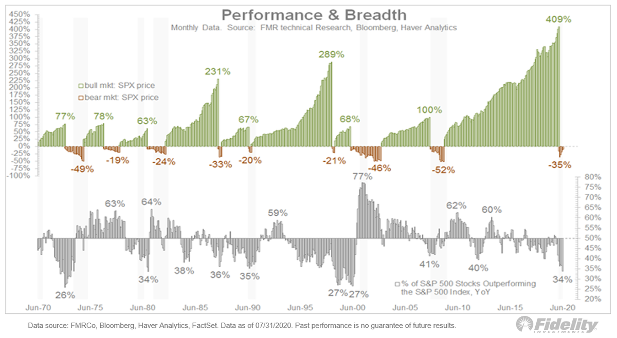
5/ Once again, retail speculation dominated in 1999 & 2000. Here, you can see these periods of market breadth: 

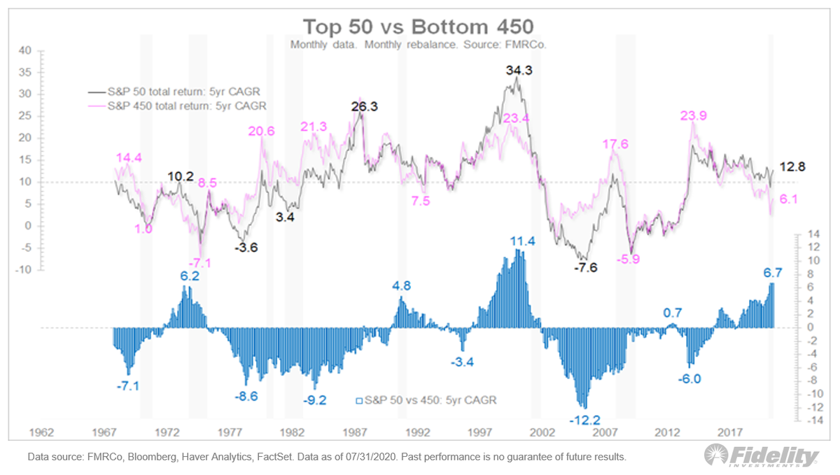
9/ This chart shows the 5-yr CAGR of the top 50 & the bottom 450. In the first Nifty Fifty period, the top 50 outperformed the bottom 450 by 620 bps. During the dot-com period, the spread grew to 1140 bps. Currently, it’s 670 bps.
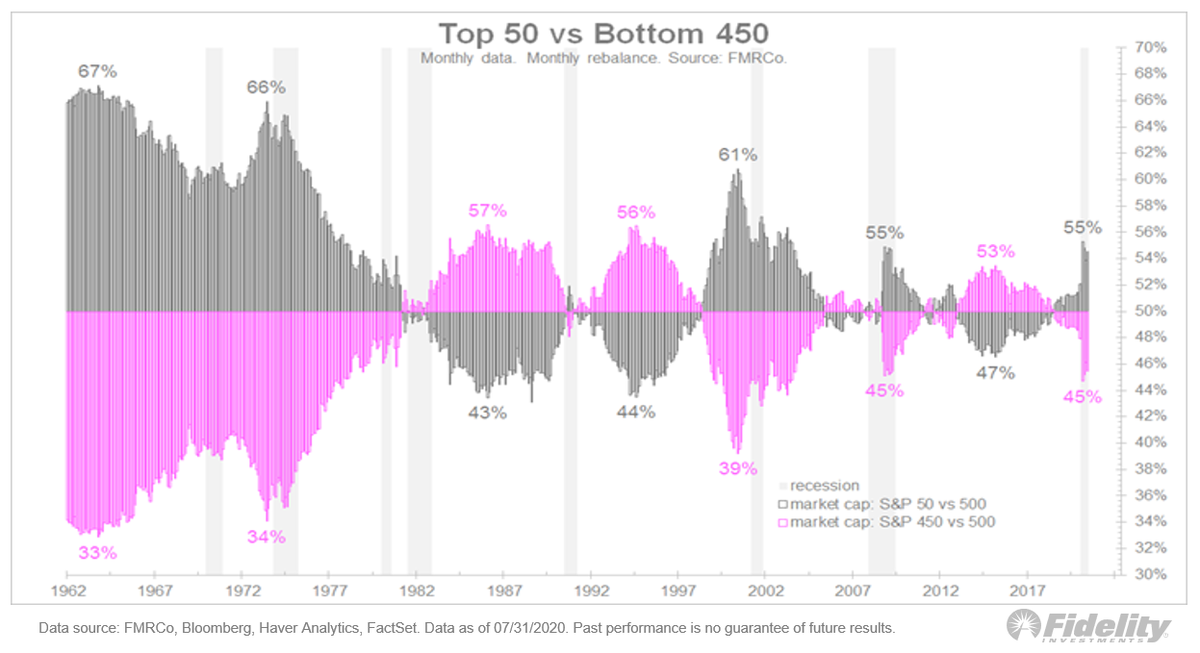
10/ Now let’s look at the market-cap weight of these two cohorts—the top 50 and the bottom 450. Currently, the top 50 comprise 55% of the #market & the bottom: 45%. Back in 2000, the top 50 were 61% of the market’s capitalization & in 1973 it was 66%.
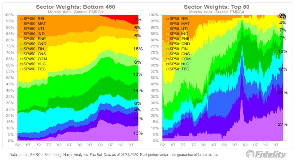
11/ The difference between the two is even more evident when looking at sector weights. Of course, what’s considered growth today (#tech, #healthcare, communication services) isn’t what was considered growth 50 years ago.
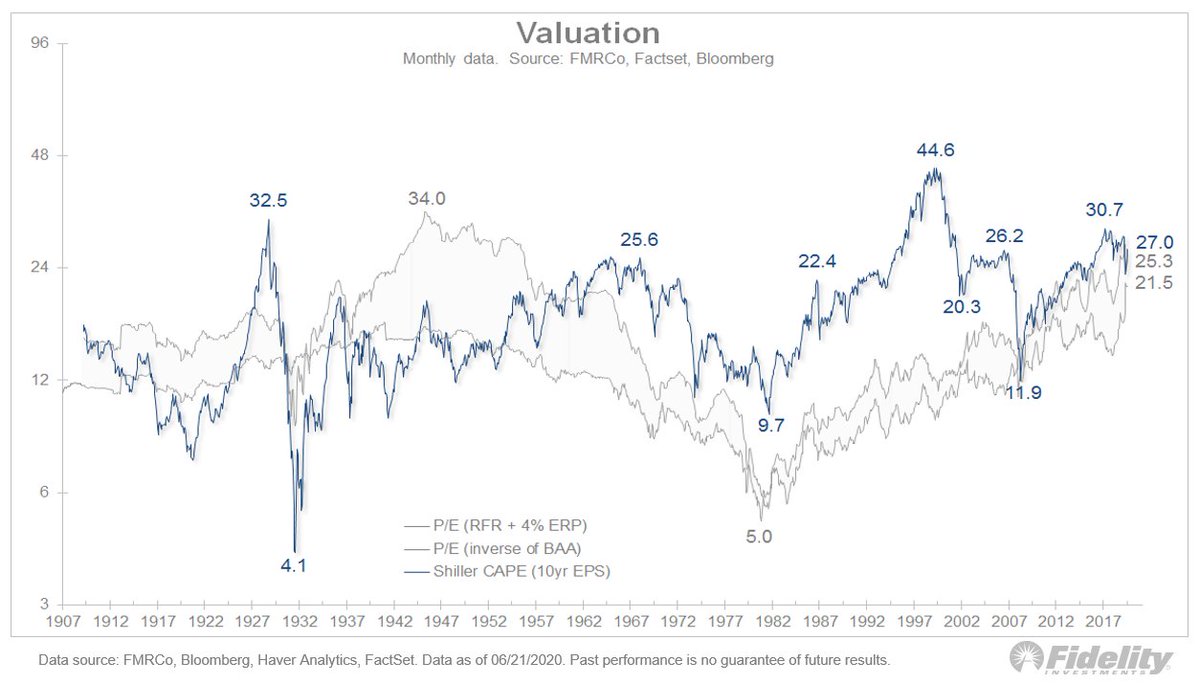
12/ So are we in another mega-cap bubble? Let’s look at valuation. Here, P/E multiples, highlighting nuances of the 3 regimes. At the peak of the dot-com bubble, the top 50 produced a P/E ratio of 40.2x while the bottom 450 traded at just 19.0x.
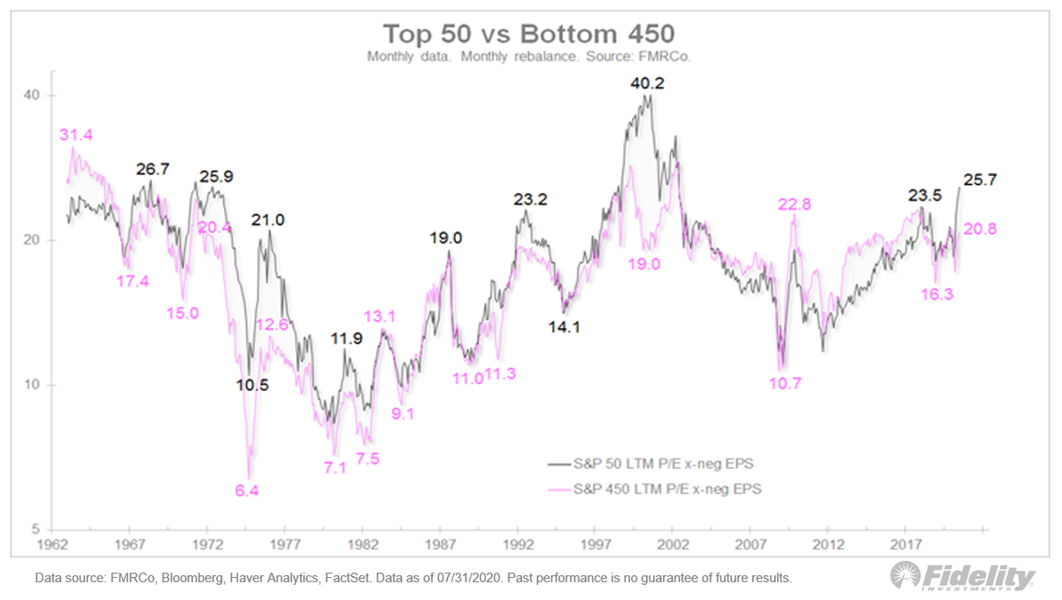
13/ Currently, the top 50 are trading at a P/E of 25.7x while the bottom is at 20.8x. Yes, the mega caps are running away from the pack but the difference isn’t even close to the dot-com bubble, in my opinion.
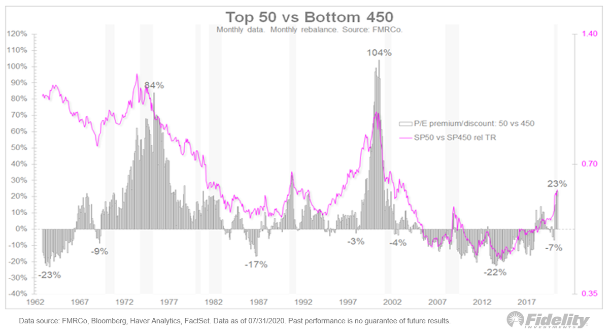
14/ Let’s consider total return overlaid against the premium/discount of the top 50 P/E vs. the bottom 450. Again, mega-cap dominance but the top 50 P/E has only swung from a 22% discount in 2014 to a 23% premium in 2020.
15/ Slicing this yet another way, this chart shows the analogs as an overlay: Relative total return on the left, relative P/E on the right.
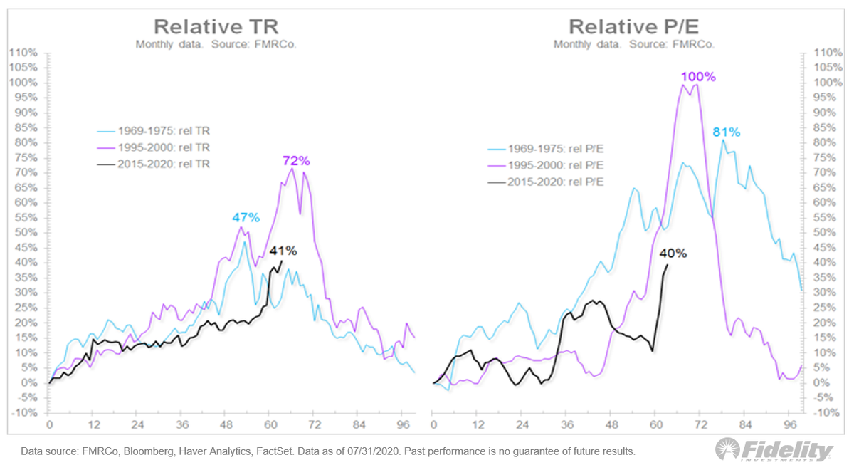
16/ My conclusion? While mega caps dominate the return side of things, it appears to be justified by their relative earnings power. As a result, while relative valuations have expanded, they aren’t close to the levels which, in past cycles, led to a bursting bubble.