A secular fork in the road: Here, the secular bear mkts & secular bull mkts interspersed. It’s my thesis that we’re in a secular bull mkt which, at 11 years old (since the #SP500 index started making new highs in spring 2013), I believe is only in its 5th or 6th inning. 1/THREAD
The double-digit CAGR, the short & swift bear markets followed by robust recoveries to new highs, and the steady expansion in valuation multiples all spell “secular bull” in my view. 2/
The post-global financial crisis (GFC) #bullmarket continues to closely track the secular bull markets of 1949-1968 and 1982-2000. It’s a sample size of only two but the analog suggests we may have a ways to go still. 3/
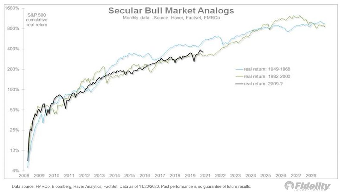
Let’s look at those previous 2 super cycles. The top panel show the #SP500 index & the bottom shows the 10-year CAGR. The chart indicates that while we’re just past the midway point on the analog, we’ve reached the point at which the 10-year CAGR has peaked in the past. 4/
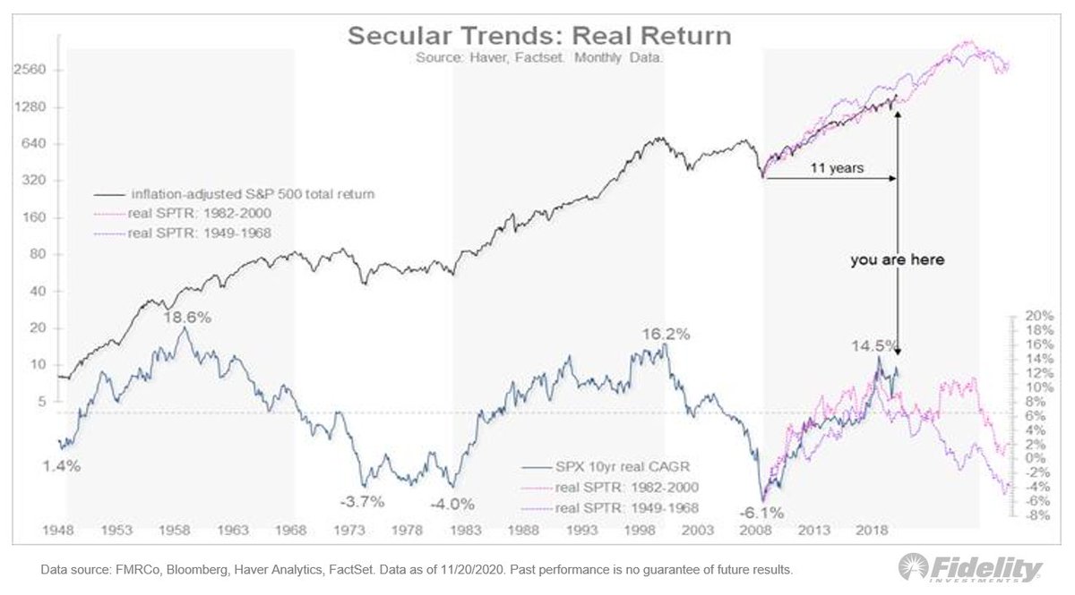
That suggests the #market should continue advancing but at an increasingly less-positive rate of change. An important milestone, in my view. From what I’ve seen, when a price trend continues but its momentum wanes, leadership can get less monolithic and more diverse. 5/
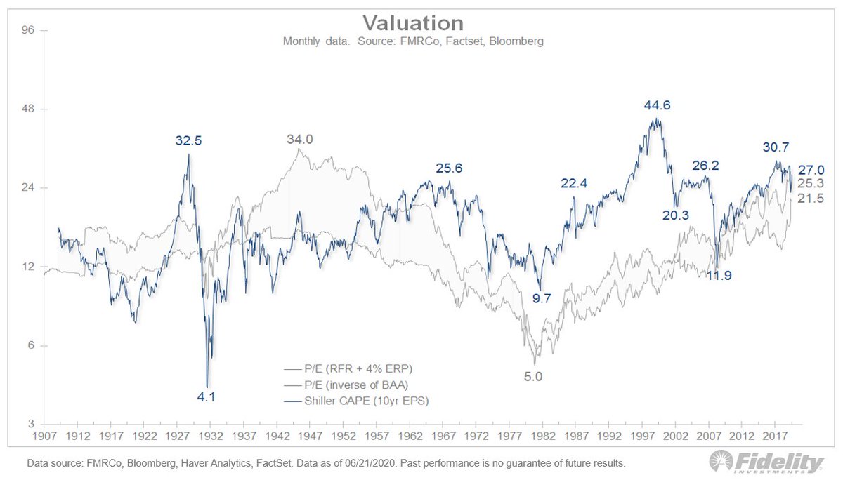
If the 10-year CAGR is peaking at around 14% and on its way to moderating, the secular road map should start to converge toward the CAPE model. 6/
The cyclically adjusted price-to-earnings CAPE model has been consistently at odds with the secular roadmap in that it has predicted lower forward returns in the low- to mid-single digits. 7/
But given we’re on the roadmap, the 2 approaches could start to look more complementary. Here, the CAPE model based on 2 different in-sample periods: 1950-1998 & 1950-2016. In the chart, the y-scale is the forward CAGR and the x-scale is the CAPE. 8/
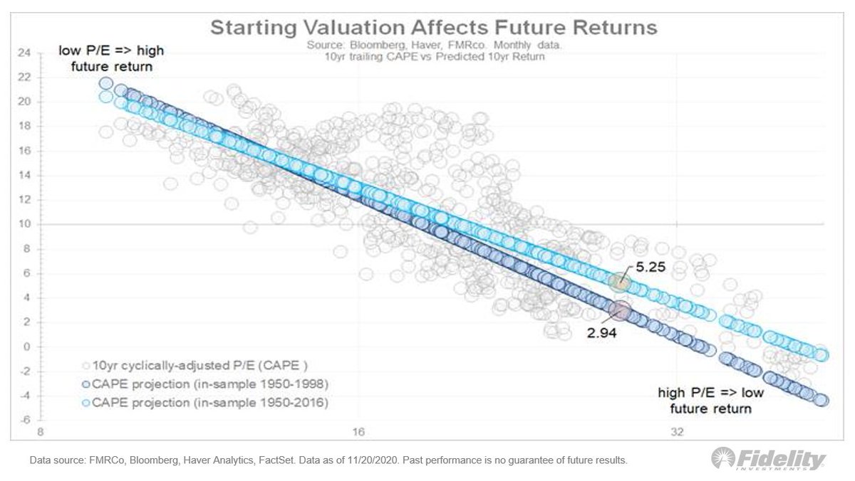
The latter in-sample “normalizes” the valuation levels of the late 1990s and therefore projects a better future rate of growth (5.25%) than the former (2.94%). 9/
Here, the history of the CAPE model and what it suggests for the future. 10/
And here, the projected return as an index. Both are up, but the CAPE model is up less. 11/
So what does this mean for style rotation? This chart shows the 10-year-CAGR for growth/value, large/small, US/ex-US and stocks/commodities. Since the 2009 post-GFC low, it has all been the same trade. Will this continue or reverse? 12/
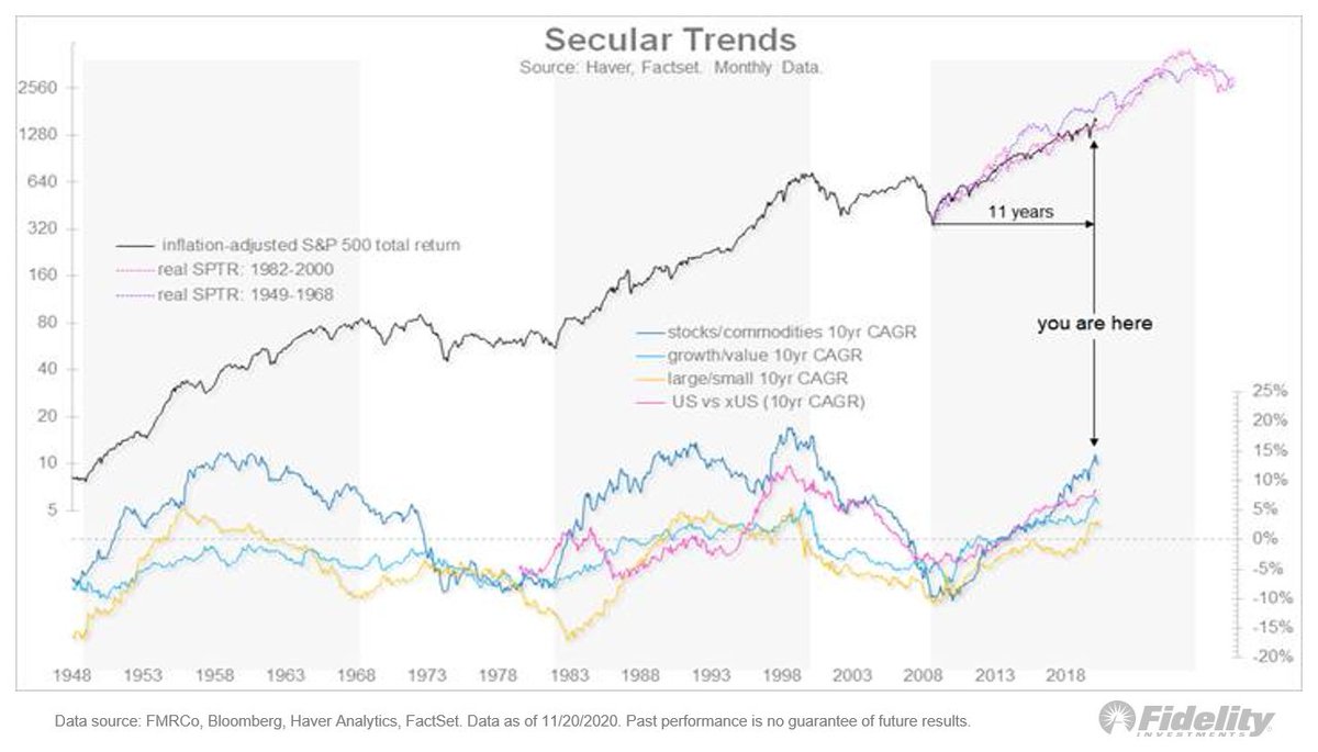
If the rate of change peaks here, it could be the time when the all-one-trade nature of the #bullmarket could change into something more disperse. 13/END

• • •

Missing some Tweet in this thread? You can try to force a refresh
 

Keep Current with Jurrien Timmer

Jurrien Timmer Profile picture

Stay in touch and get notified when new unrolls are available from this author!

Read all threads

This Thread may be Removed Anytime!

PDF

Twitter may remove this content at anytime! Save it as PDF for later use!

Try unrolling a thread yourself!

how to unroll video
  1. Follow @ThreadReaderApp to mention us!

  2. From a Twitter thread mention us with a keyword "unroll"
@threadreaderapp unroll

Practice here first or read more on our help page!

More from @TimmerFidelity

20 Aug
(1/THREAD) Sentiment: One might think, with the #market erasing all its losses, that sentiment would have gotten somewhat lopsided, but it hasn’t. Here, flows into equity funds & ETFs & money market funds. #equities #SPX
2/ The rush into #cash has barely been undone, while #investors aren’t exactly rushing into #equities. While cash sitting in money market funds has dropped slightly from nearly $5 trillion to about $4.55 trillion, it has fallen from 17% to 13% as a percent of equity market cap.
3/ Looking at the percent of equity market capitalization is probably a better way to slice the data as a proxy for sentiment and it has matched almost perfectly the spread on high-yield corporate #bonds. The rest of the sentiment picture is mixed too.
Read 8 tweets
18 Aug
Valuation: It’s a contested issue in the market. Are stocks as divorced from fundamentals as many say? This chart shows that’s a fair point. While the #SPX is up 50% from the low, the NTM P/E multiple has almost doubled. Image
But, in my view, the bearish P/E argument misses something important: At bottoms, price usually leads #earnings. So there are going to be periods where price goes up while earnings still go down which, mathematically, leads to a rising P/E ratio.
The same thing happened in 2009 after the GFC bottom. Look: an analog of the inflation-adjusted #SP500 index now & back then. Bottom panel: Earnings as measured from the price low—not the earnings low. Back in ’09, EPS fell another 5% after the #SPX bottomed on March 9. Image
Read 12 tweets
11 Aug
One noteworthy aspect of the #COVID19 market has been the success with which the #Fed & other #centralbanks have been able to stem the “Covid Crash” and then help control the recovery. The current backdrop reminds me a bit of the 1942-1946 #QE cycle. Let’s take a look. (THREAD)
1/ After the Great Depression, the government went into high gear during WWII and, in the process, ran up huge government debt. Federal debt as a percent of #GDP jumped to 116% from 39% during the 1st half of the 1940s.
2/ Not only did the Fed monetize the debt by increasing its balance sheet 10-fold, it repressed the entire #yieldcurve by capping short rates at 3/8% & long rates at about 2.5%. #Inflation ran up but, with the #Fed repressing rates at low levels, real rates went negative.
Read 24 tweets
4 Aug
Another #tech bubble? There’s a lot of talk about the FANG mega-cap #growth companies leading the market, just like 2000. The #tech companies’ narrow leadership of the #SPX is a big reason perma-bears are hating on the #market. Right or wrong? Let’s take a closer look. (THREAD)
1/ In 1999 I did a deep dive on the top darling stocks to compare the lopsided leadership of the late 1990s to the early to mid-1970s. Earlier, during the 1960s, the cyclical #bullmarket from Oct. 1966 to Nov. 1968 produced a huge bubble in retail speculation.
2/ #Tech & space companies were big favorites. Then came the #recession of 1970 & a painful bear market that wiped out speculators. During that decline & recovery, institutional investors dominated the #stockmarket & were buying tried-and-true stocks with bulletproof #earnings.
Read 18 tweets
23 Jun
(THREAD) 1/ Is the market’s current valuation really as bad the Shiller CAPE suggests? In my view, the answer is no. Here’s why.
2/ This shows the Shiller CAPE, or the #SP500 price index, divided by the 10-yr avg for #earnings per share. At 27.0x, the #market is at the 92nd percentile of all history, with only the 1929 peak and the dot com bubble producing a higher valuation. Not good company.
3/ But, like a blunt instrument used for precision surgery, the CAPE falls short. It doesn’t take into account interest rates, the equity risk premium or the percentage of #earnings that are being distributed back to shareholders via dividends & share buybacks.
Read 15 tweets
22 Jun
(THREAD) Could the huge rally since March 23 be just a bear market rally? And how would we know? Let’s take a look at history—and some charts. #SP500 #SPX #stockmarket #investing
1/ Here we see that price (#SP500) and it confirms my view that, with the exception of 1929 and 1937, the power of the current rally strongly suggests that a new #bullmarket is underway.
2/ This chart shows the retracement of the preceding decline. The current retracement far exceeds the others, but I think that’s probably just a byproduct of the fact that we have only declined 35% so far, whereas some of the prior bear markets produced declines of 50%-90%. #SPX
Read 12 tweets

Did Thread Reader help you today?

Support us! We are indie developers!


This site is made by just two indie developers on a laptop doing marketing, support and development! Read more about the story.

Become a Premium Member ($3/month or $30/year) and get exclusive features!

Become Premium

Too expensive? Make a small donation by buying us coffee ($5) or help with server cost ($10)

Donate via Paypal Become our Patreon

Thank you for your support!

Follow Us on Twitter!