New #COP26 analysis: 🚨🌡️🌍
Is COP26 on track to keep 1.5°C alive?

Here I connect the dots between findings of the most recent scientific reports and look at what current pledges mean for carbon budgets limiting warming to 1.5C

(1/n)
I start with historical CO2 emissions from the Global Carbon Project @gcarbonproject as assessed in the latest @IPCC_CH #AR6 #ClimateReport

About 2400 billion tonnes of CO2 (GtCO2) have already been emitted between the years 1850 and the end of 2019 (2/n)
I then add global emissions pathways consistent with current policies, and various interpretations of country pledges (called NDCs, or nationally determined contributions) from the latest update of the @UNEP #EmissionsGap Report 2021. (3/n)

wedocs.unep.org/bitstream/hand…
The lowest, most optimistic pathway assumes that all conditions that countries include in NDCs are met, and all #NetZero are achieved.

(Note: the @UNEP report highlights that few 2030 targets are in line with meeting countries' long-term net zero targets at this stage) (4/n)
For the remainder of the analysis, I only work with this lowest, most optimistic pathway.

And compare the emissions under the curve with the remaining carbon budgets for limiting warming to 1.5°C from the latest @IPCC_CH AR6 #ClimateReport
(5/n)
ipcc.ch/report/ar6/wg1/
As it stands today, under the most optimistic pathway of #COP26 pledges and announcements, the carbon budget for keeping warming to 1.5°C with 50% or higher chance will be exhausted by the early 2030s.
(6/n)
What can be done?
What about increasing near-term ambition to ensure emissions are halved by 2030?

This postpones the date and is critical to keep 1.5°C alive, but action (and emissions reductions) cannot end there.

(7/n)
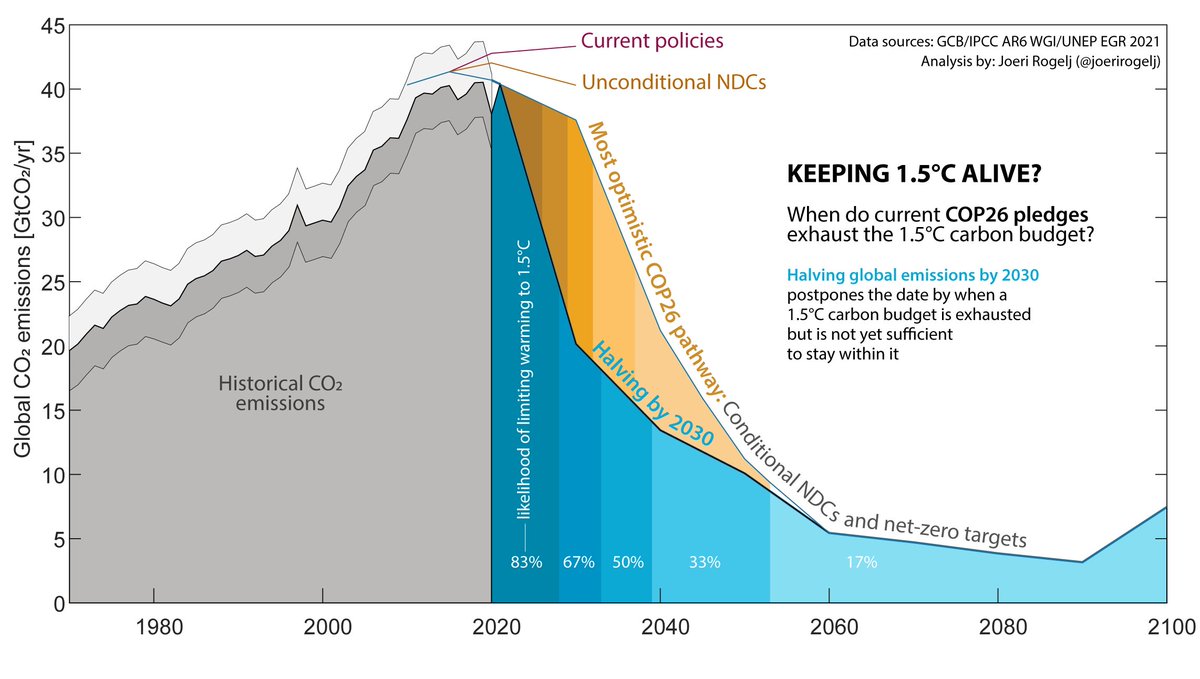
Only when further combined with the achievement of #NetZero CO2 emissions by 2050 can total CO2 emissions be kept to within a 1.5°C carbon budget.

Even then the likelihood that warming is kept to 1.5°C is barely about 50%. Not great, but keeping 1.5°C alive!

(8/n)
Uncertainties in past emissions, interpretations of pledges, and the size of carbon budgets do not change the core message that ambition needs to be increased to keep 1.5°C alive. (end)
With a big thank you to @RobinLamboll for helping to calculate these pathways!

• • •

Missing some Tweet in this thread? You can try to force a refresh
 

Keep Current with Joeri Rogelj

Joeri Rogelj Profile picture

Stay in touch and get notified when new unrolls are available from this author!

Read all threads

This Thread may be Removed Anytime!

PDF

Twitter may remove this content at anytime! Save it as PDF for later use!

Try unrolling a thread yourself!

how to unroll video
  1. Follow @ThreadReaderApp to mention us!

  2. From a Twitter thread mention us with a keyword "unroll"
@threadreaderapp unroll

Practice here first or read more on our help page!

More from @JoeriRogelj

2 Nov
Often misunderstood, even by climate change scholars like @jasonhickel, a 2050 #netzero greenhouse gas emissions is not the global average!

It is two decades earlier than the global average in 1.5C pathways. (1/2)
1.5C pathways with no or limited overshoot reach #netzero CO2 emissions by 2050, and #netzero greenhouse gas emissions around 2070.

A target of #netzero GHG by 2050, like the EU, US, UK, and others, is thus well in advance of the global average.
This year's @UNEP #emissions report gives an overview of global timings of net zero CO2 and total greenhouse gas emissions.

Note the difference of about two decades between the timing of global #netzero CO2 and total GHG emissions. Image
Read 4 tweets
2 Nov
What makes a good #NetZero pledge?

Many things but picking three:
1) focus on reductions then removals (& separate them out)
2) justify how it is fair and adequate
3) have a clear plan showing how reductions are achieved in the near term (1/n)
bbc.com/future/article… @BBC_Future
Together with @CFyson from @climateactiontr and @katecullen_ we comment on how #NetZero targets can help, but also on how there is a series of boxes to be ticked by before any #NetZero target becomes a solid and ambitious contribution to tackling the #ClimateCrisis. (2/n)
Interested in more on #netzero targets?

I wrote a long thread on 10 guidelines that we published earlier this year in the scientific journal @Nature (with Annette Cowie, @ReisingerAndy and @Oliver_Geden) (3/n)

👇👇
Image
Read 4 tweets
26 Oct
The Heat is On🔥🌍
A world of climate promises not yet delivered

Today we’ve publish the @UNEP #EmissionsGap report

Good news:
we are doing increasingly better closing in on 2°C
Bad news:
it is still far from meeting the goals of the #ParisAgreement

A short thread (1/n)
The @UNEP #emissionsgap report takes stock of current pledges of countries and compares them to where emissions emissions should be going to limit warming to 1.5°C or 2°C.

The difference is called the emissions gap.
(2/n)
The latest @UNEP #EmissionsGap Report finds new and updated Nationally Determined Contributions only take 7.5% off predicted 2030 emissions compared to previous commitments. Reductions of 30% are needed to stay on the least-cost pathway for 2°C and 55% for 1.5°C. (3/n)
Read 15 tweets
19 Aug
Visuals in the latest #IPCCReport are a marvel I cannot stop talking about!

Here's part 2 of my overview of @IPCC_CH AR6 SPM visuals.

Kudos once again to @angelamorelli @tomhal99 @jordanharold and @MelichatGo for helping to visualize our insights (1/n)
After yesterday, we now landed on changes in extremes🌡️⛈️🥵🧺!

And although I don't like to pick favorites, I do like this visual very much.

Too big for a single tweet, this one shows how hot extremes over land change compared to when our great-grandparents were alive. (2/n)
Did you notice in the previous figure: a heat extreme that our great-grandparents would have experienced once in their lifetime, will occur about once every 4 years in a 2°C warmer world. It will be the norm in a 4°C warmer world.

I like the clarity of this figure! :)
(3/n)
Read 12 tweets
18 Aug
After the first bang of the @IPCC_CH AR6 report, it's time to look at my favorite part of the report:
visuals in the SPM.

It was a privilege to work with a team of #dataviz and information design experts @angelamorelli @tomhal99 @jordanharold on these visuals
(1/n)
The first visual shows us that human influence has warmed the climate at a rate unprecedented in at least 2000 years.

I really like how it contrasts the climate our societies were used to during their development with the evidence that we are responsible.
(2/n)
Read 12 tweets
9 Aug
Carbon budgets tell us how much CO2 we can still emit while keeping warming below specific limits.

The latest @IPCC_CH report provides updated estimates of these budgets.

Here’s an insider's view with a deep dive looking at how they have changed since previous reports. (1/n)
I have been involved in the estimation of carbon budgets since the IPCC Fifth Assessment Report in early 2010s.

And since the first IPCC estimates published in 2013, we have learned a lot and have gotten much better at estimating remaining carbon budgets. (2/n)
The scientific basis underlying a carbon budget is our robust scientific understanding that global warming is near-linearly proportional to the total amount of CO2 we ever emit as a society.

This is shown in Fig. SPM10, both for the past and future projections. (3/n)
Read 25 tweets

Did Thread Reader help you today?

Support us! We are indie developers!


This site is made by just two indie developers on a laptop doing marketing, support and development! Read more about the story.

Become a Premium Member ($3/month or $30/year) and get exclusive features!

Become Premium

Too expensive? Make a small donation by buying us coffee ($5) or help with server cost ($10)

Donate via Paypal

Thank you for your support!

Follow Us on Twitter!

:(