
,
10 tweets,
3 min read
Read on Twitter
I've noticed that some people have tweeted this graph as “refutation” of my argument about global poverty. They have clearly not been paying attention to my actual argument. Thread: 

1. The graph shows that as we raise the poverty line toward the evidence-based $7.40 threshold, it becomes clear that incomes have increased by such a tiny amount that to this day a full 58% of the human population remains poor, exactly as I have said.
2. The graph shows that the proportion of poor declined only marginally from 71% in 1981 to 58%, exactly as I've said. As I put it in my letter to Pinker, “Suddenly the grand story of progress seems tepid, mediocre, and – in a world that’s as rich as ours – completely obscene.”
3. What is more – and most importantly – this cannot be considered “progress” against poverty when compared against our capacity to end it. Indeed, by this metric we are regressing as a civilization.
4. Because the graph shows only global figures, it obscures my key point: that virtually all net gains have come from China, which cannot be recruited in defense of neoliberalism. Outside China, the proportion of global poor is about the same today as it was in 1981, at 60%.
5. The graph shows proportions, rather than absolute numbers. The absolute number of global poor has increased dramatically (by 1 billion people) since measurements began in 1981. I have explained in detail why this is an important metric.
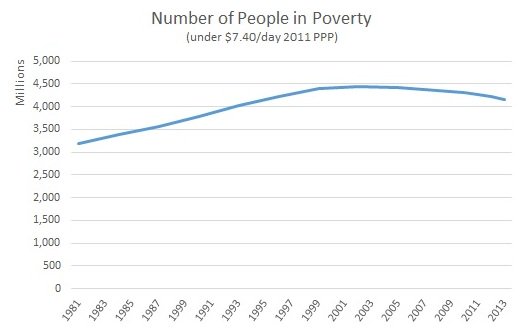

6. I consider these numbers – including those represented in the graph in question – to be a clear indication that the global economy is not working for the majority of humanity, in stark contrast to the narrative peddled by Gates and Pinker.
7. The graph says nothing about the long-term poverty data, which was the core of my argument. Indeed, Max Roser has still not answered my point about how it is illegitimate to use GDP figures to assess poverty during the period of enclosure and dispossession under colonialism.
8. In sum, it's a great graph, I like it, I have used it myself, and it nicely illustrates key aspects of my argument. At the same time, there is also much more to the story about global poverty than this graph is able to capture.
Here's the argument, for those of you who have asked for it: jasonhickel.org/blog/2019/2/3/…


