, 18 tweets, 4 min read Read on Twitter
1. A Tutorial on Sophisticated Trickery
This graphic does not represent what you think it does. Give me a raw time series of data on any two entities A and B and ask me to make A look better than B, and I will produce a visual that will seemingly do that. 1/
2. Now switch the data between A and B and ask me again to make A look better, and I will do it again, with a new visual and narrative. The trick is a little complicated for those who are not familiar with differential mathematics, but awfully simple for those who know math.
3. I am now going to reveal the trick on how they do it in the media and even academia (believe it or not, not everyone in academia is mathematically savvy, and it is awfully easy to deceive even advanced academics and Nobel Laureates if you appeal to their confirmation bias).
4. Here is the trick. Draw a simple graph of time series data for A and B (i.e. raw data values on Y-axis and time on X-axis). If A looks better than B, you are done.
5. If A looks worse than B, take the first derivative of the data values, i.e. instead of raw data values, compute the percentage change from year to year for the data values. Say if the original values represented GDP in dollars, abandon that and compute GDP growth rate instead.
6. Now graph the first order derivative against time. You may find A now looks better than B. If so, your job is done. Now the narrative should only focus on GDP growth rate and never mention the actual GDP values. Mission accomplished. A looks better than B.
7. What if A still looks worse than B, i.e. the raw data values and the first order derivative both look worse for A. Well, rinse and repeat. Compute the second order derivative, i.e. compute the rate of change of "GDP Growth rates," and compare again.
8. If second order derivative looks better for A, you're almost done. You now just have to come up with a natural language narrative that makes the second order derivative intelligible to a common man. And that's where the narrator's talent lies.
9. You might say, "We all know GDP Growth is a key metric for economic prosperity. While GDP Growth rate for A still lags B, the GDP Growth rate is growing at a higher clip for A than B. At this rate A is certainly going to outpace B in the near future." And voila! Job is done.
10. What if even the second order derivative looks worse for A? Well then compute the third order derivative. I think you get the point. Some nth order derivative is bound to look better for A than B.
11. The only challenge is coming up with a natural language description of higher order derivatives. But trust me, it's not as difficult as you might think, especially for people who do this for a living.
12. By the way, converse is also true. If there is a metric for which the usual metric is already a first or second order derivative, you can also use the same process in reverse, i.e. go from second order derivative to first order derivative, or to raw data, for comparison.
13. And that is exactly what the graph in your original tweet that I based this thread on did. It is customary and usual (for a good reason) to talk about GDP Growth as a metric for comparing economic growths of various countries.
14. Post-recession GDP Growth during Obama years was not any better for the U.S. than the U.K., so how to make U.S. look better? Well, abandon GDP Growth rates (the first order derivative) and revert to raw GDP instead, normalized to 100 at the starting point.
15. With the massive injection of trillions of dollars via Fed quantitative easing and the stimulus package the U.S. GDP overall in normalized dollars was doing much better than say UK when the recession ended six months into the Obama presidency, around middle of 2009.
16. Look at the differential between the US and UK GDPs around middle of 2009. US is significantly better. Jot it down. Now look at the same differential at the end of Obama presidency in 2016. Is the differential any different? Nope. If anything, probably a little worse.
17. But visually U.S. graph is above the UK graph all through, so claim US did better than UK when in fact both did equally poorly in terms of a post-recession recovery. Ask yourself why did the people who came up with that graphic use GDP instead of GDP growth rates?
18. I think by now, you know the answer.

The End
Missing some Tweet in this thread?
You can try to force a refresh.

Like this thread? Get email updates or save it to PDF!

Subscribe to Bansi Sharma
Profile picture

Get real-time email alerts when new unrolls are available from this author!

This content may be removed anytime!

Twitter may remove this content at anytime, convert it as a PDF, save and print for later use!
Try unrolling a thread yourself!

how to unroll video

1) Follow Thread Reader App on Twitter so you can easily mention us!

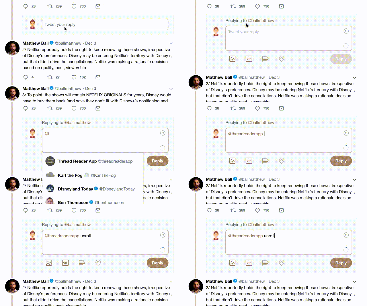
2) Go to a Twitter thread (series of Tweets by the same owner) and mention us with a keyword "unroll" @threadreaderapp unroll

You can practice here first or read more on our help page!

Follow Us on Twitter!

Did Thread Reader help you today?

Support us! We are indie developers!


This site is made by just three indie developers on a laptop doing marketing, support and development! Read more about the story.

Become a Premium Member ($3.00/month or $30.00/year) and get exclusive features!

Become Premium

Too expensive? Make a small donation by buying us coffee ($5) or help with server cost ($10)

Donate via Paypal Become our Patreon

Thank you for your support!