, 20 tweets, 5 min read Read on Twitter
Next up is Nadine Raydan from @ReachOut_AUS talking about the Next step story: young people, digital self help and better mental health.

#uxaustralia
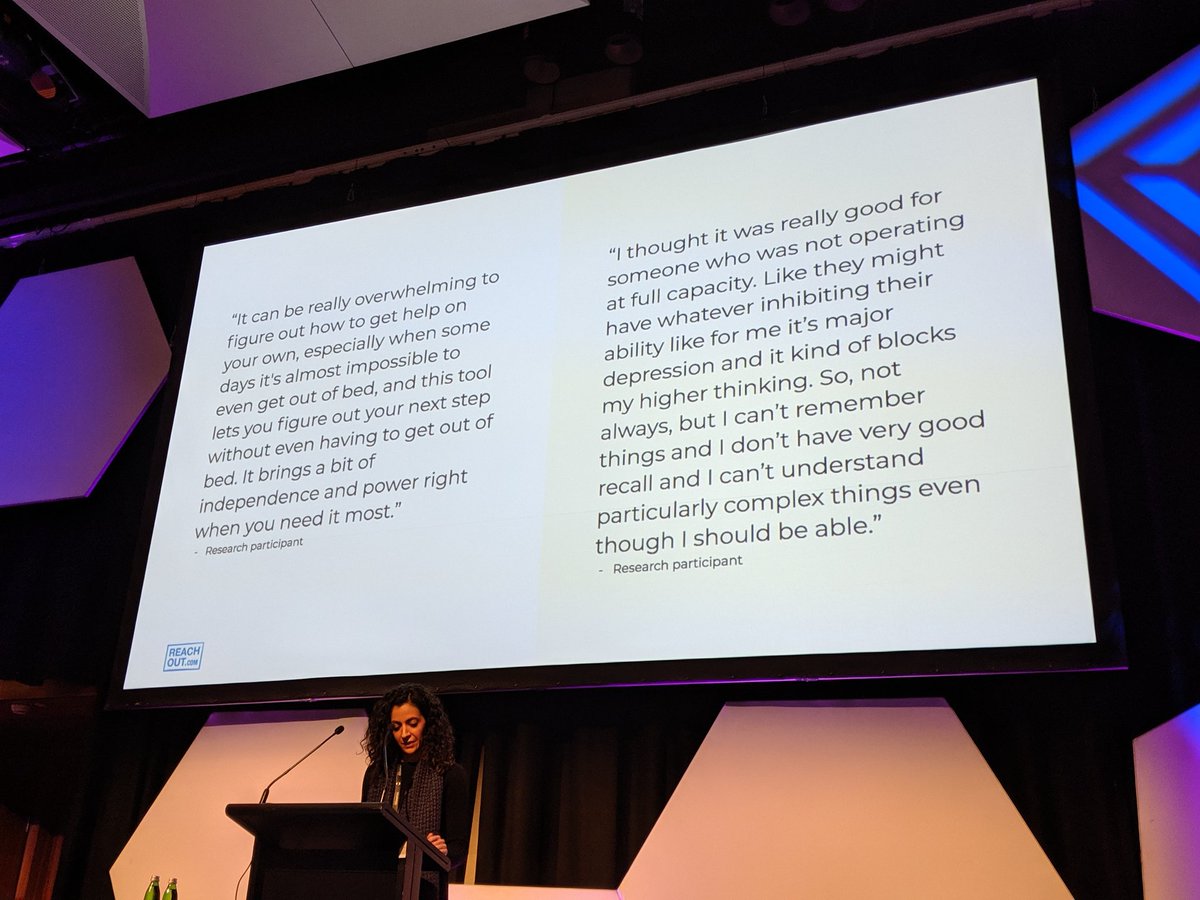
Everything Reach out do is codesigned with young people.

Quotes from their audience:
We know they're no isolated incidence and they're they data points that drive what they do.

Self efficacy and autonomy are barriers that prevent young people seeking help.
When staking the first steps to seek help they are stepping into the unknown, seeking help privately.

The process is:

Assessing
Accepting
Acting

And it is non linear and very easy to become overwhelmed.
It's very hard to know what information is trustworthy and because of this the NextStep was funded to help move young people through process of seeking help before they're in a crisis.
It will be a personalised approach and in 4 steps a young person can receive support for the moment they find themselves in.
The stepped care approach sees your local GP as the first step for mental health support and the NextStep app puts the focus on what can be done before needing the GP
Process that was done to build the app
Even after all this process it wasn't having the impact Nadine wanted and the list of issues read like all products.
UX Challenges & Complex considerations
They were able to challenge the bias of adults designing for young people through the language used.
How can we keep the service anonymous and safe to use?

They used the 4 digit pin if the young person wanted to use it to protect their session data. They self select it and have control over the option.

If they return they have 3 attempts to connect to the session
One of the issues was the list of symptoms at the beginning of process was important but they had an 80% drop off from step 1 to 2.

They added a number of different ways to select the issues to reduce the likelihood of drop off.
To reduce the amount of user lead data input they made identifying a location automatic.

For young people seeking help the less cognitive load the better, not having to enter information makes them more.likely to continue the process.
If a young person selects any of the high risk symptoms and emergency overlay is displayed to direct them to immediate help like 000
They had a list of icons and filters to represent each category but the final conclusion was the icons distracted people away from the action they wanted them to take.
They built in an extra confirmation step so that there was time for reflection before every choice. It meant the young person was given space to reflect on their choice before moving forward.
The emoji use was important to young people. It allowed them to focus on the emotion they were feeling rather than if the face looked like them or distracted them from being able to think about their emotions.
Thanks Nadine!
@threadreaderapp unroll please!
#uxa19
Missing some Tweet in this thread?
You can try to force a refresh.

Like this thread? Get email updates or save it to PDF!

Subscribe to Rohan Irvine
Profile picture

Get real-time email alerts when new unrolls are available from this author!

This content may be removed anytime!

Twitter may remove this content at anytime, convert it as a PDF, save and print for later use!

Try unrolling a thread yourself!

how to unroll video

1) Follow Thread Reader App on Twitter so you can easily mention us!

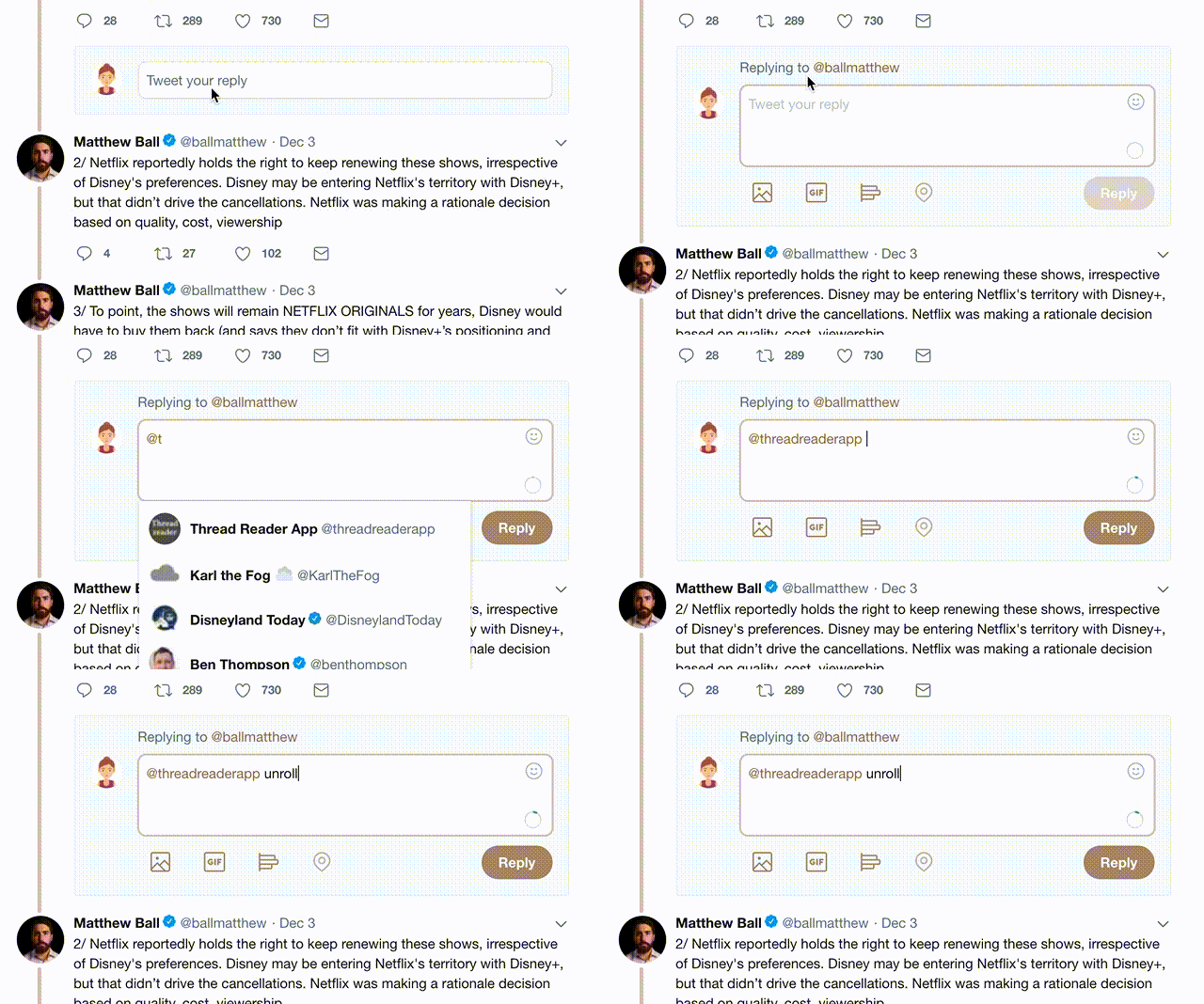
2) Go to a Twitter thread (series of Tweets by the same owner) and mention us with a keyword "unroll" @threadreaderapp unroll

You can practice here first or read more on our help page!

Follow Us on Twitter!

Did Thread Reader help you today?

Support us! We are indie developers!


This site is made by just three indie developers on a laptop doing marketing, support and development! Read more about the story.

Become a Premium Member ($3.00/month or $30.00/year) and get exclusive features!

Become Premium

Too expensive? Make a small donation by buying us coffee ($5) or help with server cost ($10)

Donate via Paypal Become our Patreon

Thank you for your support!