, 18 tweets, 4 min read Read on Twitter
Just real quick, there's a couple things I want to talk about regarding the thread about aspiring comics artists I started last night.
Please keep in mind, this is coming from a non-artist. I can't draw. I don't have some astonishing insight into comic art.
1/
HOWEVER, I have written over six hundred comics for a multitude of artists, including some of the best the industry has ever produced. I may not know how to draw a building, but I know what is effective for comic storytelling, or at least what I feel works. 2/
So I have a few things that I see often enough, SOME on this thread but also quite a few times each convention when people bring me comics or their portfolios.

I'm throwing out a couple notes that may be helpful to some of you. Things I see often that can bring down a page. 3/
What I am seeing a LOT more now than I used to is faces and bodies that are rendered, but don't seem to match. I see comic book body poses with these kind of overly rendered but emotively flat faces. It is more important that a figure conveys emotion than anything. 4/
I see a lot of skimping on a sense of place. Figures often seem placed on a 2d plane in a 3d room, as if the space doesn't allow depth. This is the art version of every superhero conversation taking place in a diner. Allow for dynamism. 5/
I think some of this would work itself out with experience, but I see a LOT of comics with huge flat word balloons crowding out the art. It's supposed to be chocolate and peanut butter. Draw so fewer words are needed, write so art conveys meaning and mood. 6/
I feel like some comics are relying a bit too much on photo or model reference. I am seeing a lot of comics that have real people standing around in a manner that takes the life out of the drawing. Elongate. Vary the camera. Emote. We see dull people standing all day long. :) 7/
I do realize not everyone wants to do the same kind of comics, that's fine...but in most circumstances, we are still trying to create a pleasing sequential visual. If we're not doing that, we might need to reconsider our approach. 8/
For inking and rendering, I am seeing a lot of pieces where every line is given equal weight, and every figure uses the same line. That's a whole discussion of its own, but remember negative space. Remember panel flow. Lead the eye, don't give every detail the same weight. 9/
And coloring, I think it's better to have no coloring than coloring which is detrimental to your work. I see two glaring things over and over.
1) Too much shiny gloss, where the reality of the line drawing is lost to an effort to make everyone look like a Gundam or something. 10/
And thoughtless color, where no thought is given to how the overall page looks, and again, every color is given the same weight. If you color the average comics page with every color you would see in the real world version, it looks messy and sloppy, usually. It's unpleasant. 11/
If I have a message, it's that you have to edit. In writing, some of the best work done is getting rid of lines you don't actually need. It's the same with comics art.
You might do better with more careful color, fewer huge swaths of solid black, less crosshatching, etc. 12/
I know every artist is different and if you are Alex Ross or Jim Lee, you break all these ideas and it works and people love it. But for many of the samples I see, this is stuff that gets in the way of storytelling, even in pin-up shots. 13/
I have to finish getting ready for my trip today but I do want to repeat, it's your style, it's your art. My advice may not apply. And I would definitely take the advice of a working comics art pro over some weird lady who wrote Gus Beezer. 14/
But writers are often the very people who discover artists and bring them to the attention of editors. There are a bunch of pro artists that I found online or at a convention.
If I look at your sequentials and they don't evoke emotion, there's not much I can do for you. 15/
Don't let this get you thinking you can't do it. Use it to evaluate, motivate and activate. Look, get pumped, adjust.

The best, the artists we all want to work with, are CONSTANTLY looking to make their work the best it can be.

16/
Now, I don't know your goals, I don't know your situation.
You may be in a minority in that you don't need or want a working pro writer's advice, and that's fine!
But for those who are aspiring to work in comics, this thread may help a bit. I hope it does.
17/
And finally, I really enjoyed the thread, and the submissions. There are quite a few of you I'd love to see doing regular work and a bunch more that are almost there.
I wish you luck. KEEP GOING.
Take gigs, work on your craft, bring your heart to your art.
GOOD LUCK! end/
Missing some Tweet in this thread?
You can try to force a refresh.

Like this thread? Get email updates or save it to PDF!

Subscribe to GAIL SIMONE
Profile picture

Get real-time email alerts when new unrolls are available from this author!

This content may be removed anytime!

Twitter may remove this content at anytime, convert it as a PDF, save and print for later use!

Try unrolling a thread yourself!

how to unroll video

1) Follow Thread Reader App on Twitter so you can easily mention us!

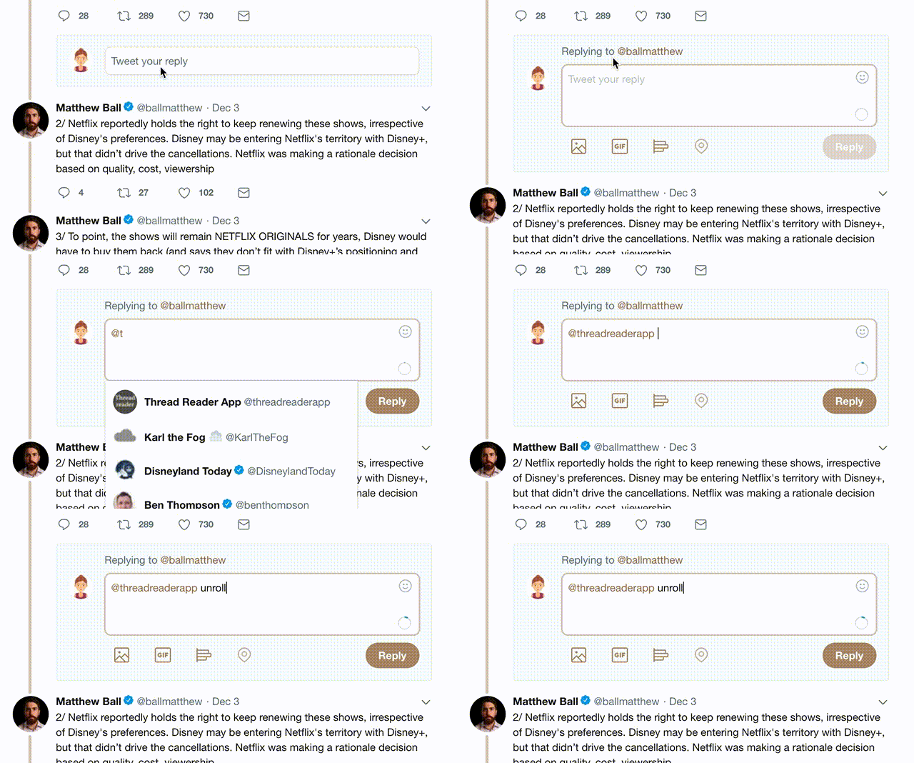
2) Go to a Twitter thread (series of Tweets by the same owner) and mention us with a keyword "unroll" @threadreaderapp unroll

You can practice here first or read more on our help page!

Follow Us on Twitter!

Did Thread Reader help you today?

Support us! We are indie developers!


This site is made by just three indie developers on a laptop doing marketing, support and development! Read more about the story.

Become a Premium Member ($3.00/month or $30.00/year) and get exclusive features!

Become Premium

Too expensive? Make a small donation by buying us coffee ($5) or help with server cost ($10)

Donate via Paypal Become our Patreon

Thank you for your support!