Profile picture
Gravis! @gravislizard
, 23 tweets, 3 min read Read on Twitter
this paypal website menu is extremely useless and bad.
it takes you to this page, which is full of GIGANTIC "cards" that tell you nothing and do nothing.
There are multiple pages of these cards. There's absolutely no reason for this asinine waste of screen real estate.
The cards can be favorited, but the favoriting does almost nothing.
The only thing it does is allow you to make the favorited ones appear higher on the page. But you have to manually select that.
The default sort order is "Popular", and it doesn't store your preference. So every single time you go to this page you have to change the sort order.
This brings up a CRITICAL observation I've made in UX: People will not use affordances of this sort because they don't match thought processes.
I promise you nobody uses this box. Maybe one in a hundred thousand people. The rest just scroll and use their eyes.
This is a tremendous waste of time, but it doesn't matter. I've watched people search through lists of hundreds of items by eye.
They don't even use ctrl+f and I know why that is too: Browser ctrl+f is fundamentally broken.
Case in point, search for a phone number on a webpage. What format should you enter it in?
(425) 606-1303?
(425)606-1303?
425-606-1303?
425.606.1303?
4256061303?

And here's what's important: The moment you have to ask that question, it's over.
People won't use something that isn't 100% reliable. The first time it fails they walk away and never look back.
If browser text search defaulted to ignoring punctuation and spacing, this wouldn't be a problem and everyone here would use it.
The way the cognitive feedback works though, we condition ourselves VERY rapidly out of actions that produce false negative results
I've been at this company for five years and I've consistently seen this behavior over and over and over when we introduce tools.
Employees start using it, and the first time it fails when they KNOW it should have succeeded, they never trust it again.
So, the first time that someone sets a favorite on this paypal page and then discovers it doesn't stick, they abandon it and go back to The Old Way
Okay, let me sum this up differently: Do not offer "options" to users. Users don't want "options", they want a good UI.
Users will SAY they want options. That is because they have been mistrained. Any UI can be objectively done Right.
How Paypal could have done this well:
This makes the Favorite concept useful; by appearing in the menu - one less click! - it gets you something you can't get any other way
The icon allows you to rapidly locate what you want, and when you DO go to All Tools the entire list will fit easily on one page.
Missing some Tweet in this thread?
You can try to force a refresh.

Like this thread? Get email updates or save it to PDF!

Subscribe to Gravis!
Profile picture

Get real-time email alerts when new unrolls are available from this author!

This content may be removed anytime!

Twitter may remove this content at anytime, convert it as a PDF, save and print for later use!
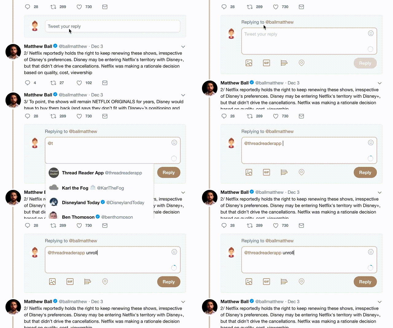
Try unrolling a thread yourself!

how to unroll video

1) Follow Thread Reader App on Twitter so you can easily mention us!

2) Go to a Twitter thread (series of Tweets by the same owner) and mention us with a keyword "unroll" @threadreaderapp unroll

You can practice here first or read more on our help page!

Did Thread Reader help you today?

Support us! We are indie developers!


This site is made by just three indie developers on a laptop doing marketing, support and development! Read more about the story.

Become a Premium Member and get exclusive features!

Premium member ($3.00/month or $30.00/year)

Too expensive? Make a small donation by buying us coffee ($5) or help with server cost ($10)

Donate via Paypal Become our Patreon

Thank you for your support!