Profile picture
Antti Oulasvirta @oulasvirta
, 13 tweets, 3 min read Read on Twitter
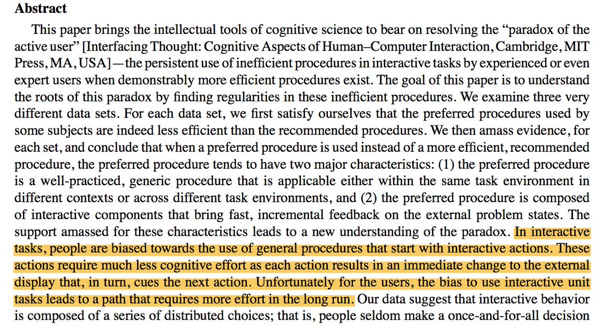
1/12 The Paradox of the Active User is three decades old. Let's talk about it!

TL;DR: While the paradox has assume a folklore status in design, it was misinterpreted from the start and has become an impediment to ambitions in computing at large.
2/12 In 1987, Carroll & Rosson [1] found that users thwart interactions that require reading manuals and practice, even though this results in long-term inefficiency. They wrote: "One of the most sweeping changes ever in the ecology of human cognition may be taking place today."
3/12 This was misinterpreted as the failure of the rational account. People are irrational, designers should assume [2]. Krug's (in)famous "Don't Make me Think" captured the ethos well.
4/12 While computing developed with Moore's Law, the new opportunities it created in interaction mostly concerned new applications and contexts. Comparable improvements were not achieved in the raw, moment-to-moment user performance.
5/12 Result: Point-and-click became the dominant interaction style. While other styles co-exist, this is what most users do with browsers and smartphones. Search, recognize, point, click, wait, repeat.
6/12 We ended up in a lock-in. User performance in point-and-click does not reach high levels even with practice. It is capped by visual search and motor performance. From verbal to spatial skills, many of key abilities are underused. Sayonara, power users!
7/12 On the other hand, users have become to expect immediate usability. This is short-term-rational, given the massive number of applications and services we can try if the present one does not be to our liking.
8/12 The lock-in is an obstacle. From AI to IoT, developments tend to increase complexity rather than decrease it. This, in turn, insists on matching complexity in the controller, the user. (The Law of Requisite Variety.) Presently, there is no easy path to these visions.
9/12 The point-and-click UIs also render people vulnerable to outside control. Our choice environments are infested with ads and biased against unwanted actions (think: Facebook's privacy settings). UIs that turn people into consumers.
10/12 Let's end with a positive note: We are now much better equipped to work with the paradox. Fu and Gray revisited the paradox in 2004, claiming that it does not show irrational but rational behavior, albeit with a short-term horizon [3].
11/12 New theoretical tools have emerged, such as economic models of decision-making and computational rationality [4]. We can better analyze cost-benefit structures and predict behaviors. We may start designing healthier choice environments that 'pull' people up from the rut.
12/12 Finally, we (HCI researchers) do not need to accept the the People are Dumb School. User interfaces, like literacy, require training and dedication. It's a skill not a whim.
Missing some Tweet in this thread?
You can try to force a refresh.

Like this thread? Get email updates or save it to PDF!

Subscribe to Antti Oulasvirta
Profile picture

Get real-time email alerts when new unrolls are available from this author!

This content may be removed anytime!

Twitter may remove this content at anytime, convert it as a PDF, save and print for later use!

Try unrolling a thread yourself!

how to unroll video

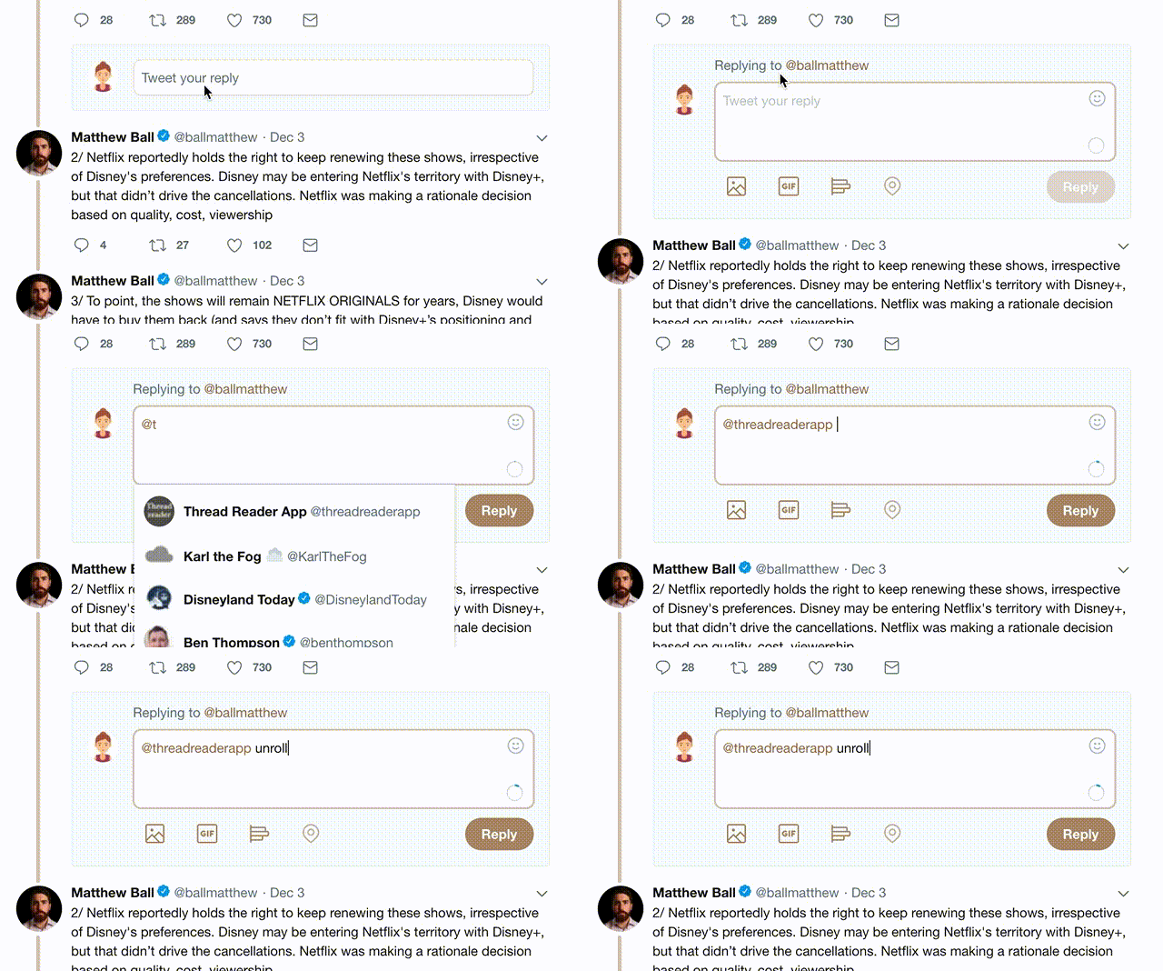
1) Follow Thread Reader App on Twitter so you can easily mention us!

2) Go to a Twitter thread (series of Tweets by the same owner) and mention us with a keyword "unroll" @threadreaderapp unroll

You can practice here first or read more on our help page!

Did Thread Reader help you today?

Support us! We are indie developers!


This site is made by just three indie developers on a laptop doing marketing, support and development! Read more about the story.

Become a Premium Member and get exclusive features!

Premium member ($30.00/year)

Too expensive? Make a small donation by buying us coffee ($5) or help with server cost ($10)

Donate via Paypal Become our Patreon

Thank you for your support!