, 61 tweets, 22 min read Read on Twitter
As promised, here's a retrospective on @GamesDoneQuick's broadcast design!

THREAD COMMENCES
The initial goal was to overhaul how information was conveyed to viewers. The old design didn't have a donation total, or any information about donation incentives or prizes. You had to rely on hosts talking about them or looking at the website. No good!
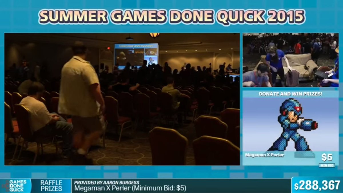
That brings us to our first layout: AGDQ 2015!
Gameplay layouts: 7 (4 standard, 3 widescreen)

A big improvement, but you can tell that I'm pretty new at this. As mentioned a few days ago, I put that bar at the top just to shove a logo and a hashtag into view. That was silly.
I chose Futura Condensed as one of the main fonts for the nameplates, which is something you do when you're panicked about fitting long text everywhere.

Also, just FYI: That number that looks like a timer? That's a TIMER. I made sure to label it everywhere. Good job, me.
The world's smallest runner cam, while sponsors take up a chunk of negative space that's the size of the Panama Canal.

(I remember people thinking this was intentional, but sponsors were always the last thing to go on. I was just.. you know, still learning.)
You'll also notice that the timers aren't built into the graphics, they're compositied captures of Livesplit or some other app, I forget which. I wanted to use an 8-bit font like the estimates have, and was talked out of it by the rest of staff. They were right, I was wrong.
Hey everyone, we're giving away a PS4! If you're interested in what one looks like, it's wayyyyyy over there. I can't be bothered to bring it closer, you're just gonna have to walk over yourself.
The other big innovation was getting a break screen which had upcoming runs on screen. This felt like such a big deal at the time, and we almost take it for granted now.

Pulling off this show was such an amazing feeling, but we came away thinking we could do better.
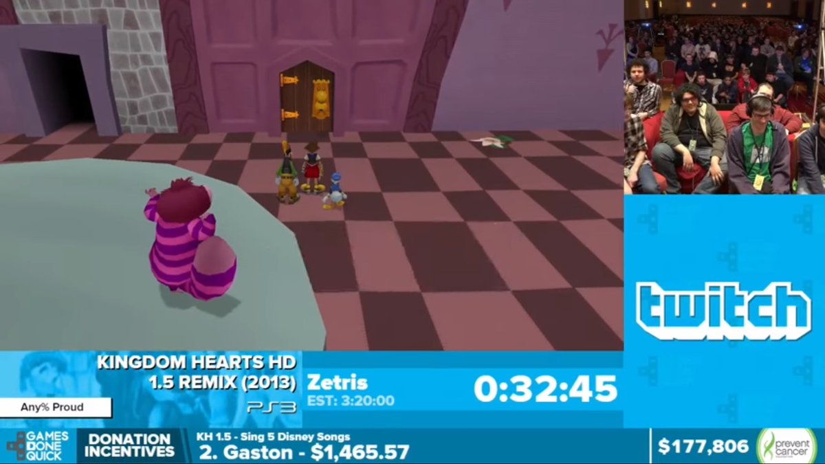
SGDQ 2015
Gameplay layouts: 11 (4 standard, 2 widescreen, 3 for GBA, DS, and 3DS)

We started from scratch, and began the process of using the ticker at the bottom, which we've always internally called the 'omnibar' because it's displaying info about *everything*.
Inexplicable design decision: multiple running timers on screen. I wanted to be able to have every runner's individual finishing time, and went about it in a very redundant, awkward way. One of those things where mid-event I knew it would be the last time we did it.
"So, I got this weird space in the bottom right corner of the screen...."

(2 weeks later)

"...screw it, I'll just put a GDQ logo there."
The break scene got some nice improvements, including a better prize presentation. This was the beginning of realizing we should take our own prize photos, too.

We also were able to start giving credit to those who provided prizes. Never ceases to amaze the cool stuff we get.
Next event: AGDQ2016
Gameplay layouts: 11 (4 standard, 2 widescreen, 3DS, DS, DS-Portrait, 2 GBA)

This is the first event we did officially as @SupportClass, and was also the first event where we felt sorta confident about what it was we were doing.
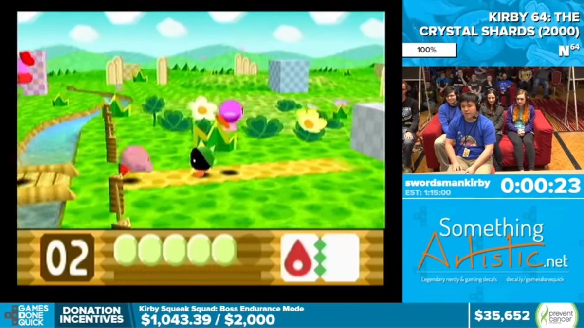
It's also where we started really learning about component design. Remember, these graphics are essentially web graphics, and each component has to work on every layout, so sometimes you end up with weird compromises, like the nameplate and timer on this scene.
I'm gonna repost this image a couple times, but there's a few things to highlight:

1) We hooked up to a DB so that if a game had cover art, it would appear and animate in the background of the game info. Neat, but distracting. Also had a high failure rate.
2) Look, mom! Audio indicators telling you which game you're hearing in the sound mix! At the time I believe this was manual(?), but nowadays our graphics are receiving data directly from the mixer, which is a big help.
3) I lied, we had more than one timer on screen again. Okay, THIS will be the last event we do that, and THIS TIME I MEAN IT
Instead of typing out what console each game was on, I used logos instead. This stunk because of the wide variety of legibility and aspect ratio for each, there were more than I thought there'd be, and they all have to work on each possible layout.
Viewers, I present to you... some really mediocre lower thirds.

I'm sorry.
I'm not going to be entirely self-hating in this thread: The animations we put together were really awesome and I'm super proud of them.

Check out the call to action on the omnibar, the way the logo shifts between elements, and how other elements enter/exit. swaaaaaag
(Thread on pause, I need to help corral some chickens. No, really.)
Alright, chickens corralled! Where were we? Oh, right, still 3 years ago.

Oh god, which is gonna finish first, #AGDQ2019 or this twitter thread
Another first for this event: We have a massive song playlist and everyone always wanted to know what was playing, so we added the notification.

Problem: it was only up for a few seconds when the song changed, and gone by the time you probably wanted that info.
Event: SGDQ2017
Gameplay Layouts: 16 (5 standard including a special demon chocobo variant for FF6, 2 widescreen, 2 GBA, 3 Gameboy, DS, DS vertical, and 3DS)

Design theory: Do you like sprite art? Do you like Mega Man? HAVE WE GOT A LAYOUT PACKAGE FOR YOU
This is probably the last time you could say we did something close to starting from scratch, and even then I believe we were able to port a lot of code over.

New feature this event: Tweets appearing on gameplay layouts! #socialmedia #engagement #braaaaaand
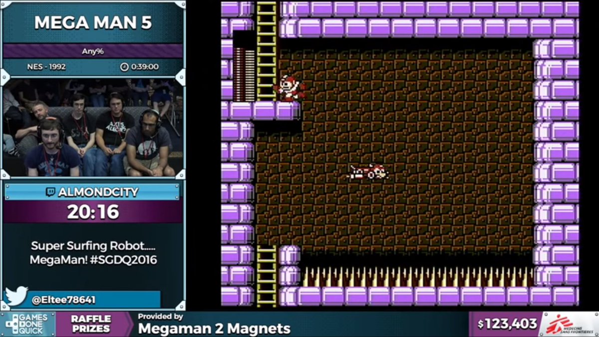
Also, we finally only have one master timer running for races, and individual results for racers appearing when they finish, along with little sprite medals for finish order. Really cute audio indicator, too.
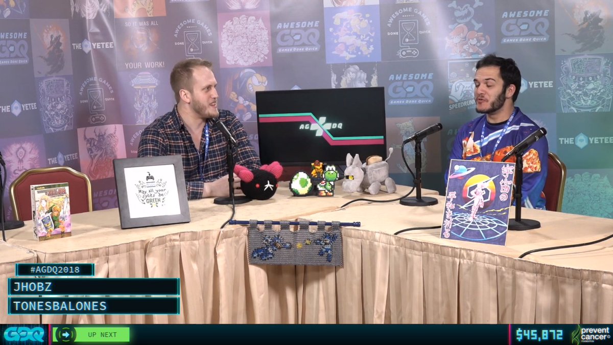
Lower thirds: moderately better. Could only show four names. Wait, we're gonna have five people at the interview desk? Oh. Everyone draw straws to decide who gets to be anonymous
If you look at the structure of these layouts, you can definitely see the framework that the current package exists in. Things are starting to mature and solidify, in a good way. There are design decisions we've made that we're not reflexively trying to rework every time.
The break screen, however, hadn't really evolved much by this point. Yes, it's fun to look at the crowd, but during the late night runs, it's incredibly underwhelming. This needed addressing.
(Whoops, a few tweets back i introduced this event as SGDQ2017 when i meant 2016. This has never happened before, but this is a run I can't reset or I'm gonna go way over estimate, so let's move on)
Event: AGDQ2017
Gameplay Layouts: 15, same configurations as before.

Design theory: THERE WAS NOT ENOUGH MEGA MAN. WE REQUIRE 150000% MORE MEGA MAN
The gameplay layouts saw very few updates, apart from new nameplates that were... yep, more styled like Mega Man. The end caps also opened up to reveal the audio indicators, which was nifty.
Twitter Q&A! I should note here that for every design feature I highlight here, there is an order of magnitude going on behind the scenes to continually iterate on back-end systems, control panels, and user interfaces. A lot of volunteers have to be able to operate this stuff.
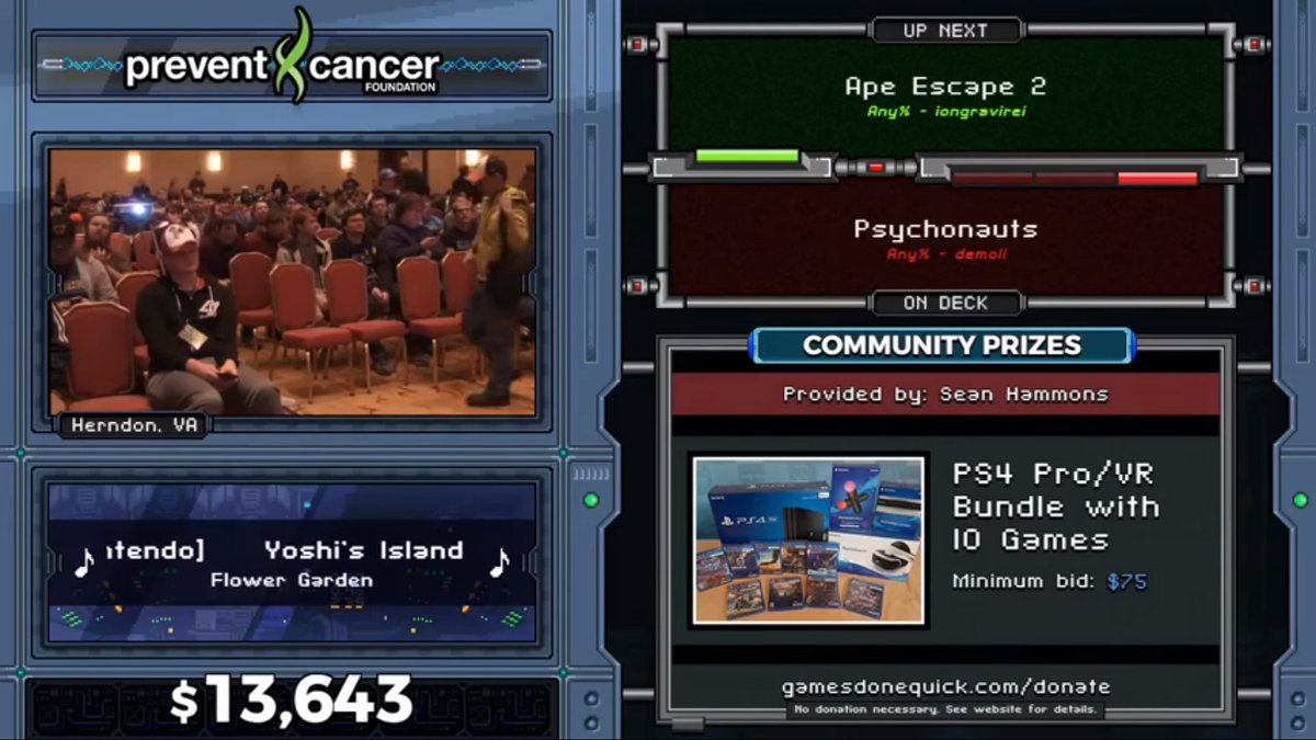
And finally, the real jewel of this event: The break scene got a HUGE revamp. There's so much going on here. Kit-bashed sprite animations in the background. Colored static loops that look awful when encoded. An indicator of where we're located, in case we... get lost or something
I still remain in love with the way we displayed bid wars on this screen.

I am not in love with how I positioned the donation total over the edge of its background element, causing a lot of people to be reflexively annoyed and assume there was a bug.
Event: SGDQ2017 (For real this time)
Gameplay layouts: 16 (We now have 4 different Game boy layouts)

The first time we've decided to give AGDQ and SGDQ different color palettes, riffing off the idea of warm/cool design schemes.
The break screen got a similar color revamp and even more cool animation. The little floating dollar amounts, the Bits/Cheer fireworks, and the last time I've ever been okay with scrolling text with the song information, because the lengths were way too long somteimes
I've forgotten to mention that at some point -- it was somewhere in 2016-2017 -- the donation total stopped updating periodically, and animated for every single individual donation in real time. This was huge for us. You got a real feel for when money was rolling in.
There was a specific moment where there was a real effort by the announcer and Twitch chat to get a wave of $5 donations in, and you could see every single one pile in. Chat went nuts. They could directly see the impact they were making AS IT HAPPENED. I was giddy.
Event: AGDQ 2018
Gameplay Layouts: 19

The first of the current generation of layouts. We've upgraded to 900p. And my love for TRON, FUI, and all things neon-glowly are fully brought to prominence.
It's really subtle, but we created a filter in OBS that applied a chromatic aberration effect to all of the overlays. I thought it looked badass, but if could also make you assume that something was wrong with your monitor, so.... maybe not
The redesigned break screen! Notice anything missing? (The feedback was so negative about the lack of crowd cam that I added one back in before the event had even finished.)
Lower thirds that riffed on our new nameplate design, and allowed us to have longer names on screen when there were a lot of people visible. It's still confusing to relate a vertical stack to people sitting L-R, though.
Another thing that's not really important to viewers but huge to us: There are almost no images being used to build out these layouts. Other than the video looping in the bottom left and the sponsor/charity logos, everything is generated by HTML, SVG, and Javascript.
Which also brings up another big point: We are powered almost ENTIRELY by open source software! We're running on @OBSProject Studio, with graphics powered by @NodeCG, communicating with each other through the obs-websocket plugin. This will never not be my favorite thing.
The first year of the binary timer, the feature that has earned the most ooohs and ahhhs as of late. A fun little thing to give the timer more life. It has states for paused, running, and finished.
The fact that every column represents a single digit does annoy a couple people, though, as it's not 'proper binary'. We once got a feedback email that was longer than the actual code powering the timer.

Characters in the code: 5,383
Characters in the email: 5,728
The layouts have stayed the same visually, so I'm not going to go into full breakdowns of SGDQ'18 or GDQx, but I will show off the color variants and mention a couple features that have been added in the last year...

(Yes, I'm a fan of Synthwave aesthetic, why do you ask)
So, when I first decided I wanted to go down this major 80's neon rabbit hole, I did this sketch in Photoshop, and got very excited. For a long time, this was the twitch channel's offline image. This became the inspiration for our transitions.
We weren't able to build them for AGDQ2018, but they were added in for SGDQ. They are complex as hell, and are not simple video files: They're actually 4 video files laid over 8 separate image elements that animate in and out, and then persist on the break screen.
OBS is playing a 'transition video' that is just a transparent, empty video file, while we animate our HTML transition graphic over the top of it, and then use obs-websocket to time the scene change behind it. NOW YOU KNOW
(The transition audio is also credited to @PowerUpAudio who always deserve kudos for the work that they do handling audio duties at half of GDQ's events)
While the number of design changes might have seemed to slow down, there are so many updates that happen behind the scenes. We have dashboards and control panels that power the stream tech station, interviewers, the announcer, the live producer, and each gets constant attention
We've also taken to building one-off layouts when the run calls for it, such as FF4FE, Randomizer events, Bingosync, etc.
This is kind of winding down, so I wanna make sure to say that I will always be thankful to the @GamesDoneQuick leadership for having faith in our work and letting us run wild every event. It's a privilege to be a part of such an awesome event and supporting charity
And also, if you like these designs, they are impossible without the work of @VanCamp, my development partner in crime who finds it in himself to support my ridiculous concepts and code EVERYTHING you see, including leading the @nodecg project. He's a beast.
If anyone has any questions, I'll be happy to take them and try and answer them in this thread. Other than that, I'm gonna get back to the end of #AGDQ2019 and enjoy the hype of another successful event!
Oh! Quick note I forgot to mention: This font here is something I created for these layouts, and it's called "gdq-pixel". And it's monospaced for the donation total - ALWAYS USE MONOSPACE FONTS ON STUFF LIKE THIS WHERE THE NUMBERS UPDATE
Yes, I believe that gdq-pixel is released along with the rest of the graphics package, which we open source after every event. You can get it on Github: github.com/GamesDoneQuick…
I am definitely not the person to ask engineering questions, but @nodecg has a fantastic community on Discord which can help you out! discord.gg/UmJ9Vx
FOLLOW UP: The #AGDQ2019 graphics package has been released and is now available on GitHub!
Missing some Tweet in this thread?
You can try to force a refresh.

Like this thread? Get email updates or save it to PDF!

Subscribe to Chris Hanel
Profile picture

Get real-time email alerts when new unrolls are available from this author!

This content may be removed anytime!

Twitter may remove this content at anytime, convert it as a PDF, save and print for later use!

Try unrolling a thread yourself!

how to unroll video

1) Follow Thread Reader App on Twitter so you can easily mention us!

2) Go to a Twitter thread (series of Tweets by the same owner) and mention us with a keyword "unroll" @threadreaderapp unroll

You can practice here first or read more on our help page!

Did Thread Reader help you today?

Support us! We are indie developers!


This site is made by just three indie developers on a laptop doing marketing, support and development! Read more about the story.

Become a Premium Member and get exclusive features!

Premium member ($3.00/month or $30.00/year)

Too expensive? Make a small donation by buying us coffee ($5) or help with server cost ($10)

Donate via Paypal Become our Patreon

Thank you for your support!