The great thing I feel Umbro have done here is using classic styling by looking back to 1924. Yes, this is simply just the colour blocking of the shirt, shorts & socks but it allows the brand to be uncluttered on its return.
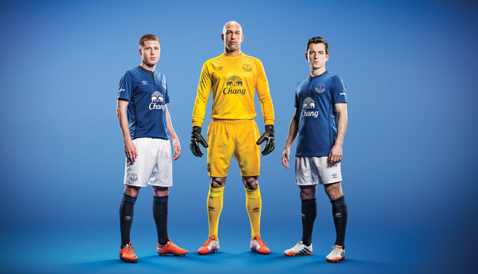
Even with just the second kit, it's clear to see a trend forming. Clean, classic styling with the variation being the secondary colour. Umbro are setting a solid foundation of kits that speak to the heritage of the brand.
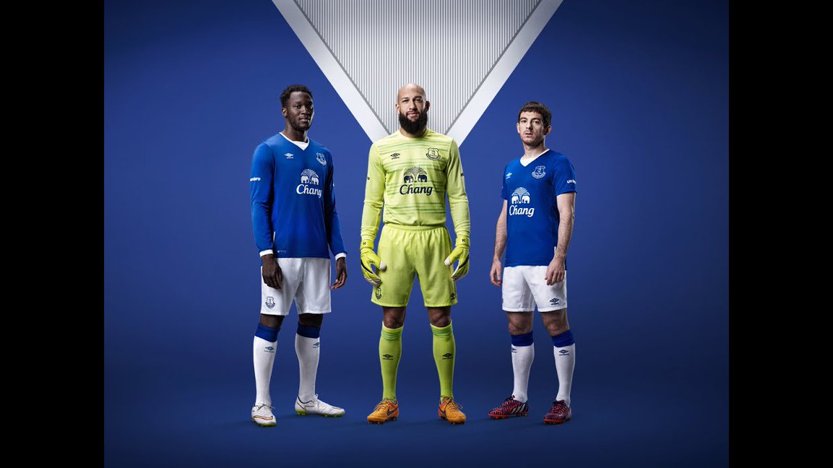
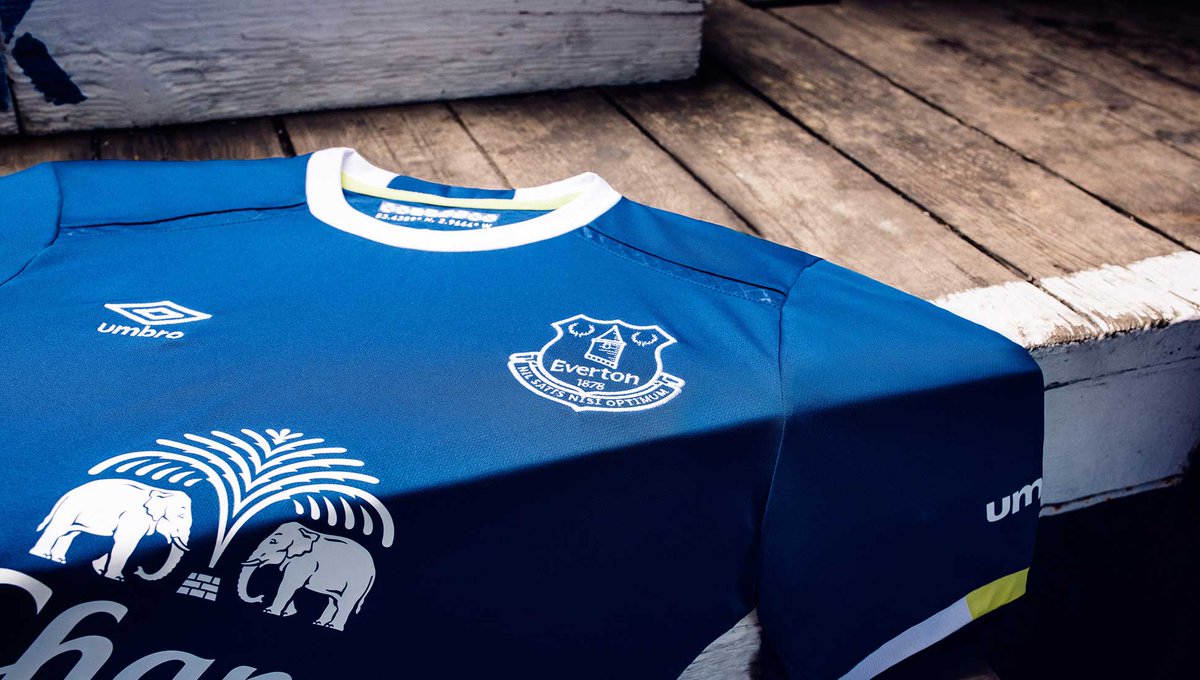
The trend continues. This kit leaves the only team reference to the co-ordinates of the ‘Grand Old Lady’ in the back of the neck. Umbro is cementing its reputation as a classic footballing brand.
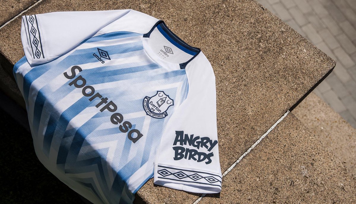
With a firm base of classic clean kits laid, Umbro upped the nostalgia by brining back the great double diamond shoulder branding. This is unmistakably Umbro before being unmistakably Everton. Great brand building that benefits both parties.
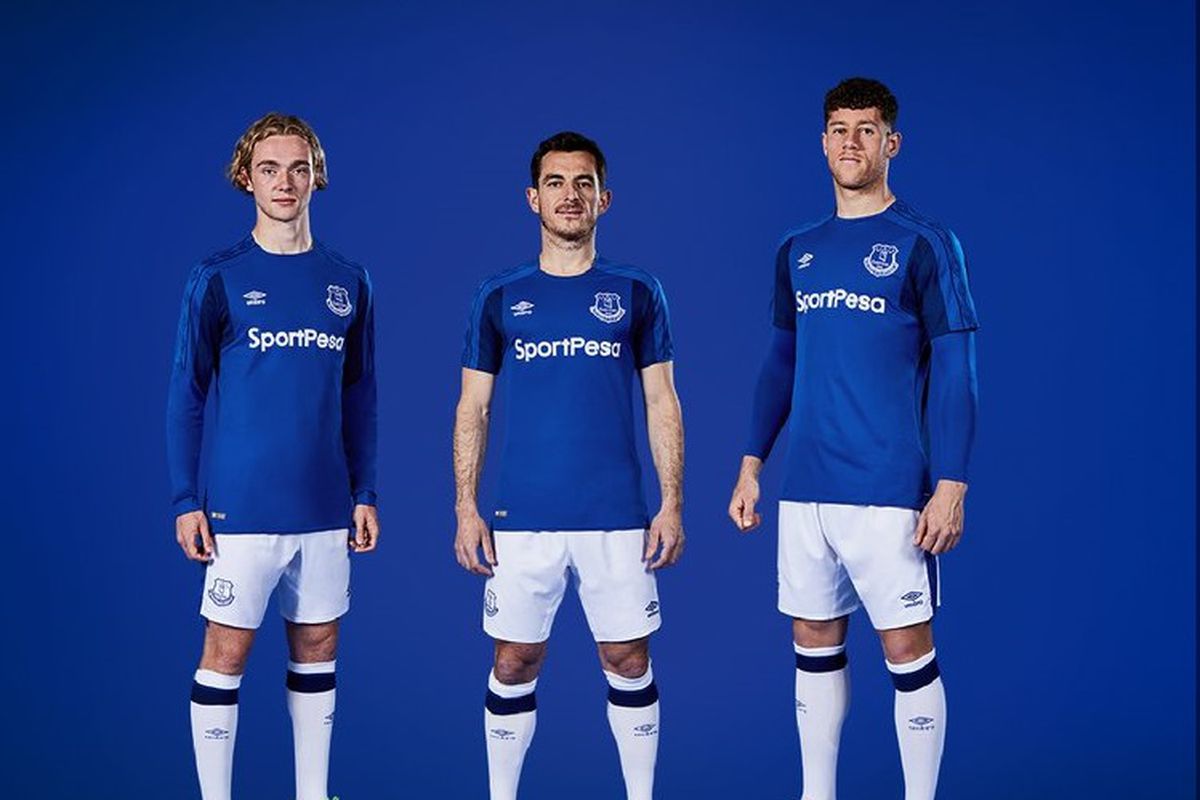
Here Umbro doubled down on the nostalgia, bringing the double diamond branding to the cuffs. With classic styling and a bit of melange detail in the fabric, once again, this is instantly recognisable as Umbro. 0-100 in 5 years.
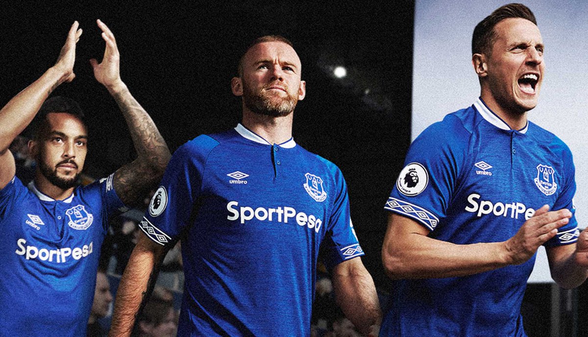
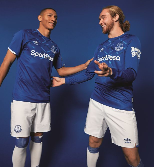
Today, Everton launched their new kit for the season...with a GRAPHIC! Now, with the brand restored to former glory, Umbro can start taking more risks on home kits as well as away. This is a club inspired graphic but tell me you don't think Umbro diamonds...
