,
28 tweets,
11 min read
Read on Twitter
X : I'm getting confused by the value chain axis on a Wardley Map.
Me : That's a good sign. Ditch it.
X : Eh? Isn't it important.
Me : It's purely scaffolding. Think of it like training wheels. You're growing beyond it.
X : I don't understand.
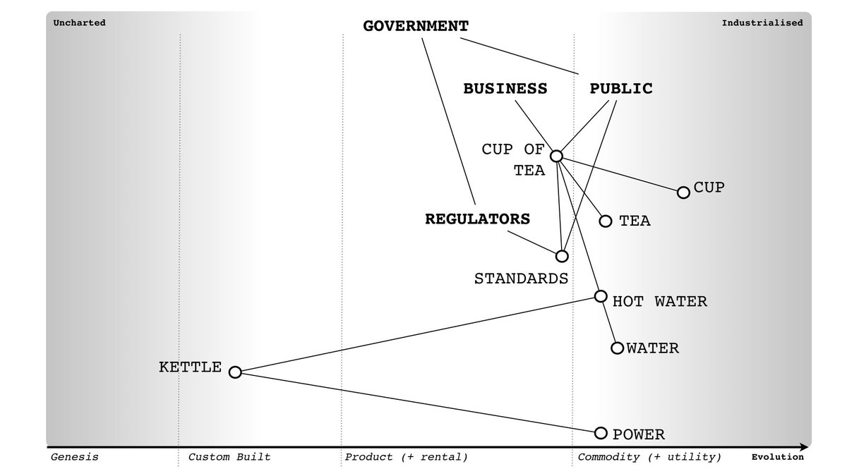
Me : Ok. Let's start with a tea shop
Me : That's a good sign. Ditch it.
X : Eh? Isn't it important.
Me : It's purely scaffolding. Think of it like training wheels. You're growing beyond it.
X : I don't understand.
Me : Ok. Let's start with a tea shop
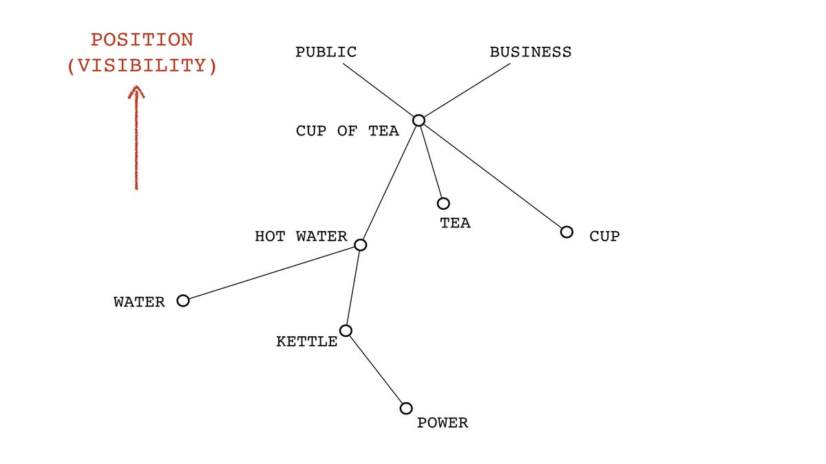
Me : The first thing we put down are the users (i.e. anchors of the map). In this case, we have the public (who has need to drink tea) and the business (who has a need to sell tea). There are of course many more users.
X : Like regulators?
Me : Yes. But we will start simple.
X : Like regulators?
Me : Yes. But we will start simple.

Me : You then expand this graph (and it is a graph) by exploring those needs to create chains of needs i.e. what does a cup of tea need ... it needs tea, it needs a cup etc.
X : It needs staff.
Me : Of course, that's part of sharing the final map. People find missing components.
X : It needs staff.
Me : Of course, that's part of sharing the final map. People find missing components.

Me : Now the closer things are connected the more visible they are i.e. to the public, the cup of tea is far more visible than the power used to create the cup of tea unless you create a deliberate link here such as promoting the green credentials of your tea production.

Me : So, we now order this chain of needs along visibility with the anchors (by convention) at the top.
X : Is this a map?
Me : No, it's a partial order list of components and still is a graph.
X : Is this a map?
Me : No, it's a partial order list of components and still is a graph.
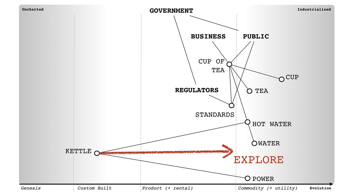
Me : We now add movement (i.e. evolution). This creates a space which we can now explore.
X : Is this a map?
Me : Yes, it has anchor, position and movement. All the things necessary to give space meaning.
X : Is this a map?
Me : Yes, it has anchor, position and movement. All the things necessary to give space meaning.

X : So, where is the value chain axis?
Me : It isn't anywhere. It didn't exist in the early maps and was added as scaffolding because people kept asking what the y-axis is? It's purely a training device to get people used to mapping. You don't need it, you can ditch it.
Me : It isn't anywhere. It didn't exist in the early maps and was added as scaffolding because people kept asking what the y-axis is? It's purely a training device to get people used to mapping. You don't need it, you can ditch it.

Me : The value chain is on the map itself, partially ordered. When it comes to value, what matters is the flow between components, the exchanges. The y-axis is irrelevant. Mapping in its purest form looks like this.
X : So why use the value chain axis?
Me : Teaching.
X : So why use the value chain axis?
Me : Teaching.

X : Do the anchors have to be at the top?
Me : No, that's just convention. You can have anchors further down if you wish. Each of those anchors, is in fact a node is some higher order map. Which are just choosing to describe the landscape around them.
Me : No, that's just convention. You can have anchors further down if you wish. Each of those anchors, is in fact a node is some higher order map. Which are just choosing to describe the landscape around them.

X : Why is it not a graph?
Me : Maps are graphs but not all graphs are maps. To explain, one of these is a map, one of these is a graph. See if you can spot the difference ...
Me : Maps are graphs but not all graphs are maps. To explain, one of these is a map, one of these is a graph. See if you can spot the difference ...


Me : To make it easier, compare these graphs and maps.

Me : The important difference is that in a map, space has meaning. This means we can explore a space and learn about it.

Me : So, in our cup of tea example, we can explore (we call this challenging and questioning assumptions) the use of commodity vs custom built kettles. It's through this sort of exploration and observation that we discover patterns on the map.
X : In your example, surely both are graphs?
Me : Yes, that's correct. But only one of these is a map.
Me : Yes, that's correct. But only one of these is a map.


X : Can we add weighting to graphs.
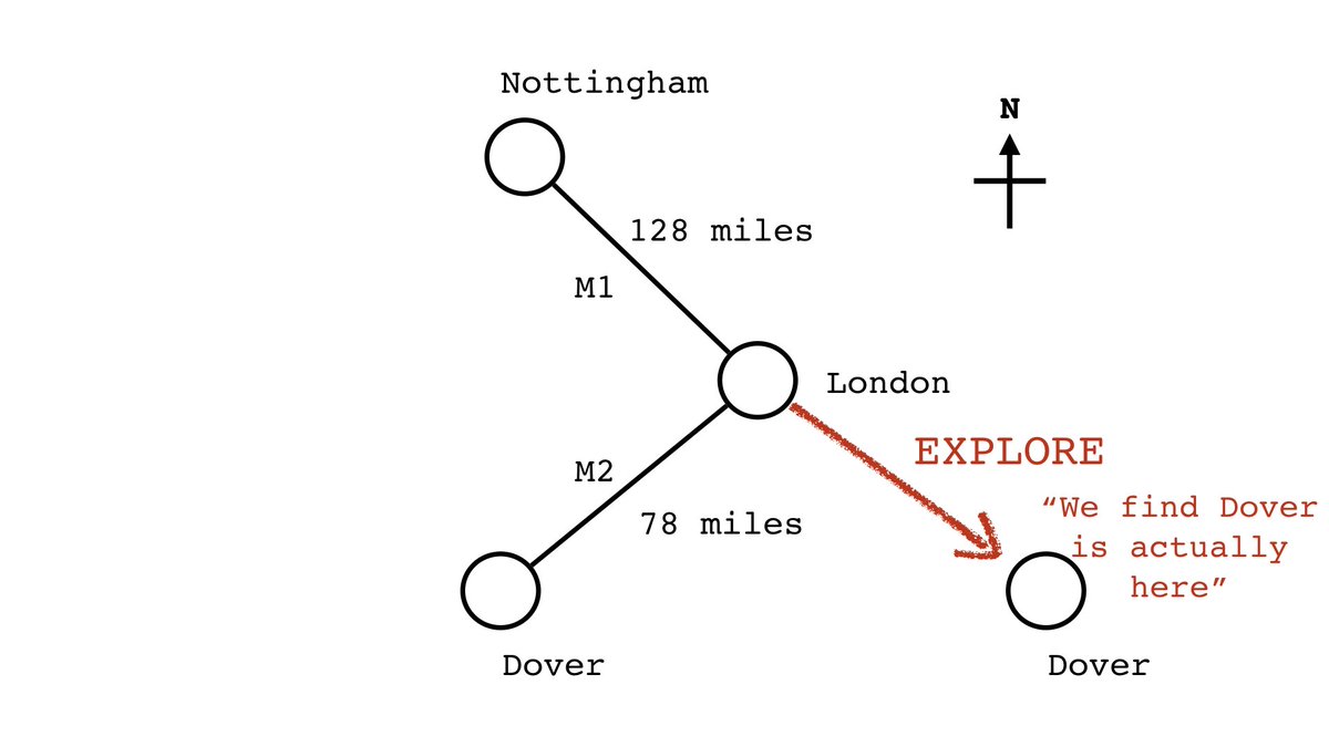
Me : Of course. I've done this in the following example with distance. Weighting doesn't turn a graph into a map. Only one of these maps is "correct" (i.e. roughly approximates reality).
Me : Of course. I've done this in the following example with distance. Weighting doesn't turn a graph into a map. Only one of these maps is "correct" (i.e. roughly approximates reality).

X : The map you gave in your example is wrong. Dover isn't there.
Me : Of course, all maps are imperfect. But because we can explore, we can find better maps.
Me : Of course, all maps are imperfect. But because we can explore, we can find better maps.


X : So, any graph I can move things on is a map?
Me : Well, there has to be consistency of movement i.e. the space has to have meaning and not some arbitrarily changing construct i.e. north has to mean north and not north sometimes and south other times.
X : Not sure I follow.
Me : Well, there has to be consistency of movement i.e. the space has to have meaning and not some arbitrarily changing construct i.e. north has to mean north and not north sometimes and south other times.
X : Not sure I follow.
Me : Ok, let us make some unconnected categories i.e. forest, hilly, coastal and metropolis. Describe London as the anchor and draw our "map". Add cheddar gorge. What instructions can you give to go from Dover to Cheddar Gorge?

... your two choices are either
a) follow the long route of roads
or
b) head to where it's hilly but not coastal, avoid metropolis and forests?Basically you can end up anywhere.
Movement has to have consistency. It can't be arbitrary classifications. It needs repeatability.
a) follow the long route of roads
or
b) head to where it's hilly but not coastal, avoid metropolis and forests?Basically you can end up anywhere.
Movement has to have consistency. It can't be arbitrary classifications. It needs repeatability.
i.e. north is north, south is south or ... in my case ... capital consistently evolves from genesis to custom built to product to commodity.

Me : It took over 9k data points to create a consistent axis for movement in mapping. Sure, it's a model, it'll be wrong, someone will find a better way ... but no-one has yet as far as I know. It's the best I've got. It's also the key to mapping.
X : I thought the value chain was the key bit?
Me : The y-axis? No. It's purely scaffolding / training wheels. The value chain is what you're describing on the map. So the value chain is important but once you get used to mapping, you can throw the y-axis itself away.
Me : The y-axis? No. It's purely scaffolding / training wheels. The value chain is what you're describing on the map. So the value chain is important but once you get used to mapping, you can throw the y-axis itself away.
X : So the Y-axis makes no difference?
Me : It's more a question of perspective. So you can use it to represent that "this" is more visible than "that" but what truly matters is the connections i.e. I could make tea less visible than the standards.
Me : It's more a question of perspective. So you can use it to represent that "this" is more visible than "that" but what truly matters is the connections i.e. I could make tea less visible than the standards.


X : This confuses me.
Me : Well that's perfectly fine. Stick with the value chain axis for the time being, it's there for support. Over time, as you get more comfortable, you'll find you don't need it.
Me : Well that's perfectly fine. Stick with the value chain axis for the time being, it's there for support. Over time, as you get more comfortable, you'll find you don't need it.

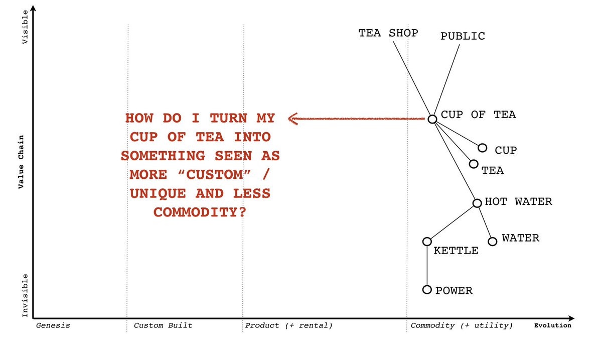
X : How do I turn my commodity thing into something more custom?
Me : You mean perceived as custom, something special, more unique? Try adding another need ...
Me : You mean perceived as custom, something special, more unique? Try adding another need ...
Me : e.g. add status to it, make it more desirable and add other characteristics. Remember you can map not only activities, practices, data and knowledge (all forms of capital) but ethical values as well ...

Me : So, I can take your humble commodity cup of tea and turn it into a virtuous tea of renewable energy, fair conditions and fair trade. I can even throw in some theatre to the entire process if I wish ... all for a price.
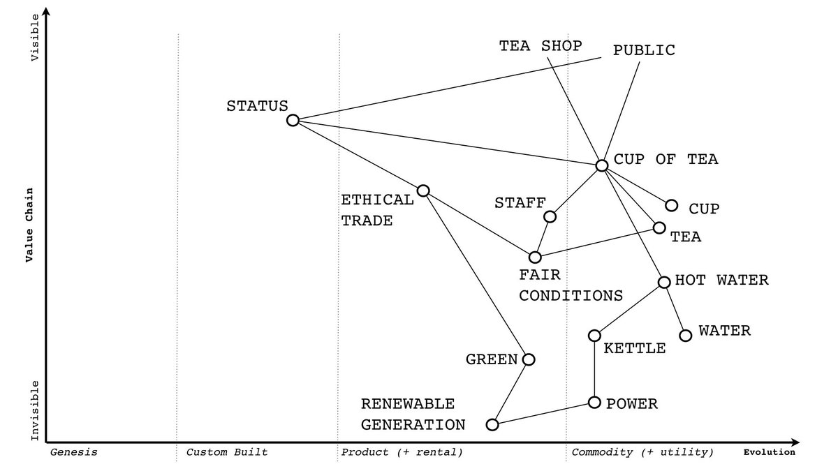
Me : The sleight of hand, is I'm no longer actually buying a cup of tea (that's a commodity) ... what I'm buying is a whole "experience" ... status, that feeling of doing something good ... it's not just a cuppa, it's a life changing moment ... cue the advertising.